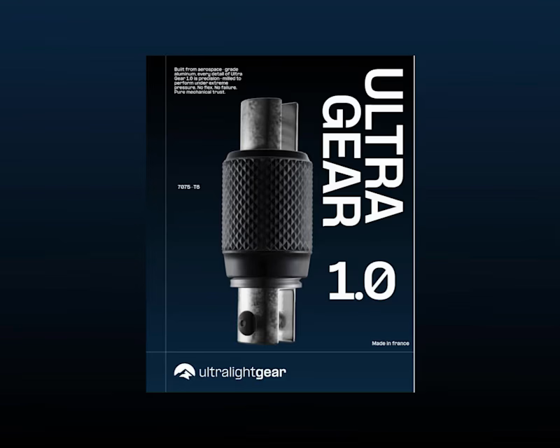
I’ve just finished and submitted my entry for the @webflow (https://www.instagram.com/webflow/) × @contra (https://www.instagram.com/contra/) Challenge.
⠀
Built in Webflow, this concept explores the balance between engineering and emotion.
⠀
Because every project is a test of alignment between what we imagine and what we make real.
⠀
Ultra Gear 1.0 and the Webflow Challenge remind me why I create:
to turn precision into emotion, and structure into story.
[ Live Site (https://ultra-gear.webflow.io/) ]
5
21
393
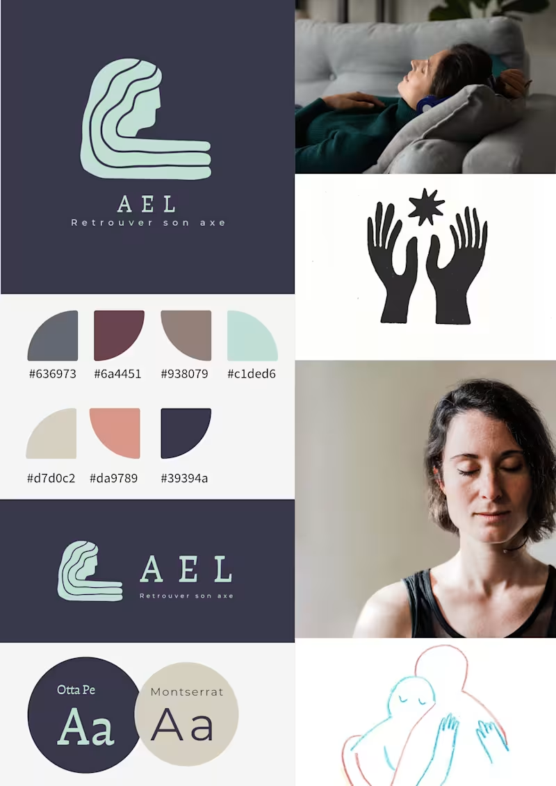
AEL is a visual identity developed for a practitioner working in soft healing and holistic support.
The brand was built around the idea of retrouver son axe — returning to one’s center.
The challenge was to create an identity that could feel calm, grounded, and emotionally safe without becoming clinical or overly spiritual.
Instead of using familiar wellness tropes, the visual direction focuses on presence, silence, and reconnection through a symbolic logo, a restrained color system, and spacious composition.
The final identity includes:
logo system
color palette
typography pairing
moodboard
vertical and horizontal lockups
AEL is designed to feel quiet, human, and steady — a brand that supports rather than performs.
1
371
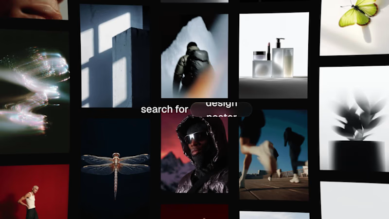
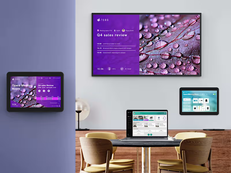
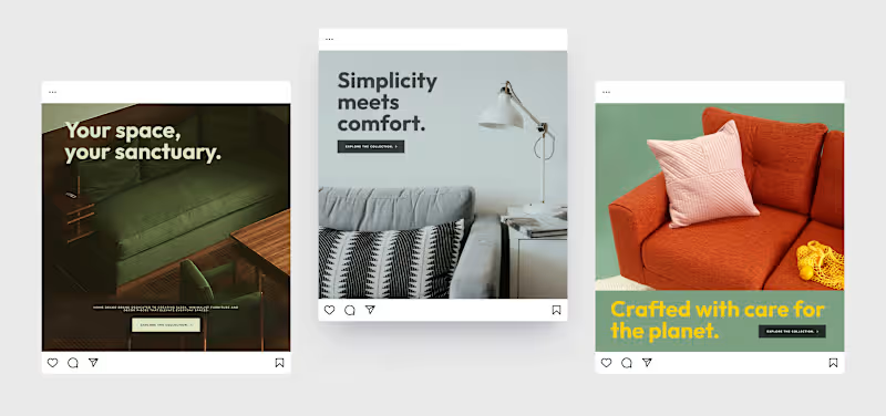
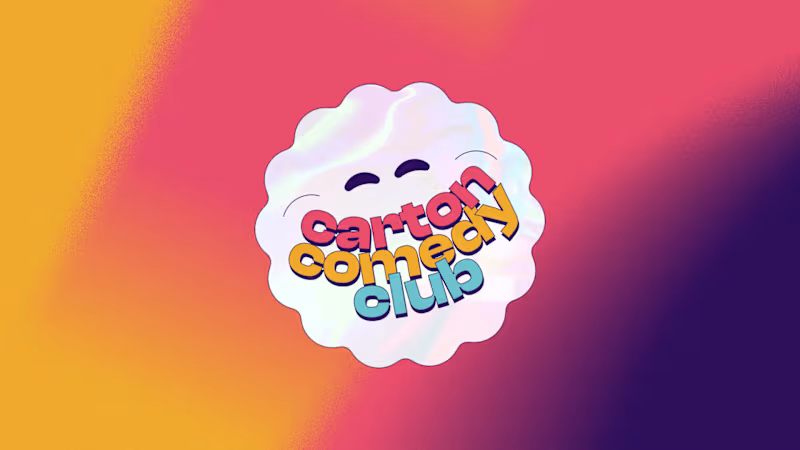

Event poster series designed for Bras de Fer, a music and cultural venue in Nantes. The project combines bold typography, vibrant colors and playful illustrations to create distinctive visuals for DJ sets and events. Each poster develops its own graphic universe while maintaining a recognizable identity for the venue.
1
4
354

