
Branding, Product & Web Design that convert

Branding, Product & Web Design that convert


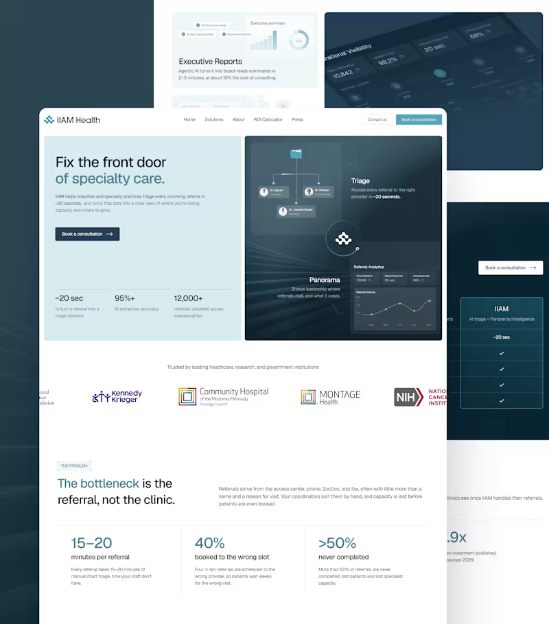
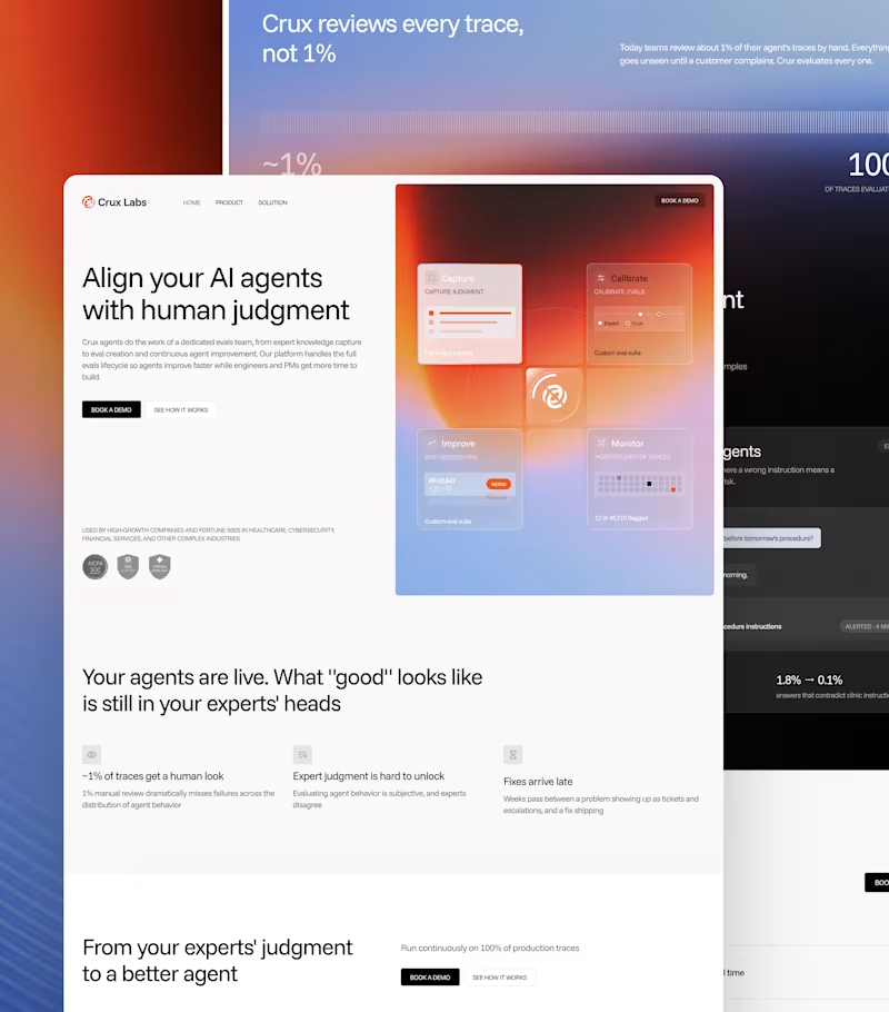


Performance-based brand, website & funnel designer.
- $50k+
- Earned
- 23x
- Hired
- 4.7
- Rating
- 340
- Followers
Performance-based brand, website & funnel designer.


Certified Webflow Professional Partner


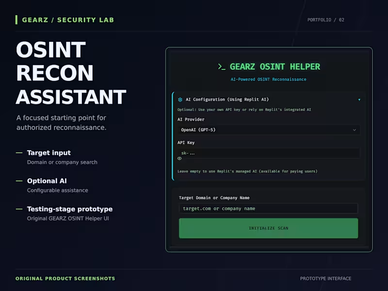
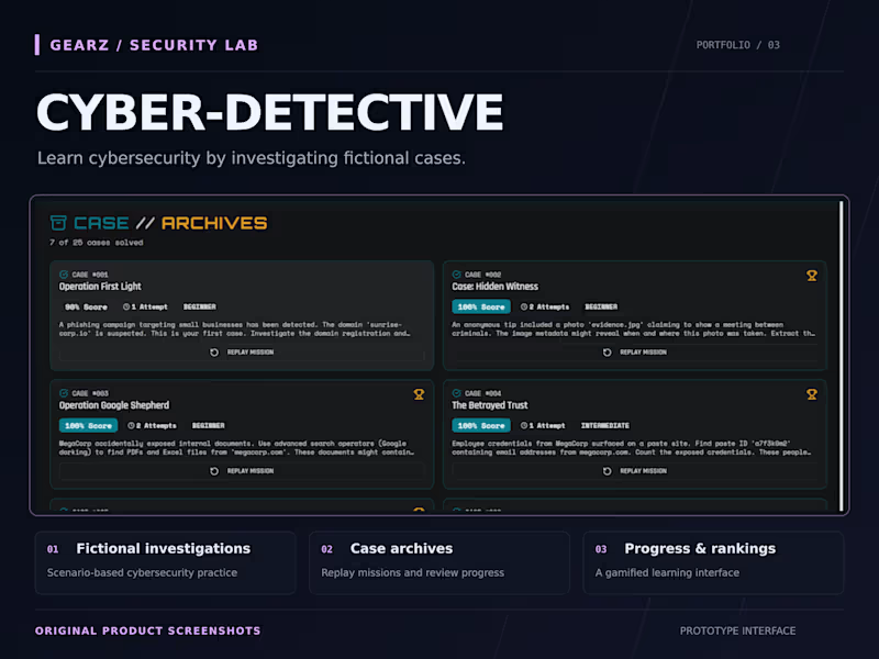
AI-powered security tools, apps & automations
AI-powered security tools, apps & automations
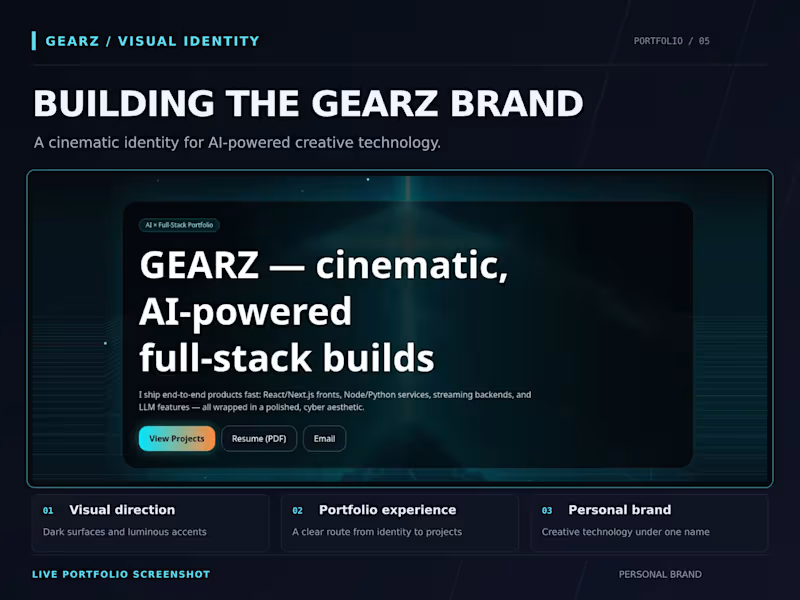
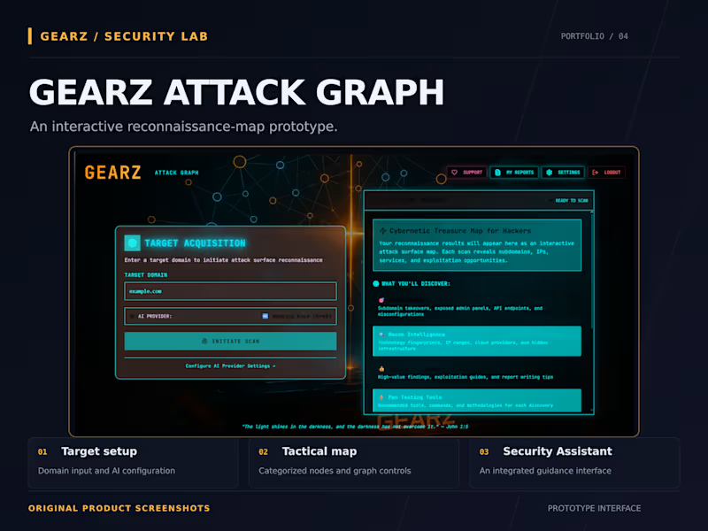

AI Video Ads & Avatars · Websites with AI Receptionist

Senior Product Designer + Frontend Developer | AI-Assisted
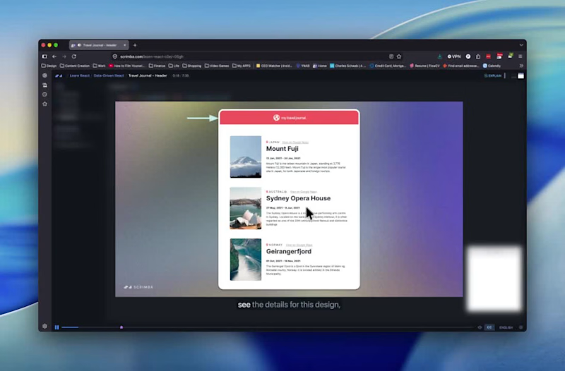
I've tried learning React a few times. Always hit the same wall.
The tutorials made sense while I was watching them but then I'd close the video and have no idea where to start on my own.
Scrimba is different because the lesson is the code editor. You're not watching someone build in one window while you try to copy it in another. You click inside what they're working on mid-lesson and write directly in it.
I'm still early in it but I'm further along than I've ever gotten before. For designers trying to bridge design and code, it's the most useful format I've found.
scrimba.com (http://scrimba.com)
0
101

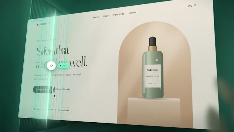
I built my portfolio from scratch using Claude Code and I'm genuinely proud of how it turned out.
As a designer who can code, I wanted something that actually reflected that. So instead of a template, I built it myself with a little help from AI.
A few things I'm proud of:
The whole thing is custom built, no Webflow, no Squarespace
Claude Code helped me move fast on this one. It gave me full control over every interaction and detail
Check it out at patlopes.com (http://patlopes.com) would love to hear what you think.
1
218
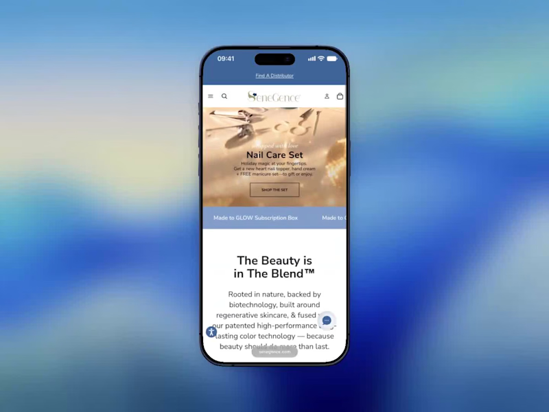
I started the SeneGence checkout redesign by looking at where people stopped.
The behavior data and stakeholder feedback pointed to the same place. Navigation was confusing, mobile and desktop didn’t match, and checkout required an account before anyone could pay.
I took the checkout first. Dropping the account requirement was the biggest change, and the rest was making each step clear about what was coming.
The video is me going through the mobile checkout as it works now. It’s short, which is the point.
The full redesign ran six months and ended up with 80K+ conversions and over $7M in revenue. I was the designer on it from problem definition through delivery, working with engineering and the business team.
If you’re stuck on a conversion problem, start by finding the exact screen where people leave. Redesign that one first.
2
49
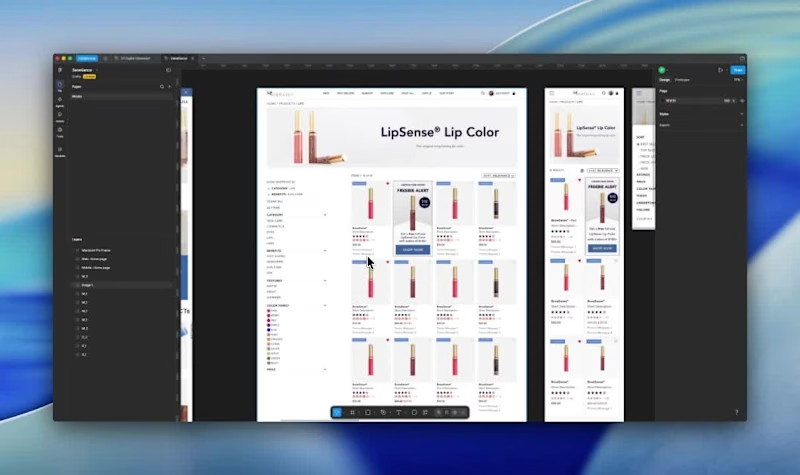
Every product page decision has a job to do before someone ever reaches checkout. On the SeneGence PDP, the job was simple to state and hard to execute: help someone choose a shade with confidence.
That meant building the color swatch grid as the primary interaction, not a secondary detail, with limited edition tags called out clearly so nobody's disappointed after checkout. Related shades and complementary products show up right below, so discovery doesn't dead-end at one product.
On the listing page, filters had to hold up across dozens of SKUs. Mobile users get a filter drawer with chips for active selections. Nothing gets buried behind a menu they'll forget to check.
Case study here: patlopes.com/case/senegence-redesign
2
146


UI Designer, Web Developer, Web Designer


