Designer. Developer. Creator.


We build frictionless operations software for modern teams

We build frictionless operations software for modern teams


Animator, Illustrator and Art Director

Animated a piece for the Stavros Niarchos Foundation, inspired by the Biblioburro, a donkey library bringing books to rural Colombia. I wanted the piece to capture the warmth, dedication, and hope behind this story. I handled illustration in Illustrator and Photoshop, animation in After Effects, and art direction.
19
66
1.2K


Software developer


Brand Designer & Illustrator
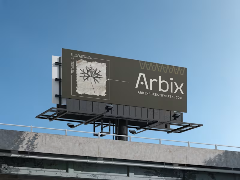
Brand identity exploration for Arbix. This direction explores the transformation of environmental complexity into actionable data. View case study: https://www.behance.net/gallery/258207795/ARBIX-BRAND-IDENTITY
0
44
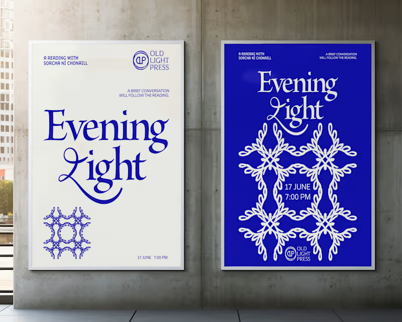
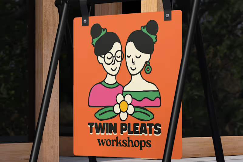
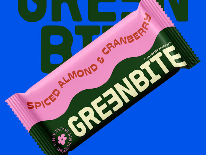

Next.js & TypeScript Dev | Blockchain & dApp Specialist
- 1x
- Hired
- 5.0
- Rating
- 2
- Followers
Next.js & TypeScript Dev | Blockchain & dApp Specialist


View more →

Book & brand designer: covers, identities, album art.
New to Contra
Book & brand designer: covers, identities, album art.
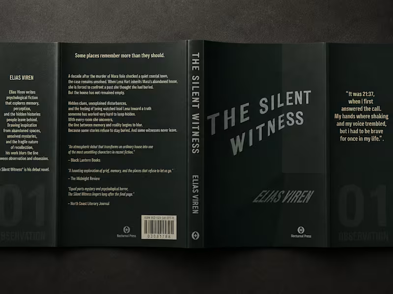
A book cover is often a reader's first introduction to a story. For The Silent Witness, the goal was to create a cover that captures the book's atmosphere, draws attention, and gives potential readers a sense of its tone before they turn the first page. The design uses restrained imagery, muted green tones, and textured details to create a distinctive visual identity for the title.
0
71
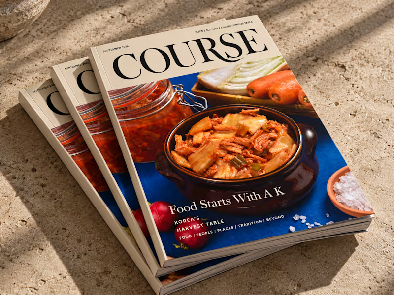
A food magazine needs an editorial identity that makes each issue engaging while keeping the publication recognisable.
COURSE is an international food magazine concept built around a different theme each month. I developed its editorial layouts and visual direction, creating a framework for presenting food, culture, and stories in a cohesive publication. The Korean-themed issue explores Korean traditions through the magazine's editorial format.
0
79
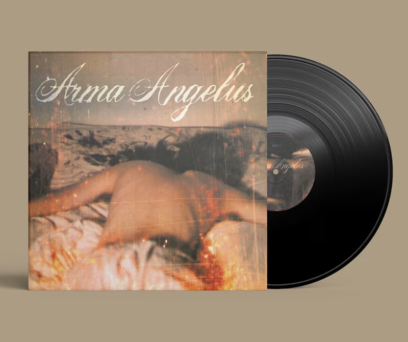
An anniversary vinyl release deserves packaging that gives the music a strong physical identity. For Arma Angelus, I designed a gatefold sleeve for an anniversary edition commissioned through Another City Records, bringing the artwork and layout together in a cohesive format designed for the finished vinyl release.
0
87
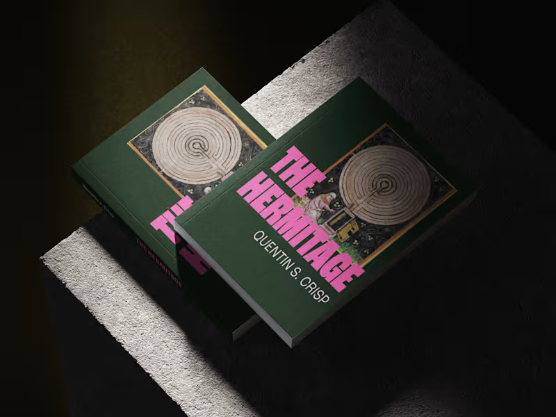
How do you give a publisher's fiction titles a recognisable identity while allowing each book to retain its own character?
For Verdurin, I developed a visual direction for a fiction title and created a design system to guide future fiction projects. The work brought cover design, typography, and colour into a consistent framework, giving the publisher a repeatable approach to future titles rather than a one-off design.
2
2
147

🔧 Fullstack Engineer & Solution Architect