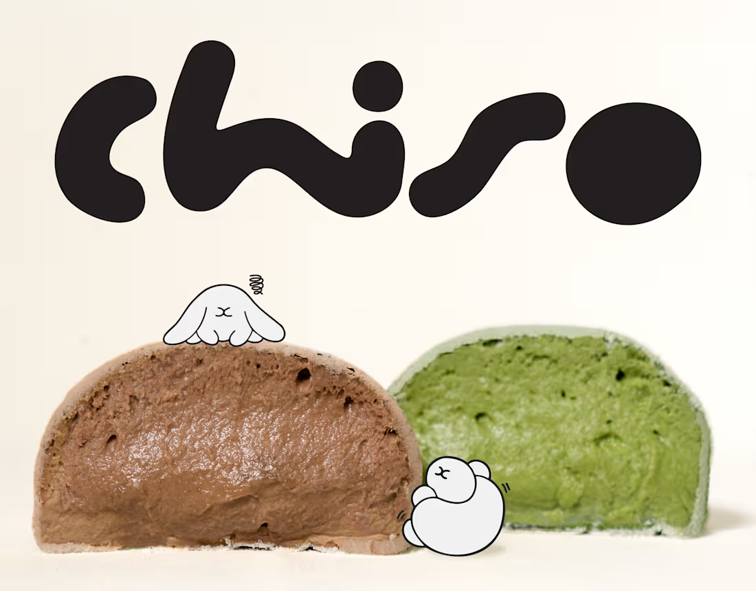
Chiso | Branding & Packaging Design
A good brand is more than what meets the eye. It's how every little detail comes together.
For Chiso, we explored a visual direction inspired by Japanese aesthetics, bringing together a distinctive logotype, soft visual elements, and thoughtfully designed packaging for mochi and soy milk.
From the typography to the packaging details, each element was designed to create a consistent identity that feels fresh, playful, and effortlessly recognizable.
A simple idea, thoughtfully brought to life.
0
16

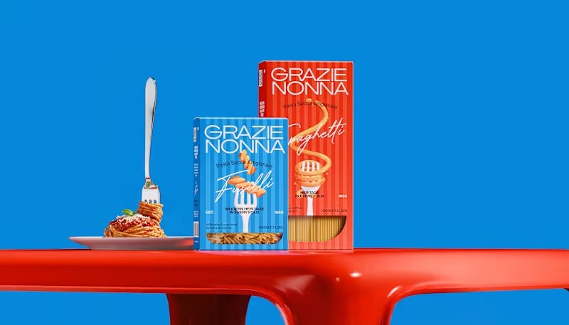



:Luvto | Healthy Indulgence, Made Real.
We created Luvto as a modern gelato brand that makes healthy indulgence feel a little more exciting.
Built around pure milk and real fruits, the identity embraces the things that make real ingredients special natural textures, playful imperfections, and fresh flavors.
The goal was to create a visual language that feels youthful, fresh, and full of energy, while still communicating Luvto’s mindful approach to indulgence.
From the visual identity to the packaging, every touchpoint was designed to make gelato feel not just good to eat, but good to experience.
0
129
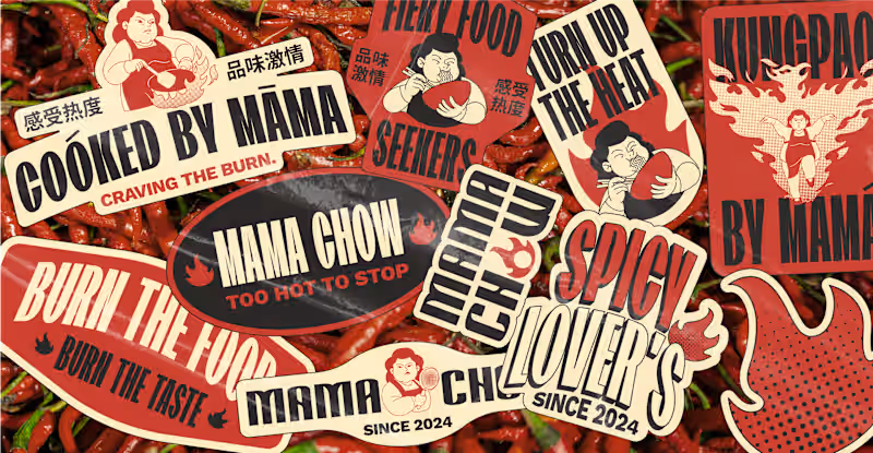


Blume is a lifestyle brand built around the intersection of fashion, café culture, art, and collectibles. I developed a cohesive visual identity centered on an abstract flower symbol a distinctive expression of individuality, growth, and creativity. The identity was designed to balance a contemporary, expressive character with a refined and timeless visual language, creating a flexible system that can extend across multiple touchpoints and experiences.
0
159
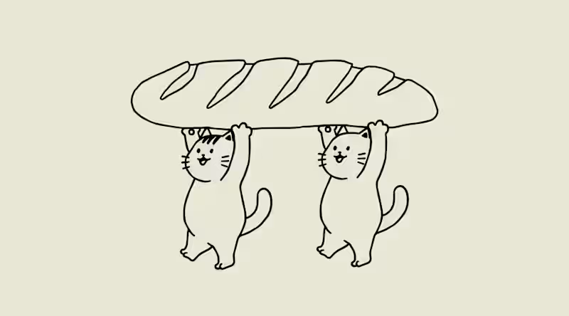



Roomspace Creative Lab collaborated with Tavora Studio to craft a brand identity that reflects its core values: mindfulness, balance, and personal growth. The custom logomark symbolizes harmony and natural flow, while the elegant serif and script typography blend modernity with a calming, spiritual aesthetic. A refined earthy palette and flexible logo system were developed to ensure consistency across various applications
15
60
522