
Branding Identity Designer
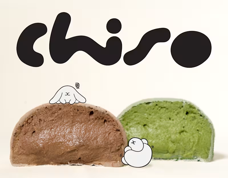
Chiso | Branding & Packaging Design
A good brand is more than what meets the eye. It's how every little detail comes together.
For Chiso, we explored a visual direction inspired by Japanese aesthetics, bringing together a distinctive logotype, soft visual elements, and thoughtfully designed packaging for mochi and soy milk.
From the typography to the packaging details, each element was designed to create a consistent identity that feels fresh, playful, and effortlessly recognizable.
A simple idea, thoughtfully brought to life.
0
16

:Luvto | Healthy Indulgence, Made Real.
We created Luvto as a modern gelato brand that makes healthy indulgence feel a little more exciting.
Built around pure milk and real fruits, the identity embraces the things that make real ingredients special natural textures, playful imperfections, and fresh flavors.
The goal was to create a visual language that feels youthful, fresh, and full of energy, while still communicating Luvto’s mindful approach to indulgence.
From the visual identity to the packaging, every touchpoint was designed to make gelato feel not just good to eat, but good to experience.
0
129

Blume is a lifestyle brand built around the intersection of fashion, café culture, art, and collectibles. I developed a cohesive visual identity centered on an abstract flower symbol a distinctive expression of individuality, growth, and creativity. The identity was designed to balance a contemporary, expressive character with a refined and timeless visual language, creating a flexible system that can extend across multiple touchpoints and experiences.
0
159


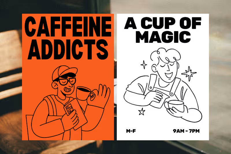
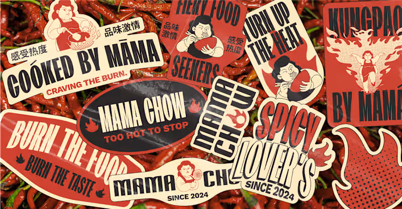
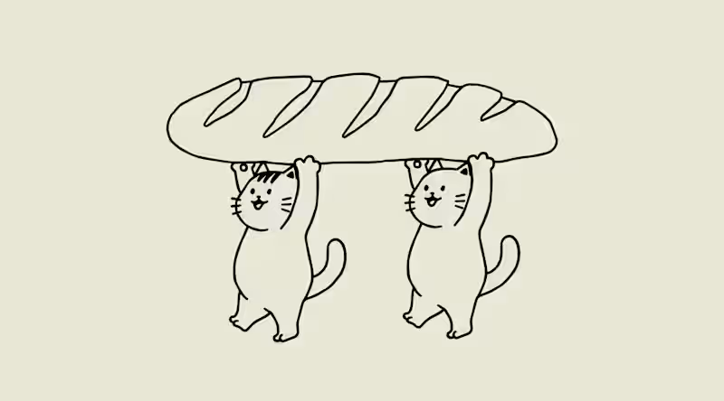
Unique Branding & Presentations with Impact 🎨
- $1k+
- Earned
- 1x
- Hired
- 3
- Followers
Unique Branding & Presentations with Impact 🎨

View more →

Creative Designer from Indonesia
Illustrator since 2019
Creative Designer from Indonesia
Illustrator since 2019

Brand & Design Studio for premium visual experience
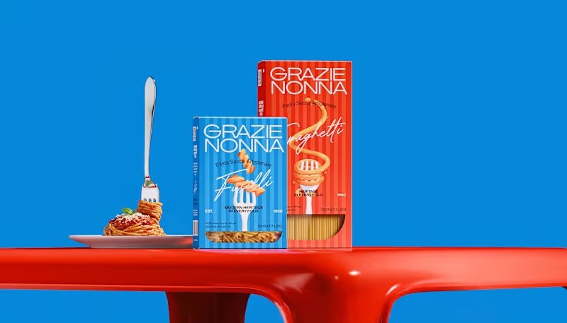
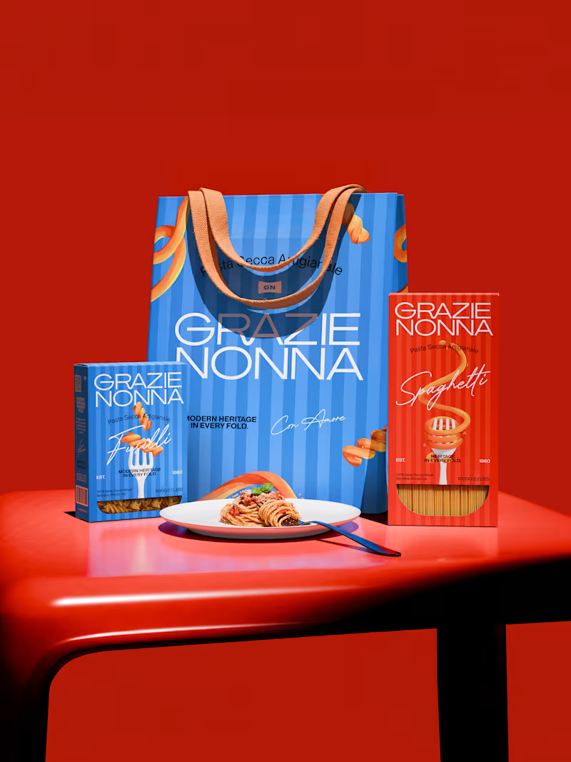
Grazie Nonna is a modern pasta brand inspired by the warmth, craft, and authenticity of handmade family recipes.
The challenge was to create a brand identity and packaging system that could celebrate Italian heritage without falling into the familiar visual language of traditional pasta brands.
Instead of looking backward, the identity brings nonna's heritage into a contemporary world: bold, expressive, colorful, and unmistakably Italian. The result is a visual identity built around one central idea: Tradition, reframed for a new generation.
4
3
148

One Stop Solution Digital Agency
One Stop Solution Digital Agency


View more →