Product Designer & Framer Experts


Product Designer & Framer Experts
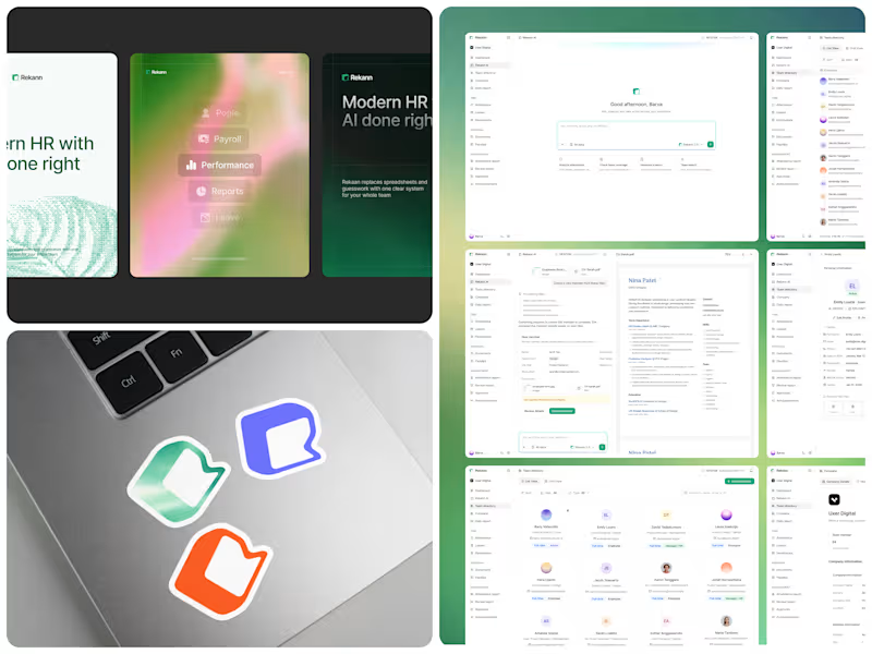
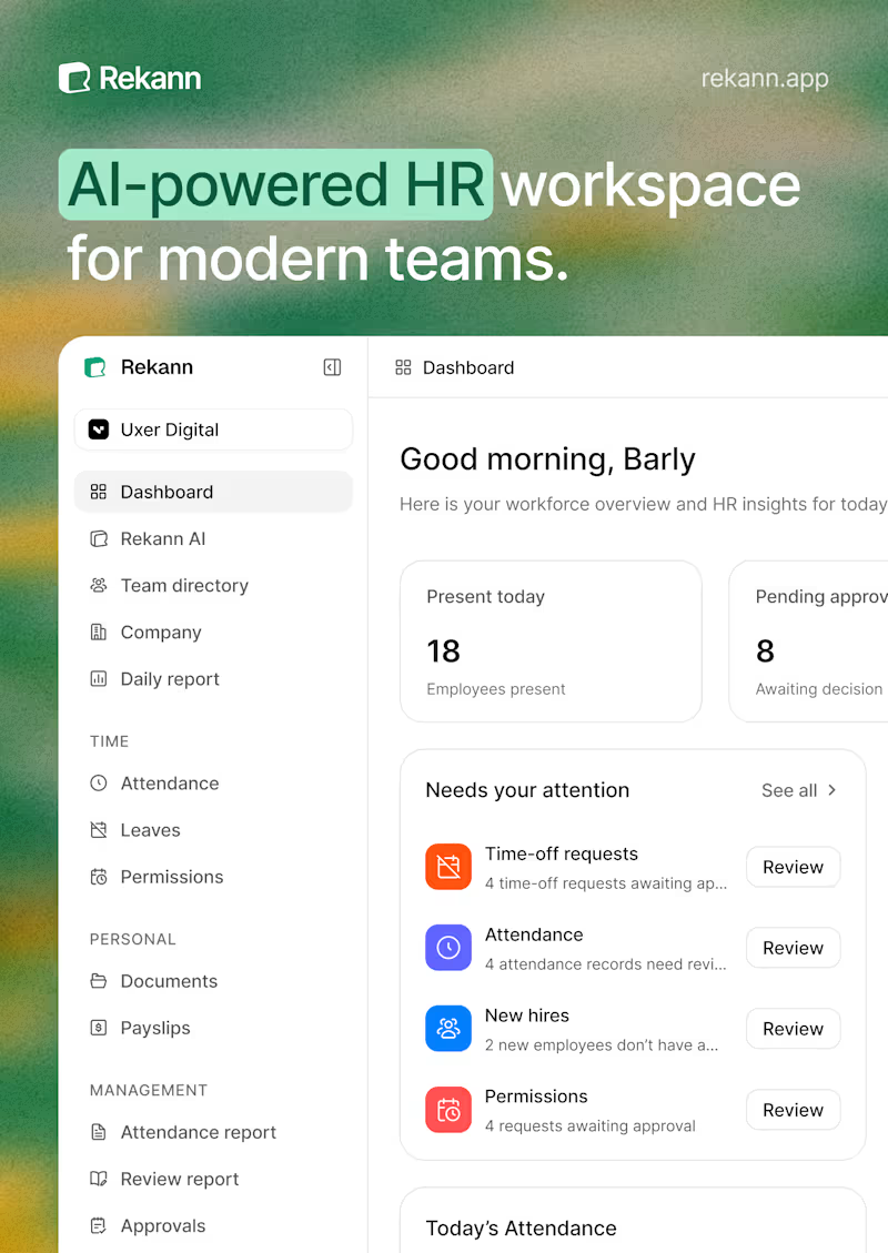
Working on the branding for Rekann. A quick look at the visual system, product UI, and brand applications.
3
6
325



Digital Product Design for SaaS & Tech Companies
Digital Product Design for SaaS & Tech Companies


Brand Identity Designer
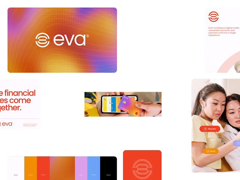
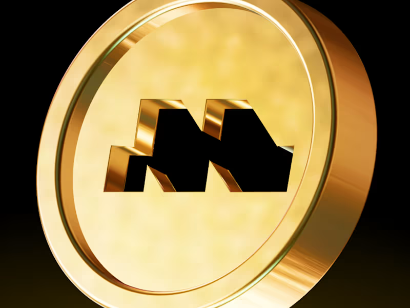
Introducing EVA, a digital wallet and payment ecosystem designed to make money movement feel effortless. The logo concept explores connection, simplicity, and fluidity through a minimal geometric symbol built for a modern financial experience.
Money, connected.
3
3
323
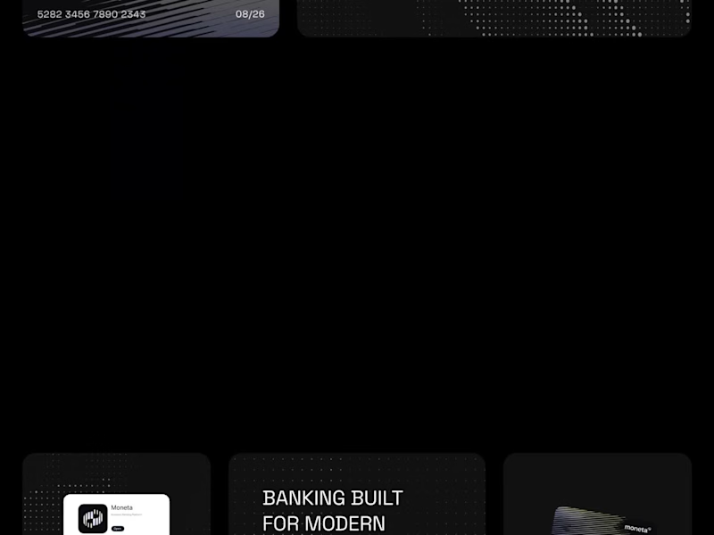

Branding Identity Designer
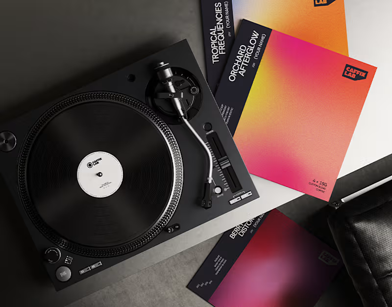
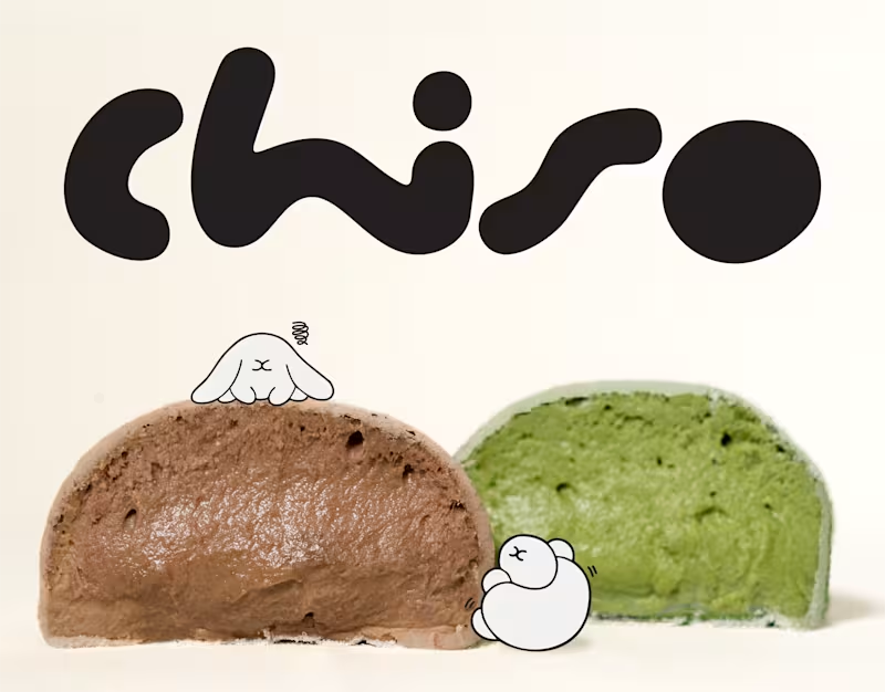
Chiso | Branding & Packaging Design
A good brand is more than what meets the eye. It's how every little detail comes together.
For Chiso, we explored a visual direction inspired by Japanese aesthetics, bringing together a distinctive logotype, soft visual elements, and thoughtfully designed packaging for mochi and soy milk.
From the typography to the packaging details, each element was designed to create a consistent identity that feels fresh, playful, and effortlessly recognizable.
A simple idea, thoughtfully brought to life.
0
16
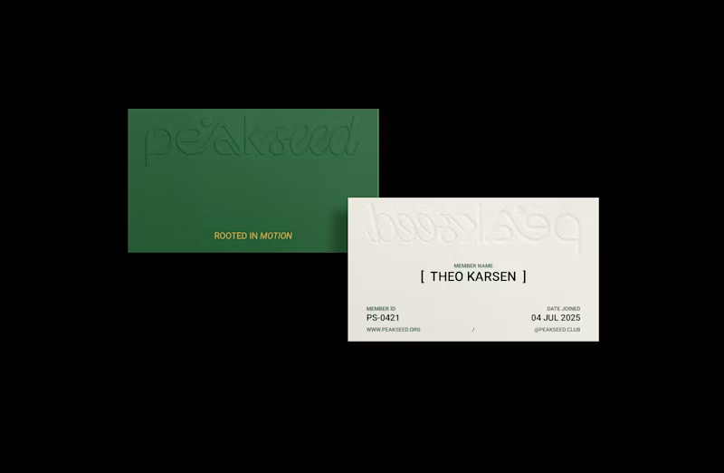
Peak Seed | Brand Identity
Inspired by the trail culture and alpine landscapes of Chamonix, France, Peak Seed is a mountain running community that sees running as more than a pursuit of performance. It is a continuous journey of movement, awareness, and connection with nature, ourselves, and one another.
The logotype combines organic typography with a defined geometric structure, balancing fluidity with precision. Its flowing curves and connected letterforms draw inspiration from the rhythm of each stride, the breath that sustains it, and the ever-changing contours of mountain trails.
The resulting identity reflects Peak Seed’s philosophy: moving freely while staying grounded, embracing the journey while remaining consistent, and finding connection along every path.
Have a brand in mind? Let’s build something meaningful together.
0
60
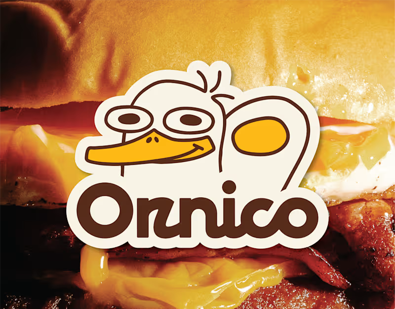
Ornico | Good Food, Full of Character
A warm and playful brand identity for Ornico, an all-day brunch house made for slow mornings, good food, and easy conversations.
From the custom logotype to the visual language and brand applications, every detail was designed to feel bold, welcoming, and effortlessly familiar.
A simple idea, given a little more character.
Brand Identity · Custom Logotype · Art Direction · Packaging · Brand Applications
https://www.behance.net/gallery/254213581/Ornico-Burger-for-Breakfast-Restaurant-Branding
0
88

Graphic Designer | Logo, Pitchdeck, Branding
Graphic Designer | Logo, Pitchdeck, Branding


Crafting Brands That Last 🚀


Illustrator/Graphic Designer