Premium Websites for Startups & Enterprise
Premium Websites for Startups & Enterprise
AI Image & Video Producer | AI Ads | AI UGC
AI Image & Video Producer | AI Ads | AI UGC


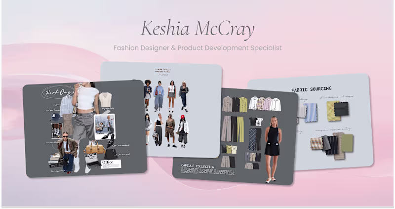
Experience Design (Product, Brand, IRL)
Experience Design (Product, Brand, IRL)
AI Content Creator & Expert Video Editor. Let's Create!

AI Visual Designer | Luma, Ideogram, Dreamina Partner
AI Visual Designer | Luma, Ideogram, Dreamina Partner
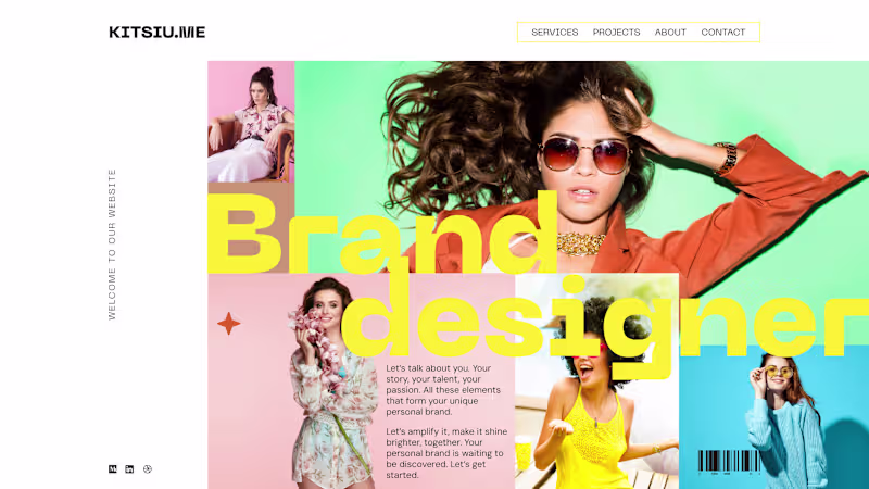
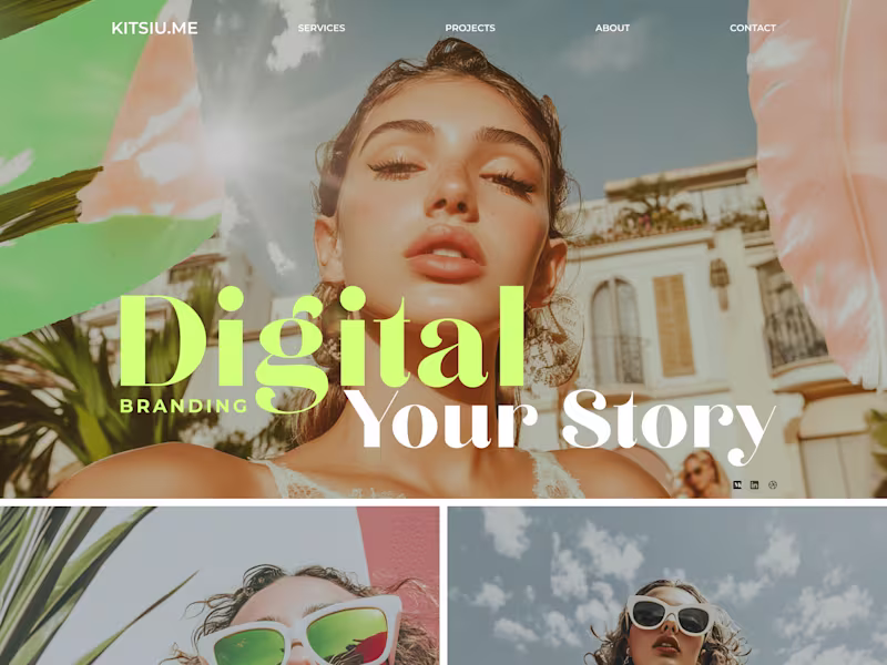
Web Designer & Digital Architect, Brand Identity/Aesthetics
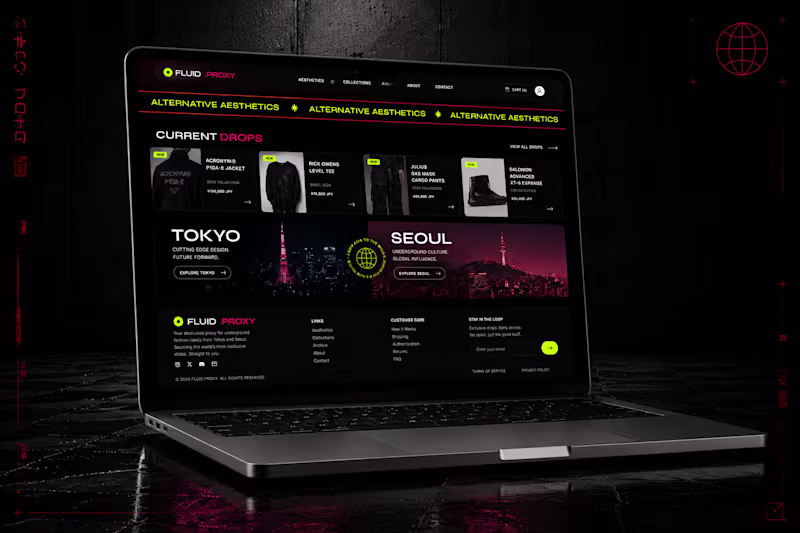
Web Designer Figma & Framer Expert
9+ Yrs: Stunning & Print-Ready Designs
9+ Yrs: Stunning & Print-Ready Designs