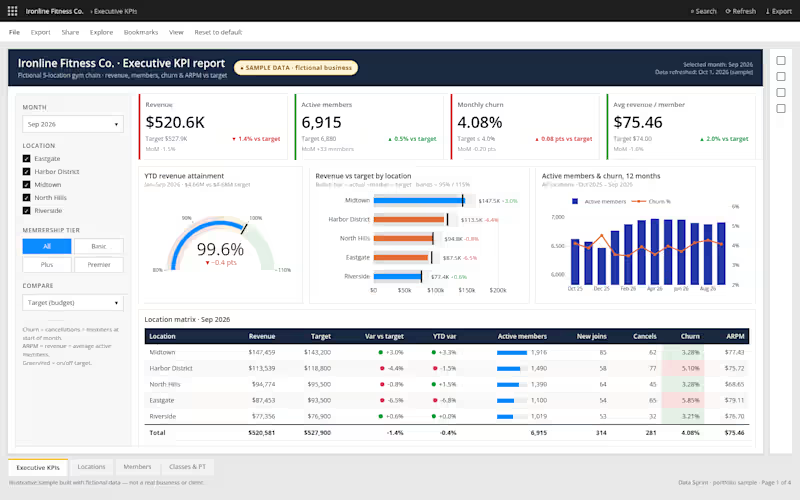
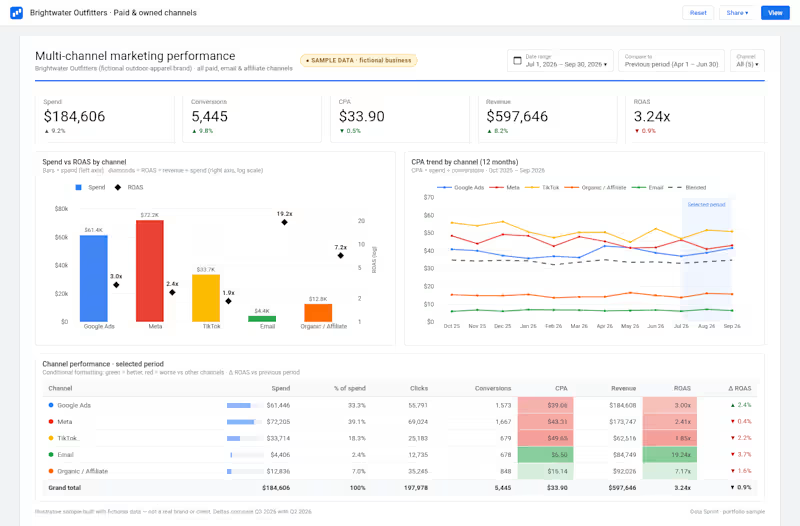
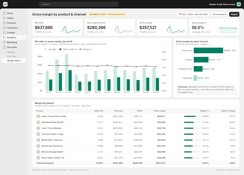
Color contrast isn’t enough on its own, so I’m trying out textures as a second cue to improve accessibility.
What are the best practices for using patterns to support users who can’t rely on color alone without making the chart feel busy or distracting?
2
18
281
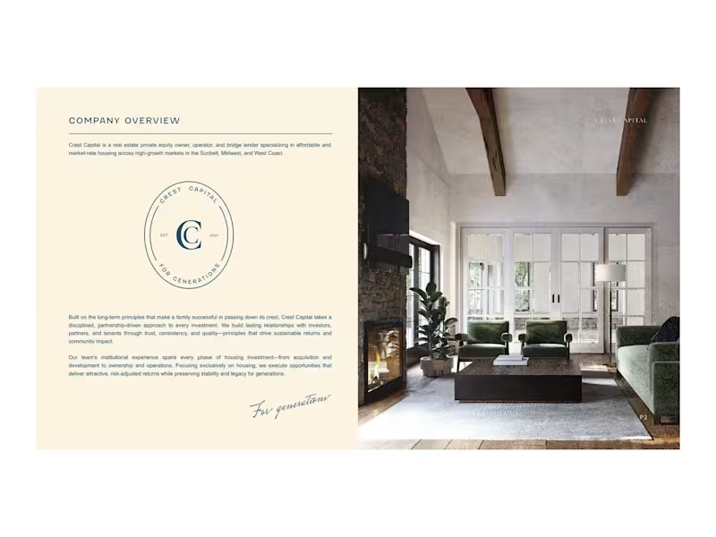
Investor decks designed to impress and written to persuade. Your team brings the numbers and the substance; I make it clear and beautiful, turning complex financials into a story that's easy to follow. Shown with sample content to protect client confidentiality.