

Award-winning creative technologist



UI/UX Designer that loves creating immersive experiences.
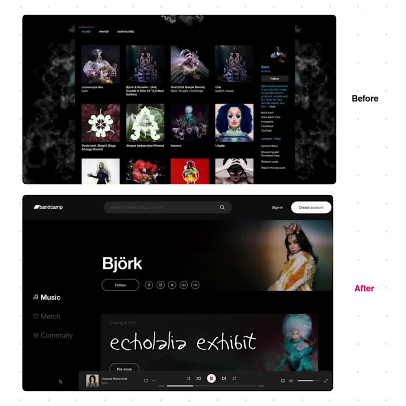
A speculative UX redesign of Björk's Bandcamp artist page, exploring what a modern, artist-first music platform could look like.
The original page loses the artist's identity as soon as you scroll, has no way to sort or filter a large back catalogue, and buries merch and community behind unused tabs. I redesigned the page to address each of these problems directly.
🌟 Key changes:
1. ) A persistent, sticky player bar that keeps the artist and track visible throughout the scroll
2.) Sort and filter controls for Albums, Singles, and EPs
3.) A dedicated hero section for promoting upcoming releases or events
4.) The artist's own handwriting used as the hero typeface, so the page feels personal rather than templated
5.) Merch and Community surfaced directly on the page instead of hidden behind tabs
6.)Simplified navigation and clear conversion points ("Follow," "Create Account")
7.) The layout was built as a reusable template, designed to adapt to any artist's catalogue and brand, not just this one.
This project focuses on identifying real usability gaps in an existing product and solving them with a clear, artist-centred design system.
1
92
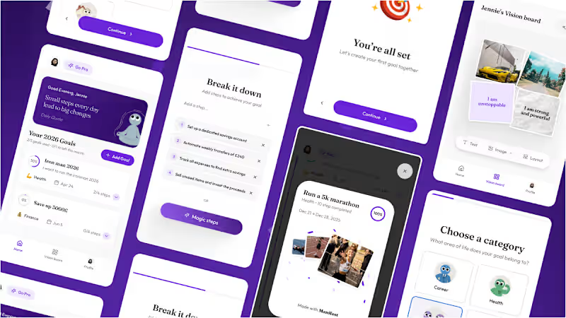
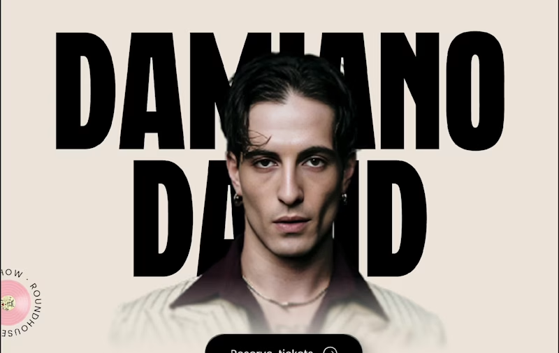


Brand & Web Designer | Art Director | Fractional Designer
- 1x
- Hired
- 5.0
- Rating
- 3
- Followers
Brand & Web Designer | Art Director | Fractional Designer

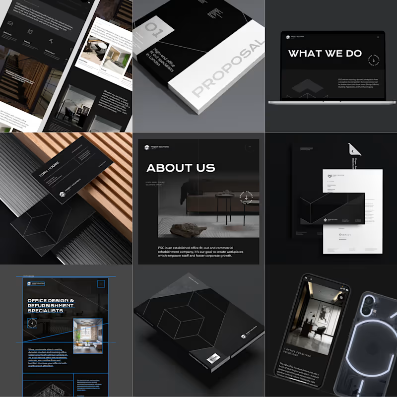

Let's build you a digital experience!


WebGPU + TSL image explorations.
I’ve got some availability opening up again, so if you’re working on something cool, I’d be happy to chat.
1
1
162

Excited to be joining the Contra x Webflow challenge after a packed ten-day sprint with @Isaac Fayemi (https://contra.com/isaac_fayemi_xpwqo637).
Our entry is a concept website for Agemo, a fictional ceramics studio creating bespoke homeware pieces inspired by Yoruba heritage.
https://agemostudio.webflow.io/
We leveraged GSAP + Webflow to build an immersive catalogue of products with fluid navigation and smooth transitions.
We hope you have as much fun window shopping on the site as we did making it :)
9
36
747


🏆 Award-Winning Web/UI & Brand Design
🏆 Award-Winning Web/UI & Brand Design


Web Developer providing modern and creative solutions
Web Developer providing modern and creative solutions


