Results that are similar to your search
Similar results
Creative Graphic Designer | Visual Design Expert
Creative Graphic Designer | Visual Design Expert
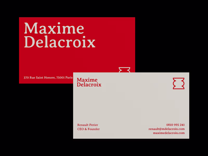
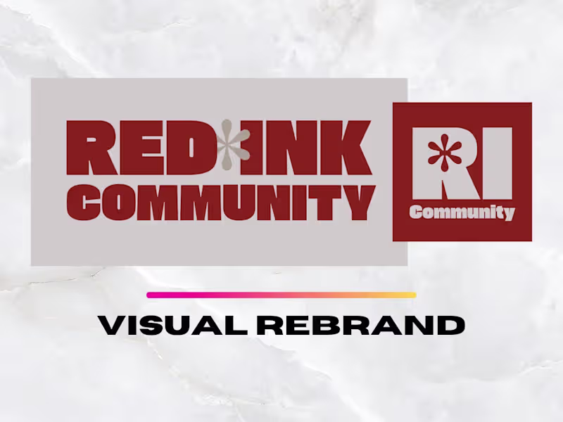
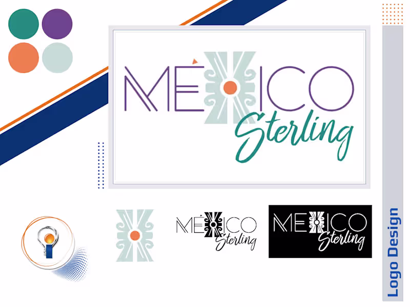
Creative Director: Brand Identity & Logo Specialist

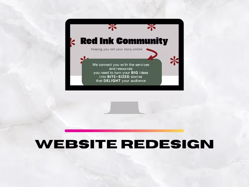
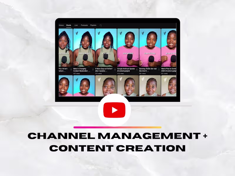
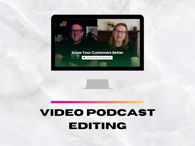
Video Editor + Copywriter | Sharing Your Story Online ✨
Video Editor + Copywriter | Sharing Your Story Online ✨
Turning Creative Ideas into Successful Businesses
Turning Creative Ideas into Successful Businesses


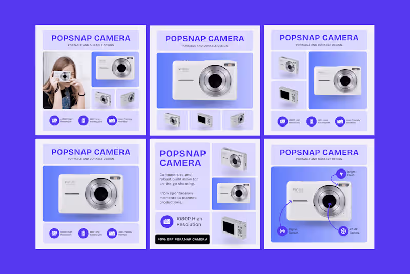
Pixel-perfect graphics & video narratives


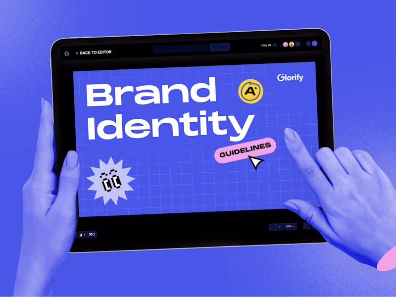
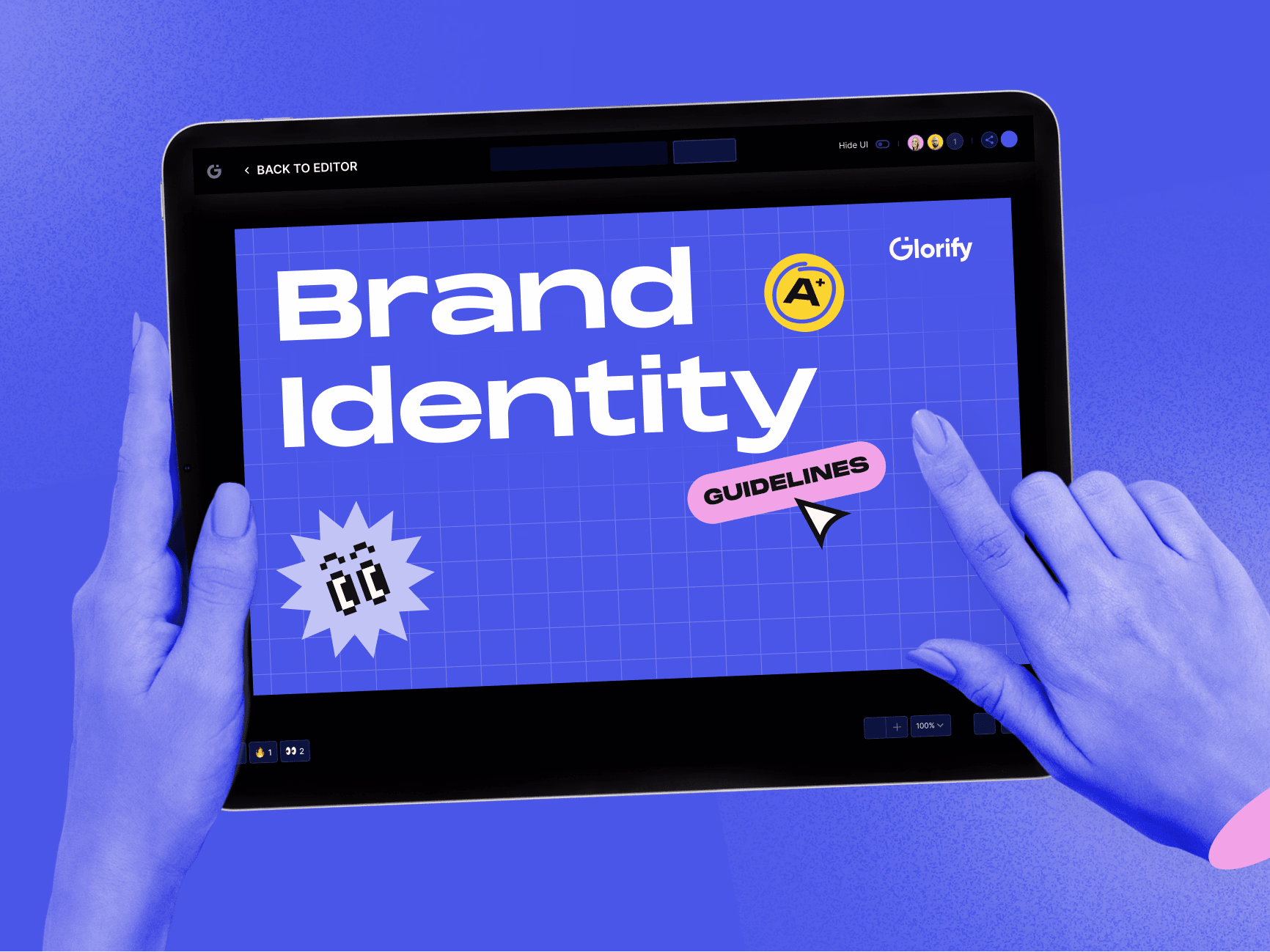
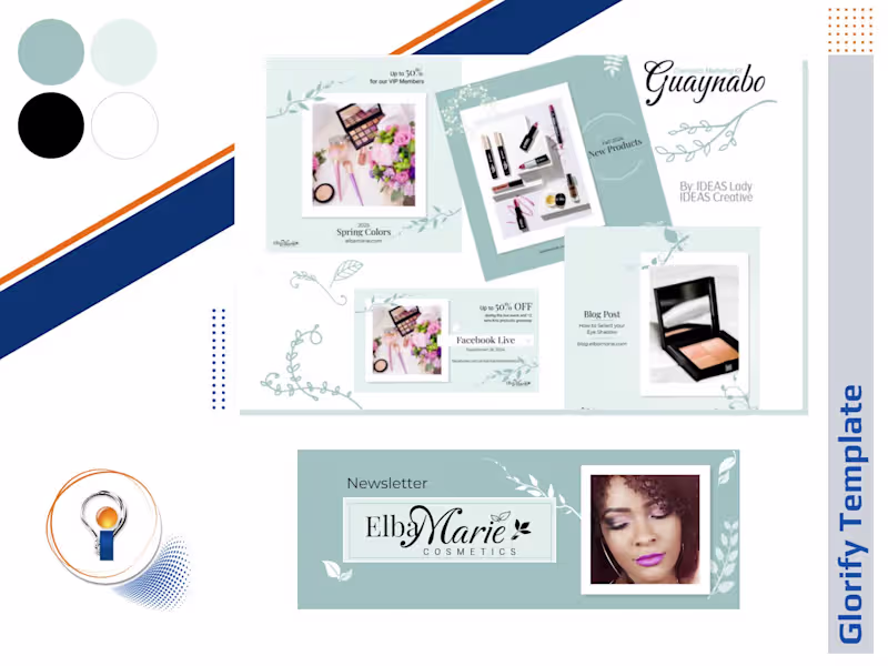
Glorify Template Manager for All Your Design Needs
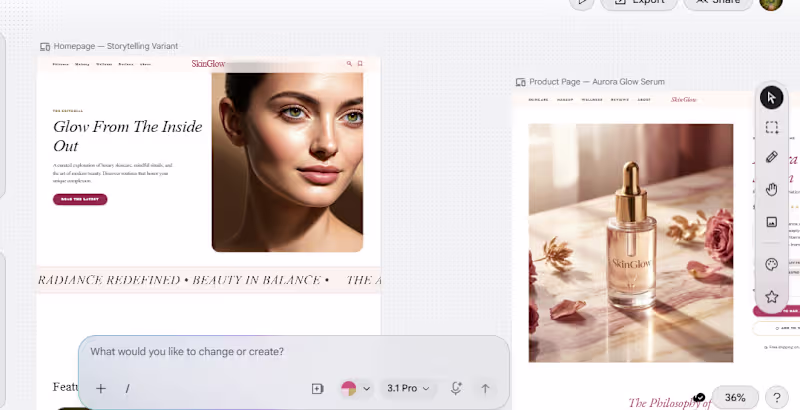
Crafting Stunning Graphics & Websites with Ease


View more →
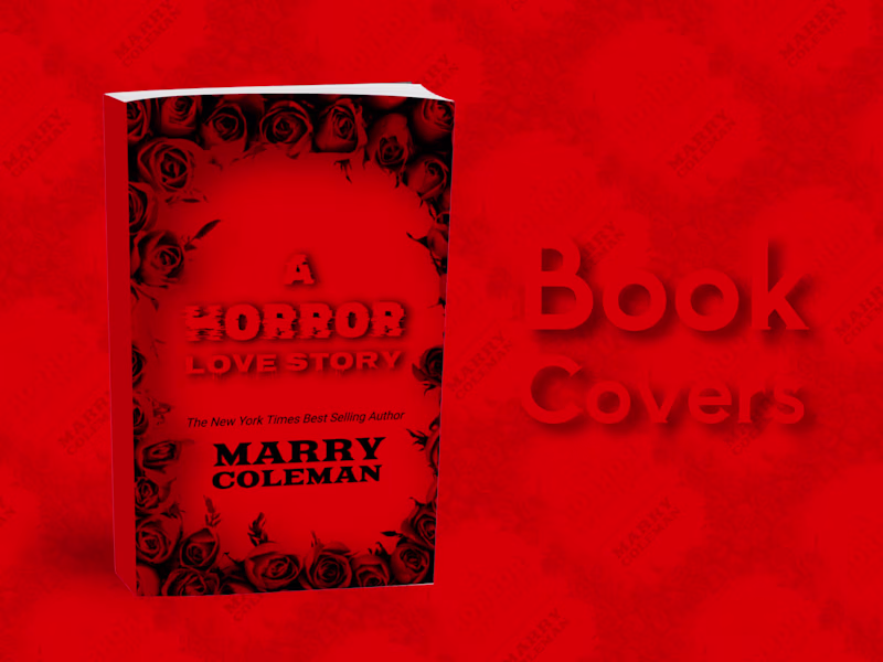
Graphic design with an avant-garde approach for all.
Graphic design with an avant-garde approach for all.