The network for creativity
Join 1.25M professional creatives like you
Connect with clients, get discovered, and run your business 100% commission-free
Creatives on Contra have earned over $150M and we are just getting started
Back to feedPost
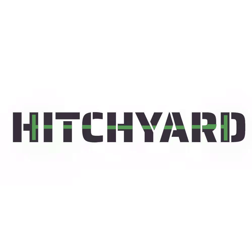
Hitchyard requested a proposal for a minimalist logo design for a Freight Tech Startup with two distinct colours.
My proposal:
Freight should be vehicle-independent hence why I avoided design cues that resemble specific vehicles such as a truck or road train specifically.
#avantgarde is one of my design philosophies in this approach hence the C-elements on opposite sides flanking a line that may represent encompassing arbitrary goods.
While #accessibilityforall is also one of my design philosophies, it is understandable that selected and distinct brand colours take precedence for a more specific range of customers here.
As part of consolidation for conformance to the Hitchyard brand identity, the Hitchyard logo should be recognisable regardless of scale whether it is an app icon or a full-size logo on your invoices and vehicles.
The network for creativity
Join 1.25M professional creatives like you
Connect with clients, get discovered, and run your business 100% commission-free
Creatives on Contra have earned over $150M and we are just getting started
Trending
Claude
Claude has entered the design space. How are you using Claude Design?
Contra University
Learn from expert creatives how to earn more using next-gen AI tools.
creativeaiflow
Creative AI workflows are evolving. What tools do you use, and what are their strengths and weaknesses?
freelancerlife
Freelancer life is wins, pivots, and everything in between. What’s yours right now?