𝐖𝐡𝐲 𝐔𝐈 𝐬𝐭𝐢𝐥𝐥 𝐦𝐚𝐭𝐭𝐞𝐫?
Consistency builds trust.
Here, the same upload progress bar is used across two flows: CSV upload and Google Sheets import. Same logic, same behavior, same visual language.
Reusing familiar patterns reduces cognitive load and helps users feel in control.
Consistency isn’t repetition. It’s clarity.
2
229


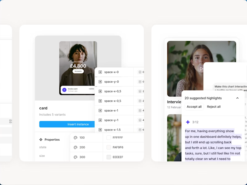
I designed the thumbnail system for Memorisely's bootcamps and live workshops. Each one needed to feel like part of the same family while making it obvious what the course was about, so I built a reusable template with consistent badges, dates and layout, then art directed real UI from each course into the frame. The result is a set that stays recognisable across the site and social, and can be extended easily as new workshops launch.
0
289

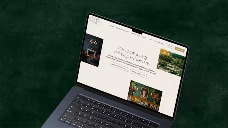
A recent project for The Royal Bell, a heritage venue reimagined as a modern members’ club. I led the brand development across print and digital, designing and building a website that complements the visual identity. The result is a refined brand system that balances heritage character with timeless elegance.
4
23
443

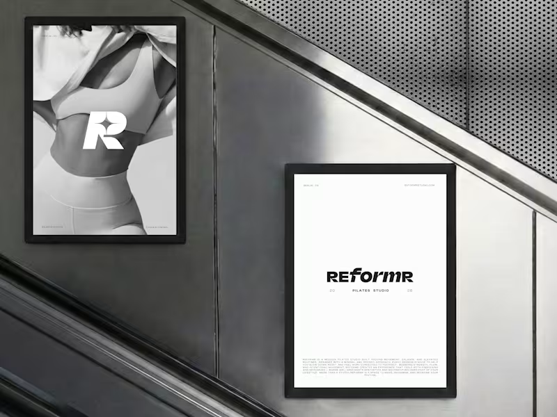
REFORMR — Pilates Studio Brand Identity
REFORMR is a self-initiated branding concept for a modern Pilates studio, built around movement, balance, and a refined visual aesthetic.
The visual identity combines bold typography, minimalist layouts, and monochromatic art direction to create a premium, contemporary brand. The project explores how a consistent visual language can translate across brand materials and advertising applications.
Scope: Logo design, visual identity, art direction, and mockup design.
12
32
1.1K