
Client-focused Logo & Branding


Median didn’t start from a visual. I started it from a question: what does fairness actually look like when it holds under pressure, not just in theory. That became the base. Not styling. Not aesthetics. Just structure.
As the idea developed, it became clear balance isn’t something applied at the end. It has to exist from the start. Every decision around form, spacing, and proportion followed that. Nothing decorative. Everything stable.
The logomark came out of that thinking. Two equal forms, held in place within a controlled system. No dominance. No absence. Not symbolic for the sake of it. Just a direct expression of balance.
The name followed; Median. The point that remains when everything unnecessary is removed. Not the extremes. Just what holds. In law, that idea carries weight. Because what matters is what stands when tested.
Most firms lean into authority and legacy. Very few focus on balance and structure. That’s where Median sits. Quiet, but deliberate.
Not built to impress. Built to hold.
Full casestudy: https://www.behance.net/gallery/245375919/Median-Brand-Identity
4
200

Working on this project has pushed me to explore AI more deeply, especially its use in commercial production.
For this one, my goal is to showcase the ring as one of the statement pieces in Wollsey’s jewelry collection, using AI to bring it to life.
Full case study real soon...
6
11
525
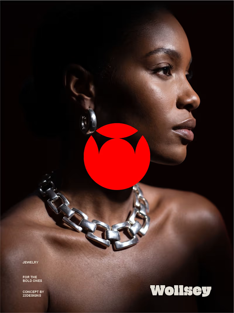
WOLLSEY - Jewelry for the Bold Ones
Wollsey is a jewelry brand built on one idea: bold jewelry should never blend in.
The identity centers on two interconnected principles; presence and permanence. The symbol takes the form of a solid, self-contained mark: a circular silhouette holding a crown-like negative space at its center, representing a piece of jewelry as an object of its own weight and status, not an accessory borrowed from someone else's trend cycle.
This concept carries through the entire visual system. The custom wordmark is built in a bold, condensed sans — compressed, confident letterforms that read as a stamp rather than a script, echoing the same solidity as the symbol itself.
The color palette pairs deep matte black with a controlled, high-impact red, balanced by warm cream and stone tones across packaging and supporting materials — a system built for contrast and attention rather than quiet luxury.
Full casestudy is coming soon
17
20
2.6K

Innovative designer crafting compelling visuals.

Innovative designer crafting compelling visuals.
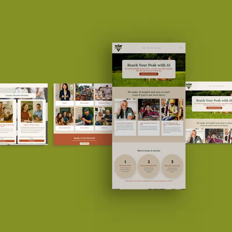
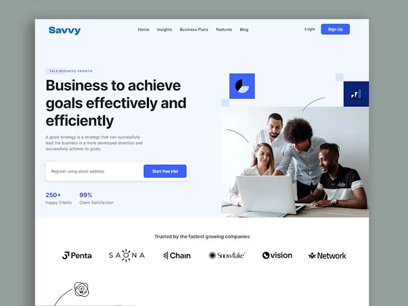
5 things I check when someone says:
"My website isn't converting."
The headline
The CTA
The offer clarity
Trust signals
The user journey
Notice what's missing?
"Make the button prettier."
Design matters.
But design can't compensate for a confusing offer.
3
215
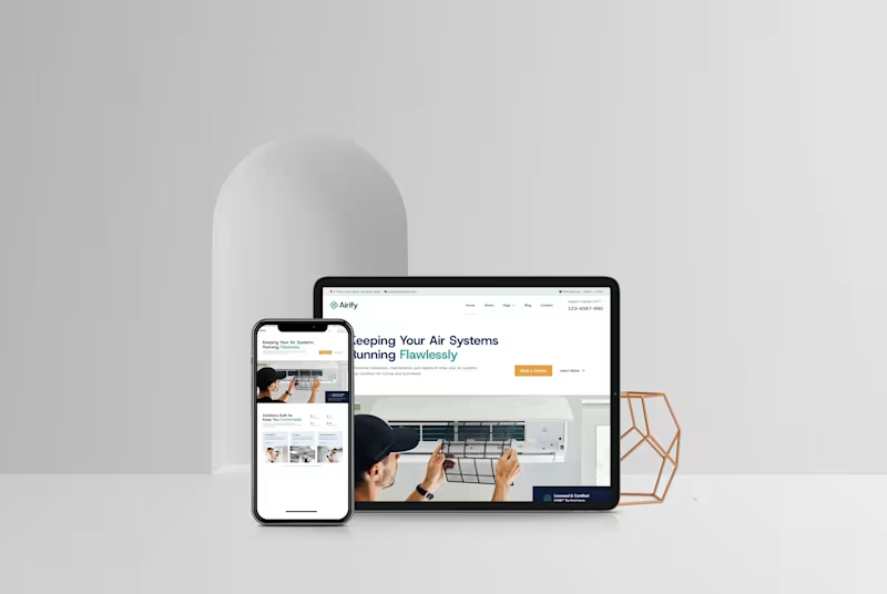
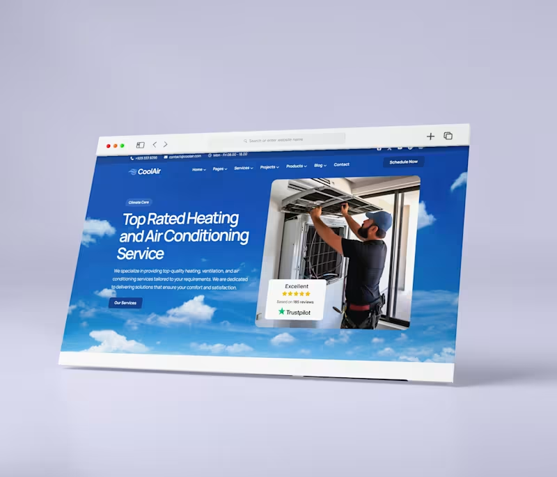
HVAC Service Website Design & Development
Description
A modern, conversion-focused website designed for an HVAC service company to establish a professional online presence and make it easy for customers to request services.
I focused on a clean, trustworthy visual style with clear service messaging, strong calls-to-action, responsive layouts, and a mobile-friendly experience. The design was structured to quickly communicate the company’s expertise while guiding visitors toward booking a service.
0
79

Online Course Creator | Website design | Kajabi expert
- 5.0
- Rating
- 79
- Followers
Online Course Creator | Website design | Kajabi expert

Designed a modern, high converting lawyer website homepage ⚖️
This is not a mockup, it’s a real client-style website built to establish trust, authority, and generate qualified leads.
The goal was simple: create a professional and structured experience that builds credibility from the first click.
✔ Clean, authority driven hero section
✔ Trust-focused layout for legal services
✔ Strategic content flow to guide potential clients
✔ Mobile-optimized and built for performance
Every section was designed to communicate expertise, build confidence, and encourage inquiries.
For law firms, your website is more than just an online presence, it’s your first impression.
If you are looking to attract more clients and position your brand professionally, your website needs to do more than exist… it needs to convert.
Let’s build something that works.
#WebsiteDesign #LawyerWebsite #LawFirm #WebDesign #GoHighLevel #BusinessWebsite #LeadGeneration #UIUX #ProfessionalServices #LandingPage.
1
11
277
.
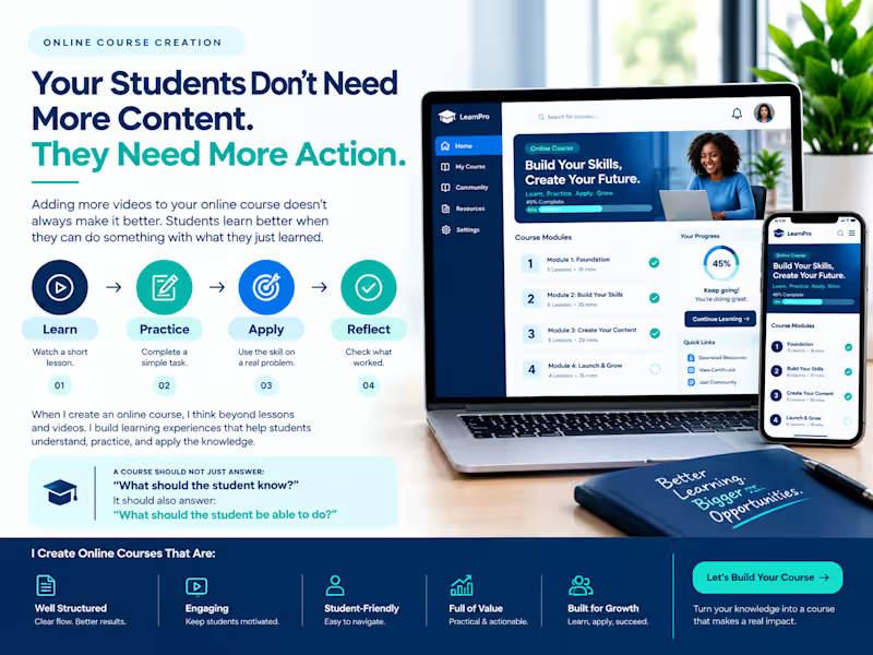
🎓 Your Students Don’t Need More Content. They Need More Action.
Adding more videos to your online course doesn't always make it better.
Students learn better when they can do something with what they just learned.
For example:
📖 Learn → Watch a short lesson
✍️ Practice → Complete a simple task
🎯 Apply → Use the skill on a real problem
✅ Reflect → Check what worked
When I create an online course, I think beyond lessons and videos. I build learning experiences that help students understand, practice, and apply the knowledge.
A course should not just answer:
“What should the student know?”
It should also answer:
“What should the student be able to do?”
What do you think makes an online course more engaging? 👇
#OnlineCourseCreation #CourseCreation #OnlineCourse #CourseCreator #InstructionalDesign #Elearning #OnlineLearning
0
101
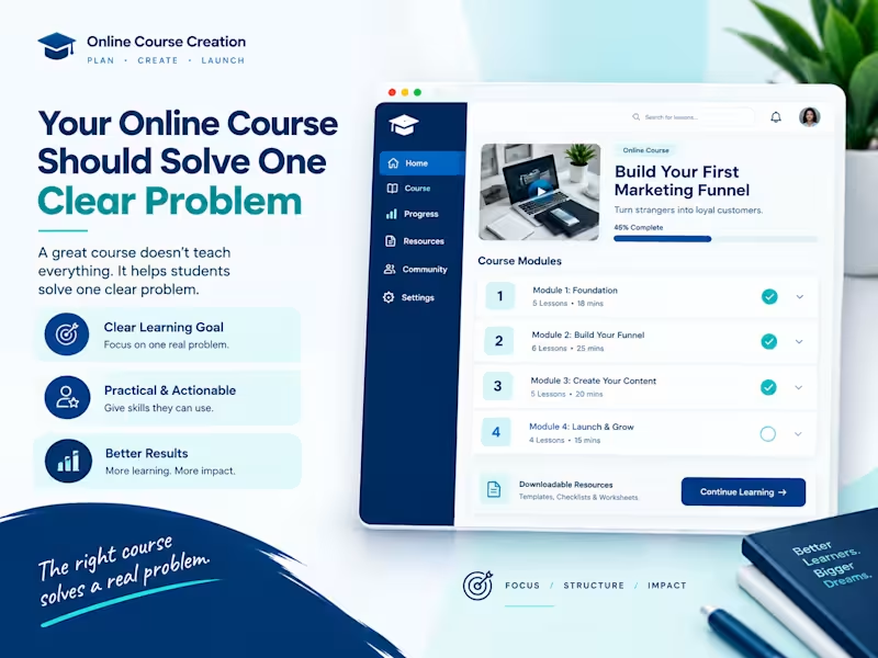
🎓 Your Online Course Should Solve One Clear Problem
A good online course does not need to teach everything.
It needs to help students solve one clear problem.
For example:
❌ “Learn Everything About Marketing”
✅ “Learn How to Create Your First Marketing Funnel”
A strong course should make these things clear:
What will I learn?
What problem will this solve?
What will I be able to do after the course?
When creating an online course, I focus on the learning goal first, then build the lessons, modules, activities, and course website around that goal.
That makes the course easier to understand, easier to follow, and more useful to students.
What problem would you love to turn into an online course? 👇
#OnlineCourseCreation #CourseCreation #OnlineCourse #CourseCreator #CourseDevelopment #InstructionalDesign #Elearning
0
103

A Simple Course Can Still Make a Big Impact
Many people think an online course needs 50 lessons to be valuable.
It doesn't.
A simple course that solves one clear problem is often more effective than a course packed with too much information.
Focus on:
📚 One clear outcome
🎯 A step by step learning path
🎥 Short, easy to follow lessons
📝 Actionable exercises
✅ A transformation your students can achieve
Remember, people don't buy courses because they are long.
They buy them because they help solve a problem.
Keep it simple.
Keep it valuable.
Would you rather take a 2-hour course that gets results or a 20-hour course you will never finish?
10
303

SEO Content Writer. Editor. Human.
SEO Content Writer. Editor. Human.


Brand Identity & Graphic Designer | Helping Businesses Build
- 31
- Followers
Brand Identity & Graphic Designer | Helping Businesses Build

Preparing for Canvathon Africa 🎨🇳🇬
As part of my preparation, I challenged myself to build a complete brand experience for Kora Bites — beyond just creating a logo.
0
66

From the visual identity and campaign designs to the website and promotional content, I focused on creating a consistent brand experience for busy students and young professionals.
This project pushed me to think more about strategy, communication and how every design decision connects.
Good mornings start here. 🥣🍊
1
131
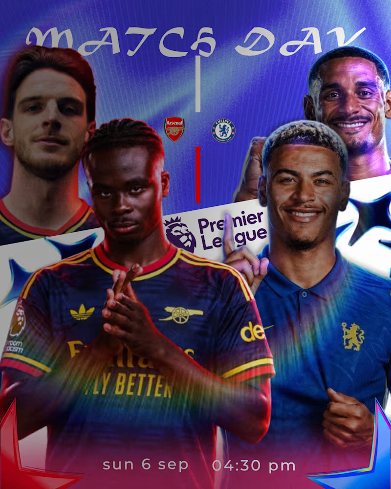
This personal project explores a modern approach to football matchday graphics through cinematic lighting, bold typography, and clean composition.
The goal was to create a visual that feels premium while maintaining a strong editorial aesthetic suitable for digital campaigns and sports marketing.
Tools Used-Affinity Designer
Project Type- Sports Poster • Matchday Graphic • Personal Concept
0
165

Results-Driven Legal Advisor & Consultant
Results-Driven Legal Advisor & Consultant


Tailored Legal & Virtual Support Expert
Tailored Legal & Virtual Support Expert


Lawyer & Legal VA for contracts, research & admin.
Lawyer & Legal VA for contracts, research & admin.


View more →