Freelance Framer Shopify Developers in LagosFreelance Framer Shopify Developers in Lagos
Software Product & Web Designer / Framer Expert
$25k+
Earned
17x
Hired
5.0
Rating
328
Followers
Software Product & Web Designer / Framer Expert
Helping Brands Grow With Better Web Design, UX & CRO
5.0
Rating
28
Followers
Helping Brands Grow With Better Web Design, UX & CRO
Kenzo Digital Creator | Shopify & Dropshipping Specialist
5.0
Rating
4
Followers
Kenzo Digital Creator | Shopify & Dropshipping Specialist
Shopify Website Designer| Conversion rate optimization | SEO
5.0
Rating
8
Followers
Shopify Website Designer| Conversion rate optimization | SEO
Cover image for As a Shopify Website Designer,
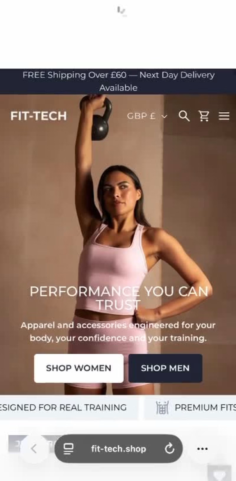
As a Shopify Website Designer, Shopify CRO Specialist, and Ecommerce Growth Expert, I redesigned and optimized this apparel Shopify store to improve conversions, customer engagement, and sales. The project included Shopify website redesign, UX/UI design, landing page optimization, product page optimization, and conversion rate optimization (CRO). I redesigned the homepage, collections, and product pages with a modern, mobile-first experience. Key improvements included optimized product layouts, compelling copy, customer reviews, trust badges, promotional banners, stronger CTAs, improved navigation, mobile responsiveness, site speed optimization, and a streamlined checkout experience to reduce bounce rates, increase add-to-cart rates, and drive higher conversions. Growth starts with a store built to convert. DM "CRO" if you're ready to scale your Shopify brand. #ShopifyGrowth (https://www.fiverr.com/whizwaydigit0?public_mode=true) #ShopifyCRO (https://www.instagram.com/explore/tags/shopifycro/) #EcommerceExpert (https://www.instagram.com/explore/tags/ecommerceexpert/) #ShopifyWebsiteDesign (https://www.instagram.com/explore/tags/shopifywebsitedesign/) #ShopifyDeveloper (https://www.instagram.com/explore/tags/shopifydeveloper/) #ConversionOptimization (https://www.fiverr.com/whizwaydigit0?public_mode=true) #EcommerceBusiness (https://www.fiverr.com/whizwaydigit0?public_mode=true) #ShopifyMarketing (https://www.fiverr.com/whizwaydigit0?public_mode=true) #DTCGrowth (https://www.fiverr.com/whizwaydigit0?public_mode=true) #ShopifySuccess (https://www.fiverr.com/whizwaydigit0?public_mode=true)
2
3
105
A CERTIFIED WEB DESIGNER WITH LOVE FOR FRAMER
New to Contra
A CERTIFIED WEB DESIGNER WITH LOVE FOR FRAMER
Cover image for Project Title:
I Build the Internet
Project Title: I Build the Internet Infrastructure That SaaS Brands Run On Let me tell you what nobody tells you when you're scaling a SaaS product. Your website is working against you. Not because it's ugly maybe it's actually decent-looking. But because it was built by someone who didn't truly understand your world. Someone who didn't know that SaaS buyers are skeptical, fast-moving, and comparison-shopping three tabs at once. Someone who didn't know that your automation stack and your website need to be speaking the same language or the whole funnel leaks. Someone who just built you a site and shipped it. I built BinativeSultop Studio to be the answer to that exact problem. This portfolio is proof that design, development, and automation can coexist and when they do, something powerful happens. Walk through the work. What you'll find isn't a random grab-bag of client projects. You'll find a consistent thread: every single project was built with a conversion goal in mind, a system underneath it, and a founder on the other side who needed results not reassurance. For SaaS brands specifically, I've gone deep. I understand the onboarding flow problem. I understand why trial-to-paid conversion is where most products bleed. I understand that your marketing site and your product need to feel like they came from the same brain cohesive, sharp, confident or you lose trust before the demo even gets booked. Here's what working with me actually looks like: You come with a product that deserves a better digital presence. We start with strategy not aesthetics. We map the journey your ideal customer takes from first touch to signed contract, and we reverse-engineer every design and automation decision from there. Then I build it. The pages. The flows. The n8n workflows that tie your tools together. The lead capture system that runs while you sleep. The CRM integration that means your sales team never chases a cold lead again. And when it launches? It feels like you hired a full growth team not one freelancer. The portfolio speaks for itself. But what it's really saying is this: Some people build websites. Some people build automations. Very few people build the whole machine and understand the SaaS space well enough to make it actually work for a product like yours. I'm one of those people. And I'd love to build yours next. BinativeSultop. Design. Development. Automation. All under one roof — all pointed at your growth.
1
220
I’m a Shopify & WordPress Developer/Designer
New to Contra
I’m a Shopify & WordPress Developer/Designer
Cover image for Artistic is a beautifully organized,
Artistic is a beautifully organized, feature-rich Shopify storefront tailored for an artisanal brand specializing in handmade crafts, pottery, and home decor. The core objective was to build an online marketplace that balances a warm, creative identity with heavy-duty e-commerce functionality, maximizing product visibility and conversions. Key Features & Design Layout Earth-Toned Artisan Hero Section: Utilizes a soft, neutral palette and minimalist product placement ("New Sell Handmade & Collection") to establish a warm, welcoming, and authentic craftsman feel immediately upon landing. Granular Category Carousel: Features an intuitive "Shop By Category" slider with clean square thumbnails (Architecture Art, Literature Art, Theater Art, Ceramics Art, Sculpture Art). It serves as a visual navigation map for extensive inventories without cluttering the screen. Asymmetrical Promotional Banner Grid: Implements a dynamic masonry-style layout highlighting multi-tiered promotions (Flat Discount 30%, 25% Discount, 35% Discount). This creates a structured yet visually engaging way to guide shoppers to seasonal collections. Direct-to-Cart Product Grid with Filter Tabs: A collection showcase equipped with quick-category tabs (Literature Art, Theater Art, Ceramics Art), product rating stars, and clear "Add To Cart" buttons beneath every item to significantly lower purchasing friction. Scarcity & Urgency "Deal Of The Day" Modules: Features dedicated promotional slots with live countdown timers (Days, Hrs, Min, Sec) and inventory scarcity indicators ("Hurry up! only 145 items left in stock!"). This uses psychological triggers to accelerate checkout decisions. The Results A robust, content-rich e-commerce store optimized for boutique brands with diverse inventories. By blending an authentic, earthy artisan layout with conversion-focused tools like scarcity timers and direct-to-cart functionality, the design transforms a portfolio-style site into a high-yield retail engine.
1
2
27
Cover image for Mojuri is an editorial-inspired Shopify
Mojuri is an editorial-inspired Shopify e-commerce store designed for a modern, high-end jewelry boutique. The design prioritizes a clean, lifestyle-focused layout that mimics a premium digital magazine, elevating the brand's perceived value and creating an immersive shopping experience. Key Features & Design Layout Editorial Hero Slider: Features an asymmetrical, organic composition using structured 3D elements, soft tropical greenery, and minimalist typography ("Jewelry For Every Day") to establish an instant luxury identity. Asymmetric Grid Navigation: A beautifully structured lifestyle gallery that serves as a visual directory for categories (Shop Rings, Shop Bracelets, Shop Necklaces, Shop Earrings, Shop Charm). This layout blends model photography with product shots to increase engagement. Curated Product Showcase: A clean product row titled "Everyday Elegance" focusing on whitespace and high-quality photography, complete with subtle, high-contrast discount badges to encourage clicks without disrupting the premium aesthetic. Interactive Brand Storytelling Section: A dedicated narrative block ("Beauty & Ingenuity") featuring tabbed navigation (Beauty & Ingenuity, Ear Stack Magic, Wristwear Essentials) that combines storytelling with direct shopping capabilities (CTA button) to build a deeper connection with consumers. The Results A sophisticated, high-end digital storefront tailored for lifestyle commerce. By replacing standard boxy layouts with dynamic, magazine-style grids, this storefront drives longer session times and enhances emotional design-to-purchase conversions.
1
2
33
Cover image for Jewelish is a premium, high-converting
Jewelish is a premium, high-converting Shopify e-commerce store designed for a luxury jewelry brand. The goal was to create a sophisticated, clean, and highly intuitive user interface that showcases delicate products while driving seamless user navigation and conversions. Key Features & Design Layout Premium Minimalist Hero Section: Features a high-resolution banner with subtle typography, clear calls-to-action (CTA), and a promotional top bar to instantly capture visitor attention. Visual Category Navigation: A clean "Popular Categories" grid utilizing circular product thumbnails to allow customers to easily browse specific collections (Brackets, Earrings, Engagement Rings, etc.) without clutter. Targeted Promotional Banners: Split grid banners highlighting specific collections ("Flutter & Butterfly Pendant" and "Best Gold Filled Bracelet") to drive traffic to high-margin products. Tabbed Dynamic Product Grid: A "Trending Products" section equipped with filter tabs (Featured, New Arrival, Best Seller) and clear sales badges to optimize product discovery and psychological urgency. Value Proposition Footer: Integrated trust badges featuring icon-driven markers for Worldwide Shipping, Easy 30-Day Returns, and a Money-Back Guarantee to build immediate buyer confidence. The Results A fully responsive, visually stunning jewelry store built with a focus on luxury aesthetics, optimized loading speeds, and a streamlined layout engineered to convert casual browsers into loyal customers.
0
25
Cover image for Upstudy is a premium, fully
Upstudy is a premium, fully responsive Learning Management System (LMS) platform designed using WordPress. The core objective was to create a clean, modern, and highly engaging educational interface that organizes a massive directory of courses into an intuitive user journey, making online learning accessible and visually appealing. Key Features & Design Layout High-Engaging Hero Section: Features a dynamic lifestyle graphic paired with strong value proposition typography ("Best Platform to Empower Skills"). Includes trust signals like an interactive student enrollment counter (100K+) and a clear, high-contrast Call-to-Action (CTA) to drive immediate sign-ups. Grid-Based Category Directory: A clean, multi-colored grid section for "Top Categories" (Mathematics, Development, Email Marketing, IT/Technology, etc.) utilizing clear iconography to help users jump directly to their field of interest. Targeted Audience Split Banners: Implements customized pathways for different target user groups—specifically segmented for learning with an "Expert Teacher" or self-paced paths "For Individuals"—streamlining the onboarding experience. Dynamic Course Marketplace Grid: A feature-rich "Popular Courses" section with clear card layouts. Each card showcases category badges (Development, Language, Fitness), instructor avatars, lesson counts, ratings, pricing/free indicators, and an interactive wishlist feature. The Results A robust, highly intuitive educational hub engineered for minimal user friction. The platform seamlessly bridges clean typography with heavy-duty database management, giving the brand a professional corporate look while maximizing course enrollment and user retention.
0
19