Built with Framer
Hedge Website Development
Plaiter HQ
Overview
Hedge presents itself as a creative / design agency with a polished, modern website built on Framer.
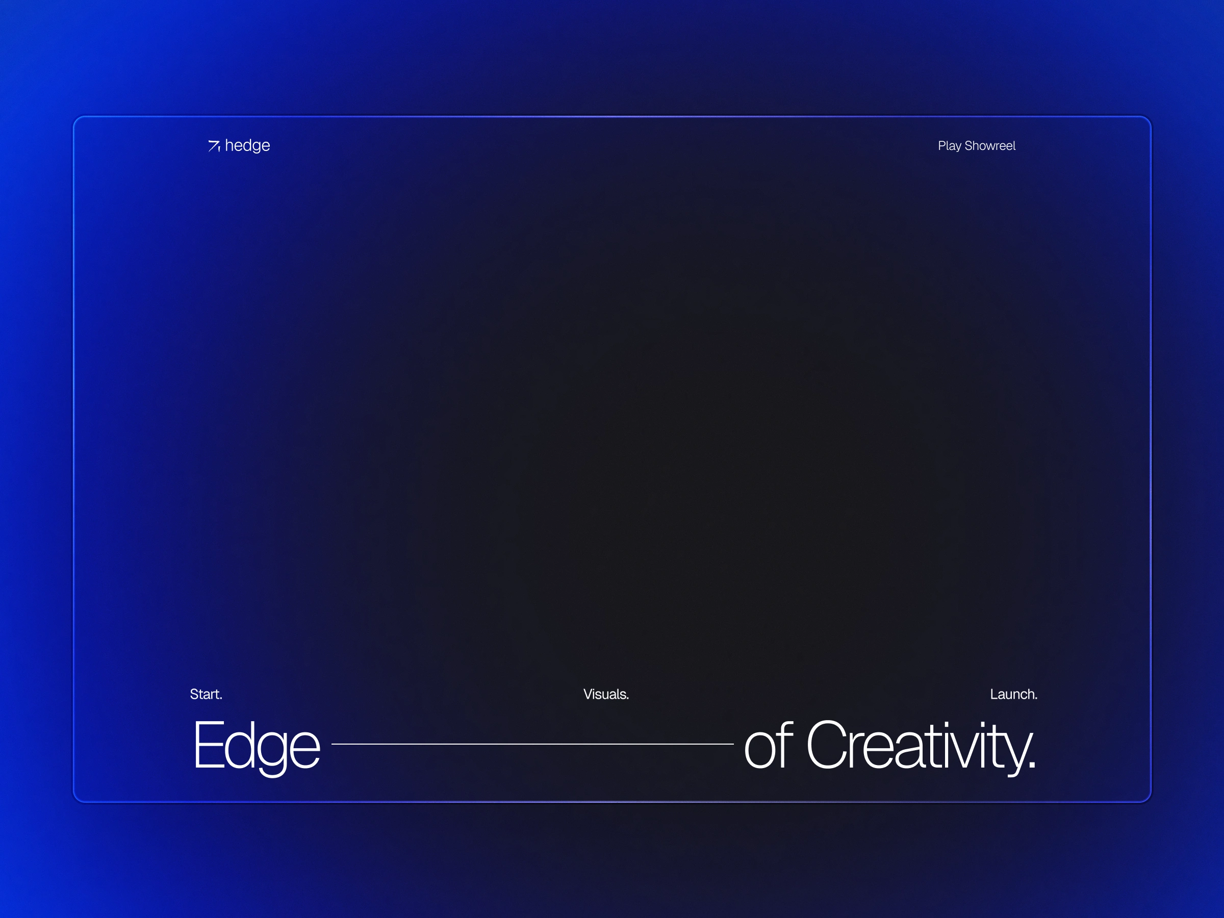
The site has clear sections: hero messaging (“Captivate, convert, and create lasting connections with your audience”), services, awards/numbers, featured projects, testimonials, team, pricing, etc.
The build likely uses Framer’s capabilities for smooth animations, responsive layouts, and visual polish.
The design phase (in Figma) must have laid out a modular system that enabled translation into Framer; consistent typography, spacing, components.
The goal: deliver a high-end digital presence that positions Hedge as a premium partner for clients who care about design, brand and digital execution.
The Opportunity
Many agencies have digital presence but struggle to differentiate: you see similar layouts, stock visuals, weak storytelling. So the opportunity for Hedge: stand out.
Hedge needed a website that not only looked premium, but functioned as a marketing tool; converting visitors into enquiries, reflecting credibility via numbers, clients, projects.
Because the audience is design-savvy (clients that themselves value brand & digital), the website must reflect that high aesthetic expectation.
From a build perspective: using Framer means rapid iteration and allowing for interactions and responsiveness without fully custom code-heavy build. So it’s an opportunity to combine speed + quality.
The design handoff in Figma: clear system enables faster build, fewer mis-alignments. Opportunity: efficient workflow (designer → Figma → component library → Framer) and reusable for future site updates.
Our Approach
Here’s how the approach likely unfolded (and how you could replicate it):
Discovery & Strategy
Understand Hedge’s positioning: what they offer (visual design, product design, branding, consultancy) as seen on the site.
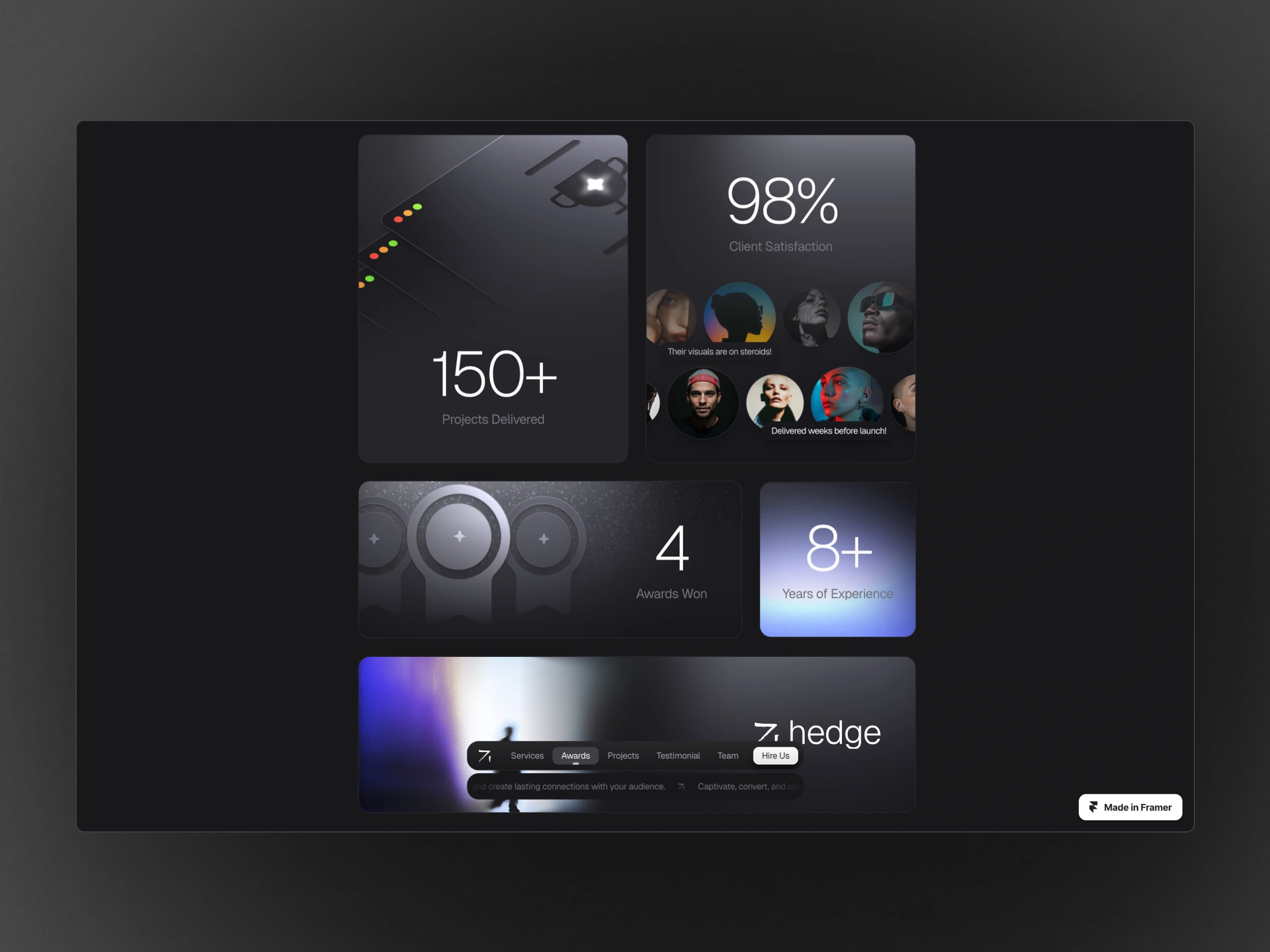
Map user journeys: visitors who come seeking an agency vs brand refresh vs website redesign. What information they need? So we decide on hero message, trust signals (“150+ projects delivered”, “98% client satisfaction”) to build credibility.
Define KPIs: e.g., lead form submissions, project “See Project” clicks, newsletter sign-ups.
Design System in Figma
Create typography scale (likely mix of bold headings, clean subheads, body text).
Define colour palette (Hedge uses bold dark backgrounds, large white text, accent imagery).
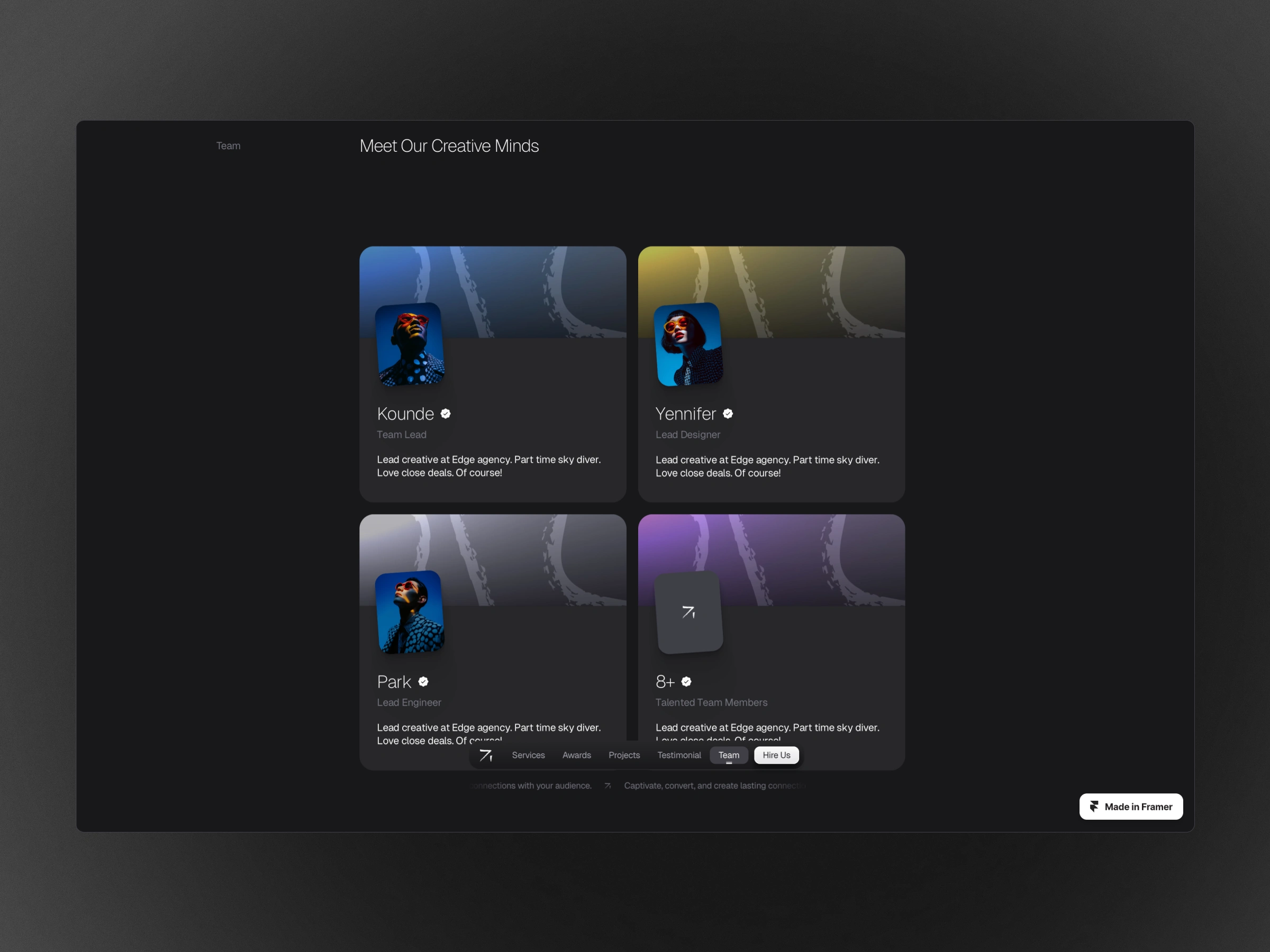
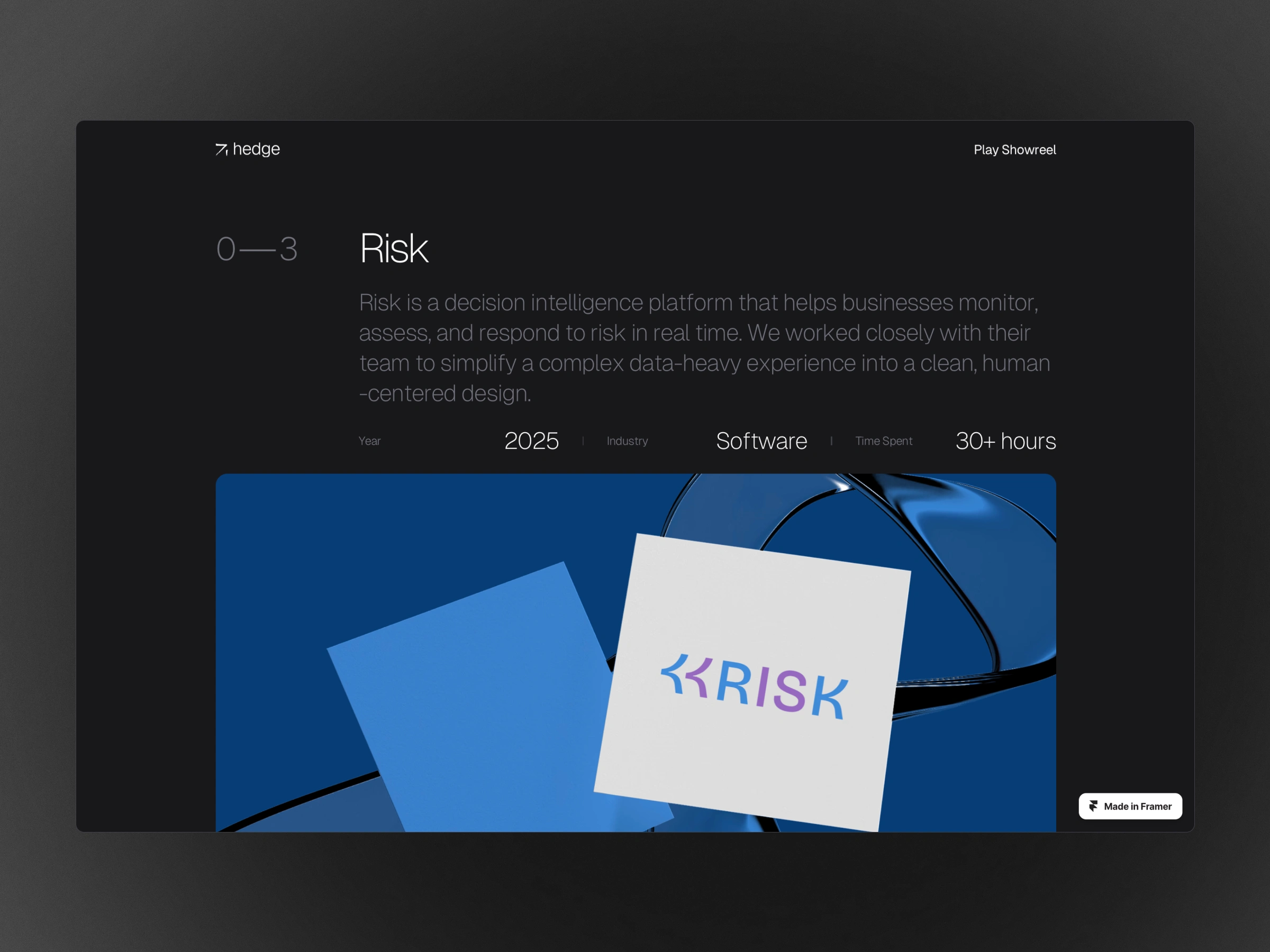
Build components: hero banner, service cards, metrics counter, project showcase module, testimonial cards, pricing tables, FAQ accordion.
Create responsive frames in Figma (desktop, tablet, mobile) so the layout adapts.
Run reviews & iterations with client (Hedge) to refine visuals, copy, motion cues.
Prototyping & User Testing (optional but advisable)
In Figma, build a clickable prototype to test navigation flow: e.g., how a visitor moves from hero to services to project detail to contact.
Validate readability, hierarchy, and mobile experience.
Build in Framer
Import or recreate the design system: header, navigation, hero section with large imagery and text overlay.
Use Framer’s responsive grid or auto-layout features to ensure the site works across screen sizes.
Incorporate interactions: reveal animations for service cards, scroll triggers for metrics counters (“150+ Projects Delivered”), hover states on project items.
Set up CMS or project listing (if required) so future projects can be added.
Optimize performance: ensure images are compressed, animations aren’t too heavy, the site loads fast.
Set up SEO basics, meta tags, and analytics tracking (so Hedge can measure performance post-launch).
Launch & Iterate
QA across browsers/devices, ensure layout breaks, responsiveness.
Go live, collect initial data: bounce rate, scroll depth, conversion (contact forms, newsletter).
Iterate based on real-user metrics: maybe change wording, adjust hero image, refine CTA.
Where It Stands
The website as it stands is strong: visually compelling, modern, and with a clear user journey from awareness → consideration → conversion.
From a design + build perspective: using Framer means the site can be updated relatively easily (less reliance on heavy dev). The use of Figma for the design system sets a solid foundation for future iterations and scalability.
For Hedge’s business, it positions them as a credible, high-quality agency rather than a low-budget shop; this is important given their target audience (other brands, high end clients).
Some areas for further improvement (opportunities) might include:
Performance optimisation: heavy imagery and animations can slow mobile load times — make sure Framer build is optimised for speed.
Accessibility: ensure colour contrast, keyboard navigation, and screen-reader support are validated.
Analytics & ongoing optimisation: set up A/B tests for hero messaging or pricing tiers to refine conversions.
Content depth: beyond showing trust signals and projects, adding case study pages with deeper client stories could increase authority.
Localization / global optimisation: if Hedge targets clients worldwide, language versions, region-based performance optimisation might help.
Like this project
Posted Oct 25, 2025
Developed a premium website for Hedge using Framer and Figma, enhancing digital presence and client engagement.