Freelance Typographers in Kumanovo
Freelance Typographers in Kumanovo
Sign Up
Post a job
Sign Up
Log In
Filters
2
Projects
People
Filip Panov
max
Skopje, North Macedonia
I make founder brands premium, trusted & story-led
$10k+
Earned
12x
Hired
5.0
Rating
608
Followers
expert
Expert
+1
Follow
Message
I make founder brands premium, trusted & story-led
0
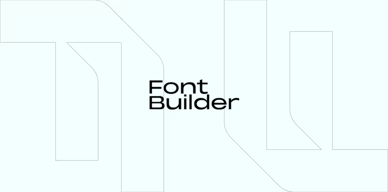
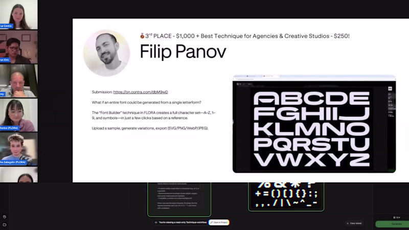
Font Builder Flora Winner 🥉
0
7
12
I'm proud to announce that I've been selected as one of the winners of the @FLORA Technique challenge 🥉 My technique (Font Builder (https://contra.com/community/MzfuLrdy-ever-thought-you-can-build-an)) was also selected for the Best Technique for Agencies & Creative Studios ✨ I wanna say thank you the @Contra HQ and @FLORA team for this amazing opportunity to allow us to showcase our skills and create an inspiring experiences & techniques that leave a lot of value to the table. Flora is such an efficient tool for designers and offers endless opportunities to facilitate your workflow, I use it on a daily basis.
12
1.6K
4
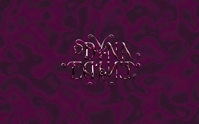
Dyna Edyne | Visual Identity
4
57
6
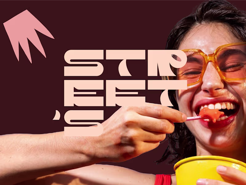
Street's Brand Identity Refresh
6
43
Typographer
(16)
Follow
Message
Nebojsa Nask
Kumanovo, North Macedonia
Designer
25
Followers
Follow
Message
Designer
0
Hand-Crafted Skull Identity for Puca Cerep
0
4
0
Crowned Bodybuilder Identity for Imperial GYM & Fitness
0
6
0
Logo Design for Treelogy
0
5
0
Healing Hands Identity for a Physical Therapist
0
2
Typographer
(1)
Follow
Message
Valentino Mateski
Skopje, North Macedonia
Brand Designer | Brand Strategy & Visual Identity | Branding
23
Followers
Follow
Message
Brand Designer | Brand Strategy & Visual Identity | Branding
5
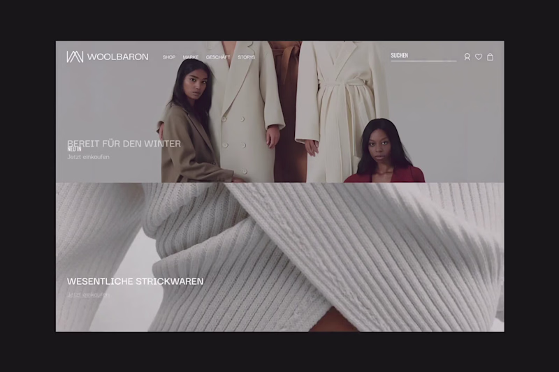
Typography exploration for a client. ⬇️ As a brand designer, typography is one of the first places I test a brand’s personality. I ask myself: how should this brand sound if it could only speak through type? I play with weight, spacing, and rhythm. Small shifts change everything. The same sentence can feel trustworthy, aggressive, or effortless just by adjusting the typography.
5
109
1
There’s a point where design stops trying. And just fits. Palette, typography, layout, everything holds the same tension. Just a brand that knows exactly what it is.
1
1
58
7
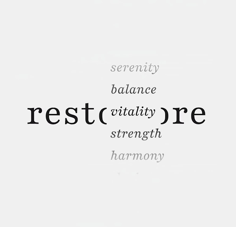
What if strength looked a bit quieter? When working on Restore, the goal wasn’t to make it feel like “wellness.” It was to make it feel like something people in high-pressure roles would actually trust. So the system leans on restraint. A grounded serif to carry weight, paired with clean, clear type that keeps everything easy to move through.
7
101
0
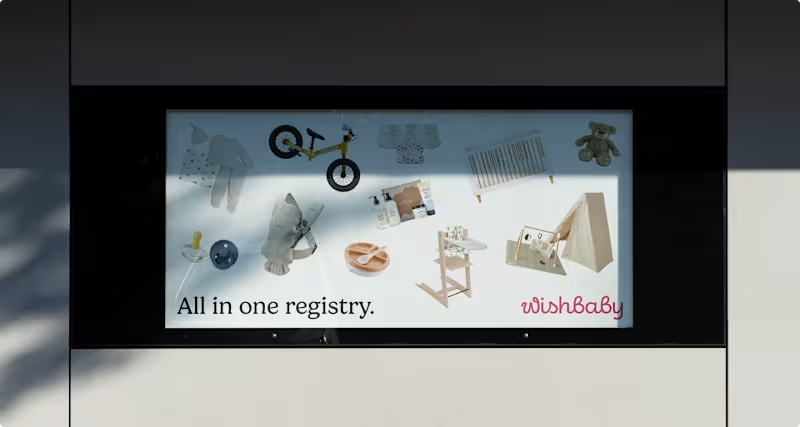
What does a baby registry look like when it actually feels calm? For Wishbaby, the work wasn’t about adding more softness; it was about removing noise. Less “cute,” more clarity. Less scattered, more considered. We designed a system that feels warm, but structured. Something that guides you without getting in the way. Because when everything is in one place, it stops feeling like a task.
0
80
Typographer
(1)
Follow
Message
Explore people