The network for creativity
Join 1.25M professional creatives like you
Connect with clients, get discovered, and run your business 100% commission-free
Creatives on Contra have earned over $150M and we are just getting started
Back to feedPost

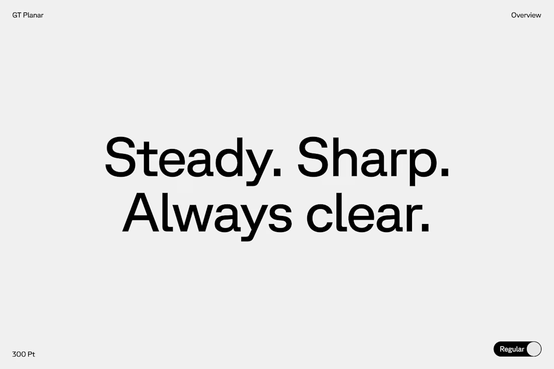
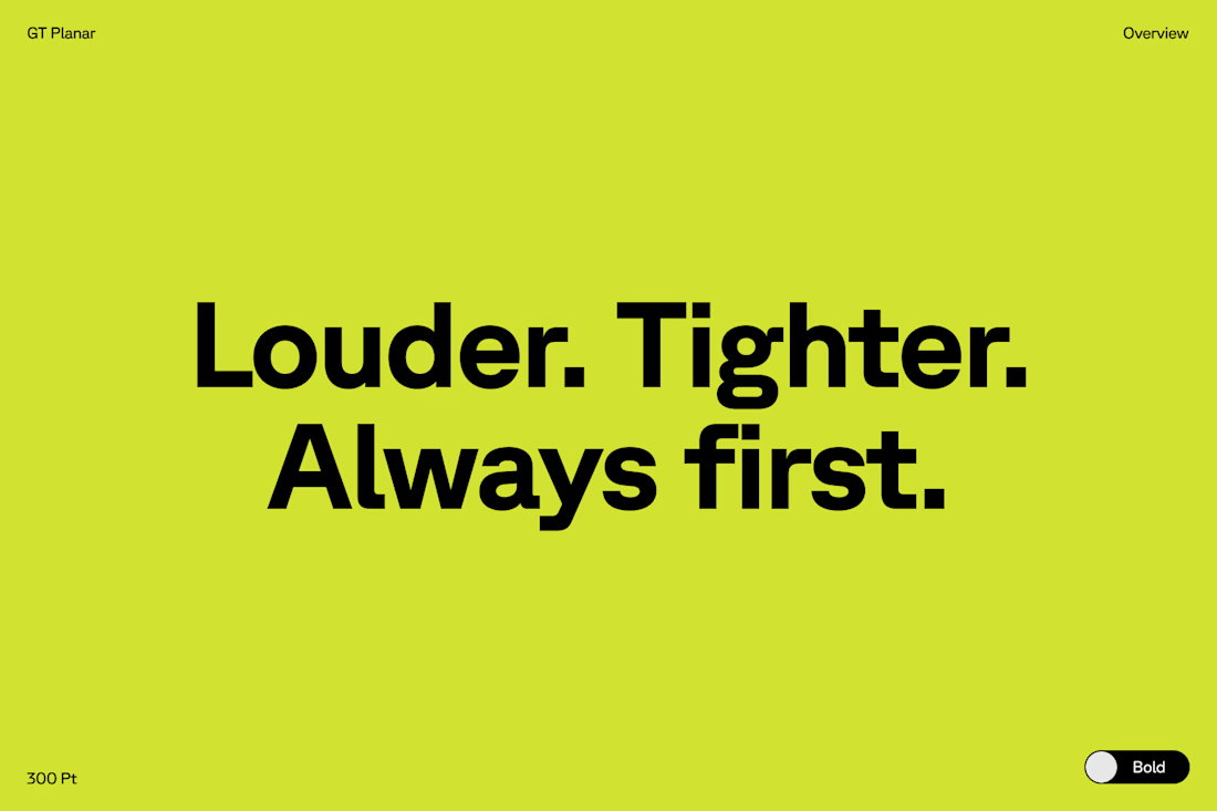
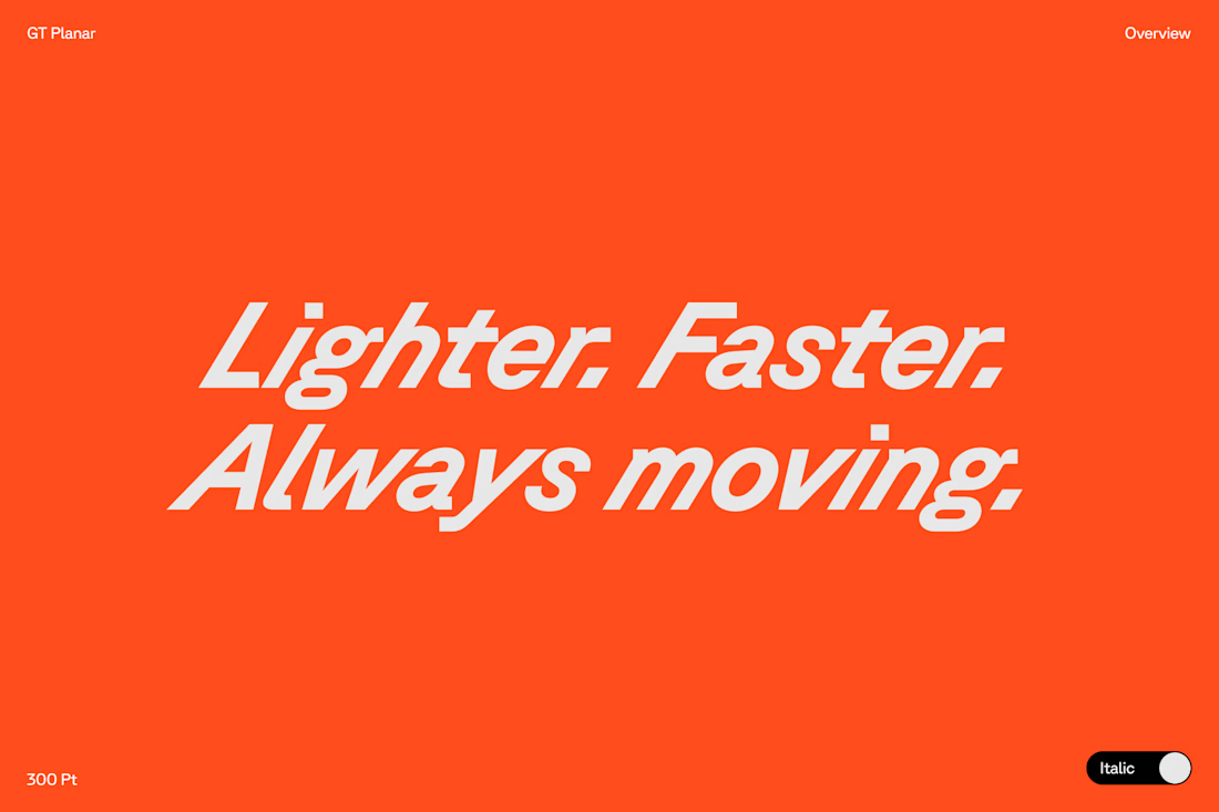
Typography exploration for a client. ⬇️
As a brand designer, typography is one of the first places I test a brand’s personality. I ask myself: how should this brand sound if it could only speak through type?
I play with weight, spacing, and rhythm. Small shifts change everything. The same sentence can feel trustworthy, aggressive, or effortless just by adjusting the typography.

The network for creativity
Join 1.25M professional creatives like you
Connect with clients, get discovered, and run your business 100% commission-free
Creatives on Contra have earned over $150M and we are just getting started











Related posts


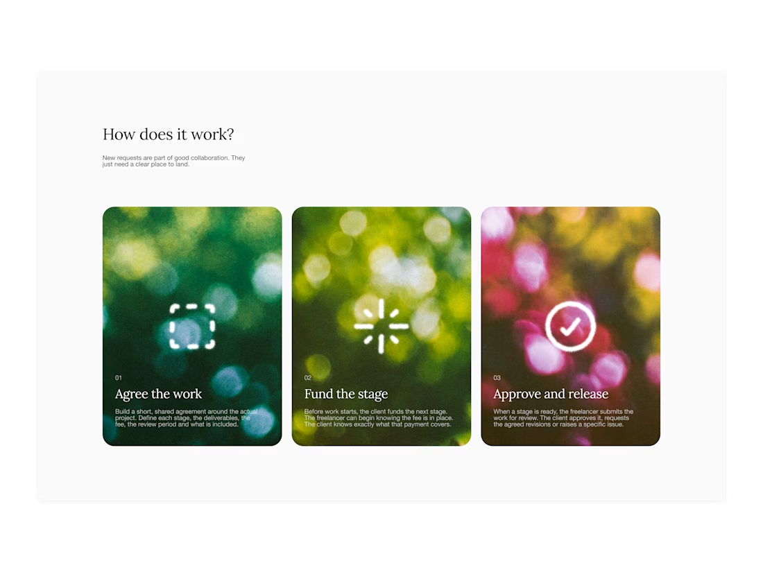

Your web sections always have such strong art direction. Great to see the brand carried right into the layout.

When Typography Breaks the Rules. 🖤
Bold 3D lettering, dramatic shadows, and twisted perspectives turn typography into an experience you can’t ignore.
Would you call this art or an obsession?
3dtypographymotiondesignexperimentaldesignGraphic DesignMotion DesignTypographyAdobe After EffectsAdobe IllustratorCinema 4D


That's really great Saleha it's unique I like it ❤️❤️❤️


A little excerpt from the brand guidelines for a recent project


The APS mark built from the four small symbols reads like a map legend, which suits a psychology service. Nice that the guidelines page shows it on the dark teal, most would have played it safe on white.