

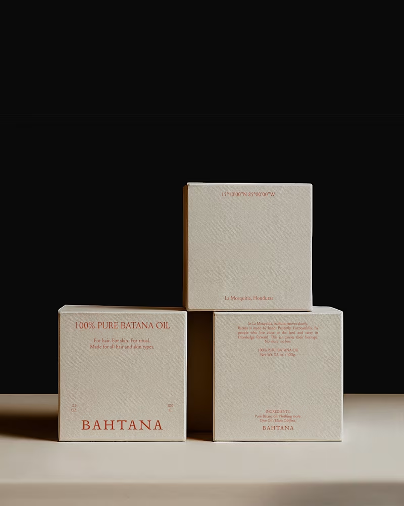
You all showed so much love to the Bahtana project, so I wanted to share a deeper look.
Here are more moments from the case study — the typography details, the earth-led palette in context, the packaging decisions, the quiet structure behind it all.
Bahtana was built around one idea: luxury is reverence. Every element had to feel rooted, not decorative.
Let me know which detail stands out to you the most.
1
116
Inspiration behind the logo
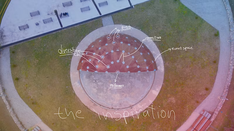
The festival takes place every year in this circular open space. When I first saw it from above, it immediately felt like more than just a venue. It felt like a system.
Performers at the center. Guests surrounding them. Countless connections happening at the same time. Music, movement, diversity, energy, all flowing outward from a single point.
That aerial view became the foundation of the logo.
I translated the space into a simplified network. A semi-circle representing the venue, nodes symbolizing people and cultures, and connections showing how everything comes together through music. The gradient reflects diversity and transition. Different voices, one shared experience.
The goal was to design a mark that does not just label the festival, but visually explains how it works and what it stands for.
1
1
98