
AI CRM, Automation & Webflow Developer
- $10k+
- Earned
- 2x
- Hired
- 5.0
- Rating
- 29
- Followers
AI CRM, Automation & Webflow Developer



Framer expert, product designer, motion in Rive and Jitter
- 1x
- Hired
- 5.0
- Rating
- 26
- Followers
Framer expert, product designer, motion in Rive and Jitter


Bento design exploration for my own agency website.
I wanted to make the “Why choose us” section feel more visual, premium, and easy to scan.
Focused on clean cards, soft purple branding, and a modern layout that presents multiple ideas without feeling crowded.
1
478

Just finished this cross-border payments landing page in Framer
Went with a dark futuristic direction, bold typography, neon accents, and a premium visual feel to make the product feel modern, trusted, and high-converting.
Built to make fintech feel simple, fast, and bold.
0
531

Metrica — Finance SaaS Landing Page Design
Designed a clean, modern landing page concept for Metrica, a finance management platform built for businesses that want better control over cash flow, expenses, budgeting, and team collaboration.
The goal was to create a calm, trustworthy visual direction using soft mountain imagery, clean typography, and a premium dashboard preview that instantly communicates clarity, control, and confidence.
Design focus:
Modern SaaS layout, finance dashboard UI, strong hero section, soft visual storytelling, and conversion-focused CTAs.
Available for SaaS, fintech, AI, and startup website design projects.
2
1
617

Youtube content creator
Youtube content creator
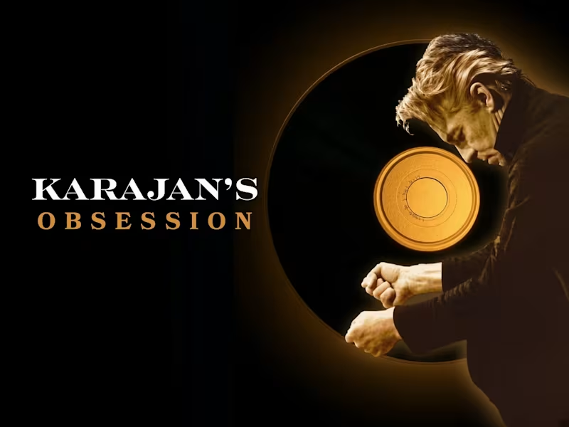
A stark, cinematic cover for Karajan’s Obsession: bold white and gold typography set against a black field, anchored by a glowing disc that evokes both vinyl and halo. The conductor’s silhouette, caught mid‑gesture, embodies the relentless pursuit of perfection that defined Herbert von Karajan’s life and legacy.
https://youtu.be/uYGumBOPsJA
0
119
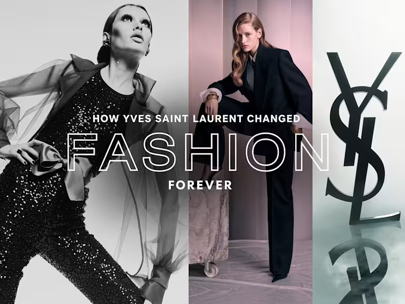
Free-domain editorial and archival photography arranged into a clean triptych — divider design, spacing, and typography composed by hand to turn three separate images into one cohesive fashion-history thumbnail.
1
95



UI/UX & Graphic Designer
UI/UX & Graphic Designer

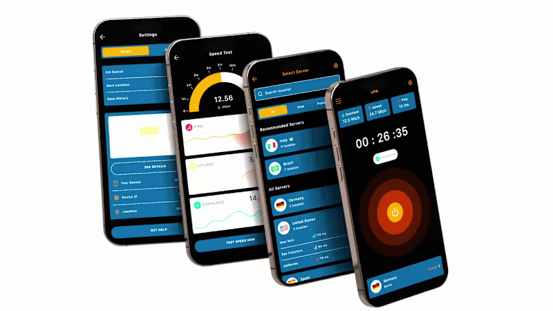
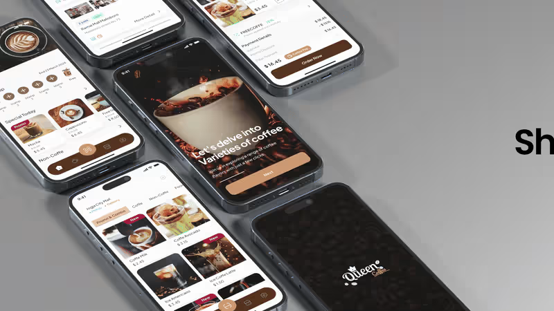
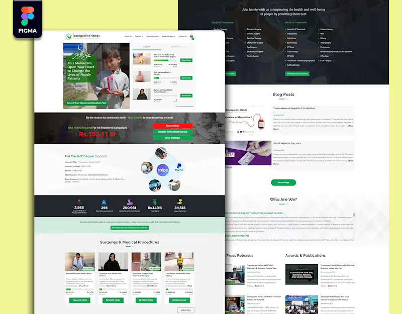

AI SaaS & Full Stack Developer | Product Development
New to Contra
AI SaaS & Full Stack Developer | Product Development

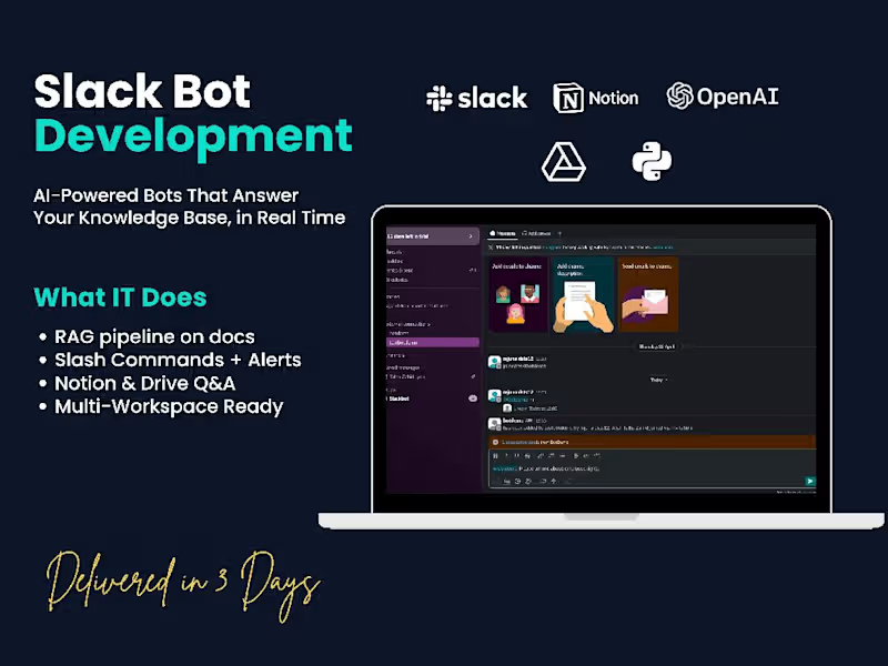



Crafting custom 3D animations that bring your vision to life
Crafting custom 3D animations that bring your vision to life


View more →

WEB CONTENT WRITER/ PROFESSIONAL WRITER
WEB CONTENT WRITER/ PROFESSIONAL WRITER


View more →

Top Rated Wix Studio Expert | WordPress Developer | Shopify
Top Rated Wix Studio Expert | WordPress Developer | Shopify

Plam Beach Tax
WordPress Elementor Website for Palm Beach Tax firm with user-friendly experience.
0
131

The Research Science Network
Redesign the wix website for The Research Science Network with video course gallery.
0
138

