Full-Stack & AI Developer | Next.js, AI Agents
- $50k+
- Earned
- 12x
- Hired
- 5.0
- Rating
- 277
- Followers
Full-Stack & AI Developer | Next.js, AI Agents



Full-Stack & AI Developer | Next.js, AI Agents
- $25k+
- Earned
- 9x
- Hired
- 5.0
- Rating
- 61
- Followers
Full-Stack & AI Developer | Next.js, AI Agents

We built the website for Sliding Scale, a product-first development studio focused on MVPs and internal automations.
In a time where websites can be generated in minutes, the goal here was not just to ship fast, but to communicate the right message with clarity and intent.
The focus was on positioning:
1. Real user testimonials instead of generic social proof
2. Clear articulation of what we do and what we don’t do
3. Strong emphasis on product thinking over service execution
We designed and structured the website to reflect how we actually work; starting from problem understanding, reducing scope, and building only what truly matters.
1
402

$8000 in revenue from just two events.
That came in a few weeks after we helped Jackie build her digital presence. Nothing too complex, just making things clearer, more accessible, and more professional for her customers. She recently shared that she landed an event for April 18 with 100 people and another for May 13 with 250 people.
Reading that felt different. Not because it was a “win”, but because behind every project, there is someone trying to grow their livelihood, take a step forward, and create something for themselves.
2
466


Product Designer & Developer


Product Designer & Developer

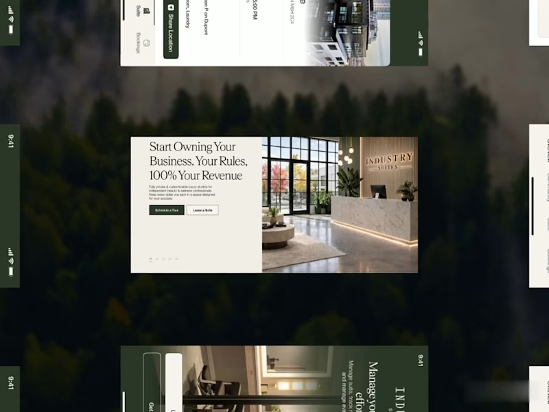
A fresh digital identity, a premium workspace designed for creative professionals.
From an elegant, editorial-style website to a functional mobile app for bookings and studio management, the goal was to make every interaction feel as refined as the space itself.
Clean layouts, timeless typography and a deep green palette bring the whole experience together.
4
21
1.9K
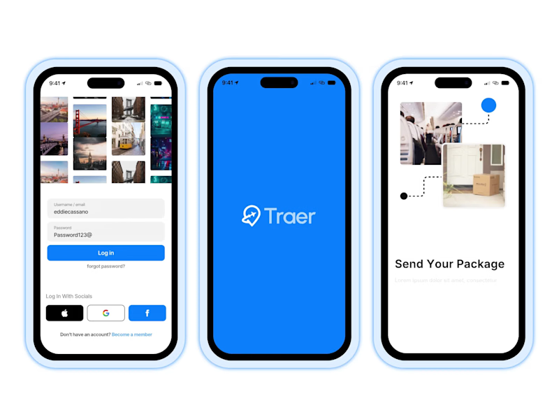
Traer Mobile App Design.
A clean and modern mobile app UI/UX design for Traer, a P2P global package delivery platform.
Designed the experience around package tracking, orders, trips, and delivery management, keeping everything simple and easy to navigate.
Also explored the visual identity, typography, colors, and responsive product experience to keep the app consistent across the brand.
Really enjoyed bringing this one together.
30
35
2.4K

Top-Rated Independent Design. Develop. Deliver Results

Top-Rated Independent Design. Develop. Deliver Results



Business Systems, AI Workflow Automation and MVPs
- $•••••
- Earned
- 36x
- Hired
- 5.0
- Rating
- 92
- Followers
Business Systems, AI Workflow Automation and MVPs
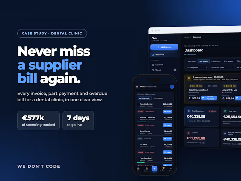
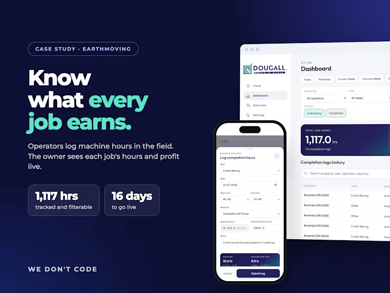
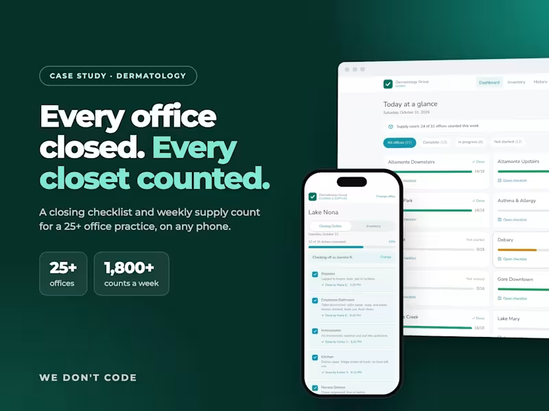
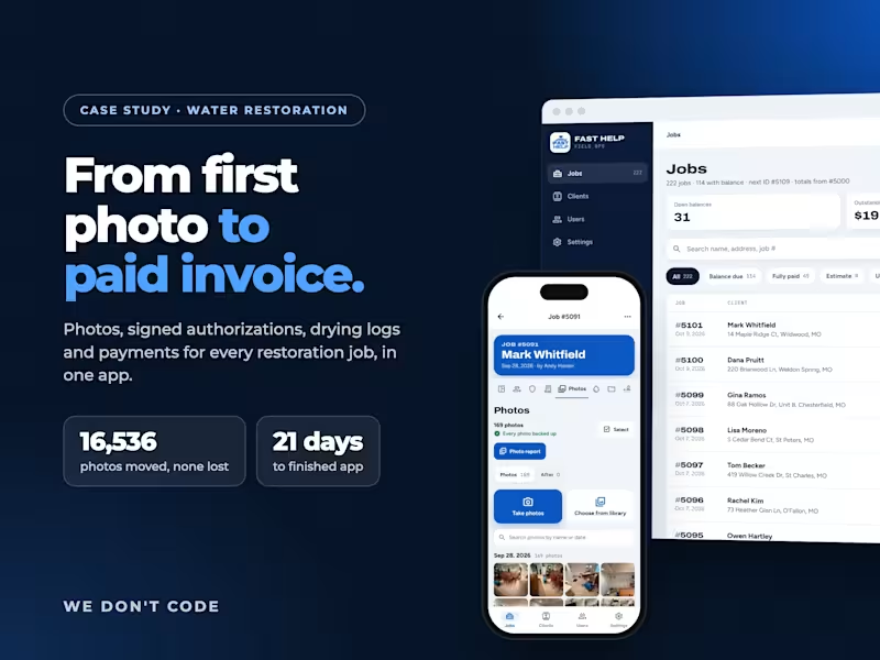

Brand & Framer Designer for Startup Websites That Convert
- $5k+
- Earned
- 6x
- Hired
- 4.9
- Rating
- 44
- Followers
Brand & Framer Designer for Startup Websites That Convert



New brand identity for Curated Kitchens & Bath, a remodeling studio that helps homeowners fall in love with their space again.
The brief was warmth without the clutter. A calm, earthy palette of smoky green, warm taupe and soft greige, paired with a clean editorial wordmark and a house-shaped mark that tucks the kitchen right inside it.
Built out the full system too: logo suite, business cards, door hangers, flyers and merch, so every touchpoint reads as the same brand.
Which application is your favorite? Curious what stands out to you.
0
178

UI/UX Designer | Framer & Video Editing
- $1k+
- Earned
- 3x
- Hired
- 5.0
- Rating
- 35
- Followers
UI/UX Designer | Framer & Video Editing



AI SaaS Engineer | Next.js + Node.js | MVPs to Production
- $1k+
- Earned
- 1x
- Hired
- 5.0
- Rating
- 15
- Followers
AI SaaS Engineer | Next.js + Node.js | MVPs to Production