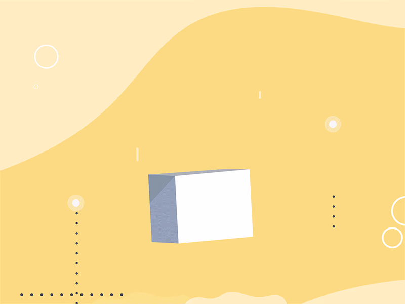
Explainer Video Producer | Helping SaaS & Tech Startups.
- $1k+
- Earned
- 4x
- Hired
- 4.8
- Rating
- 68
- Followers
Explainer Video Producer | Helping SaaS & Tech Startups.


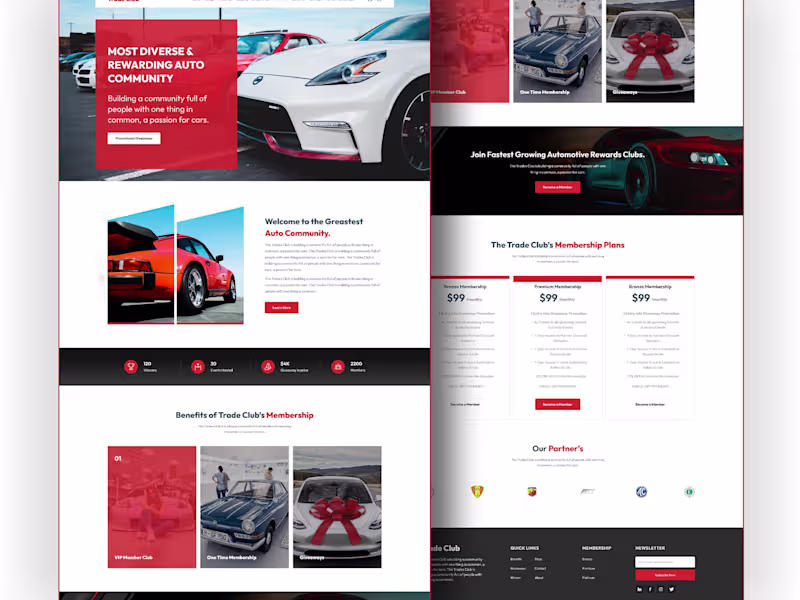
SaaS Explainer Video | Product DEMO Video | Motion Graphics
- $1k+
- Earned
- 3x
- Hired
- 5.0
- Rating
- 16
- Followers
SaaS Explainer Video | Product DEMO Video | Motion Graphics


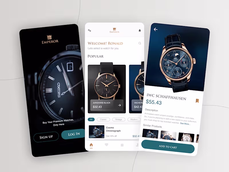
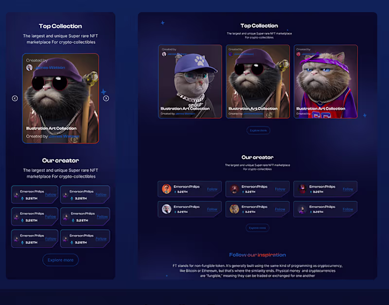
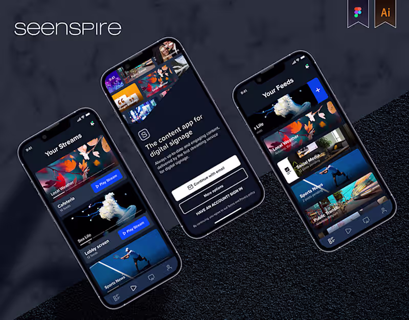
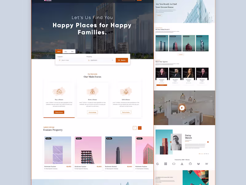
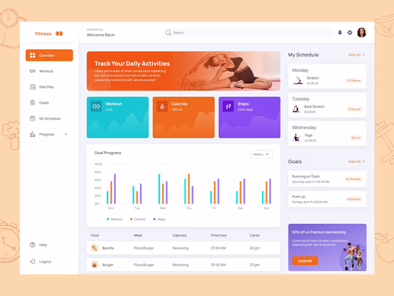
UI/UX Designer · SaaS · Healthcare · Fintech · Ecommerce
- 5.0
- Rating
- 20
- Followers
UI/UX Designer · SaaS · Healthcare · Fintech · Ecommerce


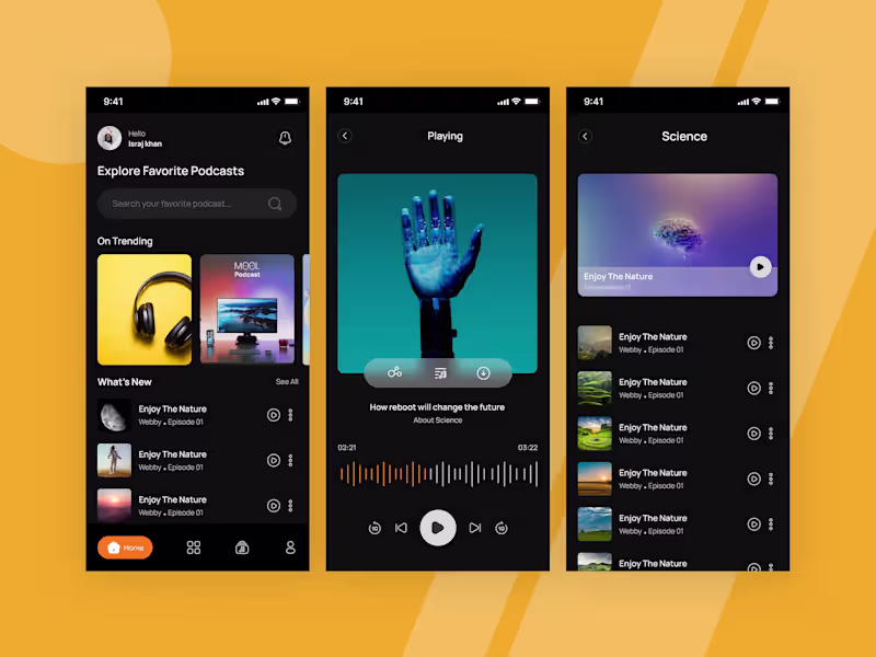
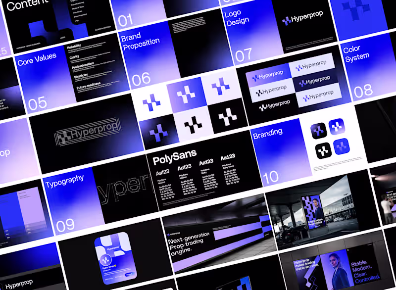
Product Designer for SaaS & MVPs
Graphic Design |Android Developer | Brand & UI/UX Specialist
- 6
- Followers
Graphic Design |Android Developer | Brand & UI/UX Specialist


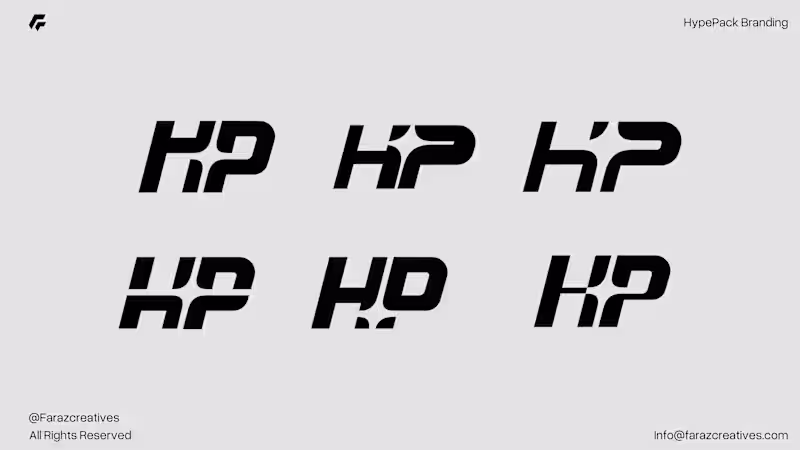
Minimalist Brand & Logo Designer

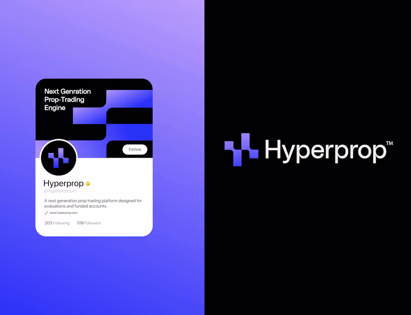
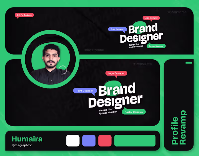
Brand Designer - Solving visual identity challenges
- 5.0
- Rating
- 28
- Followers
Brand Designer - Solving visual identity challenges


UI/UX Designer | Branding Expert | UX Strategy