Freelance Brand Designers in Islamabad Capital TerritoryFreelance Brand Designers in Islamabad Capital Territory
Brand Designer - Solving visual identity challenges
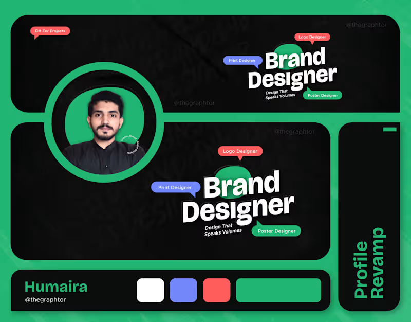
5.0
Rating
29
Followers
Brand Designer - Solving visual identity challenges

Crafts Diverse Logos & Brand Identities that lasts

5.0
Rating
15
Followers
Crafts Diverse Logos & Brand Identities that lasts
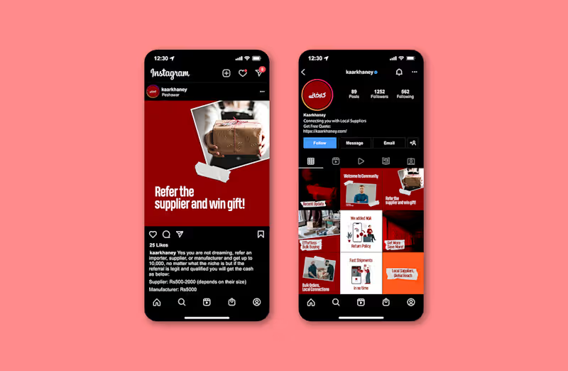
Brand Identity, UI & Web Designer | Webflow & Figma Expert
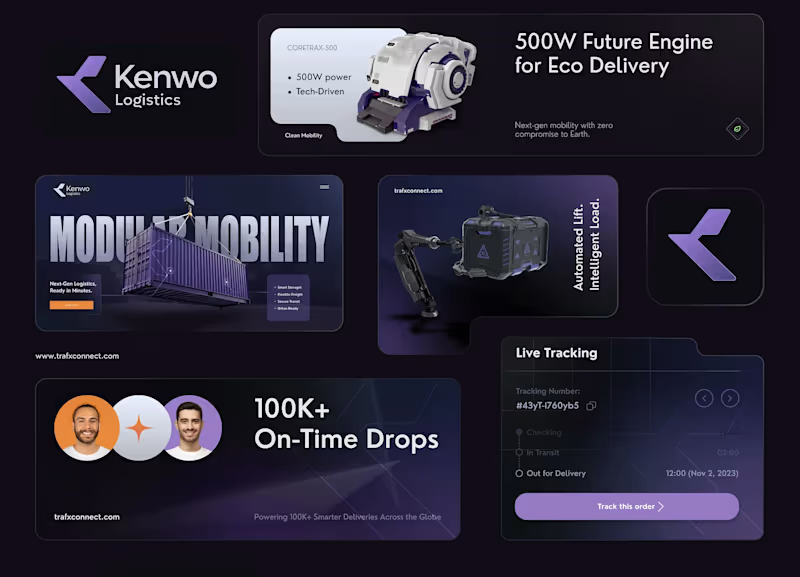
Web Developer | UI/UX| 3D Product Animation |

12
Followers
Web Developer | UI/UX| 3D Product Animation |
Cover image for 📐 BRAND STRATEGY — CASE
📐 BRAND STRATEGY — CASE STUDY ⚙️ Koia Objects: Making the Photography Match the Positioning Goal: Closing the gap between what Koia Objects makes and how it is seen — using photography as the proving ground for the brand's design logic. 📸✨ 1. 🎯 The Brief Koia Objects is a Swedish stainless steel tableware and serving brand, two years in, with a design sensibility that sits deliberately between two traditions: 🏛️ Bauhaus Rationalism (Mies van der Rohe): Form follows function & industrial precision. 🌿 Nordic Warmth (Alvar Aalto): Human-centric design that keeps precision warm rather than cold. 💰 The Positioning: Accessible Premium — not luxury, not budget, but a fair price for genuine material quality and craftsmanship. ⚡ The Challenge: This positioning has to be felt, not stated. It must be built into every decision the brand makes, starting with how the product is photographed. 2. 🔍 The Diagnosis Most young premium tableware brands drift into one of two failure modes: 🚫 The Catalog Trap (Current State): Flat white backgrounds, even front-on lighting, centered objects. It looks like a cheap e-commerce listing and flattens the way light moves across brushed steel. 🚫 The Overcorrection (To Avoid): Dark moody backdrops, heavy gold rim-lighting, and fake luxury marble. It looks like an imitation of luxury watch ads and ignores both Bauhaus and Nordic roots. 💡 The Fix: Build a third direction grounded in Koia’s true design lineage rather than borrowed conventions. 3. ⚖️ The Design Logic Translating "Bauhaus Rationalism + Nordic Warmth" into 5 concrete photographic principles: 🏷️ Principle🖼️, What It Means in a Photograph🛠️ Function, Visible Show the object doing its job (pouring, serving, being held). Function is the whole premise.✨ Material Honesty Real ,directional light on real steel. Let reflections show weight and precision without over-retouching.🪵 Restraint in Styling Few, purposeful props (raw wood, linen, stone). Nothing on set unless it earns its place.☀️ Warm Directional Light .Soft daylight or a single warm key light instead of flat, cold studio flashes.🏡 Grounded Negative Space, Generous breathing room on a real surface (table, hand, counter) — never a void. 4. 🎬 The Direction, Made Concrete 📋 Shot List 🖼️ Hero Shot: The object alone on a real surface (oiled wood, honed stone) with soft single-direction daylight. 💧 In-Use Shot: The object mid-function (pouring water, serving food, lifted by a hand). 🔍 Material Macro: A tight crop on an edge, weld line, or brushed surface to prove craftsmanship. 🍽️ Grounded Flat Lay: The product with 2–3 purposeful props (linen, raw ceramic, cut citrus) and generous breathing room. 5. 🔄 Before / After — Case Study 🏺 Object: Stainless Steel Serving Pitcher ❌ BEFORE (Catalog Default): Shot dead-on against a white seamless background with flat lighting. The steel looks flat, generic, and cheap. ✅ AFTER (Koia Direction): Shot at a slight angle on an oiled walnut counter, lit by soft side daylight. Highlights catch the spout, shadows add depth, and water is captured mid-pour into a glass. 🌟 Why It Works: Highlights prove the metalwork quality, the pour proves function, and the warm wood adds Nordic cozy vibes without clutter! 6. 📈 Why This Matters Commercially 🏷️ Shifts Value Perception: Replaces price comparison with craftsmanship appreciation ("This is clearly better made"). 📦 Scalable Framework: The 5 principles extend directly to packaging, website UI, and social content as the brand scales. Prepared as an example project — Koia Objects Brand Strategy Engagement. 🚀
1
152
Cover image for Behind the Design: Crafting the
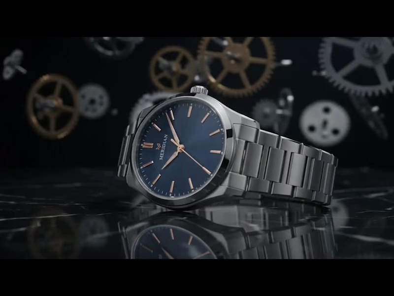
Behind the Design: Crafting the Meridian Luxury Timepiece Ever wondered how a high-end luxury watch goes from concept to photorealistic motion? Here is a breakdown of how this showcase was created from A to Z using industry-standard 3D design tools. How It Was Created (A to Z Workflow) Precision CAD Modeling: Using SolidWorks, AutoCAD, and CATIA, every mechanical component—from the intricate watch casing, bezel, and link bracelet down to the floating background gears—was engineered using precise parametric measurements to ensure exact real-world dimensions and mechanical accuracy. Refining & Scene Assembly: The precise CAD geometry was imported into Blender to assemble the full scene. Here, organic details like the micro-grooved dial face, subtle metallic textures, brush patterns, and the polished marble reflective surface were crafted. Lighting & Motion: Dynamic studio lighting setups, depth of field (cinematic background blur), and smooth camera push-ins were configured to highlight the metallic sheen, rose-gold accents, and delicate typography. Photorealistic Rendering : Using a high-end 3D renderer, realistic ray tracing was calculated—capturing complex light reflections, refractions on the sapphire glass, and realistic material physics across every frame. Want to bring your product vision to life with cinematic quality? Whether you need photorealistic product visualization, 3D mechanical models, or high-impact promotional animations for your brand, let’s make it happen. 📩 Send me a direct message today to elevate your product visualization!
0
133
Cover image for 🖤 Velaro — Technical Architecture
🔗
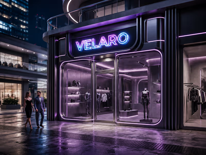
🖤 Velaro — Technical Architecture 🔗 Live Website https://saif-velaro-clothing-brand.netlify.app 📌 Overview Velaro is a single-page application (SPA) for a fashion/clothing brand, built with React + TypeScript, bundled by Vite, and styled with Tailwind CSS. The entire UI renders on one HTML page and updates dynamically as the user scrolls, searches, or interacts with the cart — no full page reloads. The architecture follows a standard modern frontend pattern: a single entry point boots the app, a root App component composes independent section components, and a global context manages shared state (the shopping cart) across all of them. ⚙️ Build & Tooling Layer These files configure how the project compiles, lints, and runs — they aren't part of the visible website, but control everything behind it. vite.config.ts — Configures Vite, the build tool/dev server. Defines how .tsx/.ts files are compiled, how the dev server runs (npm run dev), and how the production bundle is generated (npm run build). tsconfig.json — Root TypeScript config — points to the two more specific configs below via project references. tsconfig.app (http://tsconfig.app).json — TypeScript rules specifically for the application code in src/ (JSX handling, module resolution, strictness, the @/ path alias). tsconfig.node.json — TypeScript rules for Node-context files (like vite.config.ts itself), since those run outside the browser. tailwind.config.js — Configures Tailwind CSS — defines the design system (colors, spacing, fonts) and which files Tailwind scans to generate only the CSS classes actually used. postcss.config.js — Configures PostCSS, the tool that processes Tailwind's output and applies vendor prefixing/optimization during build. eslint.config.js — Defines linting rules — catches code-quality issues, unused variables, and React/TypeScript best-practice violations during development. package.json — Lists all dependencies (React, Vite, Tailwind, etc.) and defines the npm scripts (dev, build, preview). package-lock.json — Locks exact dependency versions so the build is reproducible across machines. .gitignore — Tells Git which files/folders to exclude from version control (e.g. node_modules, dist). index.html — The single real HTML file. Contains a root <div> that React mounts into — everything else is injected by JavaScript. dist/ — Auto-generated production build output (plain HTML/CSS/JS) created by npm run build. This is the folder actually deployed to Netlify. node_modules/ — Auto-generated folder holding all installed dependencies (created by npm install, never edited manually). 🚪 Application Entry & Root src/main.tsx — The true entry point of the app. Imports React, imports App.tsx, and mounts it into the <div> inside index.html. This is the first application code that runs. src/App.tsx — The root component. Doesn't contain page content itself — instead it imports and arranges every section component (Navbar, Hero, About, etc.) in order, and wraps everything in the CartProvider so cart state is available app-wide. src/index.css — Global stylesheet — imports Tailwind's base/utility layers, applied once at the root so every component can use Tailwind classes. src/vite-env.d.ts — TypeScript type declarations for Vite-specific features (like importing images/CSS as modules) — lets TypeScript understand syntax that isn't standard JavaScript. 🛒 State Management src/cart.tsx — Implements the CartProvider, a React Context that holds global cart state (items, quantities, totals) and exposes functions to add/remove items. Any component wrapped inside it (via App.tsx) can read or update the cart without prop-drilling. src/data.ts — Static data module — likely product listings, collection info, or other content consumed by components like FeaturedCollection and Showcase, kept separate from UI logic. 🧱 Component Layer (src/components/) Each file is a self-contained, single-responsibility UI section. App.tsx stacks them vertically to form the full page. Navbar.tsx — Persistent top navigation — branding, menu links, and likely triggers for search/cart. Hero.tsx — The primary landing banner — headline, tagline, and call-to-action (e.g. "Shop Collection"). HeroCanvas.tsx — A visual/animated layer paired with Hero.tsx — likely a canvas-based or decorative background effect behind the hero text. FeaturedCollection.tsx — Renders a curated set of products, pulling structured data from data.ts. About.tsx — Brand-story section — static content describing the label's identity. Lookbook.tsx — A style/editorial gallery — visually presents outfits or campaign imagery. Showcase.tsx — An additional highlight section, likely for a specific collection, drop, or promotional content. Testimonials.tsx — Displays customer reviews/social proof. Newsletter.tsx — Email capture form/section for marketing signups. SearchOverlay.tsx — A modal/overlay component for in-site product search, toggled from the Navbar. CartDrawer.tsx — A slide-out panel UI that reads from the CartProvider (cart.tsx) to display current cart items and totals. Footer.tsx — Bottom-of-page section — links, contact details, social icons. 🔄 How It All Connects (Data Flow) The browser loads index.html, which pulls in the compiled JS bundle. main.tsx runs first and mounts App.tsx into the page. App.tsx wraps all sections in CartProvider, so cart state is shared without passing props down manually through every component. Each section component renders independently — some are purely static/presentational (About, Footer), while others are interactive and tied into shared state (CartDrawer, SearchOverlay). Tailwind classes used throughout every component are compiled once into index.css based on what's scanned via tailwind.config.js. On npm run build, Vite compiles and bundles all of this into optimized static files inside dist/ — which is what gets deployed to Netlify and served to visitors. 🧠 Why This Structure Works Separation of concerns — each component owns one visual section; layout composition happens only in App.tsx. Centralized state — cart logic lives in one file (cart.tsx) instead of being duplicated across components. Data/UI separation — data.ts keeps content separate from rendering logic, making it easy to update products without touching component code. Type safety — TypeScript configs enforce consistent typing across the whole src/ folder, catching errors before runtime. Optimized output — the dev-only tooling (Vite, Tailwind, ESLint, TS configs) never ships to production; only the final compiled dist/ bundle is deployed.
0
71