Freelance Brand Designers in Ishwardi
Sign Up
Post a job
Sign Up
Log In
Filters
2
Projects
People
Humaun Atelier
Natore, Bangladesh
Brand & UI/UX Designer — Design + Web Development
New to Contra
Follow
Message
Brand & UI/UX Designer — Design + Web Development
1
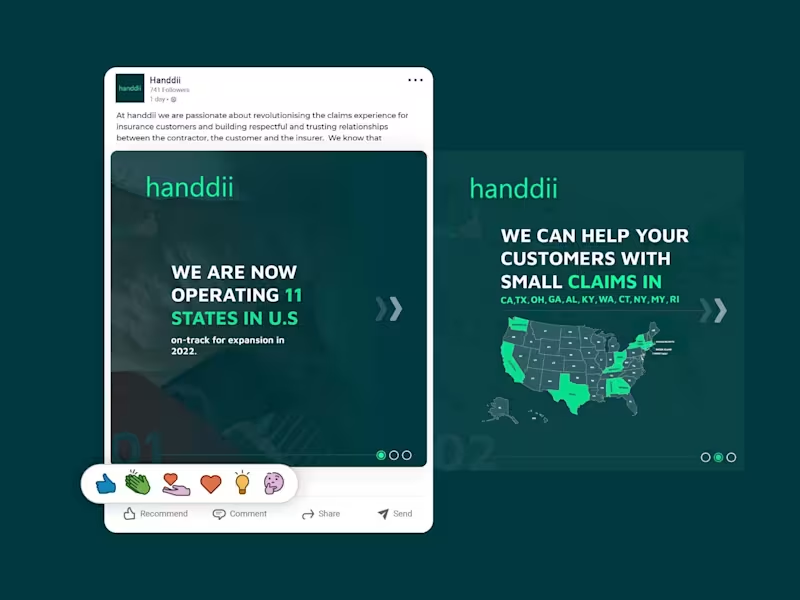
A LinkedIn carousel post designed for handdii, a company expanding across 11 U.S. states. The goal was to visually communicate their growth and service areas while maintaining their brand identity—using their signature green (#00FF99), supporting colors, and a clean, modern layout. I incorporated the 2-letter state abbreviations (CA, TX, OH, GA, etc.) into the design, creating a map-like visual that immediately conveys the company's reach. The carousel structure allowed me to present the key message—operating in 11 states with more expansion coming—across multiple slides, keeping each one clean, scannable, and on-brand. The design uses bold typography, consistent spacing, and a professional tone suitable for LinkedIn's audience, without relying on the logo since the post was published from the company page.
1
167
0
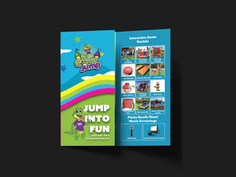
I designed a strategic, high-impact tri-fold brochure for Gator Jump, an event rental company transitioning its focus toward large-scale corporate clients, churches, and schools. The primary challenge was balancing a wide product catalog—Inflatables (Bounce Houses, Slides, Obstacle Courses), Games, Photo Booths, and Giant Movie Screens—while distinctly guiding the viewer’s attention toward the premium, high-ticket items ideal for corporate events. To solve this, I applied a strict visual hierarchy on the A4 tri-fold canvas. Obstacle Courses, Slides, and Games were given prominent placement with large, dynamic visuals on the most visible panels (front cover and center-fold), while secondary services like Bounce Houses and Photo Booths were positioned strategically on the back and side panels to ensure visibility without competing for the spotlight. Visually, the client adored a specific rainbow gradient color palette, so I used it as the structural backbone of the design—allowing the colors to flow seamlessly across the front and back panels. This creates a cohesive, energetic brand experience and transforms the brochure from a simple price list into a professional statement. I paired this with bold, modern typography inspired by the Azo Sans family (avoiding their old website fonts as requested) to ensure high readability against the colorful backdrop. All required functional elements were integrated seamlessly: the logo and contact details on the front, categorized product grids inside, and a QR code, email, phone number, and the specific brand messaging on the back. The result is a print-ready, visually striking tri-fold brochure that captures the excitement of large events while maintaining the premium credibility needed to attract corporate clients.
0
186
1
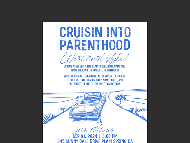
This project was a custom hand-drawn invitation design for a West Coast, lowrider-themed baby shower. The core challenge was beautifully balancing two seemingly opposing worlds—the gritty, nostalgic aesthetic of 90s car club culture (lowriders, oldies, hydraulics, and cruising) with the soft, joyful innocence of a baby celebration. I leaned heavily into a hand-drawn illustration style to capture the authentic vintage feel of classic lowrider artwork. The composition centers on a lovingly detailed lowrider, but instead of standard rims, I infused baby elements—like a tiny rattle dangling from the rearview mirror and a crib-shaped 'bed' in the back—to bridge the two themes perfectly. I used a warm, sun-soaked West Coast color palette of pastel pinks, blues, and creams, contrasted with deep blacks and chrome greys to keep the 'car club' edge intact. Typography was crucial; I paired a bold, graffiti-inspired script for the title ('Cruisin' into Parenthood') to capture the urban vibe, with a clean, readable sans-serif for the event details to maintain clarity. I carefully laid out all the supplied verbiage ('Rims, rides, and rattles') using a classic cruise-night poster layout, ensuring the flow felt like a vintage event flyer. The result is a nostalgic, humorous, and deeply personal invitation that makes the parents-to-be feel seen as a couple, while celebrating the exciting journey ahead into parenthood—proving that even a baby shower can have serious street cred.
1
185
2
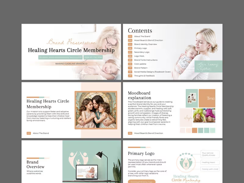
This is a comprehensive brand identity and guidelines project for Healing Hearts Circle Membership, a coaching service dedicated to supporting foster and adoptive parents. The mission is deeply emotional: to equip parents with the skills to help their children heal from trauma and build resilient, nurturing family environments. The design challenge was to translate this profound sensitivity into a visual language that feels warm, safe, and professional—never cold or clinical. I began with a strategic moodboard to align on visual direction, anchoring the brand in soft green hues to symbolize growth and renewal, balanced with gentle pinks and rust/orange tones to evoke compassion and emotional warmth. I developed a versatile logo suite—primary, secondary, and a distinct logo mark—to ensure the brand works cohesively across all touchpoints, from a website header to printed materials. Organic textures and friendly, approachable typography were selected to create a welcoming, community-driven feel. The full brand guideline document (Version 1.0) encapsulates the complete system: color palette, typography instructions, brand pattern, social media designs (Facebook cover), and actionable feedback sections. The visual narrative focuses on diverse, loving family imagery to reflect inclusivity. The final result is a nurturing, trustworthy, and cohesive brand identity that makes foster and adoptive parents feel seen, supported, and empowered—turning the complex journey of healing into a beautifully structured visual story.
2
300
Brand Designer
(6)
Follow
Message
Md. Abdur Rahman
Pabna, Bangladesh
The designer that you can trust.
6
Followers
Follow
Message
The designer that you can trust.
2
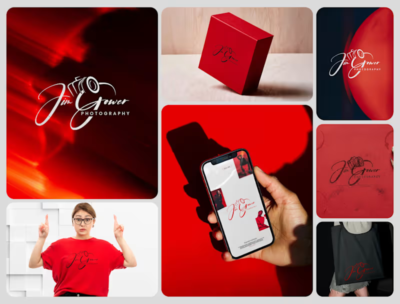
Signature Brand Identity System for a Photography Business PROJECT DESCRIPTION: Jim Gower is a professional photographer who needed more than a logo. He needed a complete brand identity that could represent his work at every level — from a business card handed to a client after a shoot to a lightbox sign above a studio entrance. The brief was clear: build something that feels personal, premium, and immediately recognizable as belonging to one person and one vision. The Approach Every decision in this project started with strategy before it touched aesthetics. Who is Jim Gower to his ideal client? What feeling should someone walk away with after their first encounter with his brand? What does premium mean in the photography space right now — and how do you stand apart from it without alienating it? The answers shaped everything that followed. The Work The primary logo is a signature script with the camera body structurally integrated into the letterforms — the "G" in Gower becomes the lens housing, making the mark read as both a name and a profession without requiring a separate icon. The script carries energy and movement, referencing the intuitive, fast-moving nature of working photographers. The crimson brand palette was selected for emotional weight — confident, warm, and saturated enough to hold presence across both physical and digital surfaces without compromise. The full system was then applied and stress-tested across every client touchpoint: — Primary and secondary logo variations — Brand color palette and typography system — Business card design — Premium gift box packaging — Tote bag and apparel — Digital UI mockup for web and mobile — Environmental signage and lightbox application The Result A brand identity system that positions Jim Gower not as a photographer with a logo, but as a brand with a presence — one that commands attention, communicates quality instantly, and scales from a phone screen to a storefront without losing a single point of its power. SERVICES INCLUDED IN THIS PROJECT: Brand Strategy, Logo Design, Visual Identity System, Brand Collateral Design, Packaging Design, Apparel Mockup, Digital UI Application, Environmental Signage Mockup Photography Logo Design, Signature Logo Design, Brand Identity System, Photographer Branding, Script Logo Design, Visual Identity Design, Custom Logo Design, Brand Identity Designer, Logo Design Process, Creative Brand Design, Handcrafted Logo Design, Photography Brand Kit, Premium Brand Identity, Calligraphy Logo Design, Brand Mockup Design, Logo Design Concept, Red Brand Identity, Photographer Visual Identity, Brand Strategy Design, Full Brand System
2
97
1
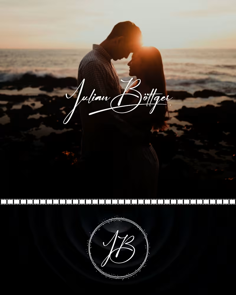
Julian Böttger — Full Brand Identity for a Wedding & Portrait Photographer A photographer's work lives and dies by first impressions. Julian's images were exceptional. His brand wasn't keeping up. We built a complete visual identity from the ground up — designed to feel personal, timeless, and scalable across every surface it would ever touch. What was delivered: → Custom hand-lettered signature logotype (primary mark) → Monogram seal (JB) for watermarks, merch, and secondary use → Business card system — black and white versions → Studio signage mockup → Apparel (t-shirt + tote bag) → Stationery and print collateral → Film-strip and overlay assets for video content The brief was clear: no templates, no stock fonts, nothing generic. Every element was drawn or crafted specifically for this brand. The identity now works at every scale — from a coffee mug to a 6-foot sign — and across every context, from dark editorial photography to bright lifestyle imagery. Available for similar projects. Inquire to discuss scope and timeline. Brand Identity, Logo Design, Visual Identity, Graphic Design, Photography, Creative Services, Wedding Industry, Brand Guidelines, Print Design, Merch Design
1
51
5
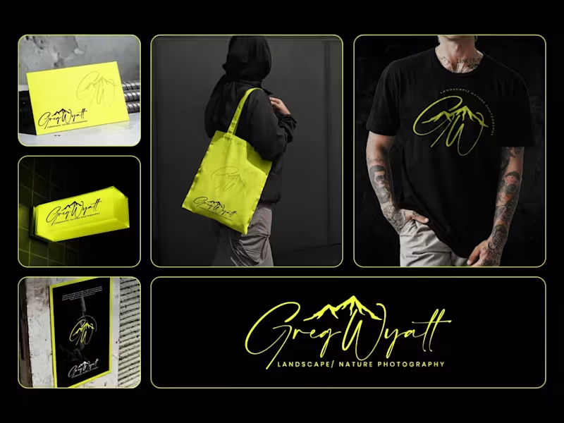
Greg Wyatt — Landscape & Nature Photography | Full Brand Identity System Project Summary: A complete brand identity built for a landscape and nature photographer who needed more than a logo — he needed a visual world that matched the scale of what he shoots. The Brief: Greg Wyatt captures landscapes the way most people only dream of seeing them. The work is cinematic, emotional, and deeply personal. But his brand wasn't reflecting any of that. The goal was to build a cohesive identity system from the ground up — one that could hold its own across every surface it touched. The Approach: Every decision in this project started with one question: does this feel like standing at the edge of something vast? The signature wordmark was hand-lettered in style to feel personal and authorial — because the best landscape photography is never accidental. It carries the photographer's fingerprint. The mountain mark was integrated directly into the initials rather than placed beside them, making the connection between artist and subject inseparable. Color was the most strategic call in this project. Neon yellow on deep black creates the kind of contrast that stops a scroll, but it wasn't chosen for that reason alone. It references the exact quality of light that makes a great outdoor photograph — that electric moment just before or after darkness. The brand lives in that moment. The system was then pressure-tested across real-world applications: a neon illuminated storefront sign, business cards, tote bags, apparel, and a brand pattern — because a logo that only works on a white background isn't a brand system. It's a starting point. What Was Delivered: — Primary signature wordmark — Mountain monogram mark — Circular badge logo — Submark and watermark variations — Brand color and typography system — Business card design — Tote bag design — T-shirt / apparel design — Illuminated signage mockup — Brand pattern / texture — Full brand presentation The Result: A brand identity that works as hard as the photographer behind it. Cohesive across every format. Instantly recognizable. Built to grow with the brand rather than date it. Services Provided: Brand Identity Design · Logo Design · Visual Identity · Brand Strategy · Print Design · Merch Design · Brand Presentation Keywords: Brand Identity, Logo Design, Photography Brand, Signature Logo, Handwritten Logo, Mountain Logo, Nature Photography Branding, Outdoor Brand Identity, Monogram Logo, Visual Identity System, Photographer Branding, Custom Logo Design, Dark Brand Aesthetic, Neon Branding, Apparel Design, Print Collateral, Brand Strategy, Creative Direction, Full Brand System, Freelance Brand Designer
6
5
85
2
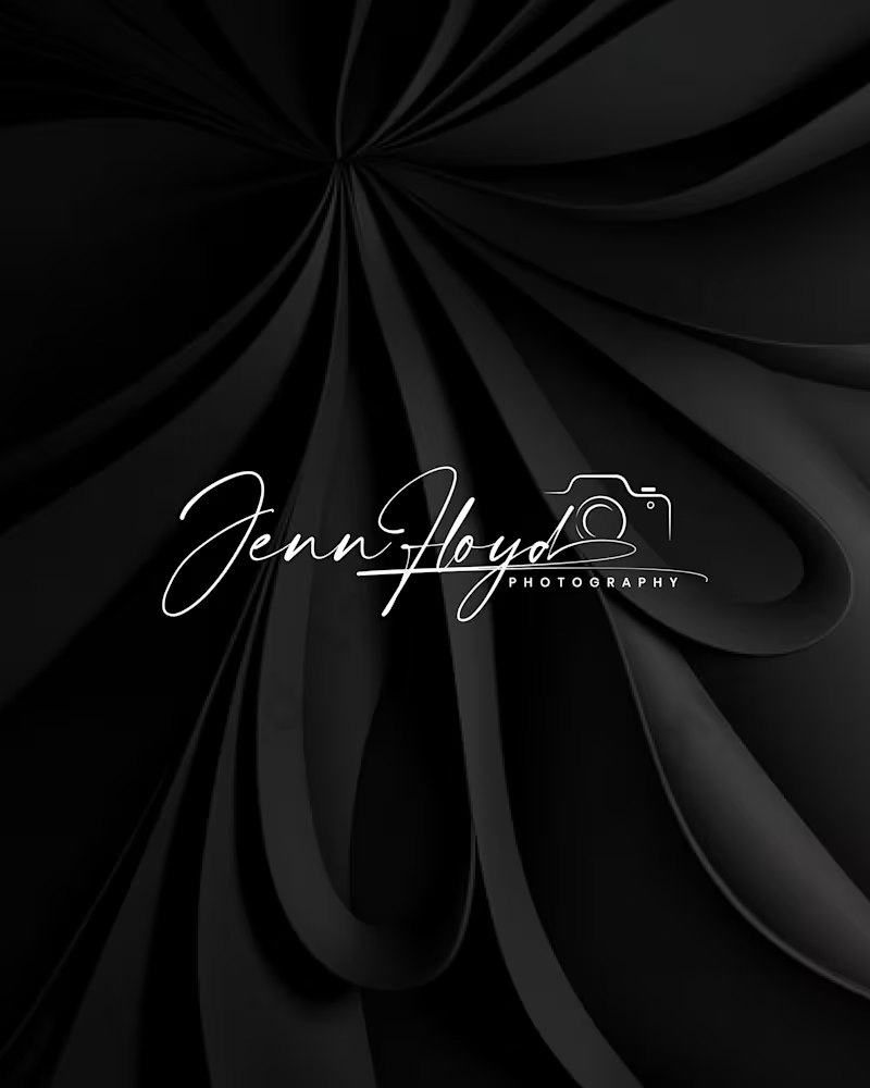
Project Title: Jenn Floyd Photography — Premium Visual Identity System Role: Brand Designer & Strategist Services: Brand Identity, Custom Lettering, Visual Strategy The Overview Many independent creatives compete on price because their visual identity relies on standard, off-the-shelf fonts. For the Jenn Floyd identity system, the objective was clear: skip the generic templates and build a bespoke, signature-driven brand that instantly positions the photography studio in the premium market. The Strategic Process True brand strategy lives in scalability. A premium identity must transition seamlessly across vastly different mediums without losing its core DNA or visual impact. Phase 1: Raw Sketching: Developed using graphite to map out organic weight, authentic line thickness, and typographic rhythm. Phase 2: Digital Optimization: Refined into a high-contrast digital vector optimized as an editorial watermark for low-light photography and high-res mobile interfaces. Phase 3: Physical Touchpoints: Engineered with precise line weights to translate flawlessly from luxury blind-embossed packaging to backlit storefront signage. By focusing on custom craftsmanship rather than fleeting design trends, we created a cohesive visual system that intentionally drives up perceived market value and consumer trust. Project Deliverables Custom Signature Wordmark & Secondary Sub-marks Comprehensive Brand Identity & Typography System Multi-Medium Asset Optimization (Digital Watermarking, Print, & Signage) Production-Ready Packaging Assets (Blind Embossing Specifications) Tools Used Adobe Illustrator, Adobe Photoshop, Procreate Tags & Skills brand identity, logo design, visual identity, custom lettering, typography, packaging design, creative direction, brand strategy, vector illustration, art direction, luxury branding
2
74
Brand Designer
(17)
Follow
Message
Enamul Haque
Pabna, Bangladesh
Creative Product developer on Webflow and Framer
Follow
Message
Creative Product developer on Webflow and Framer
0
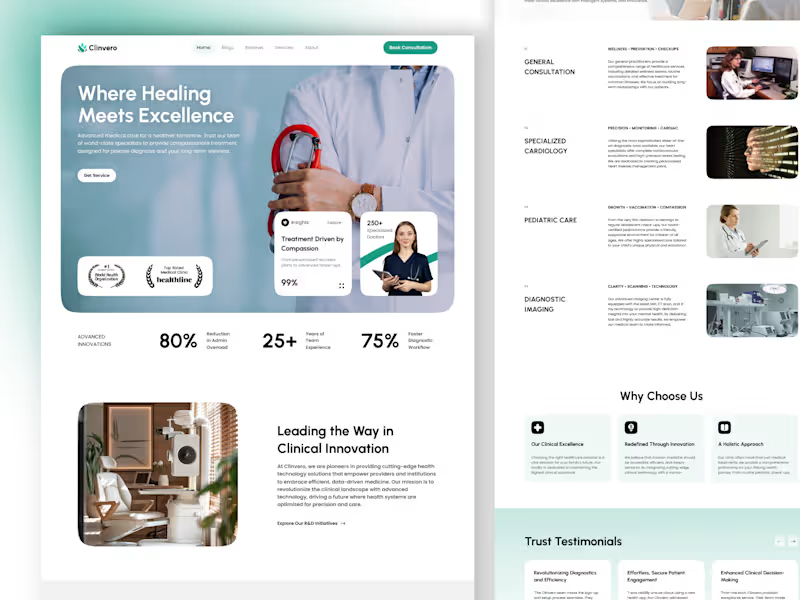
Clinvero Medical Website – Homepage UI Design
0
0
0
Genetica lab Logo animation video
0
0
0
Genetica lab Logo animation video
0
1
0
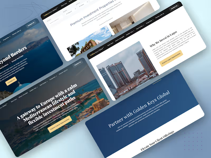
Golden Keys Global – Luxury Real Estate Platform
0
2
Brand Designer
(29)
Follow
Message
MD Abdul Alim
Kushtia, Bangladesh
Logo, Brand & Packaging Designer
25
Followers
Follow
Message
Logo, Brand & Packaging Designer
1
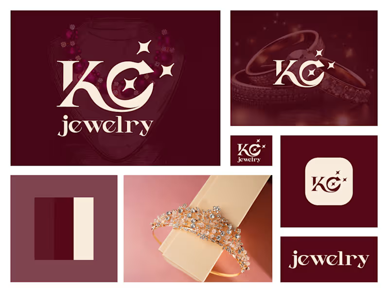
KC Letter Jewelry Logo Design - KC Brand Identity
1
82
2
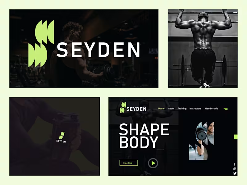
Seyden – Logo Mark & Brand Identity Design Seyden is a modern fitness brand focused on strength, discipline, and transformation. The goal was to create a bold, energetic identity that feels premium yet approachable. The abstract lime-green mark captures movement and power, while the clean sans-serif wordmark delivers confidence. A dark, high-contrast visual system paired with intense training imagery reinforces the “Shape Body” lifestyle across digital and physical touchpoints — from website and social to product applications like shaker bottles.
2
81
3
Ready to dominate? 👉 Say goodbye Unmemorable Logo, Branding, Social Media Post & Packaging Design Hello to memorable and Recognisable design!🌟 📩 Available for new projects
1
3
88
2
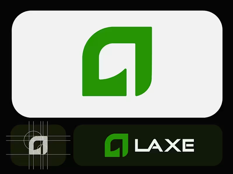
Laxe – Modern Minimalist Logo for an Axe & Tool Brand Crafted a bold yet refined logo for Laxe, a premium axe and outdoor tool brand. The abstract mark combines a strong "L" with a subtle blade-like curve, symbolizing precision, power, and craftsmanship.Clean geometric construction, balanced proportions, and a vibrant yet sophisticated green palette make it versatile across packaging, apparel, digital, and physical products. Focused on minimalism with just enough edge to feel tool-ready.Explored multiple color directions (deep green, red, inverted) before landing on this crisp light-background version for maximum adaptability. What do you think? ready for the workshop or still needs more bite? Ready to dominate? 👉 Say goodbye Unmemorable Logo, Branding, Social Media Post & Packaging Design Hello to memorable and Recognisable design!🌟 📩 Available for new projects
1
2
95
Brand Designer
(24)
Follow
Message
Md Ashraful Islam
Pabna, Bangladesh
Brand Identity and Logo Design Expert

Follow
Message
Brand Identity and Logo Design Expert
0
Splendor Comporta - Logo Project
0
9
0
MIDEAST SHIPPING - Brand Identity
0
3
0
Logo Designs
0
5
0
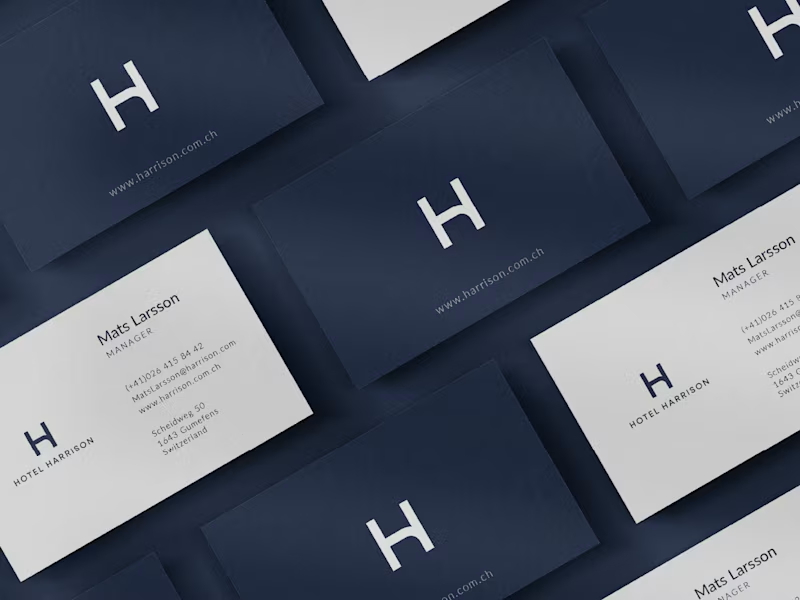
Hotel Harrison - Brand Identity
0
8
Brand Designer
(4)
Follow
Message
Abu Jaeed Khan
Pabna, Bangladesh
Visual/Graphic Designer
Follow
Message
Visual/Graphic Designer
0
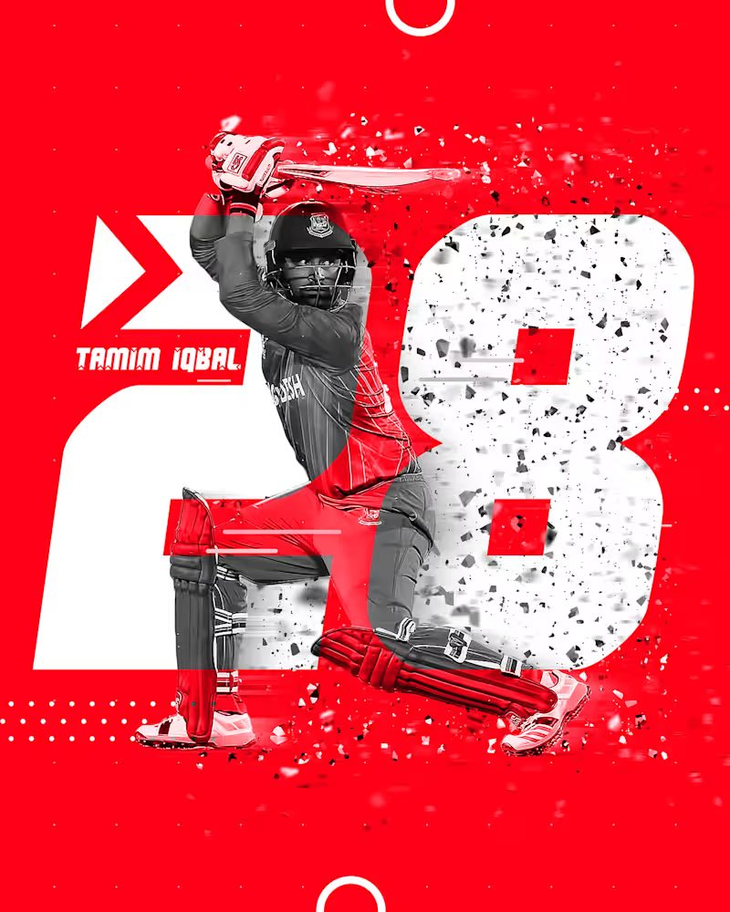
Poster of Tamim Iqbal
0
20
0
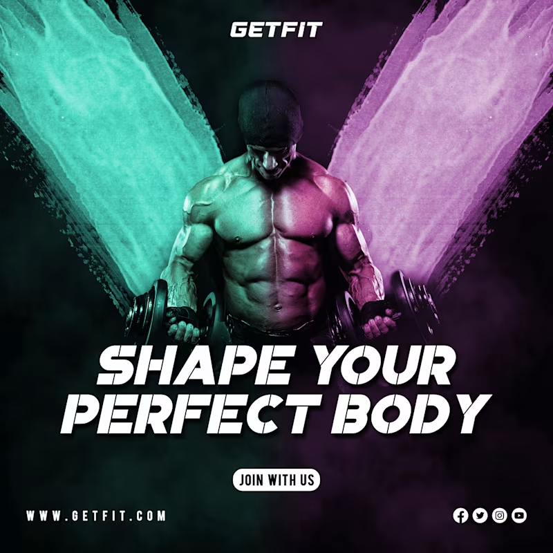
Gym Social Media Post
0
23
0
Logo for Women Luxury Brand
0
17
0
Logo for Skopeai
0
31
Brand Designer
(13)
Follow
Message
Jannatul Ferdous
Pabna, Bangladesh
Unique Brand & Book Illustrator with Passion
Follow
Message
Unique Brand & Book Illustrator with Passion
0
Book Cover Illustration :: Behance
0
24
0
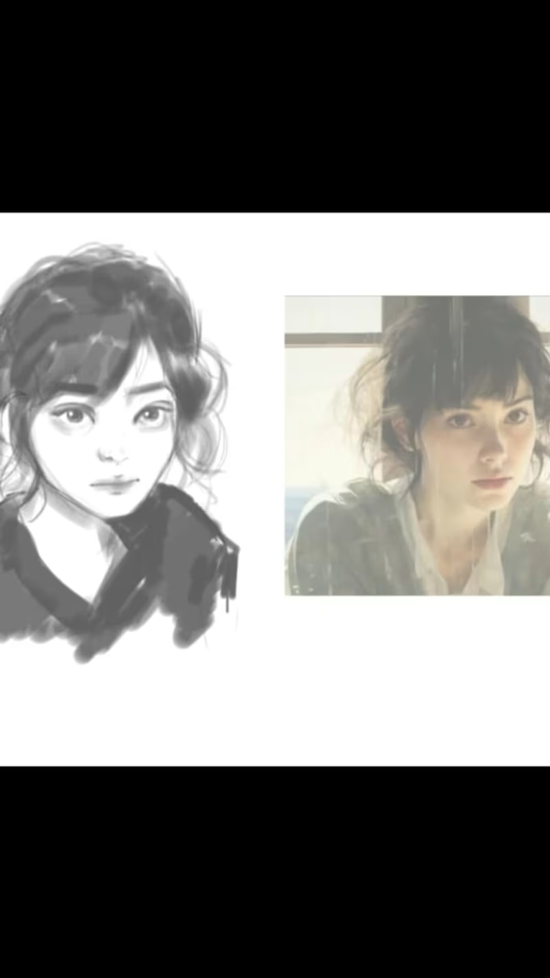
I will create a portrait from a reference
0
25
0
Logo Design :: Behance
0
24
View more →
Brand Designer
(1)
Follow
Message
Alex sabbir Bibard
Ishwardi, Bangladesh
Logo designer graphics designer video editor
Follow
Message
Logo designer graphics designer video editor
0
Design Creation with Canva
0
5
0
Company logo design
0
1
0
1. "Brand Marks: Crafting Identity Through Logo Design
0
3
View more →
Brand Designer
(1)
Follow
Message
Explore people