Expert Web & Software Developer, Graphic Designer
Expert Web & Software Developer, Graphic Designer


Experienced Product Designer and Framer Expert

Experienced Product Designer and Framer Expert

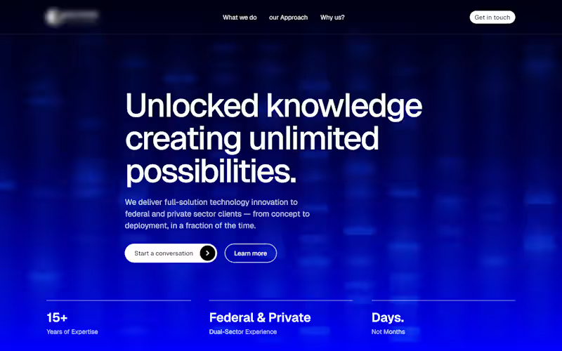
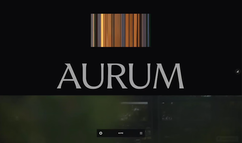
New template drop. And it's completely free for now.
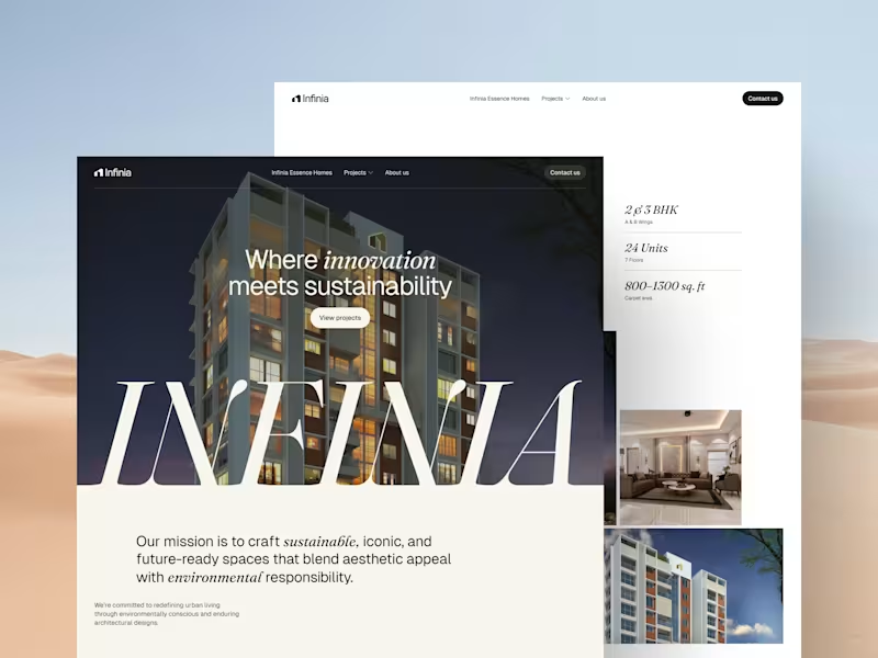
Aurum is live on the @Framer marketplace. Built for luxury real estate brokers who want a site that does the selling for them.
12 pages • Full CMS • Copy included • $0 right now.
Preview: https://diplomatic-play-827625.framer.app
(https://diplomatic-play-827625.framer.app)Comment "AURUM"
Repost
Follow me (I’ll DM you the link)
2
2
156

Brand Identity | Logos | Brand Guidelines | Art Director

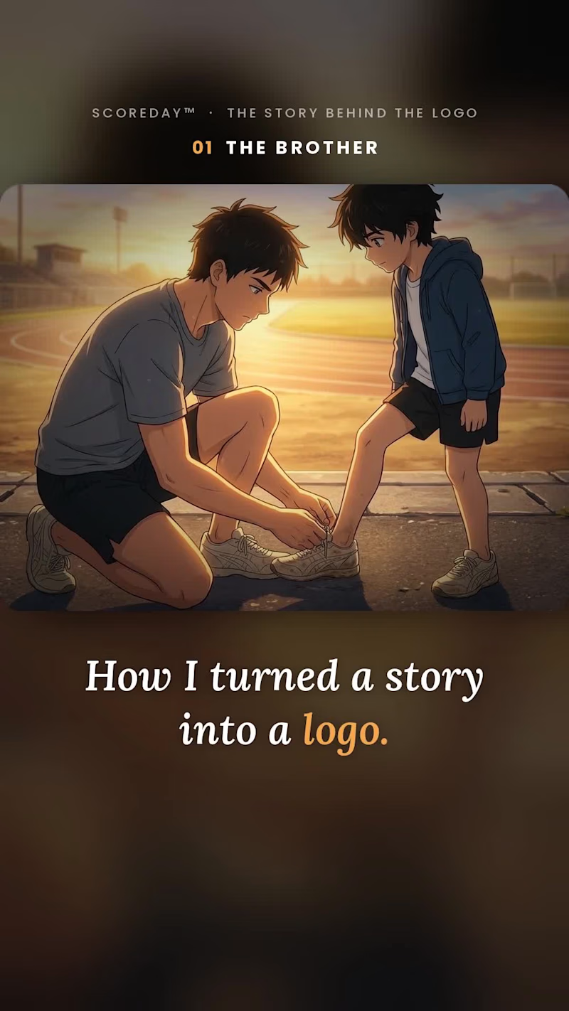
Most logos start with a mood board. Mine starts with a story.
I’m a narrative brand designer. I build brand identities out of a business’s real story: the experiences, turning points and moments that shaped it. That’s what makes the result unique and hard to copy.
To show how it works, I made an anime-style short film.
The story: a young runner, Ren, trains alone after his older brother falls short of their shared dream. He promises to finish the race for both of them.
The logo: two curved stripes on his shoes. Two paths, one finish line. That’s SCOREDAY.
What I did: wrote the story, developed the logo concept, directed the visuals (AI-generated, guided by me) and edited the film.
What it shows: a brand that comes from something real is easier to remember, easier to explain, and harder to imitate.
If you’re a founder or creator building a brand, I’d love to hear your story. What’s the moment your business started?
#BrandIdentity #BrandStrategy #Storytelling #LogoDesign #Branding
0
24
I didn't start this logo with a sketch. I started with a story.
Every business has something that makes it different. A defining moment, a personal experience, or a value that deserves to be remembered.
My process was to find that meaning and translate it into a logo that feels simple, distinctive, and timeless.
This animation shows how the story became the identity, from the original idea to the final mark.
That's what narrative brand identity design means to me: turning the meaning behind a business into something people can see.
I'm a narrative brand identity designer, working with businesses that want more than a logo.
Have a story worth building a brand around? Let's work together.
0
27

Social Media & Brand Designer|Framer Expert


Brand Identity & Visual Designer | AI-Powered Product Visual
Brand Identity & Visual Designer | AI-Powered Product Visual
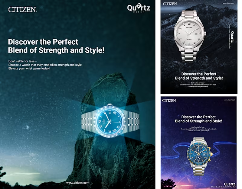
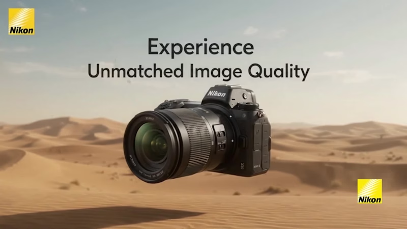
Nikon — Cinematic Commercial Campaign & Motion Design Showcase
Project Overview / Description:
Transforming Static Print & Outdoor Advertising into a Dynamic Cinematic Brand Experience
Is project mein Nikon Cameras & NIKKOR Lenses ke liye print aur digital outdoor banner campaign ko ek high-end cinematic motion video showcase mein transform kiya gaya hai.
Iska main goal static product posters ko dynamic storytelling mein badalna tha—jisme subtle camera parallax, organic lens flare sweeps, floating atmospheric particles aur kinetic typography ke zariye product ki premium optical quality ko highlight kiya gaya hai.
Key Highlights of the Project:
Visual Direction & Atmosphere: Harsh desert environments, scenic mountains aur rugged outdoor textures ke sath dark, premium camera aesthetics ko seamlessly merge kiya gaya.
Cinematic Parallax & Motion: Static posters ko multi-layer depth di gayi—background landscape ko soft horizontal drift diya gaya jabki camera body sharp aur stable 3D floating effect ke sath focus mein rehti hai.
Optical VFX & Lighting: Realistic lens flare reflections jo aperture glass par sweep karti hain, subtle lighting pulses aur fine dust/smoke particles animate kiye gaye jo scene ke realism ko badhate hain.
Typography & Layout Integrity: Nikon ki iconic typography, bold headlines aur "At the heart of the image" tagline ko bina kisi distortion ke smooth staggered fade-in animations ke sath screen par lock kiya gaya.
My Role in this Project:
Art Direction & Campaign Storyboarding
Advertising Poster & Layout Design
2.5D Parallax Animation & Motion Graphics
Lighting Effects, Optical Lens Flares & Sound Sync
Deliverables:
Cinematic Commercial Video (High-Retention Reel & Ad Format)
High-Resolution Marketing Banners & Product Callouts
Multi-Format Visual Assets for Social & Web Campaigns
2
1
249
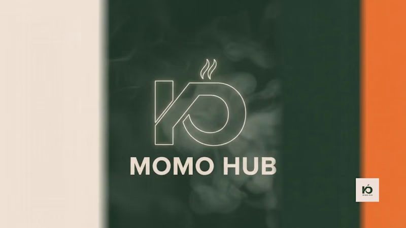
KD Momo Hub — Brand Identity & Motion Showcase (Client Project)
Project Overview / Caption:
Bringing a Modern Street-Food Brand to Life: Brand Identity & Cinematic Presentation for KD Momo Hub
Here is a 30-second cinematic brand presentation reel created for KD Momo Hub, a contemporary street-food and dumpling brand.
As part of this complete brand design project, the client wanted a visual identity that felt youthful, premium, and authentic—breaking away from generic fast-food aesthetics.
Key Highlights of the Project:
Visual Identity & Logo Design: Crafted a minimalist monogram combining the letters "K" & "D" with rising steam geometry, paired with clean typography.
Palette & Tone: Designed a fresh, warm color scheme (Cream, Forest Green, and Energetic Orange) reflecting organic warmth and vibrancy.
Packaging & Collateral: Developed sustainable packaging mockups, patterns, takeaway wraps, and ambient signage.
Motion & Presentation: Scripted, art-directed, and rendered this cinematic motion video to showcase real-world brand applications—from macro food textures to stadium lightbox activations.
My Role in this Project:
Brand Identity & Logo Design
Packaging & Merchandising Layouts
Motion Graphics & Cinematic Brand Presentation (3D/Video)
Art Direction & Storyboarding
0
159
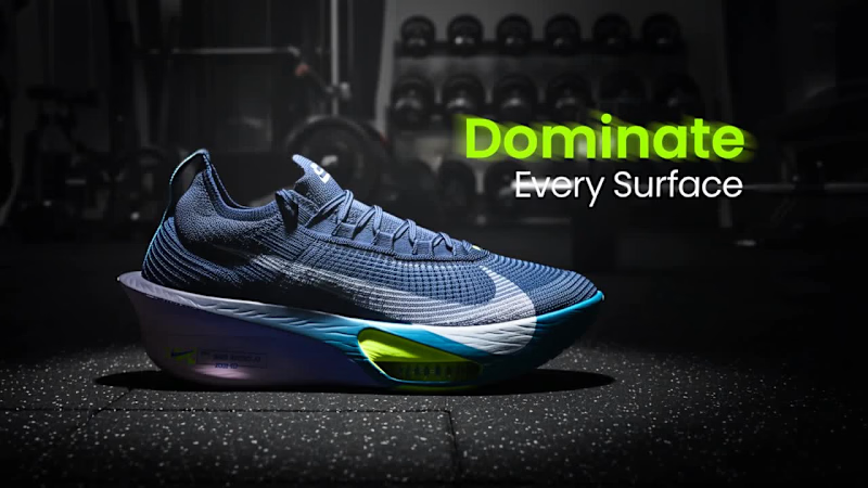
Nike Air Zoom Alpha fly NEXT% 3 — Commercial Film & Visual Design Process
This project explores the intersection of high-performance footwear engineering and dynamic cinematic storytelling. Designed for the Nike Air Zoom Alphafly NEXT% 3, the creative direction focuses on communicating raw propulsion, energy return, and lightweight stability through kinetic motion and macro texturing.
Design & Creative Process:
1. Research & Creative Direction:
Analyzed modern competitive running aesthetics to craft a dark, futuristic sports-tech visual language.
Selected a high-contrast color scheme: deep midnight navy and carbon black, accented with electric blue and pulsing neon lime-green highlights.
2. Storyboarding & Motion Rhythm:
Structured an escalating visual pace: transitioning from brooding studio push-ins to golden-hour stadium tracking, followed by explosive ground impacts.
Synced scene changes and camera orbital arcs to an aggressive, driving electronic cadence to amplify perceived velocity.
3. Feature Visualization & Macro Texturing:
Forefoot Air Pods: Designed soft glowing pulses to visualize real-time air compression and responsiveness.
Rocker Geometry: Animated dynamic callout arcs and glowing vector guides to highlight curved sole mechanics.
AtomKnit Upper: Integrated luminous cyan wind-streak lines across the fabric mesh to communicate active airflow and ultralight construction.
4. Kinetic Typography & Brand Integration:
Implemented bold, condensed athletic typography ("Dominate Every Surface", "Speed That Leaves Everyone Behind") paired with clean data callouts.
Preserved official brand assets, culminating in a balanced lockup featuring the iconic Swoosh and "Just Do It" tagline.
Core Responsibilities:
Visual Campaign Concept & Storyboarding
3D Motion Graphics & Spatial Lighting
Macro Material Shading & Particle Simulation
Kinetic Typography & Final Color Grading
Deliverables:
30-Second 4K Cinematic Commercial Film
High-Resolution Marketing Stills & Hero Feature Callouts
Social Media Aspect Ratio Adaptations (16:9 & 9:16)
7
8
1.8K

2D/3D Animation | Modeling | UI/UX Design
2D/3D Animation | Modeling | UI/UX Design


Expert Graphic & Logo Designer 🎨
Expert Graphic & Logo Designer 🎨