Freelancers using LearnDash in Ibadan
Sign Up
Post a job
Sign Up
Log In
Filters
2
Projects
People
Eniola A. Kajabi 🕊
Ibadan, Nigeria
Vetted Kajabi Expert for Coaches, Doctors & Course Creators
5.0
Rating
289
Followers
Follow
Message
Vetted Kajabi Expert for Coaches, Doctors & Course Creators
1
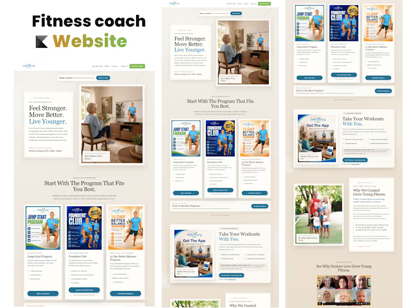
Kajabi Online Fitness Website Design for Grow Young Fitness
1
1
4
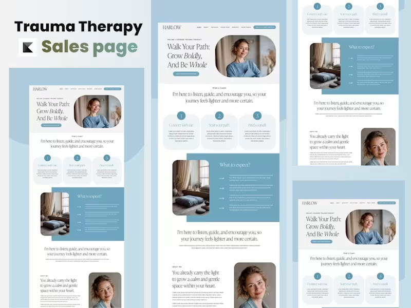
Trauma Therapy Sales Page Design | Kajabi Website Project Project Overview This project involved designing and building a high-converting trauma therapy sales page in Kajabi for a therapist focused on helping individuals heal from emotional trauma, anxiety, and past experiences. The goal was to create a calming, trustworthy, and conversion-focused experience that would encourage visitors to book therapy sessions or enroll in healing programs. The Challenge : The client needed more than just a visually appealing page—they needed a space where potential clients could immediately feel safe, understood, and confident enough to take the next step. The existing content lacked emotional connection, clear messaging, and a structured user journey that guided visitors toward booking a consultation. My Process : I began by understanding the therapist's brand, target audience, and treatment approach. From there, I planned a user-friendly page structure that balanced empathy with strategic conversion principles. The project included: - Designing a clean and calming layout within Kajabi - Creating a clear content hierarchy for better readability - Organizing sections to guide visitors through their healing journey - Designing compelling call-to-action sections to increase appointment bookings - Optimizing typography, spacing, and visual elements for accessibility and trust - Ensuring the page was fully responsive across desktop, tablet, and mobile devices - Implementing the complete design directly inside Kajabi The Solution🔥 The finished sales page provides visitors with a seamless experience—from understanding the therapist's mission to learning about available services and confidently taking action. Every section was intentionally designed to reduce overwhelm, build credibility, and create an emotional connection while maintaining a professional and welcoming aesthetic. Project Outcome : The final result is a modern, conversion-focused Kajabi sales page that reflects the therapist's compassionate brand and supports business growth through strategic design. The project demonstrates my ability to combine thoughtful user experience, persuasive page structure, and Kajabi expertise to create websites that are both beautiful and effective. Services Provided 🚀 ✅ Kajabi Sales Page Design ✅ Landing Page Development ✅ UX/UI Design ✅ Conversion-Focused Layout ✅ Mobile Responsive Design ✅ Brand-Aligned Visual Design ✅ CTA Strategy & Implementation ✅ Kajabi Page Builder Customization
4
649
6
I’m Yiśr āʾēl , an email marketing retention manager who helps both small, large scale business owners and even founders to not only increasing conversions but convert ONE -TIME customers to a real occurring client for a long period. Feel free to reach out to me either Via Contact or Hire Button. Let's get started today Best Regards .
6
1.7K
7
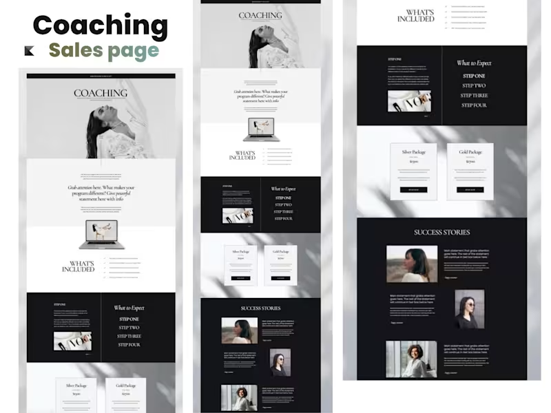
Kajabi Coaching Sales Page From Strategy to Conversion-Ready Launch The Starting Point The project started with a coaching brand that needed a professional sales page to clearly communicate its offer, build trust, and guide potential clients toward taking action. The existing presentation lacked a strong visual hierarchy and a clear conversion-focused structure, making it difficult for visitors to quickly understand the coaching offer and its value. The Approach I began by mapping out the customer journey and organizing the page around the key questions a potential client would have: What is the offer? Who is it for? Why should I trust this coach? What will I get? And what should I do next? From there, I developed the page structure, refined the messaging hierarchy, and created a clean visual direction designed specifically for a coaching audience. The page was then built in Kajabi, bringing the strategy and design together into a responsive, easy-to-navigate sales experience. What I Worked On - Kajabi sales page design and development - Coaching offer positioning and page structure - Conversion-focused section layout - Hero section and CTA strategy - Offer and benefits presentation - Social proof and testimonial sections - FAQ and objection-handling sections - Responsive desktop and mobile layout - Visual hierarchy and brand consistency - Final page optimization and launch preparation The Finish The final result was a polished, conversion-focused Kajabi coaching sales page that gives the brand a stronger digital presence while making the offer easier to understand and act on. The finished page combines strategy, branding, UX, and Kajabi development into one cohesive experience — designed not just to look professional, but to move visitors from interest → trust → action. Project Outcome A complete coaching sales page transformed from an initial concept into a professional, structured, and launch-ready Kajabi experience.
2
7
1.2K
LearnDash
(2)
Follow
Message
Jamiu Abdulhameed
Ibadan, Nigeria
Helping founders build modern websites that convert
Follow
Message
Helping founders build modern websites that convert
1
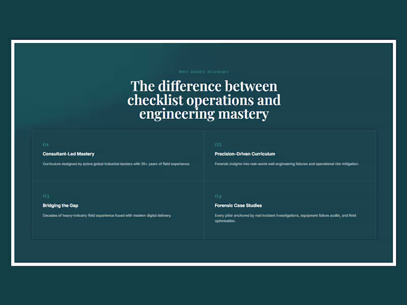
WordPress Website Design for Danec Academy
1
4
0
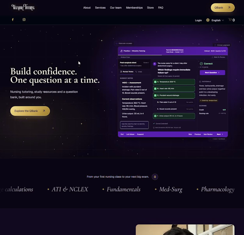
Wizardry Tutoring Website Redesign and QBank Integration
0
0
0
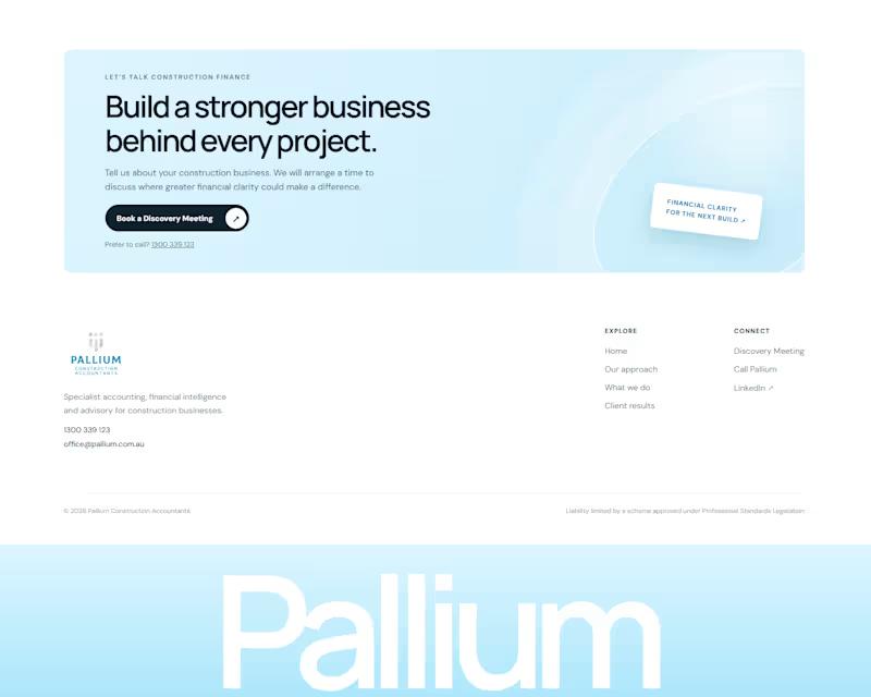
A modern website redesign for Pallium Construction Accountants, an Australian accounting and financial advisory firm specialising in the construction industry. The new homepage positions Pallium as a premium partner for builders, civil contractors, major trade contractors and property developers seeking stronger cash flow, profitability and financial control. THE CHALLENGE Pallium Construction Accountants had strong industry expertise, measurable client results and a valuable position as a specialist construction accounting firm. However, the existing website did not communicate these strengths clearly. The website focused heavily on general accounting challenges without presenting Pallium as a modern financial intelligence and business advisory firm. Its services, client outcomes and construction expertise were not organised into a clear conversion journey. The homepage also lacked a strong primary call to action, dedicated service explanations, prominent case studies and a clear process showing prospective clients what to expect. The challenge was to redesign the Pallium website so established construction businesses could immediately understand who Pallium serves, how the firm helps and why it is different from a general accounting practice. THE APPROACH I began with a comprehensive audit of the existing Pallium website, reviewing its content, structure, user experience, positioning, search visibility and conversion opportunities. The homepage was then restructured around Pallium’s ideal clients and the financial challenges they face. The new content speaks directly to builders, civil contractors, major trade contractors and property developers. The redesigned homepage follows a clear journey: Introduce Pallium as a specialist construction accounting and advisory firm Explain the financial challenges construction businesses experience Present Pallium’s accounting and advisory services Demonstrate results through real client success stories Explain Pallium’s working process Build trust through testimonials and industry focused messaging Encourage qualified prospects to book a Discovery Meeting The visual direction combines Pallium’s existing brand colour and official logo with a clean, modern layout inspired by premium financial advisory firms. Construction imagery, financial dashboard elements, subtle animations and continuous content marquees were added to make the homepage feel professional, relevant and engaging. The website copy was also optimized around relevant search terms such as construction accountants, accountants for builders, construction financial advisory, construction cash flow management, project profitability and accounting for property developers. THE OUTCOME The completed homepage concept gives Pallium a stronger and more modern digital presence that reflects the quality of its expertise. Visitors can now quickly understand that Pallium goes beyond tax returns and compliance. The website clearly presents the firm as a construction accounting, financial intelligence and business advisory partner focused on improving cash flow, project performance, profitability, tax planning and financial control. Real client outcomes are now presented as prominent case studies, including business growth, improved project visibility and significant labour cost savings. The redesigned homepage also provides a clearer conversion path through repeated Discovery Meeting calls to action, focused service descriptions and a responsive experience across desktop, tablet and mobile devices. The result is a premium construction accounting website designed to attract established construction businesses, strengthen trust and turn more qualified visitors into enquiries. “Jamiu understood the direction we wanted for Pallium and translated it into a modern website that clearly communicates our construction expertise. The new design presents our services, client results and advisory approach in a much stronger and more professional way.” Pallium Construction Accountants Website Redesign Team
0
43
1
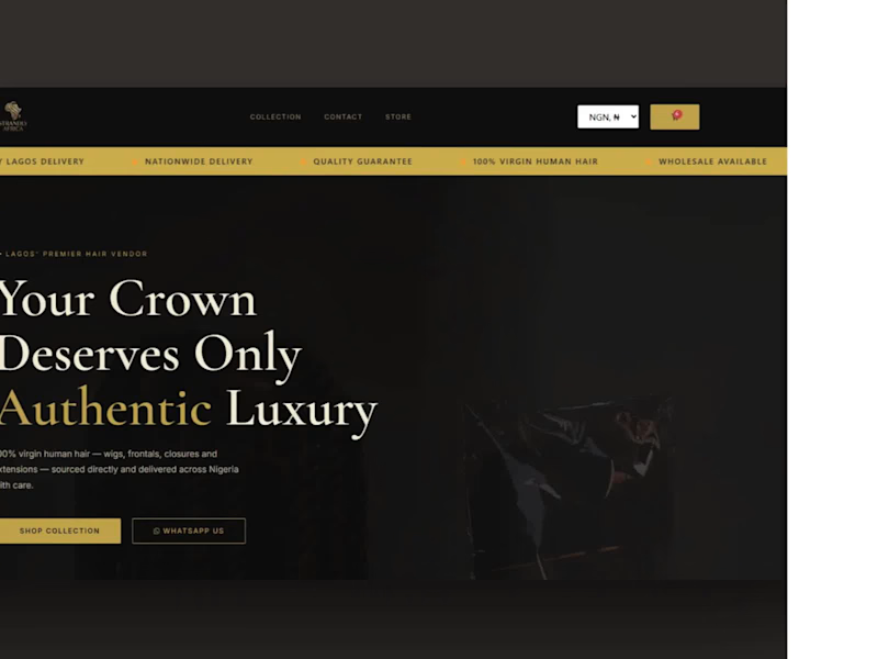
A luxury hair e-commerce platform built to turn Lagos beauty shoppers into repeat customers — with the storefront speed, checkout reliability, and search visibility to back it up. The Challenge: Strandly Africa sells premium hair to a Lagos audience that expects a luxury shopping experience but the brand needed a storefront that could actually carry that positioning: real photography that loads fast, checkout that never drops a transaction, and a foundation search engines could find the brand through in the first place. The brief: build a production-ready WooCommerce store that looks and feels premium, handles payment at scale without failure, and is structured from day one to rank. The Approach: We designed the storefront around an obsidian black and gold system- a palette chosen to read as luxury rather than generic e-commerce; with CSS fallbacks built in so the premium feel holds up even as real product photography loads across varying connections. Every template, from product pages to cart, was built production-ready rather than templated-and-tweaked, using an Estelle-based reference as the design foundation. On the infrastructure side, we solved a harder problem than most storefronts face: routing Paystack payments across multiple sites through a central relay endpoint, with metadata tagging so every transaction could be traced back to its true origin. In parallel, we built out the site’s SEO foundation, keyphrase strategy and Rank Math implementation, so the store wasn’t just launch-ready, but discovery-ready. The Outcome: Strandly Africa launched as a fully production e-commerce platform: fast, on-brand, and built to convert with SEO groundwork in place to keep bringing shoppers in beyond launch day. “I’ve worked with developers before who just handed over a template. AlphaGen actually understood what luxury means for a hair brand, down to the payment system working flawlessly. This is the site I wanted from day one.” Strandly Africa Team
1
1
160
LearnDash
(1)
Follow
Message
Explore people