Freelance Product Data Analysts in Hyderabad
Freelance Product Data Analysts in Hyderabad
Sign Up
Post a job
Sign Up
Log In
Filters
2
Projects
People
Geethasree Naguboina
pro
Hyderabad, India
Excel & KPI Dashboards for Small Business Decisions
93
Followers
Follow
Message
Excel & KPI Dashboards for Small Business Decisions
8
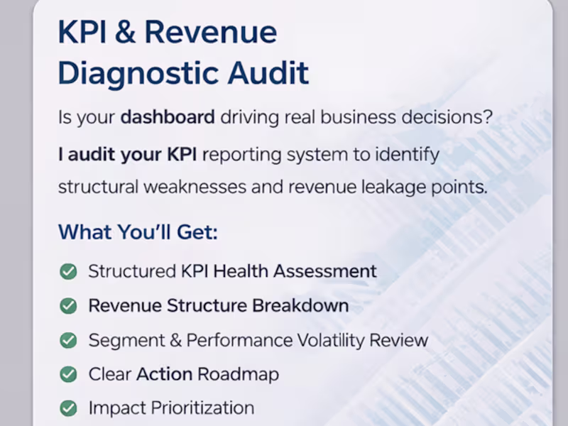
Most dashboards don’t have a visualization problem. They have a KPI problem. I’ve reviewed dozens of reporting systems recently and the pattern is consistent: Metrics are defined differently across sheets “Revenue” means one thing in finance and another in marketing KPIs are tracked… but not tied to decisions Dashboards look clean but don’t answer operational questions When metric logic isn’t aligned, teams don’t have a data problem. They have a decision problem. That’s why I’ve started offering a structured KPI & Revenue Diagnostic Audit — focused on: • Metric consistency • Reporting logic • Revenue driver alignment • Decision-readiness If you're building dashboards or scaling reporting systems, this layer matters more than design.
8
8
315
2
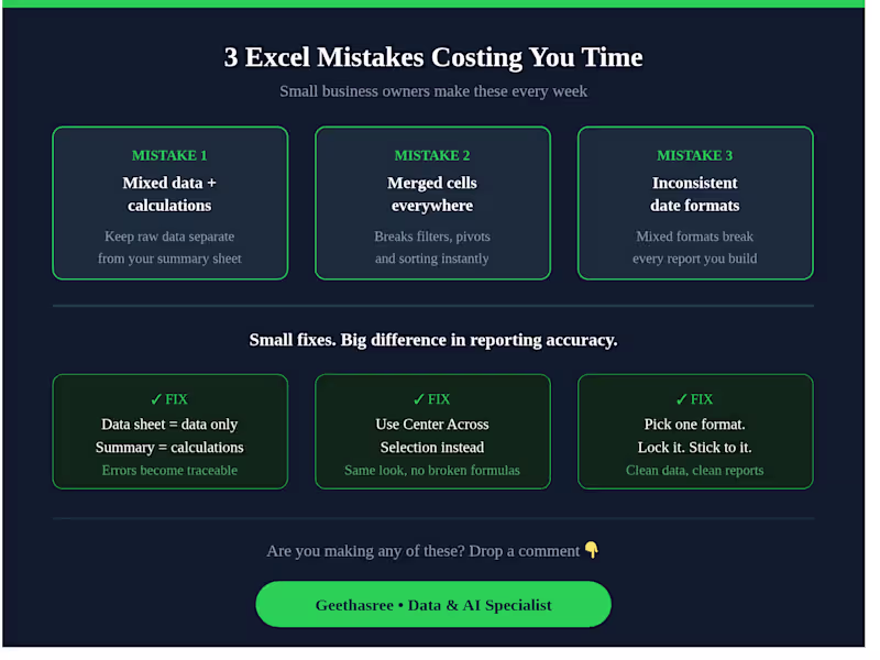
3 Excel mistakes I see small business owners make every week 👇 Mixing raw data with calculations in the same sheet — your data sheet should only have data. Calculations go in a separate summary sheet. Using merged cells everywhere — they break filters, pivot tables, and sorting. Use "Center Across Selection" instead. No consistent date format — mixed formats break every report you build. Pick one and lock it. Small fixes. Big difference in your reporting accuracy. Are you making any of these? Drop a comment 👇
2
129
5
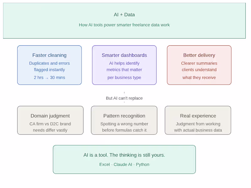
I used to spend hours cleaning messy Excel files manually. Now? I use AI tools to cut that time in half — and deliver better results to my clients. Here's how AI has changed my freelance data workflow: 🔹 Faster data cleaning Instead of manually hunting for duplicates and formatting errors, I use AI to flag inconsistencies instantly. What used to take 2 hours now takes 30 minutes. 🔹 Smarter dashboard structure Before building any dashboard, I use AI to help me think through what metrics actually matter for that specific business — not just what looks good. 🔹 Better client communication I use AI to help me write clearer project summaries and delivery notes — so clients understand exactly what they're getting and why it matters. But here's what AI can't replace: ✔ Understanding what a CA firm actually needs vs what a D2C brand needs ✔ Knowing when a number looks wrong before the formula catches it ✔ The judgment that comes from actually working with real business data AI is a tool. The thinking is still yours. If you're a small business owner or CA firm drowning in Excel data — I can help you turn it into something you can actually use. DM me or check my portfolio 👇 geethasree-data-support-cr241o7.gamma.site (http://geethasree-data-support-cr241o7.gamma.site)
3
5
350
2
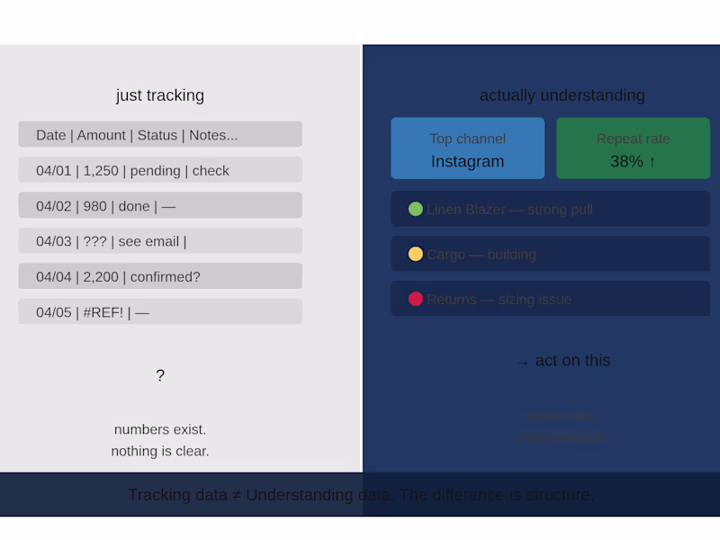
Title: The difference between tracking data and understanding it Most businesses are tracking data. Very few are understanding it. There is a difference — and it shows up in how decisions get made. Tracking data means you have numbers somewhere. A spreadsheet updated every week. A report sent every month. An export sitting in someone's downloads folder. Understanding data means those numbers tell you something specific. This channel is growing. This SKU is draining margin. This client segment is not renewing. Something you can act on before it becomes a problem. The gap between the two is almost never about having more data. It is about structure. Unstructured data gives you a feeling that things are being measured. Structured data gives you a direction. I work with founders and business owners who have plenty of the first and very little of the second. The fix is usually simpler than they expect — not a new software, not a bigger team. Just a cleaner system around the data they already have. If your numbers are being tracked but not really being used — that is the gap worth closing first.
2
159
Product Data Analyst
(1)
Follow
Message
Vikas Devarakonda
Hyderabad, India
Fast & Precise 3D Design & Copywriting
Follow
Message
Fast & Precise 3D Design & Copywriting
0
Designing and Architecture.
0
0
0
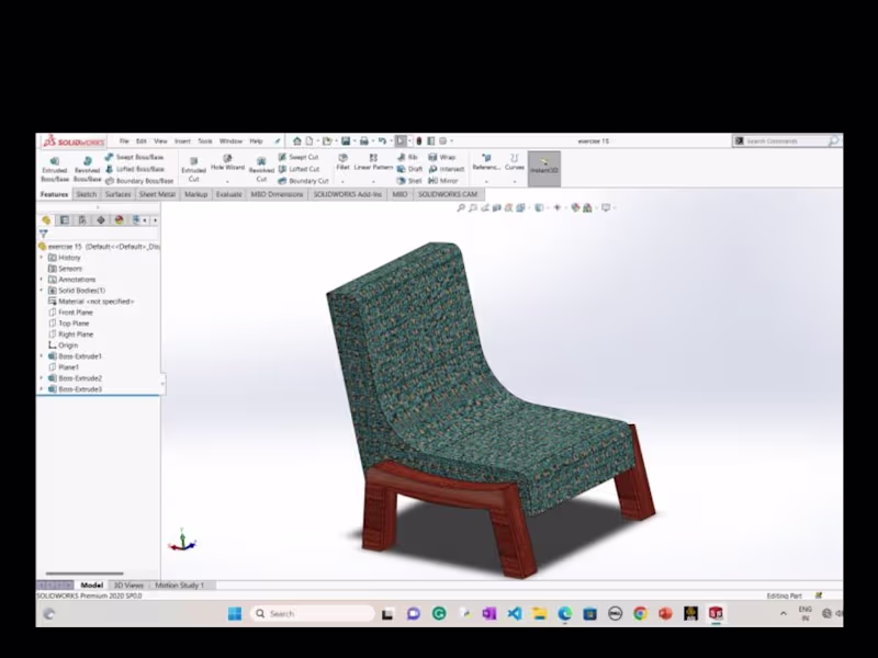
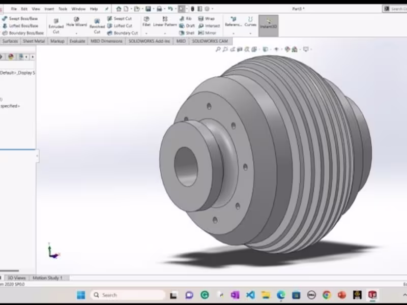
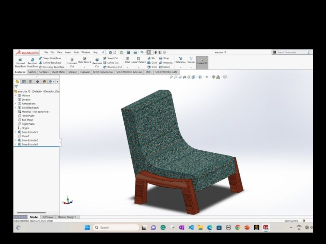
Designing using solid works
0
1
0
Website
0
1
View more →
Product Data Analyst
(1)
Follow
Message
Explore people