Projects using Adobe After Effects in HelmondProjects using Adobe After Effects in HelmondHappy Horizon is a creative marketing company operating across multiple strategic business pillars. One of these pillars focuses on Development & Technology, addressing complex digital challenges through innovation, engineering and scalable solutions. To communicate this expertise within a live event setting, Happy Horizon commissioned the creation of a dedicated showreel.
Brief & Strategic Challenge
The objective of the project was to develop a concise yet expressive showreel that would promote the Development & Technology pillar within a limited runtime of 1 minute and 10 seconds. The animation was intended for continuous playback on a large-scale LED screen (5 × 3 metres) as part of a branded event stand. As audio could not be relied upon in this environment, the narrative needed to be fully comprehensible without sound; placing a strong emphasis on visual clarity, rhythm and hierarchy.
Concept Development & Script Structuring
The process began with a collaborative brainstorming session alongside the marketing team. Together, we defined the core narrative and messaging framework of the showreel. Based on this session, a high-level script structure was shaped and subsequently finalized. This phase marked the primary point of collaboration within the project.
Visual Translation & Storyboarding
Following script approval, the responsibility for translating the narrative into a visual language lay entirely with me. I developed a dedicated sub-style that aligned with Happy Horizon’s existing brand identity while distinctly supporting the Development & Technology pillar. This included the full visual concept, compositional logic and a detailed storyboard that defined sequencing, rhythm and visual hierarchy throughout the showreel.
Animation & Final Production
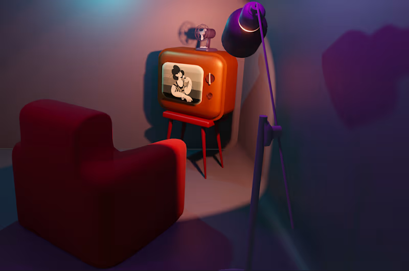
Based on the approved storyboard, I started animating the complete showreel. The animation focuses on dynamic motion, fluid transitions and carefully structured compositions to express guidance, progress and technological clarity. Through abstract visual metaphors and directional movement, the showreel positions Happy Horizon as a partner capable of navigating complexity and creating a clear horizon for its clients. The final result functions as both an aesthetic statement and a highly legible brand asset optimized for repeated, soundless viewing. Remedica is a health-education organization dedicated to delivering scientifically grounded, accessible and empathetic guidance across a diverse healthcare landscape. Following an in-depth strategic session with the founders, I was commissioned to develop a renewed brand identity, a certification mark, and an extensive suite of communication assets. This included materials for digital channels, print applications and a dedicated event campaign celebrating Remedica’s 40-year anniversary. The new identity needed to express reliability, clarity and warmth; while establishing a distinctive presence within an increasingly homogenized healthcare sector.
Strategic Foundation
Audience and value mapping revealed five core brand pillars. Together they form the brand’s narrative, its visual language and its behavioral cues.
- Guidance
Helping people navigate an increasingly complex healthcare system.
- Inspiration Across Generations
Encouraging informed decision-making for all ages.
- Operational Relief
Supporting healthcare professionals by taking over the educational burden.
- Reliable Product Recommendations
Transparent, evidence-based curation supported by a proprietary certification mark.
- Scientific Integrity
Every piece of communication is validated by domain experts and current research.
Audience Architecture
Remedica serves three interconnected audiences: commissioning parties (B2B), intermediary professionals (B2P), and the general public (B2C).
A comprehensive audience architecture was developed to understand the full spectrum of Remedica’s stakeholders. Through qualitative analysis, behavioral mapping and value-based segmentation, each audience group was examined in detail: their motivations, expectations, pain points, and communication preferences. This included healthcare professionals, patients and caregivers, corporate partners, and the broader public seeking trustworthy medical information.
By identifying what resonates with each group — and equally, what disengages them — clear behavioral patterns and emotional drivers emerged. From this, I distilled the shared denominators across all segments: a need for clarity without oversimplification, authority without arrogance, accessibility without losing scientific rigour, and emotional reassurance grounded in factual accuracy.
This cross-audience overlap formed the strategic backbone of the identity. It ensured that the visual and verbal system could flex across diverse contexts while maintaining a consistent sense of trust, empathy and expertise.
Market Positioning
The healthcare communication sector is dominated by rounded forms, soft pastels and predictable blue–pink palettes. While accessible, these styles often blend into one another, making visual distinction increasingly difficult.
Recognizing this saturation created a strategic opening for Remedica: an identity that preserves the trustworthiness expected within healthcare, yet advances it through a more contemporary and human-centered expression. The resulting positioning balances scientific rigour with empathy, allowing the brand to stand apart without stepping outside the boundaries of credibility within the healthcare industry.
Visual identity System
The final colour palette was constructed around a refreshed version of Remedica’s existing skin-tone hue, previously too muted to stand out. This updated Human Tint became the emotional cornerstone of the palette: warm, inclusive and grounded in Remedica’s personal approach. Around this tint, I developed a set of interlocking colors with distinct functional and symbolic roles.
The photography framework is built around three complementary pillars that together express Remedica’s human-centered philosophy. Imagery of healthcare specialists is captured in authentic working environments, using clean compositions and gentle depth of field to convey warmth, expertise and approachability. A second pillar focuses on workshops, emphasising participation and real interaction through dynamic angles and atmospheric depth, resulting in visuals that feel lived-in rather than staged. The product-focused imagery situates certified items in realistic, human contexts, using soft lighting and warm tones to communicate care, quality and trust across audiences.
The typographic system pairs a modern, highly legible sans serif for body copy with a bold, contemporary display type for titles and statements. The primary typeface offers clarity, balance and a subtly human warmth, ensuring readability across both digital and printed educational materials. The secondary typeface introduces confident geometry softened by rounded details, projecting authority without harshness. Together, they form a cohesive hierarchy that reinforces Remedica’s commitment to professionalism, accessibility and human-centered communication.
Behavioral & Psychological Foundations
The redesign is grounded in behavioral and psychological principles that influence how audiences process healthcare information. By establishing consistency in tone, form and narrative structure, the identity creates a stable cognitive environment—one in which users can intuitively recognize expertise and feel supported by it.
Drawing on research into patient perception, professional trust-building and educational communication, the system employs deliberate sensory cues: softened geometric forms to reduce perceived rigidity, human-centered colour values to signal empathy, and documentary-style photography to reinforce authenticity and credibility.
Together, these elements construct a visual language that is not only aesthetically cohesive but psychologically attuned—evoking reliability, warmth and professional assurance across all audience groups.
Outcome
The resulting rebrand positions Remedica as a credible, contemporary and empathetic authority within the healthcare education landscape. The identity reinforces confidence among major pharmaceutical partners, supports healthcare professionals in their day-to-day practice, and makes health information more accessible for the general public; without compromising scientific integrity. Organon is a global healthcare company with a strong focus on women’s health. One of its flagship public-facing initiatives is Anticonceptie.nl (http://Anticonceptie.nl), the Netherlands’ most widely consulted online platform for information on contraception. The platform functions as an authoritative and accessible resource, offering evidence-based guidance on contraceptive methods, effectiveness, side effects and decision-making support.
Scope & Roll
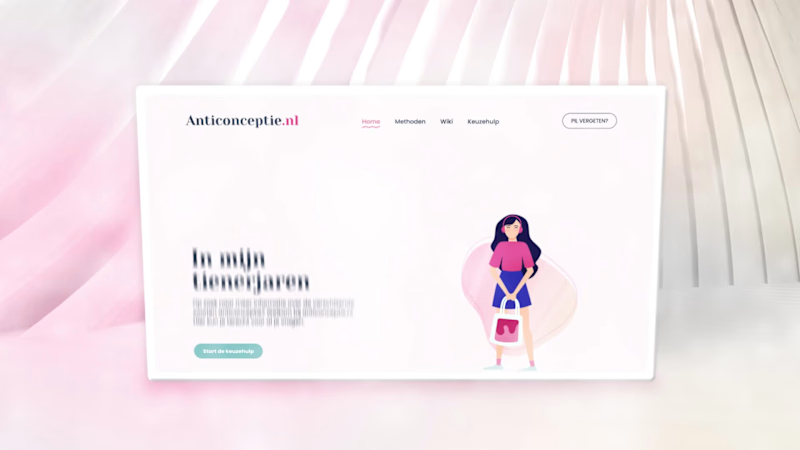
For the redesign of Anticonceptie.nl (http://Anticonceptie.nl), Organon commissioned Happy horizon to develop a completely renewed website, including its visual identity and digital experience. Within this multidisciplinary team, my role was to translate complex medical and educational content into a coherent visual language through illustration and animation.
Visual System & Motion Design
The illustrations were developed to clarify and humanize a wide range of sensitive and information-dense topics across the platform. Following positive client feedback on the static visuals, I proposed extending the system into motion by introducing short, looping animations. This approach was adopted across the site, allowing all illustrations to be animated in a subtle and functional manner. The resulting motion design enhances comprehension, adds rhythm to the interface and contributes to a more engaging, contemporary user experience without detracting from the platform’s informational credibility.