
Over the past four years, I've designed high-performing social media creatives across real estate, fintech, and financial services. My work combines brand consistency, audience psychology, and performance-focused design to create visuals that drive engagement, awareness, and conversions. This collection showcases promotional campaigns, educational content, trend-based marketing, and interactive social media creatives developed for brands including Deep Builders, Rising Capital Group, and PSB Loans in 59 Minutes.
0
148




A high-impact visual concept built to cut through the noise.
We designed this series to show how tension, energy, and sharp storytelling can lift an awareness message into something that actually sticks. The framing, expressions, and motion cues all work together to reinforce the idea of a scrambled signal and the urgency behind it. It’s built to help campaigns hit harder and communicate with clarity.
If you want visuals that challenge, provoke, and deliver a stronger message across your channels, we can support that direction.
Let’s shape your next campaign.
hola.monkix@gmail.com
(mailto:hola.monkix@gmail.com)monkix.in
(http://monkix.in)Start your project🚀
4
209


School Brand Campaign - Creative Direction & Visual Design
A premium visual campaign created for a modern school brand, combining cinematic photography, editorial typography, and thoughtful visual storytelling.
The concept focuses on themes of learning, character, curiosity, community, and a brighter future, transforming everyday school environments into aspirational brand moments.
From staircase metaphors and classroom details to bold architectural typography, each composition was designed to feel polished, contemporary, and emotionally engaging while maintaining a consistent visual identity.
Services: Art Direction · Graphic Design · Visual Storytelling · Typography · AI-Assisted Creative · Campaign Design
Concept: More Than a School. A Brighter Tomorrow.
0
103
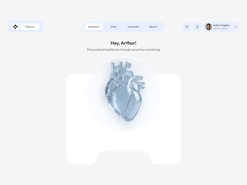
Clinora — Rethinking the Healthcare Dashboard Experience
How can complex health information feel simpler, clearer, and more engaging?
Introducing Clinora, a healthcare dashboard UI concept focused on presenting health metrics through a clean, organized, and visually engaging interface.
Design highlights
• Health monitoring dashboard with organized metric cards
• Heart rate, blood pressure, and blood sugar indicators
• Prescription reminders and consultation scheduling
• 3D anatomical visuals to create a more engaging experience
• Soft blue tones, clear information hierarchy, and consistent UI component.
My goal with this concept was to explore how thoughtful UI/UX design can make health information easier to navigate while maintaining a modern, approachable visual language.
What would you improve first in this dashboard: information hierarchy, data visualization, or navigation?
#Ui design #Ux design #Healthcare design #Dashboard design #Product design #Figma
4
6
550


