Packaging Design Projects in Groningen
Packaging Design Projects in Groningen
Sign Up
Post a job
Sign Up
Log In
Filters
2
Projects
People
Message
1
May | Brand designer & strategist
pro
Karmae — Fragrance Brand Identity & Packaging
1
18
Message
3
Gert van Duinen
pro
Liquid Special K - Logomark & Packaging
3
61
Message
25
May | Brand designer & strategist
pro
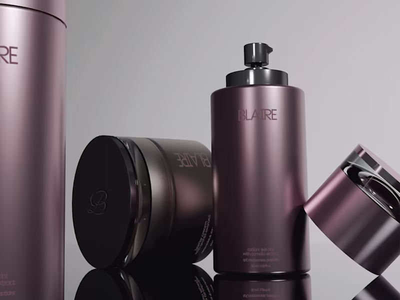
Part 2 of BLAIRE focuses on the structure behind the visual direction; exploring typography, layout systems, printed elements, and the details that create consistency across the brand. This phase shifts away from atmosphere and moves deeper into the mechanics of the identity system; balancing softness with precision through restrained compositions and controlled spacing. More renders + Full case study coming soon ✦
3
25
974
Message
43
May | Brand designer & strategist
pro
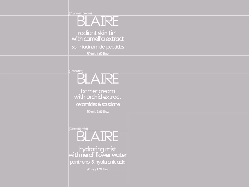
BLAIRE is a skincare and beauty concept centered around softness, restraint, and sculptural cosmetic forms. The direction explores skin-first products through coated aluminium packaging, muted floral tones, and editorial-inspired layouts. Designed as beauty objects first, the collection balances subtle branding with softened silhouettes, reflective finishes, and atmospheric color palettes. The first release includes a radiant skin tint, hydrating setting mist, and barrier priming cream developed as a cohesive luxury beauty line. Part 2 and 3 of the project, iuncluding more of the packaging and brand system will be shared this weekend, alongside the full case study.
25
43
1.9K
Message
28
May | Brand designer & strategist
pro
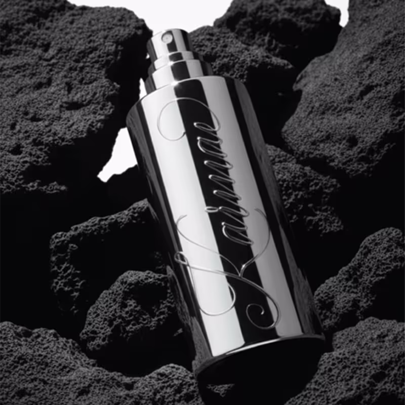
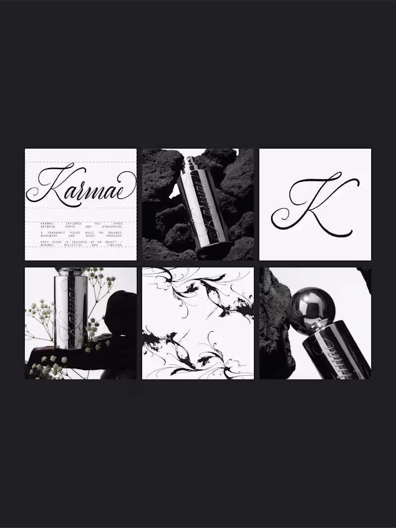
A closer look at Karmae. An exploration of balance, contrast, and presence... translated into a refined wordmark and visual system. Sublte details, controlled spacing, and a focus on restraint over excess. More coming soon. Full case study after the weekend.
3
28
839
Message
27
May | Brand designer & strategist
pro
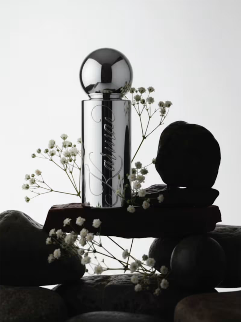
Karmae, a fragrance concept exploring the space between earth and atmosphere. This project started with the idea of balance: reflective chrome, mineral textures, and delicate botanical linework forming a system that feels both grounded and weightless. The bottle acts almost like a celestial object; minimal, reflective, and constantly shifting with light. Genderless, atmospheric, and quietly powerful. Really enjoyed building this world and translating the idea of orbit and movement into something tactile. More from this project coming soon, including a deeper case study.
9
27
683
Message
0
May | Brand designer & strategist
pro
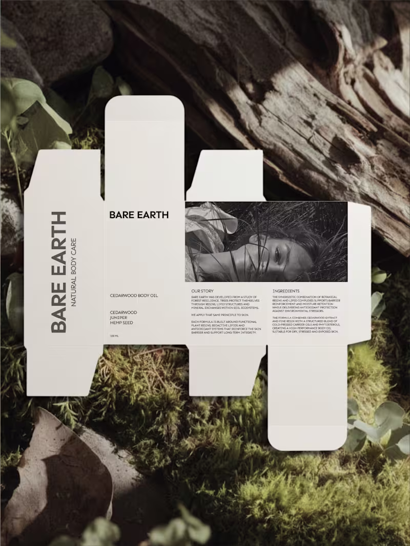
Bare Earth — Elemental Body Care Identity
0
19
Message
42
May | Brand designer & strategist
pro
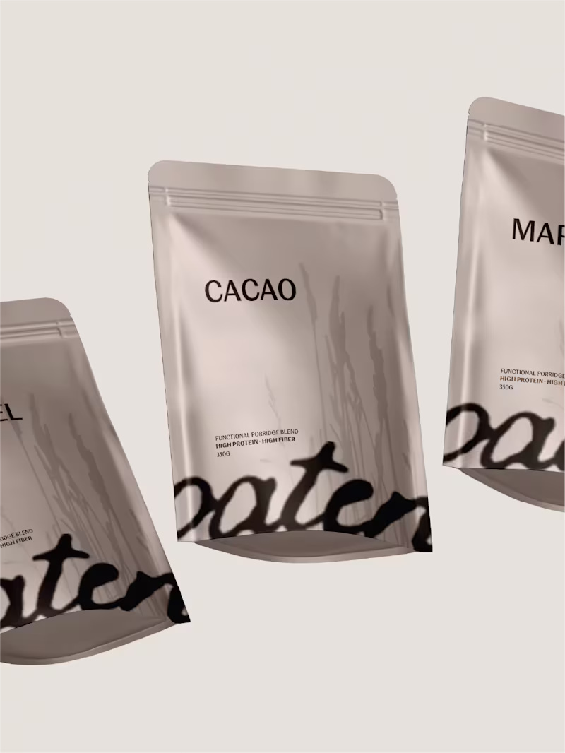
Oaten was created for modern routine. Nourishment positioned as structure, not spectacle. High protein, high fiber; translated into a restrained visual system. Muted neutrals, grounded typography, and layered materials create clarity without noise. Three blends. One daily rhythm. Designed to move seamlessly across packaging and print; tactile, precise, and intentional.
9
42
629
Message
35
May | Brand designer & strategist
pro
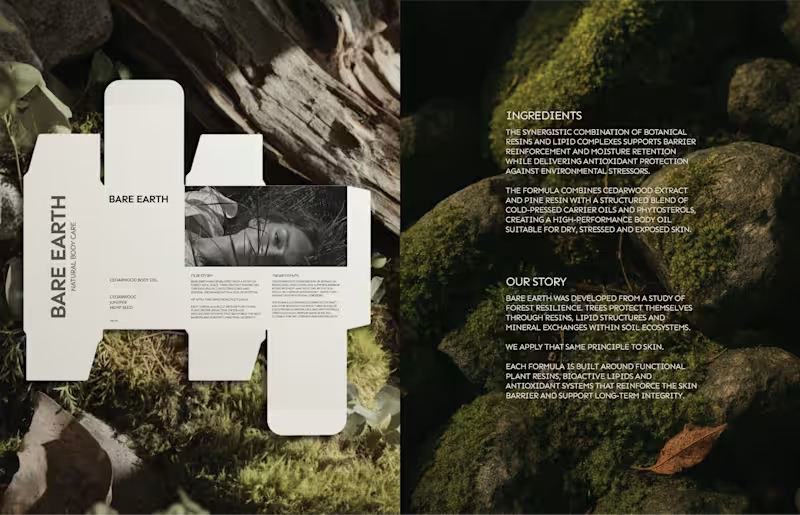
Not every body care brand needs to glow. Bare Earth explores strength as a brand decision, not just a formula claim. Forest extracts, mineral clays, pine resins; translated into a restrained visual system. Mockups by me, available soon
9
35
809
Message
34
May | Brand designer & strategist
pro
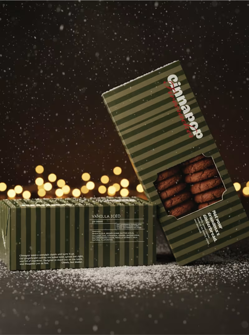
Small look at Cinnapop, a gingerbread cookie brand I made for fun... Just in time for the holidays!
5
34
661
Message
132
May | Brand designer & strategist
pro
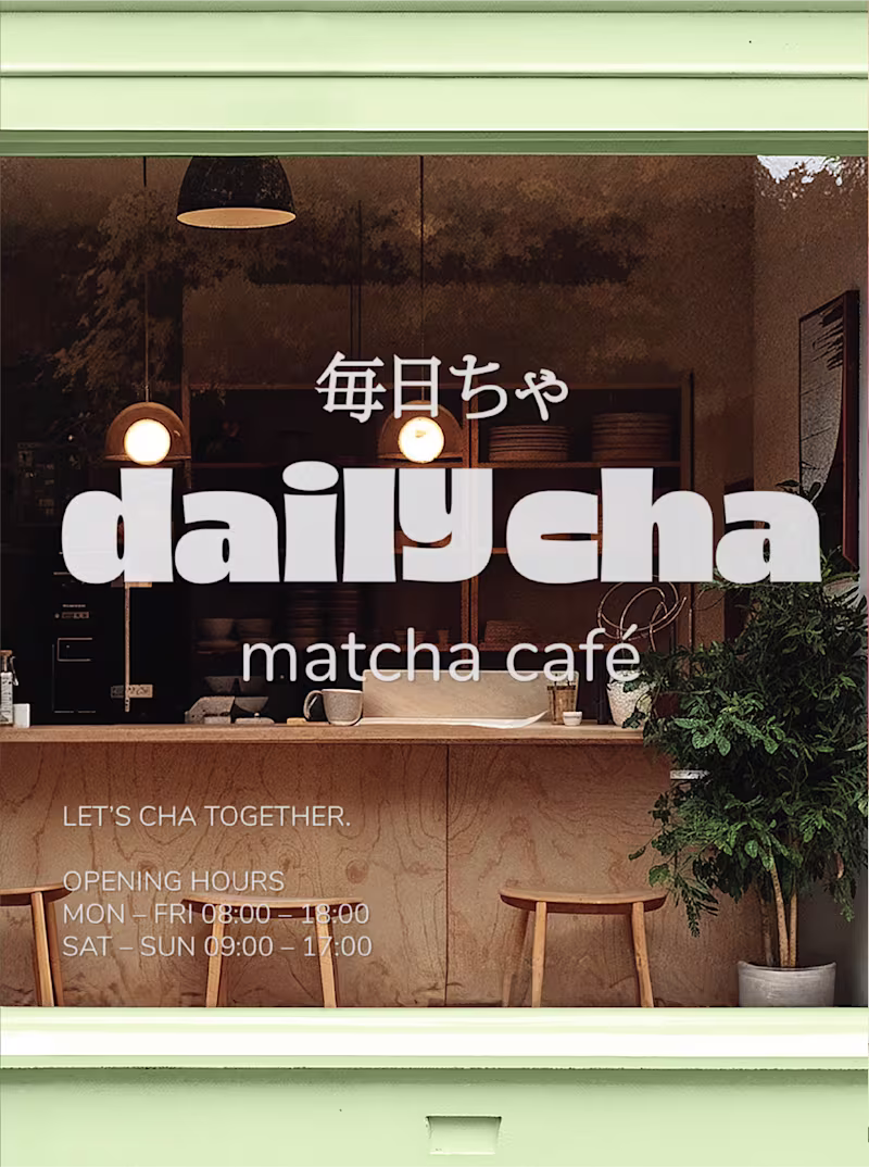
Branding & packaging for Daily Cha, let’s cha together. fresh, and anything but boring. We’re here to turn matcha into a vibe: playful colors, good energy, and a menu full of choices that hit just right. It’s not just tea, it’s a ritual you’ll actually look forward to.
48
132
1.1K
Explore projects