
Brands built from idea to launch, with brains & personality.


Brands built from idea to launch, with brains & personality.
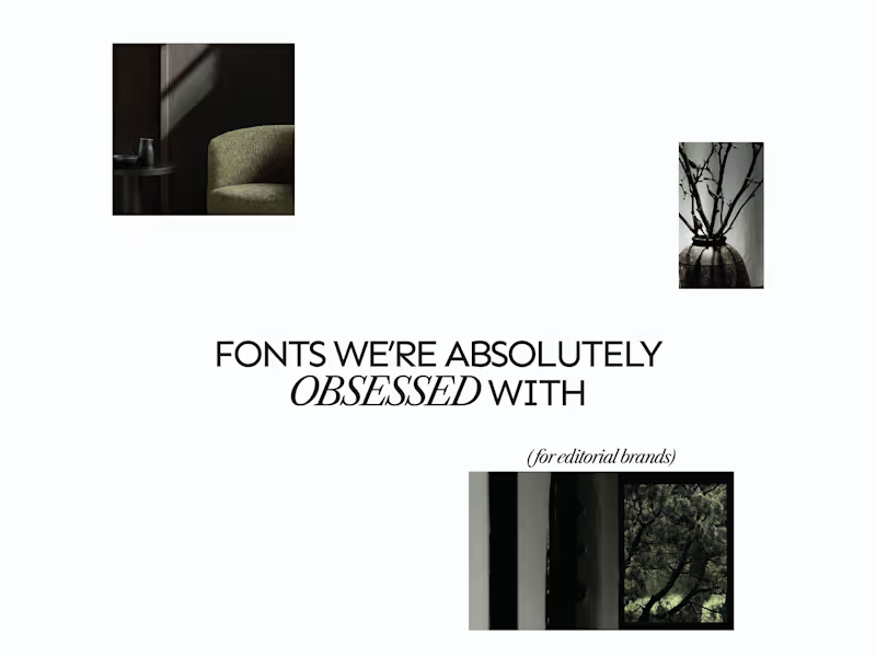
A few editorial typefaces we’re absolutely obsessed with right now.
These are some of the fonts we keep coming back to at Studio Mayze when we want a brand to feel considered, distinctive and a little more editorial without pushing the design too far.
Good type can do a lot of the heavy lifting. The right one can completely change how a brand feels before you’ve even added anything else.
Each slide shows the typeface in use at the top, with the font name underneath, so you can see how it could look in context rather than just as a specimen.
These are three of our favourites at the moment. Want to see the full selection? We’ve shared all of our favourites over on Instagram (https://www.instagram.com/p/Dewd73IkcWw/?img_index=1).
Which one would you pick? 👀
6
21
810
Not made for the moment. Made to stay.
Introducing MORROW. A home and lifestyle concept rooted in slow living, considered materials, and the beauty of things made with intention.
Less rush. More meaning. Objects to live with, and live in, for years to come.
More soon.
6
27
902

MIDDAY | Campaign & Art Direction
MIDDAY was positioned as a habit brand rather than a special-occasion destination.
The campaign language is direct, playful and grounded in the reality of a busy day. Good food, made properly, without turning lunch into a whole performance.
Not the place you save for someday. The place you return to every Tuesday.
Soon a deeper take and look in this personal project.
MIDDAY may not be a real sandwich bar yet, but the concept is ready to leave the mockups whenever someone wants to open the doors.
Lunch. Handled.
11
62
4.1K

MIDDAY | Visual Identity System
The MIDDAY identity was designed to work hardest in the everyday touchpoints, from menus and receipts to signage and takeaway moments.
A compact colour palette, oversized typography and loose illustrated assets keep the brand recognisable while giving it enough flexibility to feel relaxed, playful and human.
A system made for real lunch breaks, not just polished mockups.
Last part before the case study on this personal project.
It may only exist in mockups for now, but the brand is ready whenever someone wants to make it real.
14
53
8.6K

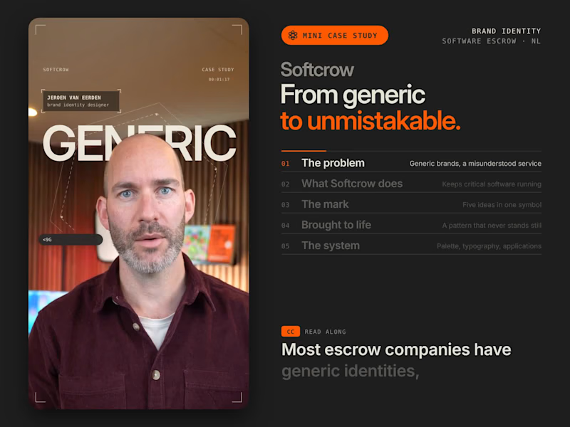


Lead Design Director / Logo & Brand Identity Design
- 6
- Followers
Lead Design Director / Logo & Brand Identity Design


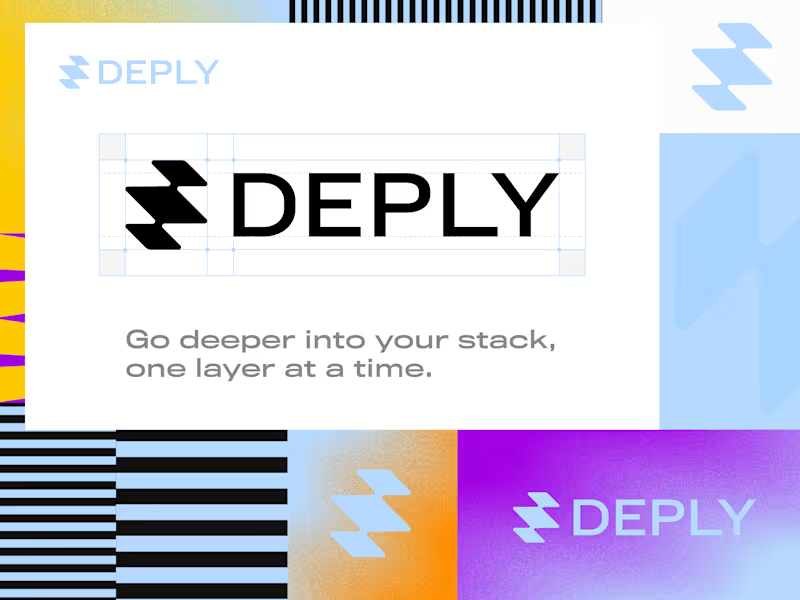
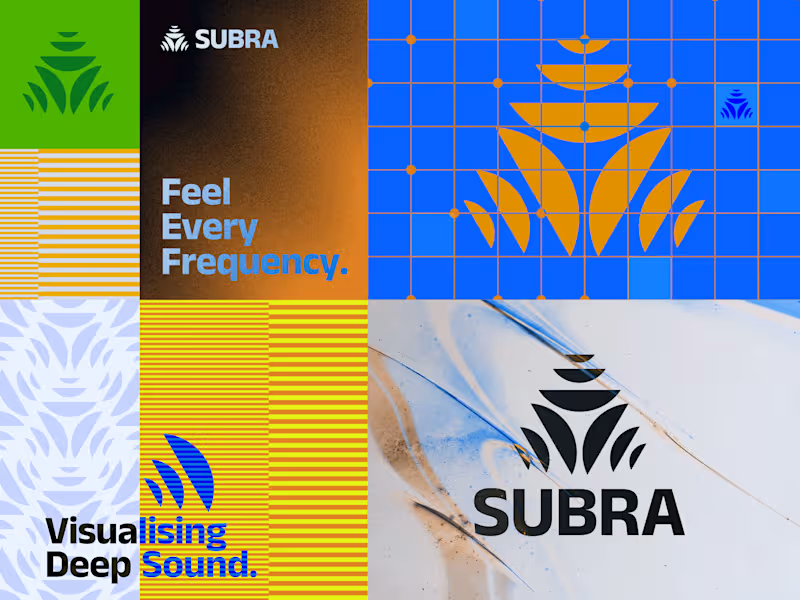
A small curated selection of logomarks for the Instagram Logoarchive wave.
Over two decades of logo and brand identity work leaves you with a lot of forms. Some became the foundation of a company. Some never made it past a sketchbook. All of them taught me something.
What I keep coming back to is simplicity with intent. A mark that works because every decision in it had a reason. That’s the thread running through everything here.
4
21
313


Design studio for branding and websites
Design studio for branding and websites


Logo & type designer from the Netherlands
Logo & type designer from the Netherlands


