Visual Design Projects in GatineauVisual Design Projects in GatineauChromatic Duel is a visual decision experience built in Wonder for the Contra x Wonder Challenge.
The project explores a simple idea:
Color palette selection should not only be about taste.
It should survive pressure.
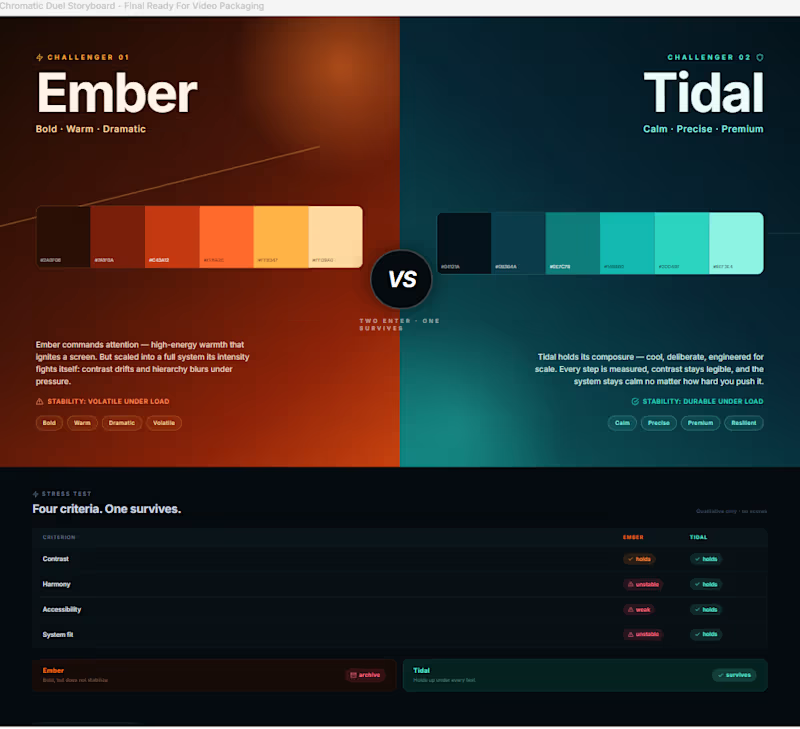
Chromatic Duel turns two competing palette directions into a visible stress test. Ember enters as the bold, warm, dramatic direction. Tidal enters as the calm, precise, premium system direction.
Instead of presenting both palettes as moodboards, the Wonder canvas frames them as a duel.
The question is not:
“Which one looks better?”
The question is:
“Which one survives?”
Inside Wonder, I used the canvas to shape the full decision journey: the initial duel, the stress-test comparison, the iteration trail, the pivot in criteria, the workflow proof layer, and the final verdict.
The palettes are compared through four qualitative lenses:
Contrast
Harmony
Accessibility
System fit
As the system became clearer, Ember felt expressive but less stable. Tidal held together better across the interface direction, making it the stronger final choice.
Final Wonder verdict:
TIDAL SURVIVES.
Ember is archived.
I also created a Framer page as a bonus interactive wrapper. It lets visitors try challenger palettes and compare them visually against the fixed Tidal benchmark. The Framer page extends the experience, but the official build, workflow, and final decision remain in Wonder.
The core memory line:
The palette that survives the stress test wins.
Wonder file:
https://app.wonder.so/faadil-boussari/files/019f35d4-04d2-7664-afd6-bb717a9100bf
Walkthrough video:
Uploaded directly with this submission.
Framer bonus page:
https://cyan-lettuce-159672.framer.app/ BRAYD: The Braided Focus Flame 🔥
BRAYD is an original mascot created for BURN THE TASK, a fictional productivity ritual brand built around focus, completion, and quiet discipline.
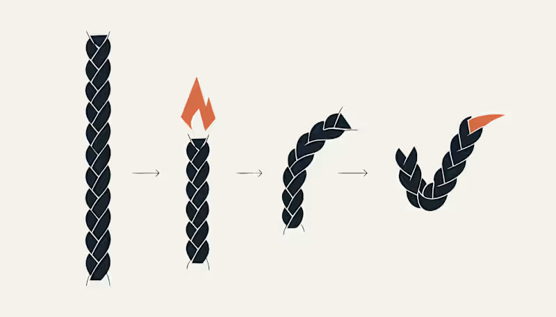
Rather than designing a cute candle character, I built a full mascot system around one clear visual behavior: focused time burns into completion. BRAYD is a braided wick core inside a faceted wax body. As a task progresses, the wick burns down, the wax form changes through clear stages, and the final braided strand becomes a checkmark.
The mascot was designed to stay recognizable across every touchpoint, from the custom wordmark and hero poster to the sticker system, focus ritual packaging, burn sequence, and consistency board. Every asset uses the same visual DNA: the same braided wick, the same faceted wax body, the same angular flame, and the same final checkmark.
This project explores how a single mascot can become the face of a fictional productivity world by turning an abstract idea, focus, into a visual ritual.
Character Brief
Name: BRAYD
Role: The Braided Focus Flame
Personality: quiet, intense, disciplined, stubborn, focused, and encouraging without being soft.
BRAYD does not rush you and does not distract you. He simply burns with you until the task is done. His braided wick represents focused effort, his faceted wax body represents pressure and progress, and his final checkmark represents completion earned through attention.
Recraft Project
Explore the full project here:
https://www.recraft.ai/project/a75515d8-3533-42f4-9a93-9815d2f3f7e3
Applications Included
The BRAYD system includes a custom name logo, hero poster, sticker pack, focus ritual packaging, burn to checkmark sequence, and a final consistency board showing the mascot across multiple moments and touchpoints.
Proof of Consistency
Same wick. Same facets. Same flame. Same final checkmark.
#RecraftAI #CharacterDesign #MascotDesign #BrandIdentity #CreativeAI #Illustration #DesignChallenge #BrandDesign #ConceptArt #MotionDesign #GraphicDesign #MascotSystem #ProductivityDesign #DigitalArt