
Expert Web Designer & Pixel Perfect Webflow Dev


Expert Web Designer & Pixel Perfect Webflow Dev




Landing Page & Website Designer

A premium digital launch experience for Kenra Professional’s Signature Style collection, designed and developed to translate the campaign’s elevated look and feel into an engaging, responsive landing page.
Working from established brand guidelines, I showcased the collection, highlighted key products and ambassadors, and created clear paths to action across desktop and mobile. The project required close attention to visual hierarchy, typography, imagery, and performance to ensure the online experience reflected the quality of the brand.
Services: UX/UI Design, Responsive Web Design, Front-end Development, Brand Experience
1
110

Oliver Sacks - His Own Life
(Logline) Oliver Sacks: His Own Life explores the life and work of the legendary neurologist and storyteller, as he shares intimate details of his battles with drug addiction, homophobia, and a medical establishment that accepted his work only decades after the fact. Sacks, known for his literary works Awakenings and The Man Who Mistook His Wife for a Hat, was a fearless explorer of unknown cognitive worlds who helped redefine our understanding of the brain and mind, the diversity of human experience, and our shared humanity. The film features exclusive interviews with Sacks conducted just weeks after he received a terminal diagnosis, and months before his death in August 2015.
Client: HHMI Tangled Bank Studios + Steeplechase Films
http://oliversacksdoc.com
0
332

Reverse the Red
Data-driven and propelled by collaboration, Reverse the Red provides the tools and partnerships to unite us around our common commitment to saving species.
So many organizations have tried in the past to reverse the "Red" (The IUCN Red List of endangered species), but the time to hesitate is through.
We worked with the Major Partners ("the board") to strategize and help deliver the new vision to the world— a movement that will most certainly reverse the red!
https://www.reversethered.org
0
430


WordPress websites for polished service businesses.
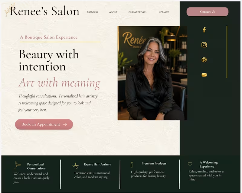
Okay, so picture this, if you will. My case study is about to be uploaded. All my T’s are crossed and all my I’s are dotted. I click “Publish” and wait—nothing happens. I check my stats and see that Contra is suggesting an “Engaging case study description.” So what do I do?
My initial instinct was to rip everything out and start from scratch. But I had to ask myself: how does that actually help me when Contra has already pointed out where I should look? Take a look at what you have and ask yourself—why isn’t what I wrote selling?
I took a little time to tweak what I had. After a few minutes, I was able to get past that “Engaging case study description” suggestion, and my case study showed up on my portfolio.
The biggest takeaway is that sometimes the answer is right in front of you.
1
66


B2B Content Strategist | Messaging & Campaigns
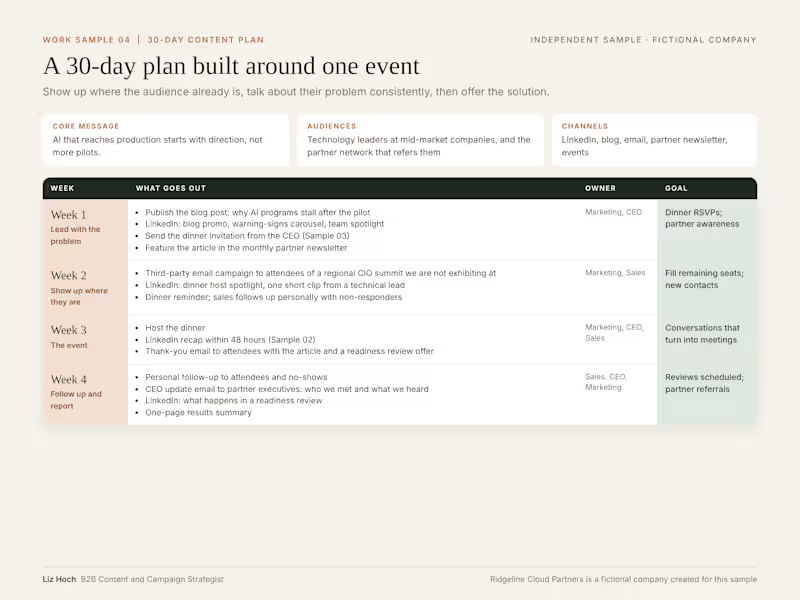
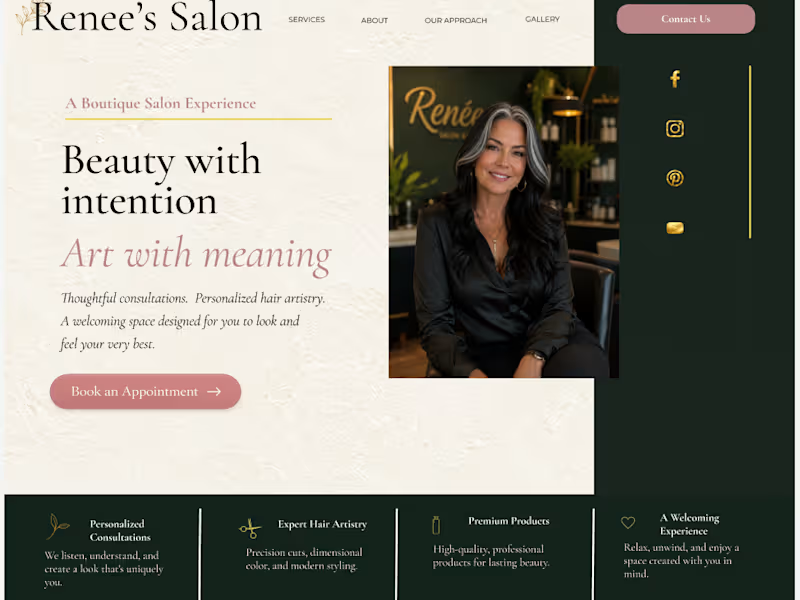
A four-week plan built around one event, with an owner and a goal for each week. Marketing is not one size fits all. This plan starts with where the audience already is: industry events, the partner network, and LinkedIn. Then it talks about their problem consistently before offering the solution. Independent portfolio sample; Ridgeline Cloud Partners is fictional.
1
14
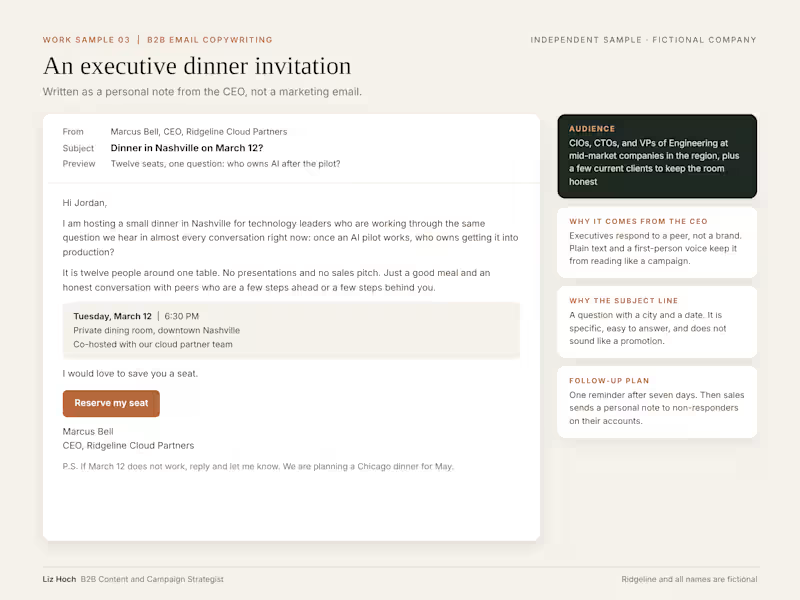
An invitation to an executive dinner, written as a personal note from the CEO. Small executive dinners are one of the most effective ways to get in front of senior technology leaders, but only if the invitation reads like it came from a peer. Notes cover the audience, the subject line, and the follow-up plan. Independent portfolio sample; all names are fictional.
0
11
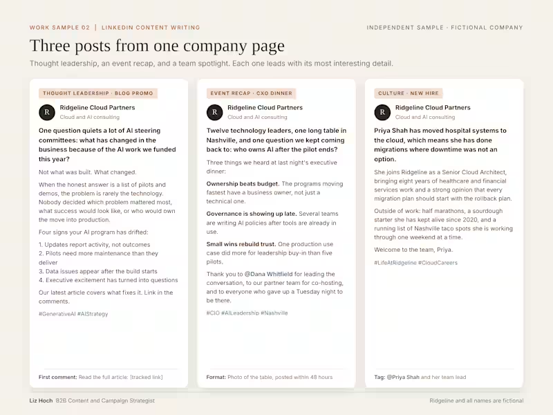
Three posts from one company page: a thought leadership post promoting a blog, an executive dinner recap, and a new-hire spotlight. My rule for company content is simple: the most interesting thing goes first, and every post ends with something specific, not a filler line. Independent portfolio sample; all names are fictional.
0
12


Expert product designer with 13 YOE - Earned $200k on Upwork
- 5.0
- Rating
- 10
- Followers
Expert product designer with 13 YOE - Earned $200k on Upwork


White-label SaaS, auto-fix scripts & plug-and-play tools.
New to Contra
White-label SaaS, auto-fix scripts & plug-and-play tools.

I'm bringing on 500 founding members for a tool I built that generates qualified leads. I use this tool personally to reach out to prospects —You scan prospects' sites, find real problems (broken links, missing images), and use those findings to book conversations and sell your products.
I use it every day. It works.
The offer: $150. One time. Locked in forever.
You get:
Lifetime access to use this as your lead generation machine
Scan prospects, find real problems, book conversations
Every feature I build from here on, no subscriptions, no per-scan fees, no limits
Help shape the future of this project based on what actually helps you — your input directly influences what gets built next
Option to white-label it down the road (separate pricing, decided later based on what the platform becomes)
Why this works: Once this scales and I launch subscription pricing for new users, you're locked in at $150. They pay recurring. You paid once, forever.
You're not just buying a tool, you're helping build something you might eventually white-label and resell or use.
0
103


Turning chaos into repeatable systems.
Turning chaos into repeatable systems.

A structured consulting deliverable that turns operational observations into prioritized, actionable findings. This sample covers a three-site distribution operation with gaps identified across receiving, carrier management, labor planning, technology, and documentation, each ranked by business impact with a tied recommendation and measurable outcome target. Built to function as a standalone reference document that leadership can act on immediately and track through implementation. This is the format every Tier 1 and Tier 2 engagement produces at close.
0
58
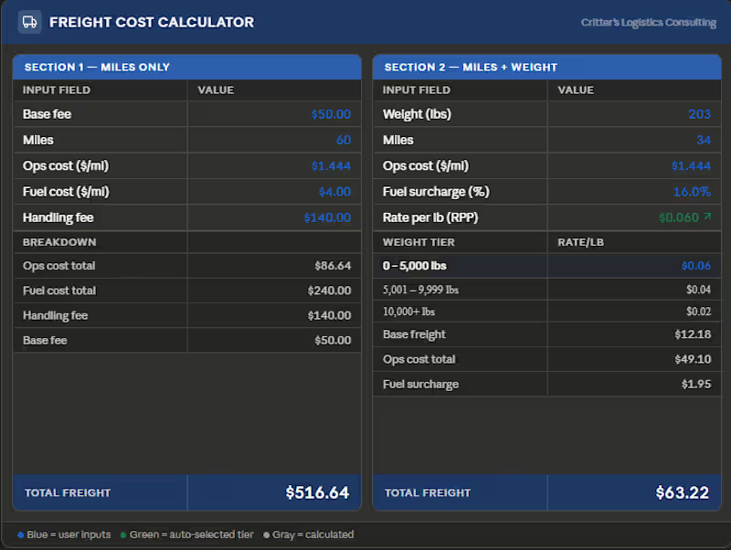
A purpose-built quoting tool for freight operations that handles two of the most common cost scenarios: miles-only and miles-plus-weight pricing. Inputs are kept simple: base fee, mileage, ops cost, fuel rate, and handling, and every calculation is automatic. The weight-tiered RPP model auto-selects the correct rate bracket based on shipment weight, so reps and account managers can generate accurate cost estimates in seconds without touching a formula. Built for 3PLs and carriers who are still quoting freight in spreadsheets or by hand.
0
52
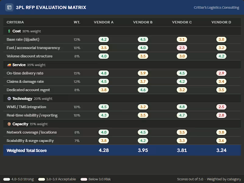
A structured scoring framework for evaluating 3PL providers across the four criteria that actually determine fit: cost, service performance, technology capability, and network capacity. Each criterion carries a defined weight, and every subcriterion is scored independently so the final recommendation is defensible and traceable, not a gut call. Built for shippers and supply chain teams going through a carrier or 3PL selection process who need an objective way to compare bids side by side and present a recommendation to leadership.
0
84
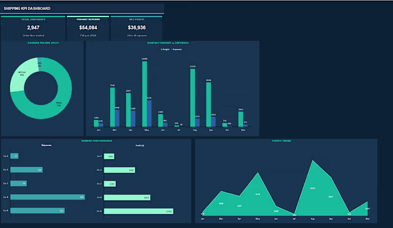
Built a shipping KPI reporting system tracking nearly 3,000 order lines across multiple vendors and carriers. Raw data captures order number, order date, vendor name, ship method, and extended weight per line. A separate 3PL performance tab tracks freight charges, fuel costs, expenses, and profit per shipment across manufacturers and delivery states. Breakdown tab analyzes carrier distribution by month across vendor groups, showing BWay, UPS, and Will Call share as a percentage of total volume. The report tab delivers an executive-level KPI summary.
0
92

High-Converting Framer Sites for Startups
Fixing the above the fold narrative for Rational.to
⚡️ I kept their core message intact "The zero-human accounting firm." and designed a custom WebGL hero to make it click instantly.
The interactive element visually bridges the gap between autonomous AI processing and human financial oversight. Live interactive canvas preview below 👇
0
46
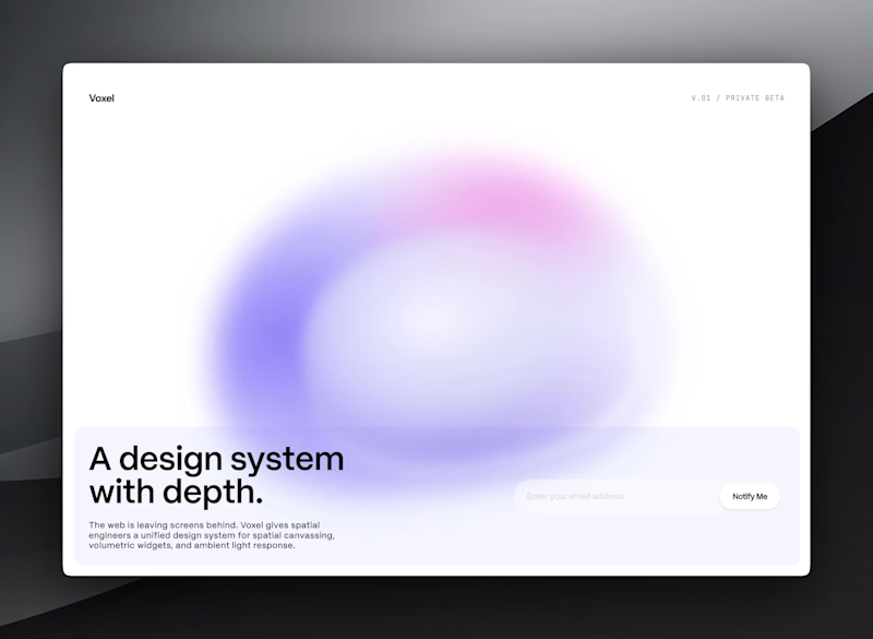
Voxel: Spatial UI Kit & Waitlist Site
Services Provided: UI/UX Design, Framer Development, Motion Design, Interactive Components
Designed and built a high-converting waitlist site for Voxel, a spatial computing design system engineered for AR optics and VisionOS. Built as a prime blueprint for stealth and early-stage founders breaking out of flat viewports, this page blends immersive ambient visuals with friction-free email capture.
Key Features & Highlights:
Ambient Morphing Orb Hero: Built a custom React/CSS fluid orb component with dynamic organic breathing, rotation, and morphing shapes.
Interactive 3D Magnetic CTA: Custom waitlist email input featuring real-time TLD validation (.com, .org, .net) that triggers an interactive glowing button with 3D parallax mouse-tracking.
Spatial Glassmorphism UI: Frosted glass visual tokens, subtle depth borders, and high-legibility typography optimized for dark/spatial backgrounds.
Zero-Friction Submission Flow: Integrated inline success state that smoothly transitions the input field upon submission.
2
2
131
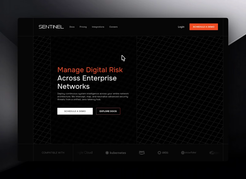
Designed a stealthy, dark-mode landing page for Sentinel, an enterprise security platform. The visual identity uses a deep charcoal canvas, crisp wireframe grid hero visuals, and high-visibility orange accents to give the brand an authoritative, defense-grade feel.
Key Features & Highlights:
3D Grid & Node Hero: High-impact wireframe grid graphic paired with interactive node charts showing real-time threat routing.
Modular Feature Cards: Clean, dark-toned card grid highlighting system capabilities with subtle hover states.
Interactive Security Tabber: Dynamic side-nav interface displaying visual media alongside live security status indicators.
Minimal Testimonial Slider: High-contrast testimonial block framed by sleek orange accent lines and clean carousel controls.
Accordion FAQ Matrix: Sleek, border-lined FAQ component with subtle orange indicator active states.
Services Provided: UI/UX Design, Framer Development
0
139
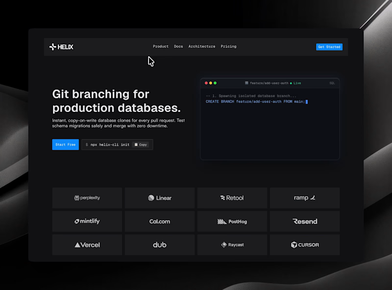
Designed a high-contrast dark mode landing page for Helix, a developer tooling platform. The aesthetic pairs rich terminal interfaces with bright blue accents to create a developer-first layout that feels technical, precise, and fast.
Key Features & Highlights:
Terminal Hero Section: High-contrast code block display set against subtle neon blues for immediate visual impact.
Architecture Cards: Structured dark-mode panels breaking down complex system features into clear visual blocks.
Interactive Workflow Stepper: Modular walkthrough UI showcasing multi-step developer processes at a glance.
Dynamic Pricing Grid: Minimalist tiered layout featuring an interactive monthly/annual billing toggle.
Logo Marquee: Sleek grayscale integration grid that blends seamlessly into the dark backdrop.
Services Provided: UI/UX Design, Framer Development
0
145