Freelance UX Designers in Fairborn
Sign Up
Post a job
Sign Up
Log In
Filters
2
Projects
People
Ian
Dayton, USA
UI/UX designer making the web fun again.
20
Followers
Follow
Message
UI/UX designer making the web fun again.
5
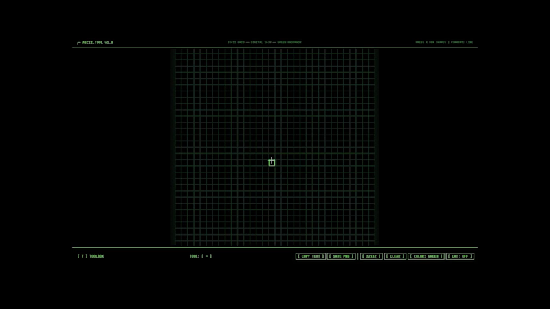
Here is my submission for the Figma Makeathon! I've created a ASCII design tool. My goal was to create unique ways to select tools. The Quick Ribbon [x] allows you to quickly swap between tools with your A & D keys. The toolbox is a quick way to swap between characters. I also incorporated a personal feature, CRT support. A quick way to swap to a 4:3 ratio to easily fit the application on any CRT. For those who want that extra level of digital grunge. Start designing! https://flower-azul-67033652.figma.site/ Community Profile (https://www.figma.com/community/file/1610056789973482976/ascii-design-creator)
3
5
178
30
My final portfolio project, Apple Fluid. A UI/UX study into the relationship between Mac, iPad, and iPhone. Researching features within Apple's ecosystem alongside user behavior. This video showcases two features within Fluid. Updated AirDrop for additional control. And a new Continuity feature, Assist. Turning your iPad into a traditional drawing tablet. View the complete project & study on my website (https://www.ianwiant.com/apple)
7
30
299
0
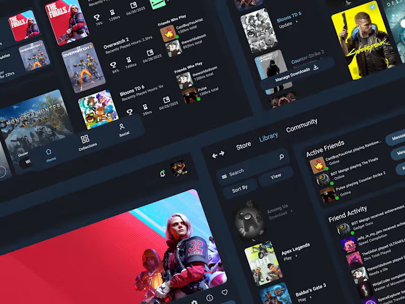
Steam Library Redesign
0
9
0
PNC Mobile App
0
8
UX Designer
(6)
Follow
Message
Tim Bullock
Dayton, USA
I make boring websites less boring!
Follow
Message
I make boring websites less boring!
0
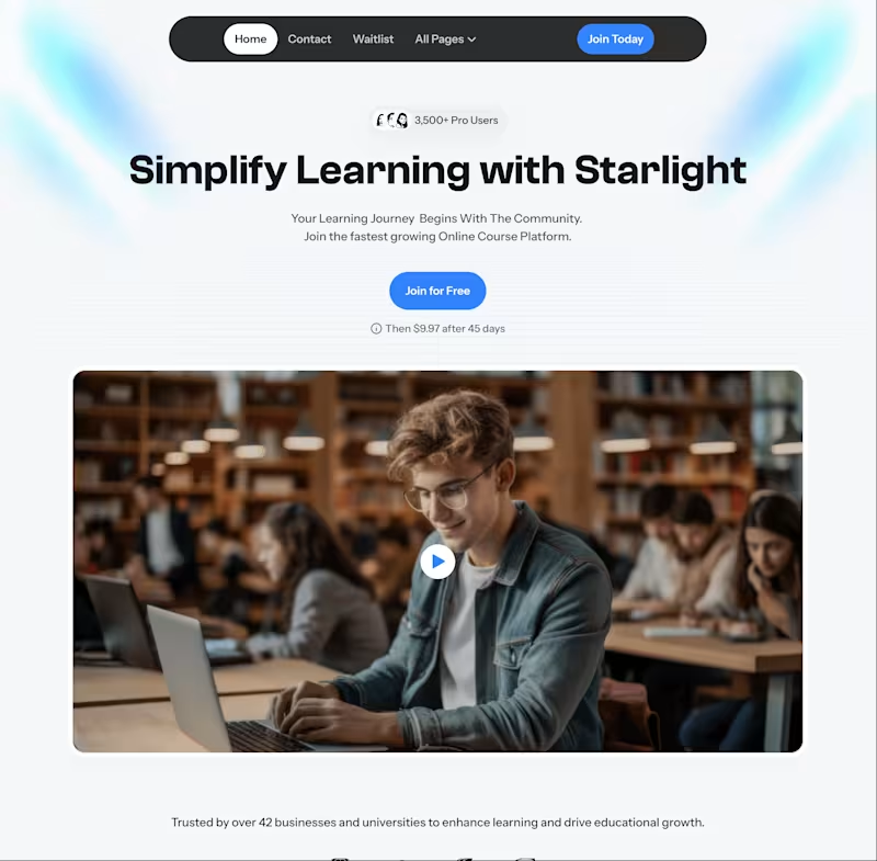
Starlight Education SaaS
0
6
0
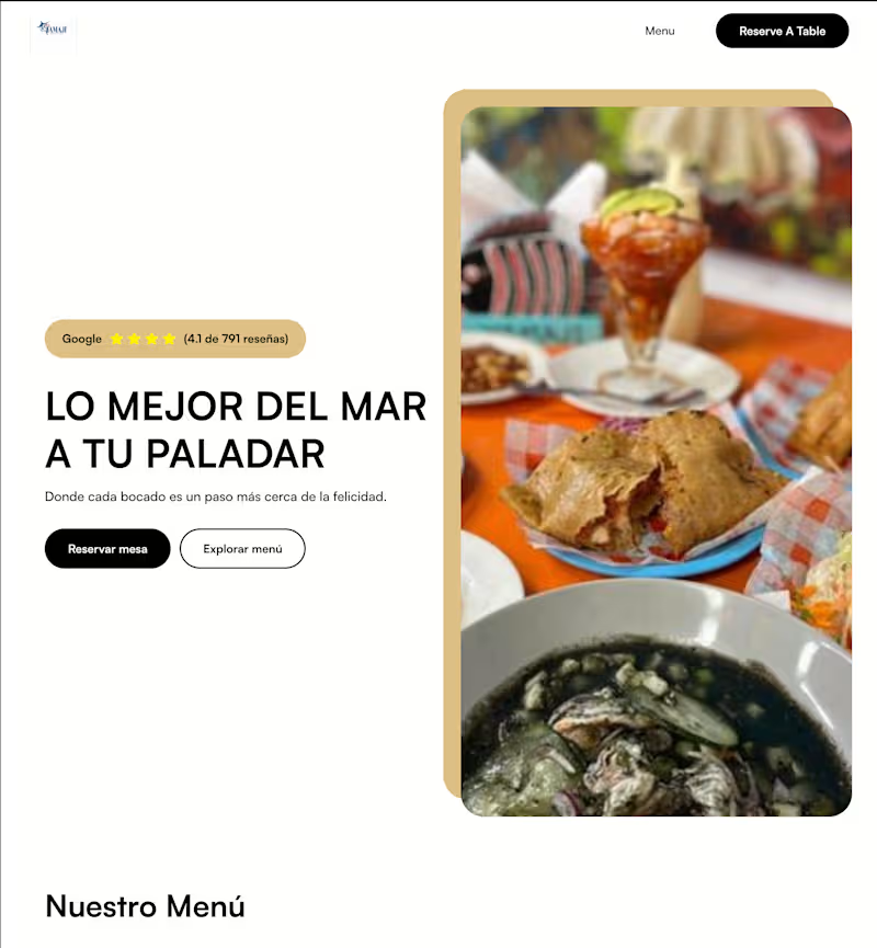
Restaurant Menu HomePage
0
4
0
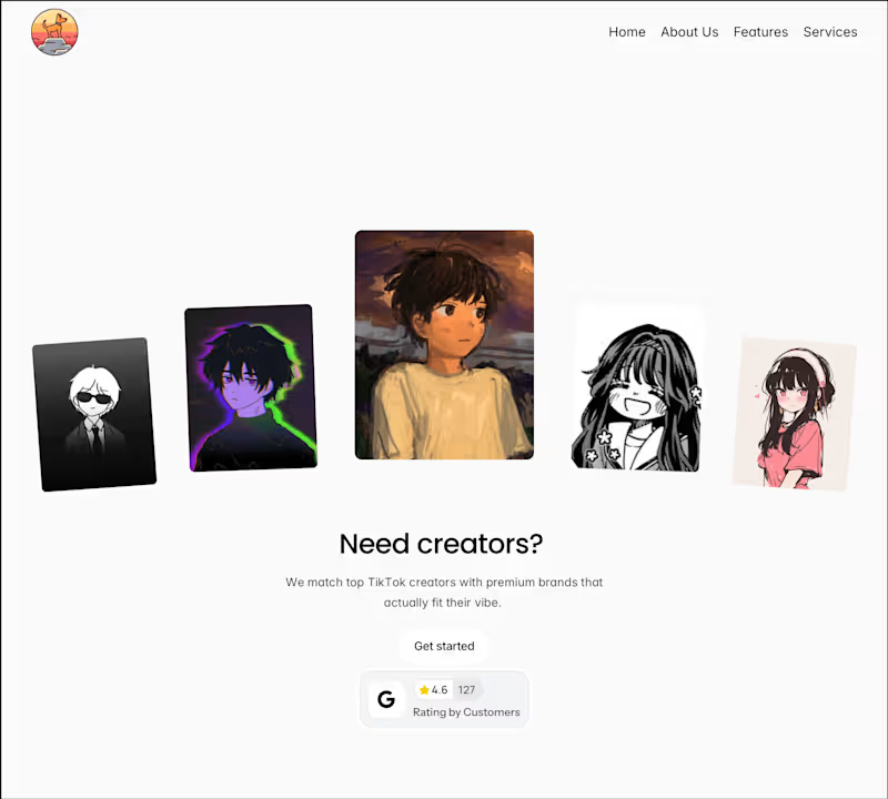
TikTok Ads Agency
0
5
0
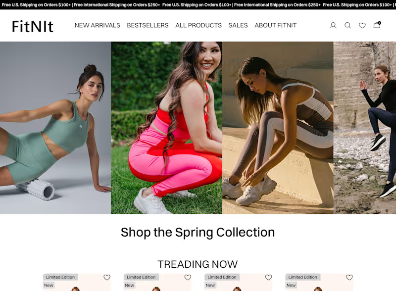
FitNIt
0
3
UX Designer
(3)
Follow
Message
Darius Dunson
Dayton, USA
NexGenWebCreators: Expert Web & SEO Solutions
Follow
Message
NexGenWebCreators: Expert Web & SEO Solutions
0
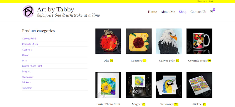
Branding and Web Development for Tabby Tid Bits
0
7
1
Augmented Reality APP
1
10
0
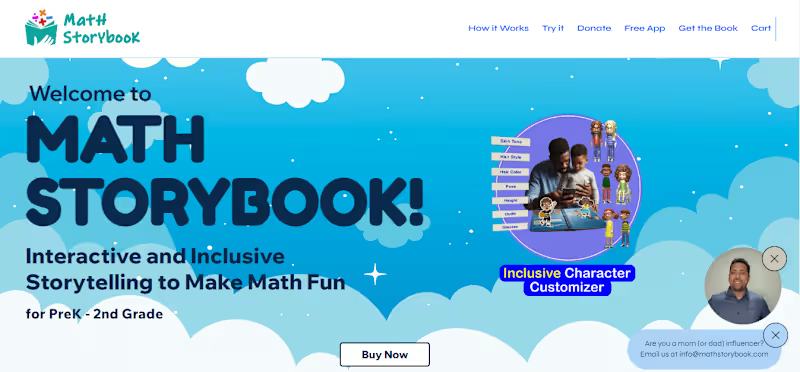
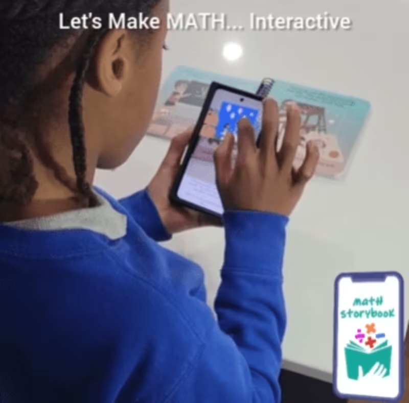
MathStorybook Website
0
8
View more →
UX Designer
(1)
Follow
Message
Jessie Nunez
Dayton, USA
Transform your brand and website
Follow
Message
Transform your brand and website
0
Landing Pages for Government Bid Saas
0
22
1
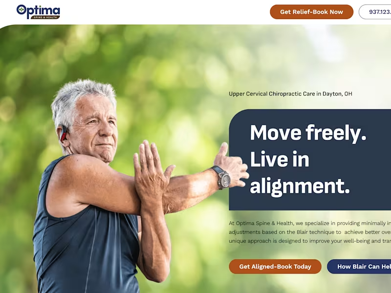
Optima Spine & Health
1
14
0
Website Overhaul for Biopharma Company
0
17
1
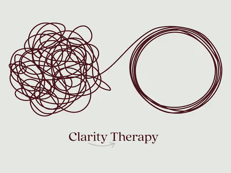
Website for Therapy Practice
1
23
UX Designer
(1)
Follow
Message
Austyn McFadden
pro
Dayton, USA
Awarded Logo Designer, Framer & Lovable Expert. Top 10% User
65
Followers
expert
Follow
Message
Awarded Logo Designer, Framer & Lovable Expert. Top 10% User
5
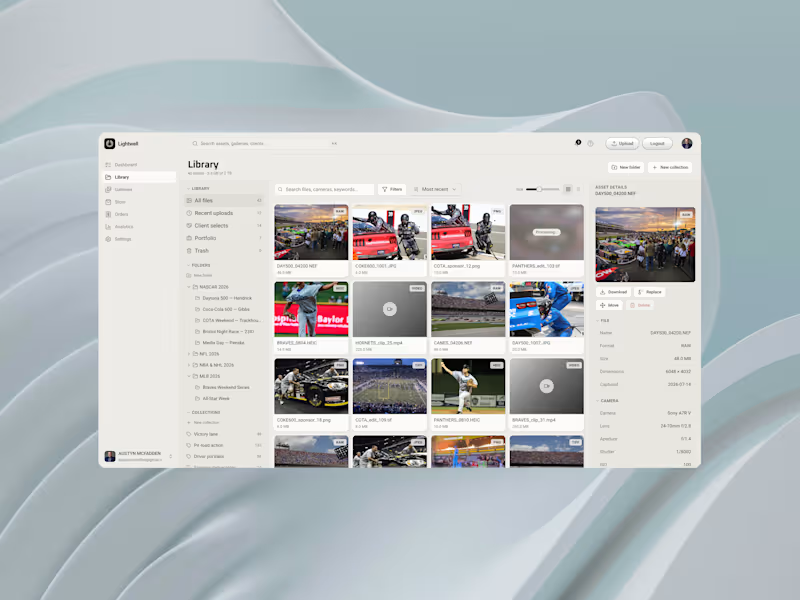
Product UI exploration for Lightwell. A library screen for a digital asset management (DAM) platform, focused on hierarchy, density, search, and making complex asset libraries feel simple. Been working on this for Daniel Overbey (https://www.facebook.com/twizoz?__tn__=-]K*F) for a few weeks now!
5
58
1
Grip It and Sip It is an annual two-day golf outing built around friends, competition, charity, and giving back. I was brought in to create an identity that could capture the personality of the event without taking itself too seriously. The final mark combines the two things at the center of it all: golf and a good drink, brought together in a simple, memorable illustration. This logo went on to be selected for LogoLounge Book 15, making it an especially rewarding project to have been part of.
1
6
4
Brand colors motion graphic, from the updated mark for Freedom Church.
1
4
88
7
A few years ago, I was brought in to design the brand identity and visual system for Freedom Church. Recently, we came back to the logo for one more round of refinement. There had always been something about it that felt just slightly off to me. I actually mentioned it during the original process, but at the time church leadership preferred the earlier version, so that’s the direction we kept. This time, we went back and forth on the smallest details and I started digging into the actual geometry of the mark. The curves, spacing, weight, balance, and how each piece interacted with the others. In the Illustrator screenshot, the white fill is the newly refined logo and the black outline behind it is the previous version. The differences are subtle, but when you see them together, they completely change how balanced the mark feels. That refinement eventually became the app icon you see in the other image. And now I genuinely can’t stop staring at it. There are always things you can tweak in design, but this might be one of the rare times where I look at a logo and think: yeah, that’s it. It feels absolutely perfect now.
1
7
119
UX Designer
(1)
Follow
Message
Cody Scott
Fairborn, USA
Full-stack developer experienced in React, Spring Boot ...
New to Contra
Follow
Message
Full-stack developer experienced in React, Spring Boot ...
0
CRM
0
34
0
Dj Website
0
23
0
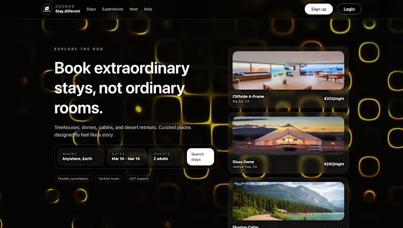
OddBnb play on AirBnb
0
53
0
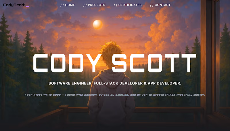
Portfolio
0
37
UX Designer
(1)
Follow
Message
Explore people