Projects using Adobe Illustrator in Doha
Projects using Adobe Illustrator in Doha
Sign Up
Post a job
Sign Up
Log In
Filters
2
Projects
People
Message
1
Khaleed Ameen
pro
Khad Studio - Brand Identity
1
21
Message
1
Inch Graphica
pro
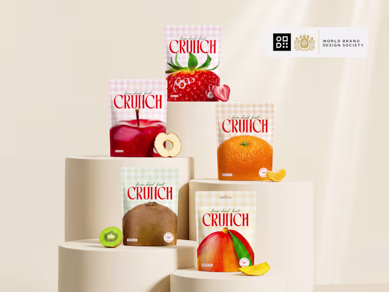
What if snack packaging was impossible to ignore? 👀 Meet CRUNCH! a brand identity designed to feel as bold as the first bite. Every flavor has its own personality through color, graphics, and expression, while staying connected as one recognizable brand system. The goal wasn't just to design packaging it was to create a brand that jumps off the shelf and stays in your memory. From the logo to the packaging, every detail was crafted to feel fresh, playful, energetic, and premium. ✨ Bold visuals. ✨ Distinct flavor identities. ✨ One unforgettable brand. If you saw this on the shelf... would you pick it up? Check it out (https://contra.com/p/3oEvmov2-crunch-bold-freeze-dried-fruit-snack-brand-design)
1
36
Message
2
Mohamed Greash
Turkish brands is more than just an ecommerce solution, It Provides every home with all it needs with a dedicated team to disassemble and install their products in various Arab countries. THE METAPHOR We start visual identity work with deep research of brand metaphors and attributes. Turkish Brands came up with ten main attributes to describe themselves, Our collaborative work led us to five main Products: Furniture, Kitchen gadgets, Carpets, Electrical Appliances, Decorations. THE Challenge The devil is in the details. To get the right feeling of a visual brand identity even the roundness of corners matters. And sometimes that leads to a design challenge, as it was in our case. The Icon is born to be sharp and edgy. Defining the shape took more time than usual, but at the end of the day we successfully overcame this challenge.
2
85
Message
0
Nidal Abadlia
Élever Brand Identity Design
0
1
Message
0
Susana Fabre
pro
Souq Remix Collection: Tradition Meets Innovation
0
0
Message
0
con 22
I USED EVERY CLASS ABILITY in COD Mobile
0
1
Message
0
Abdul Rahman
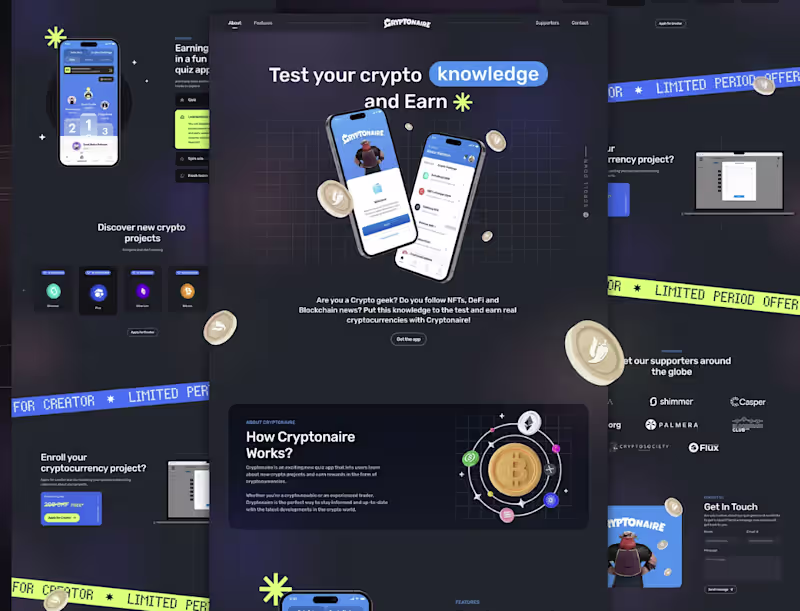
Cryptonaire Quiz App Development
0
2
Message
0
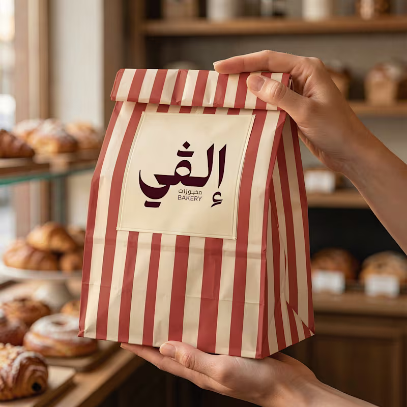
Salma Adam
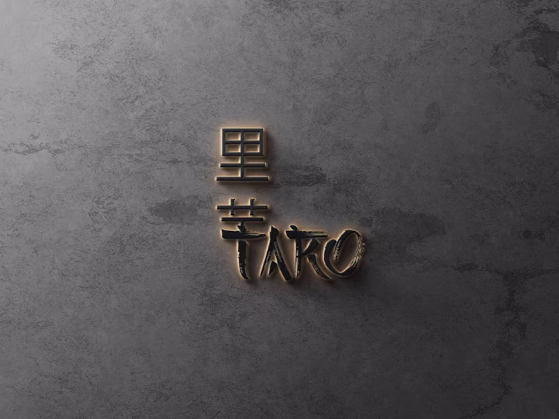
Taro Bakery
0
18
Message
0
Abdul Wahab
pro
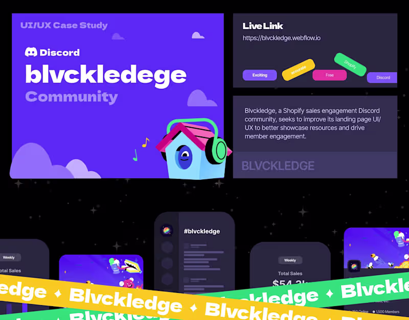
Blvckledge — Website Design & Webflow Development
0
3
Message
24
Mark Ocharo
It looks obvious once it's done, most word marks are spoken through the entire company's pipeline, from sales to strategy meetings. To have people hold an image of it when it is inserted in a statement is quite vital. People might not speak about their own branding internally, but if a company is not unique in its value proposition, the company is being lined up side-by-side with competitors. Logos & branding, quite frankly, signify an essence held on both sides of the value chain from experience and at other times as a worthy try.
24
157
Message
0
Anfas Khan
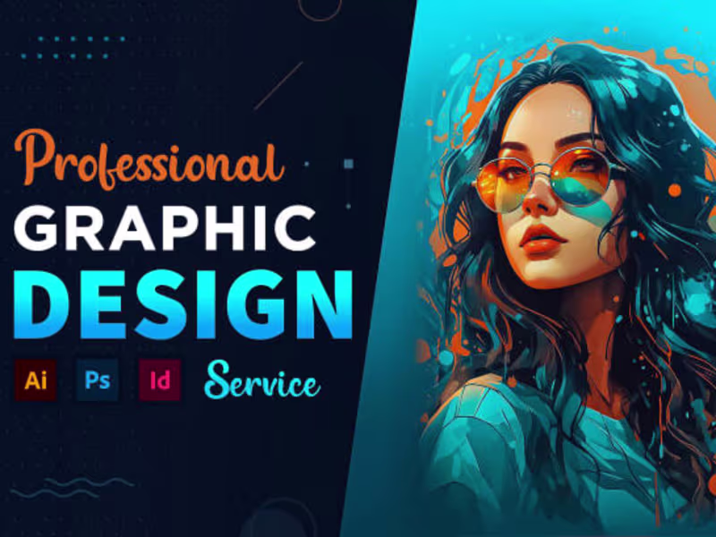
I will do any redesign and custom graphic design
0
0
Message
0
Mahek Jamil
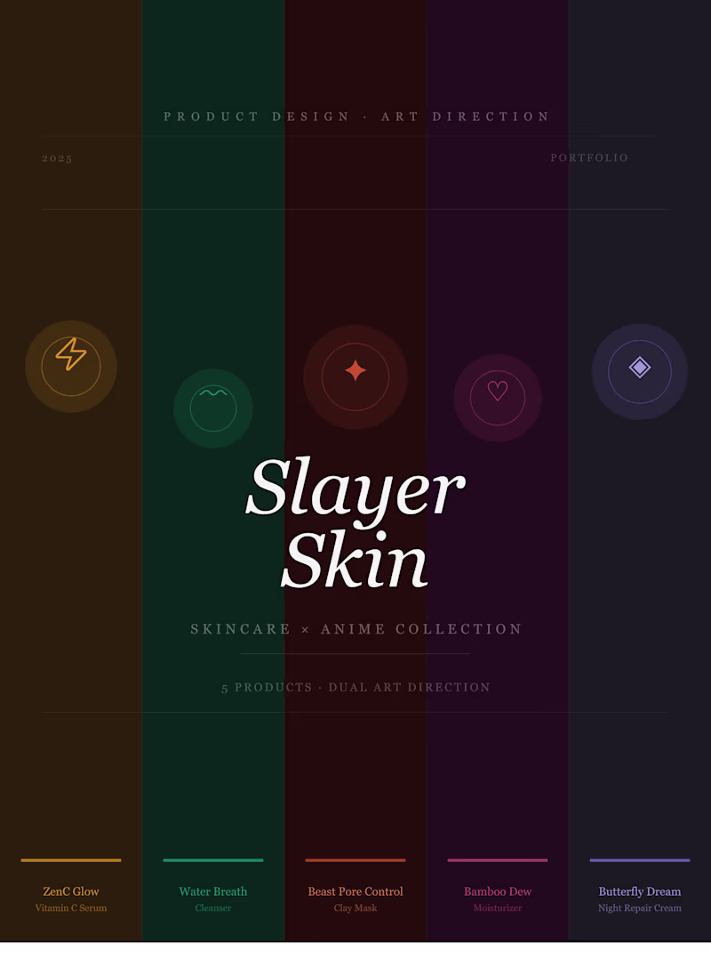
Slayer Skin | Skincare × Anime Product Design
0
7
Message
0
Sayera | HOD
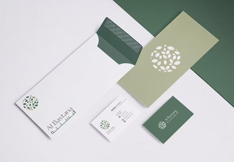
Al Bastana: Brand Guideline
0
13
Message
0
Kareem Magdi
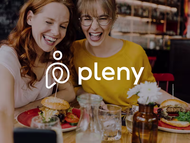
Pleny - Brand Identity
0
9
Message
0
Souhayb Graya
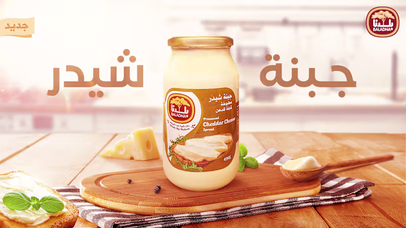
Baladna Cheddar Cheese Advertising :: Behance
0
3
Message
0
Khuloud SALIM
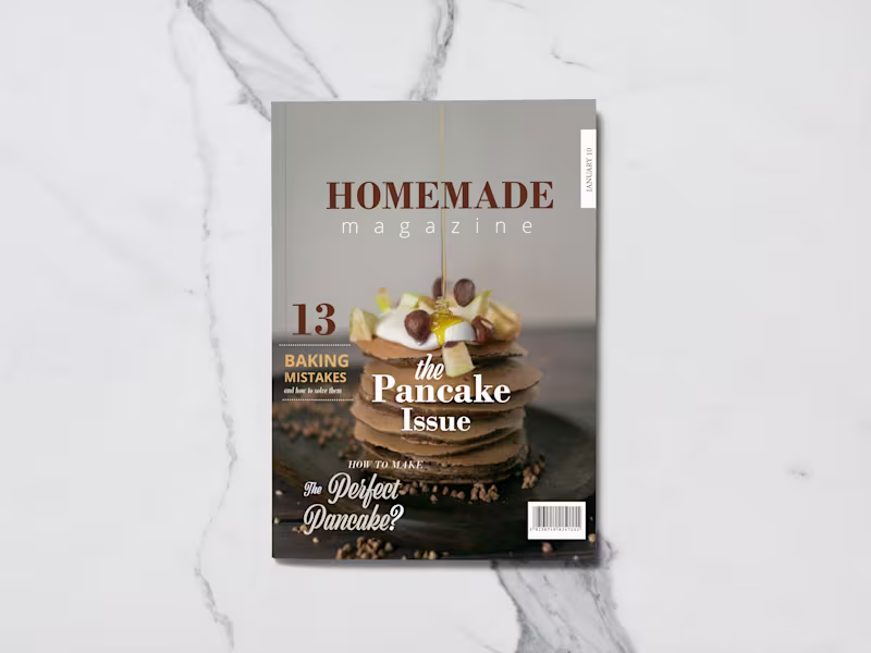
Engaging Magazine Layout Design for Clear and Stunning Content
0
1
Explore projects