Freelance Product Designers in DhakaFreelance Product Designers in Dhaka
Branding | Product Design | Website design | MVP Design
$100k+
Earned
19x
Hired
5.0
Rating
195
Followers
Branding | Product Design | Website design | MVP Design
UI/UX Designer | Figma → Framer & Elementor
5.0
Rating
164
Followers
UI/UX Designer | Figma → Framer & Elementor
Cover image for 📘 Tutorify — EdTech &
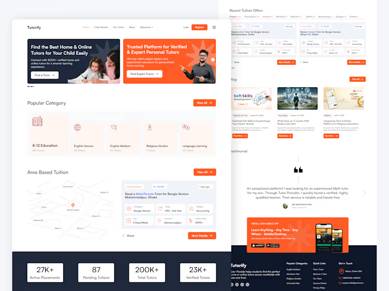
📘 Tutorify — EdTech & Tutor Finder Platform (Case Study) 📌 Project Overview Tutorify is a modern EdTech platform designed to connect parents and students with verified home and online tutors without unnecessary hassle. Instead of forcing users through complex search bars, the platform relies on a browse-first navigation system, allowing users to land on their desired tutoring options within just a few taps or clicks. The design balances visual clarity, local context, and strong trust elements to drive seamless user conversions. 🎯 Core Challenges & Design Objectives Eliminate Friction (No Search Effort): Reduce cognitive load for parents by providing direct, structured category and area choices instead of relying on manual text searches. Dual Audience Engagement: Seamlessly cater to two different user types right above the fold: Parents/Students looking for tutors and Educators looking for tuition posts. Instant Trust & Credibility: Establish high reliability for educational services through clear statistics, verified badges, and authentic testimonials. 💡 Key UI/UX Solutions & Features 1. High-Impact Dual Hero Section: Features a clear split-card layout with distinct calls-to-action (Find a Tutor & Find Expert Tutors), providing an immediate pathway for both target audiences. 2. One-Tap Category Browsing: Organized visual categories (K-12, English Medium, Religious Studies, Language Learning) allow users to explore available tutors with a single click—no typing required. 3. Map-Integrated Area & Location Browsing: A location-focused widget helps parents easily find tutors nearby or filter tuitions based on specific zones (e.g., Mohammadpur, Dhanmondi, Mirpur). 4. Scannable Tuition Cards: Custom-designed tuition cards display crucial details at a glance—Subject, Class, Days per week, Location, and Fees—giving users full transparency before opening the details. 5. Social Proof & Conversion Elements: Live stats counter showing active placements and total verified tutors. Parent testimonials highlighting real-world trust. Dedicated mobile app download banner to drive multi-device engagement. 🛠️ Role & Tools Used Role: UI/UX Design, Information Architecture, Visual Design, Micro-Interactions Tools: Figma, Photoshop
1
10
Cover image for 🛋️ Furnex – Luxury &
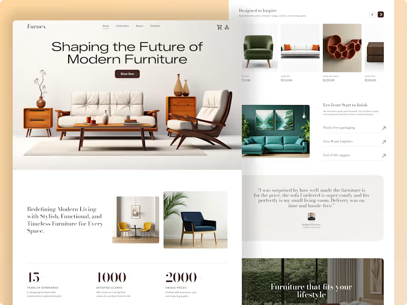
🛋️ Furnex – Luxury & Sustainable E-Commerce Experience Project Overview Furnex is a minimalist, high-end e-commerce landing page concept tailored for modern home decor and sustainable furniture brands. The goal of this design is to blend editorial visual aesthetics with functional UX, turning casual browsers into confident buyers. The layout focuses heavily on clean spatial balance, product storytelling, and effortless navigation, ensuring that high-ticket furniture items are presented with the elegance they deserve. ✨ Key UX & Visual Highlights Editorial Typography & Hierarchy: High-contrast layout pairing modern headers with readable body copy to build a luxury brand tone. Product-First Storytelling: Dynamic product showcases, structured grids, and dedicated sections highlighting eco-friendly manufacturing and zero-waste logistics. Social Proof Integration: Built-in statistics counters, verified customer testimonials, and interactive collection highlights to build immediate buyer trust. Seamless E-Commerce Flow: Clean navigation bar, persistent cart interface, and prominent call-to-action (CTA) buttons for high conversion. 🛠️ Tools & Deliverables Tools Used: Figma Deliverables: High-fidelity desktop web designs, scalable UI components, auto-layout system, and design documentation. 💡 Looking to design an elegant e-commerce experience or elevate your brand's digital store? Let’s collaborate and build something remarkable together. Send a direct message right here on Contra to get started!
1
15
Cover image for Makag — Premium Agency Website
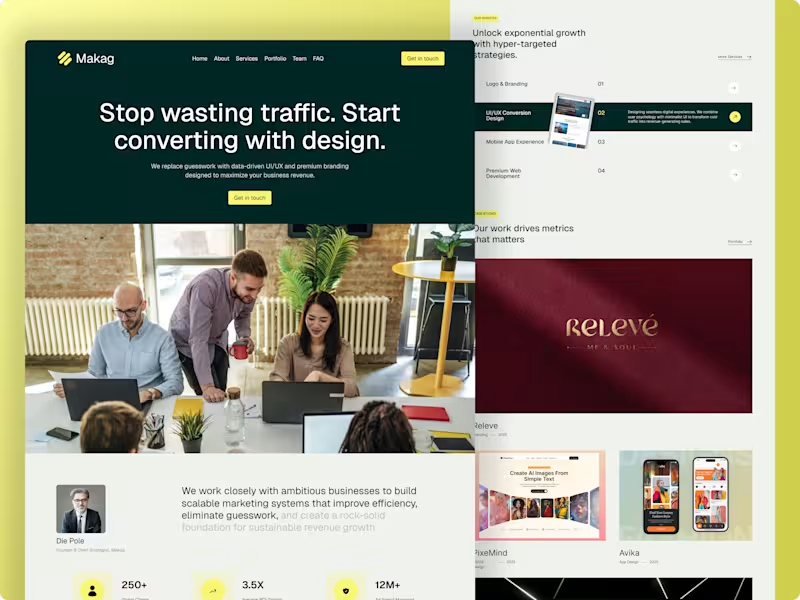
Makag — Premium Agency Website Design with Modern SaaS Aesthetics 📌 Project Overview Makag is a data-driven marketing agency designed to help ambitious businesses maximize their revenue. The core objective of this project was to design a high-converting landing page that breaks away from boring, traditional agency templates. By blending a premium agency framework with modern SaaS design trends (sleek dark overlays, vibrant color accents, and structured grids), the final interface delivers a sophisticated and trust-building user experience entirely crafted in Figma. 🚀 The Challenge Standard agency websites often struggle with low conversion because their layout feels generic or cluttered. For Makag, the core challenges were: SaaS-Inspired Premium Look: Creating a bold, dark-themed aesthetic with sharp visual contrasts to stand out instantly in a crowded market. Conversion-Driven Architecture: Designing a strong, benefit-driven hero section with strategic CTAs ("Get in touch") to turn visitors into high-value leads. Data & Authority Layout: Organizing complex agency metrics (250+ Clients, 3.5X ROI Growth, 12M+ Ad Spend) and multi-niche case studies into a clean, modern grid that feels highly intuitive. 🛠️ My Design Process UX Strategy & Structure: Designed a seamless navigation system (Home, About, Services, Portfolio, Team, FAQ) optimized to build immediate client trust and guide them toward the primary action points. Visual Direction & SaaS Aesthetics: Selected a premium dark forest green paired with an energetic neon yellow accent. The typography, spacing, and clean borders give the agency site a cutting-edge software/SaaS feel. Interactive Services Section: Built a dynamic "Our Services" section showcasing specific capabilities (Branding, UI/UX Conversion, Web Development) using clean hover states and component variations to keep the interface engaging yet minimal. Premium Case Studies Grid: Created a structured showcase grid for the agency's diverse design portfolio (featuring work like Releve, PixeMind, and Avika) across web and mobile layouts. 📦 Key Deliverables Complete High-Fidelity Responsive Landing Page Design (Figma) Reusable UI Component Library & Custom Interactive Hover States Defined Corporate Typography & Color Design Token System Clean, Developer-Ready Asset Tokens for Seamless Handoff 📈 The Outcome The final product perfectly bridges the gap between structured corporate capability and modern design aesthetics. By utilizing tech-forward SaaS visuals, strong social proof metrics, and high-visibility CTAs, the platform is fully engineered to elevate the agency's online presence and successfully capture high-tier international clients.
1
40
Cover image for 🤖 AIChatbot – High-Converting SaaS
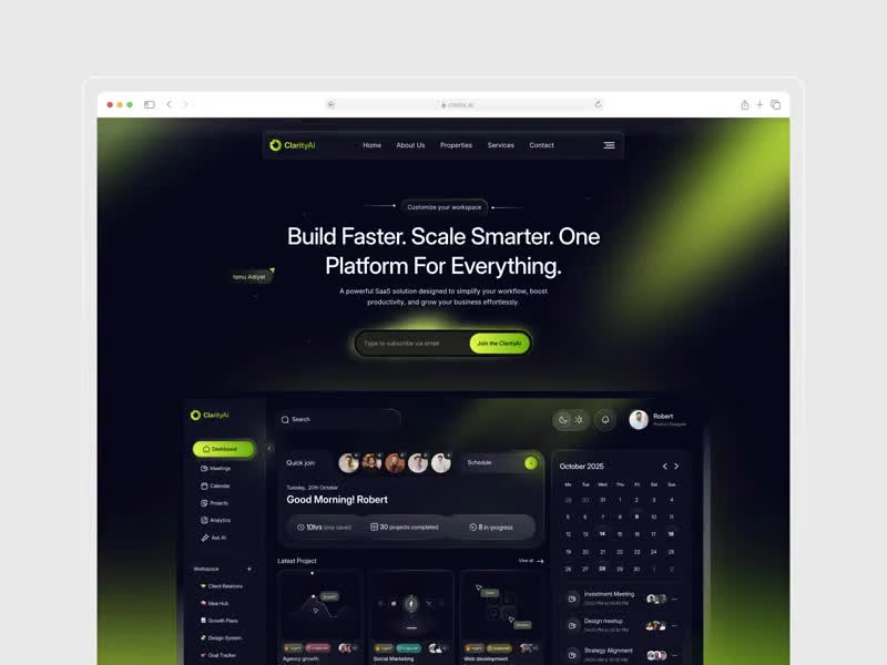
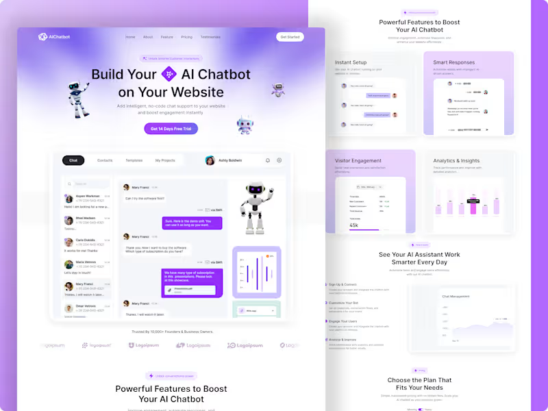
🤖 AIChatbot – High-Converting SaaS Landing Page Project Overview A complete, conversion-focused B2B SaaS landing page designed for a next-generation No-Code AI Chatbot platform. The core goal of this project was to take complex technical AI features and present them through an intuitive visual narrative that drives instant sign-ups and free-trial activations. The entire layout is structured with a strict user psychology flow—moving from an attention-grabbing hero section directly into structured feature grids, behavioral workflows, analytics proof, and transparent pricing. 💻 Key Design Highlights & UX Architecture Product-Led Hero Section: Blends bold typography with interactive 3D elements and a clear product dashboard preview, allowing users to visualize the software immediately. Feature Grid & Layout Hierarchy: Designed clean, balanced grid structures for "Powerful Features" (Instant Setup, Smart Responses, Visitor Engagement) utilizing generous white space and micro-dashboards. Visualized Analytics & Social Proof: Integrated clean graph UI elements and a subtle logo marquee to build instant trust with tech founders and product managers. Conversion-Driven Pricing Structure: A clear, modern pricing section optimized to minimize friction and guide users smoothly toward the "Get Started" CTA. 🛠️ Tools & Design System Tools Used: Figma Deliverables: Pixel-perfect responsive web layouts, scalable auto-layout components, and consistent typography scales. 💡 Need a high-converting, modern landing page or a custom SaaS dashboard for your tech startup? Let’s collaborate to turn your platform idea into an elite digital product. Send a direct message right here on Contra to start today!
1
42
Next, React, HTML, SASS | Product, Brand | Website Building
1x
Hired
5.0
Rating
349
Followers
Next, React, HTML, SASS | Product, Brand | Website Building
Delivering Memorable User Experiences for Apps and Websites.
$5k+
Earned
2x
Hired
5.0
Rating
124
Followers
Delivering Memorable User Experiences for Apps and Websites.
Creating Stunning Websites with WordPress,Webflow & Framer
$5k+
Earned
6x
Hired
5.0
Rating
34
Followers
Creating Stunning Websites with WordPress,Webflow & Framer
Strategic UI/UX Design for Scalable Tech Products
68
Followers
Strategic UI/UX Design for Scalable Tech Products
Top 10% Product Designer | Designing SaaS & Websites
1x
Hired
111
Followers
Top 10% Product Designer | Designing SaaS & Websites