Projects in Colombia
Projects in Colombia
Sign Up
Post a job
Sign Up
Log In
Filters
1
Projects
People
$1.9K+ earned
Message
10
Mateo Costa
max
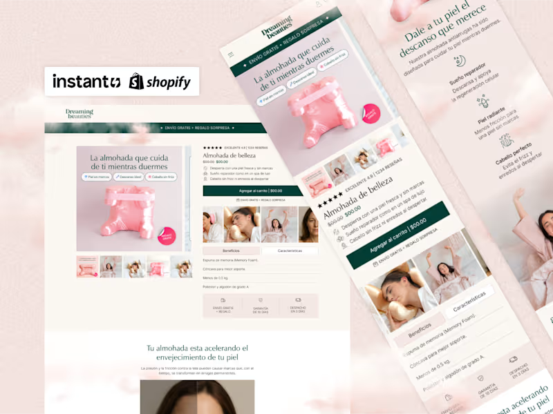
E-commerce Store Design & Development for Beauty Brand
10
271
Message
4
Marlon Velásquez
Zilverk - Stream Assets
4
14
Message
0
María Camila Páramo Molina
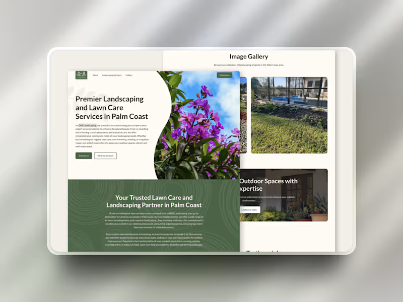
D&B Landscaping Website Design
0
13
Message
1
Daniel Muller
Waves — Brand & Logo Design
1
25
Message
0
aldama agencia
MAM 360
0
3
Message
1
Juan David Giraldo Saldarriaga
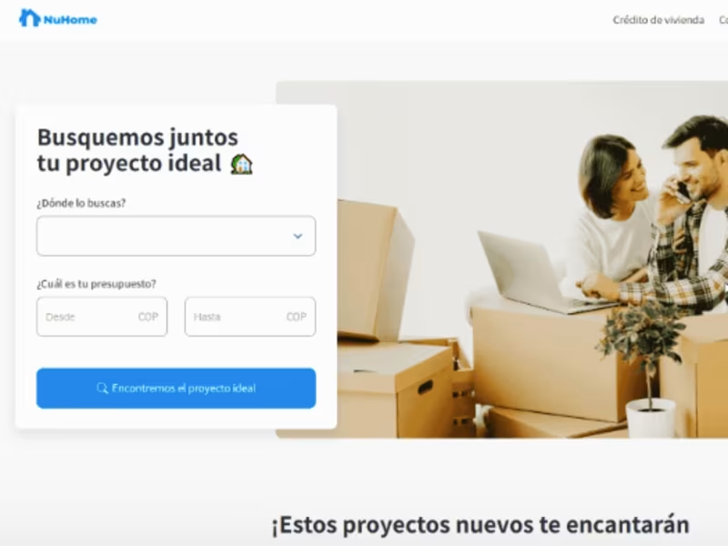
Nuhome Marketplace Development
1
19
Message
0
Jairo Ruiz
pro
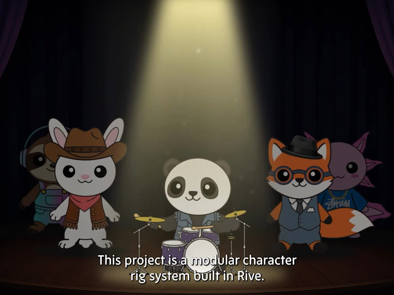
Modular Rive Character System for Music-Driven Interactions
0
10
Message
0
Juan Hoyos
pro
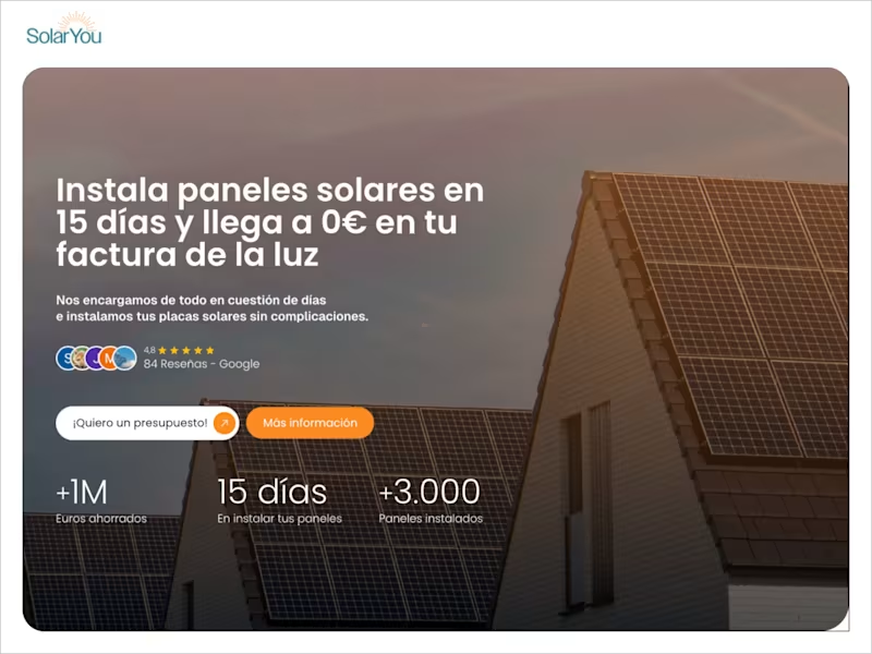
SolarYou — Solar System Platform for Spain
0
8
Message
0
Laura Castano
pro
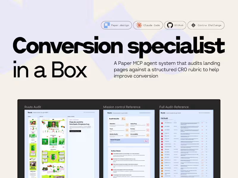
Landing Page CRO Audit System Development
0
8
Message
0
Marco Agudelo
pro
Clean and elegant
0
55
Message
1
Juan Diego
And I'm just starting
1
44
Message
35
Keileth Castillo
pro
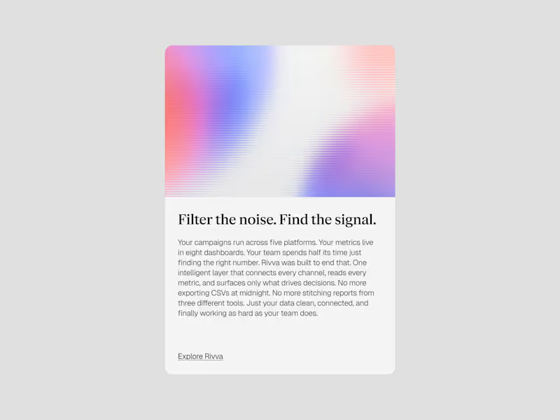
Rivva — A brand exploration. Built a full visual system and direction around an AI data management concept. Light palette, layered compositions, and gradient textures. A brand that feels approachable without losing technical credibility.
3
35
592
Message
0
Juan Garces
Website Redesign for Corsa Ecom Agency
0
12
Message
3
Daniel Castellanos
pro
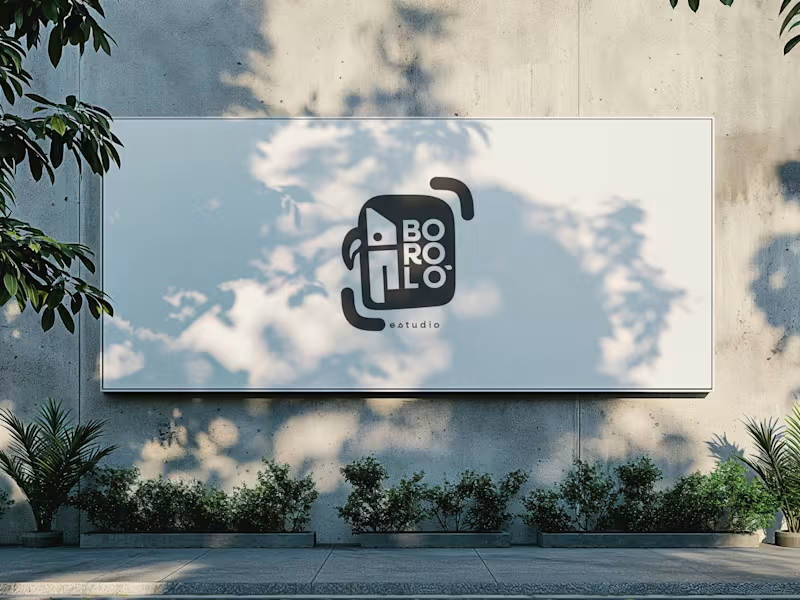
There are design decisions that don't come from the client. They come from within—and sometimes, that is exactly the problem. The previous logo for Boroló Estudio had soul. It had pre-Columbian roots, a hand-drawn stroke, and an indigenous character. It evoked drums, authenticity, and the Chocó—one of the most biodiverse and culturally rich regions in Colombia, a land of jungle, rivers, and a visual identity unlike any other. I loved it. And precisely because of that, I failed to evaluate the challenges the logo would face on real-world platforms: on a website, as an Instagram avatar, or in digital spaces. The redesign wasn't about letting go of the logo. It was about letting go of the attachment. The problem wasn't aesthetic—it was one of coherence. The studio’s brand had evolved, but the logo hadn't. A composition with too many elements in tension made the icon struggle to be memorable; what people saw didn't connect with who Boroló truly is. The new system retains the bird—now geometric, set in negative space within the icon. The inner container references the studio’s actual architectural blueprint: the diagonal of the cyclorama ceiling and the two zones of the space. The brackets refer to photographic framing. No layer imposes itself over the other—they are discovered. The result is a versatile system: imagotype, vertical logo, and wordmark. It works on a sticker, a billboard, an avatar, or a website. It scales without losing its identity. Redesigning doesn't mean the initial design was bad. It means communication needed to evolve. And from that point of view, the change isn't a correction—it’s a decision.
3
117
Message
0
Andrew Malaver
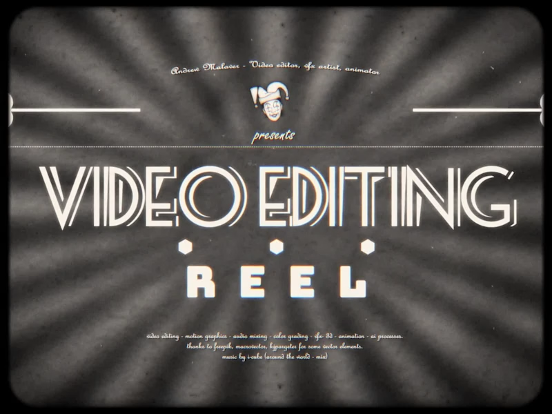
Clever Fool Studios - Video Editing Reel
0
21
Message
2
Flip by Contra Studio
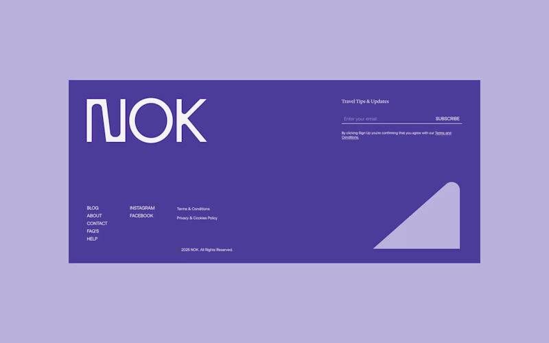
✨ New work: NOK, a hospitality brand redefining what it means to feel at home, anywhere.
2
131
Explore projects