Motion Designer with 10+ Years of Experience


Motion Designer with 10+ Years of Experience


Motion Designer | UI Animations & Explainers for SaaS
Motion Designer | UI Animations & Explainers for SaaS

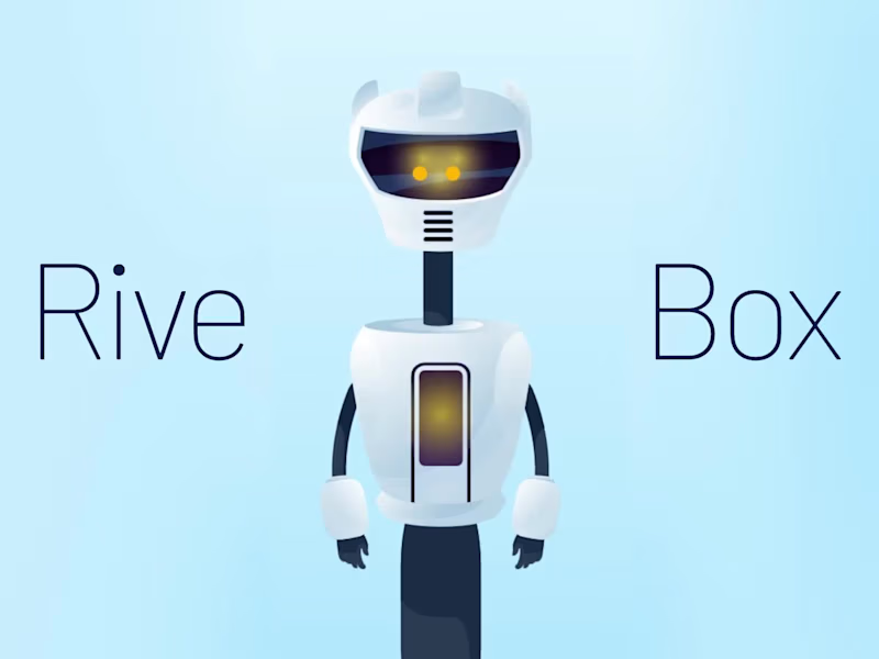
The task was to create an interactive AI assistant for a Flutter app that tracks the user's physical and mental state. Initially, I planned to build the logic entirely within Rive's State Machine, but I ran into issues with smoothly transitioning the animation speed dynamically. That's when I turned to Data Binding. The implementation was so seamless that I decided to drive the entire control system through Data Binding instead. You can test the live interactive version using the link below.
1
5
266

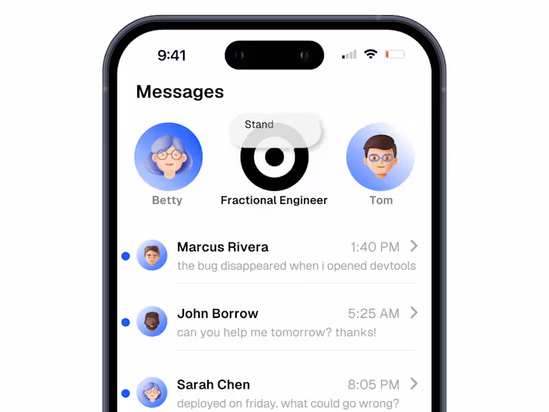
Just finished this SaaS promo for Qappt. To give it a stylish and modern feel, I brought their UI screenshots to life and mixed in some kinetic typography and live footage. The track really creates half the atmosphere in this one! )) I’d love to hear your thoughts.
2
227


Book Cover, Logo & Menu Graphic Designer
Book Cover, Logo & Menu Graphic Designer


Helping companies build brands that grow and last.
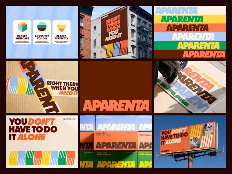
Branding direction for Aparenta, a relocation company built around the idea that moving isn’t just about boxes, it’s about people going through change.
The identity focuses on being present and supportive in those moments. It’s bold, direct, and easy to understand, just like the service itself. Strong typography carries most of the communication, keeping things clear and confident without feeling cold or corporate.
At the center of the system is a pattern inspired by helping hands. Translated into simple geometric forms, it creates a sense of movement, coordination, and support — a visual way of showing that you’re not doing this alone.
The color palette is vibrant and optimistic, bringing energy into an experience that’s usually stressful. Instead of feeling technical or logistical, the brand feels human, active, and reassuring.
Overall, the direction positions Aparenta as more than a relocation service. It’s a reliable presence that helps people move forward, both physically and emotionally.
2
98
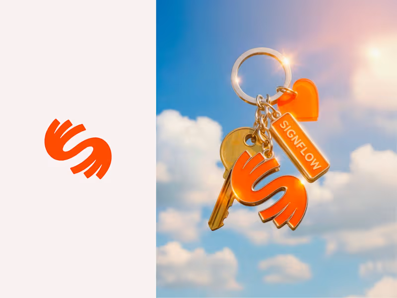
Logo exploration for Signflow, an American Sign Language (ASL) learning platform designed to make sign language more accessible, human, and intuitive.
The logo brings together two connected hands, forming the letter S — a symbol of sign, connection, and flow. The continuous shape reflects the natural movement of signing and the way communication flows seamlessly between people.
Built around clarity, inclusion, and ease of learning, Signflow aims to make ASL feel natural, expressive, and approachable for everyone.
1
115

Senior Brand Identity & Packaging Designer
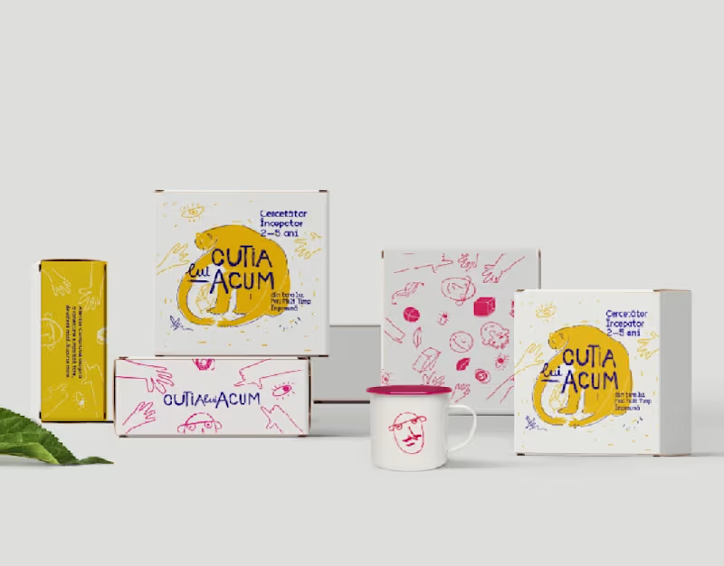
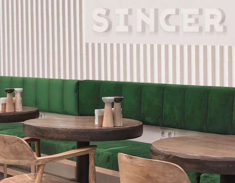
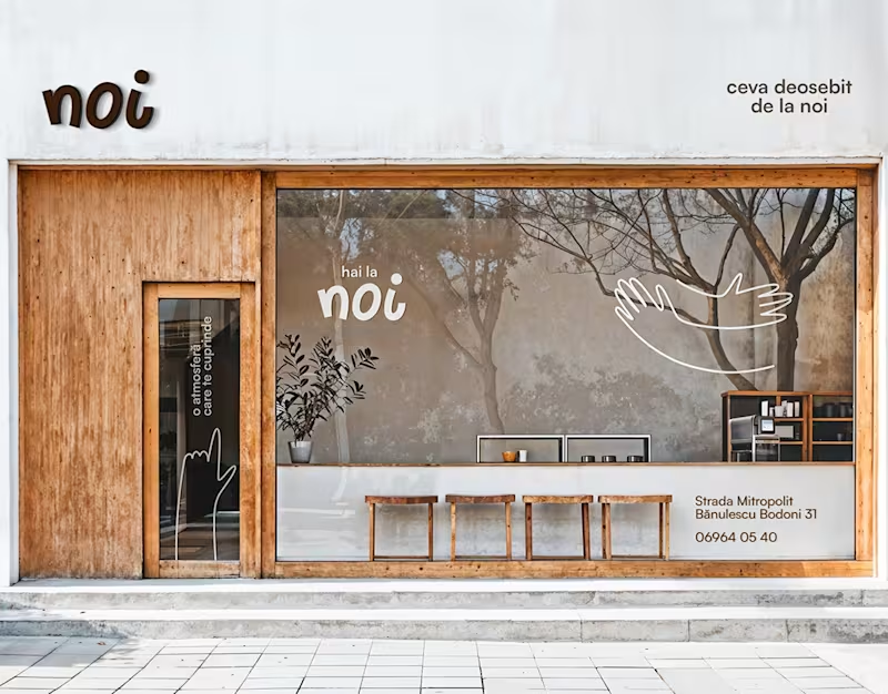
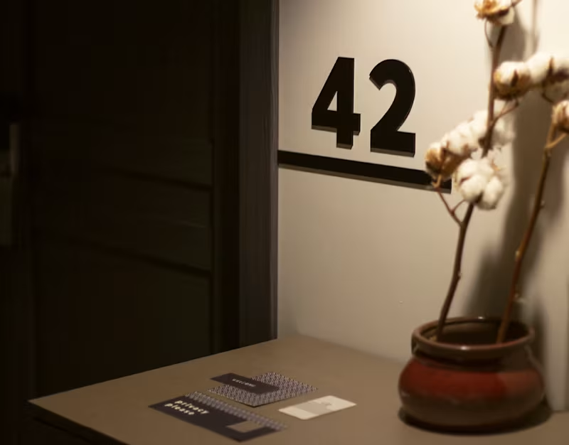

Brand Identity Designer & Web Designer & Logo Designer


Senior Branding Studio for AI, SaaS and Fintech


Innovative Brand Designer ✨