Freelance Web Designers in ChennaiFreelance Web Designers in Chennai
Product Designer, Brand Designer, Founder & Jitter Expert
$50k+
Earned
7x
Hired
5.0
Rating
163
Followers
Product Designer, Brand Designer, Founder & Jitter Expert
Web Design Team. We're here for you!
$25k+
Earned
6x
Hired
4.4
Rating
31
Followers
Web Design Team. We're here for you!
Product Design specialist + Framer Developer.
5.0
Rating
6
Followers
Product Design specialist + Framer Developer.
Product Designer & Developer
$1k+
Earned
8
Followers
Product Designer & Developer
Cover image for Been heads down on this
Been heads down on this for a bit and I'm genuinely hyped to share it 🎸 Jamly - everyone deserves an instrument 🎸🎹🥁 I always wanted to learn guitar. I just never wanted to buy one. So instead of buying one, I built it Turns out tools that let you play piano off your keyboard already exist, but why does literally none of them feel like an actual instrument, something worth touching? 🤔 That question turned into Jamly, built for the Flowstep Challenge - guitar, keys, and drums, played entirely off the keyboard you already have. Free. No login. Nothing to download. 🎯 What it does 🎸 Guitar - six strings, live. Fret with your fingers, strum with space, and the string actually rings out and fades, the way a real one does 🎹 Keys - two full octaves, playable with both hands, notes fading in over 300ms 🥁 Drums - five pieces, snappy 150ms hits that feel percussive, not laggy Guided Play - real songs, chord by chord, at your pace, ending in a jam-ticket recap screen instead of a plain checkmark Upload your own chords and play your own song, your way ✨ How Flowstep made it possible Every screen was designed in Flowstep - including the three instruments themselves, down to the guided-play animations. Getting the instruments right took a few honest misses first: an early pass leaned on a reused reference photo, then a stock image standing in for it, then flat shapes with no real depth. The actual fix was staying in Flowstep and iterating hard, screen by screen, until the material and depth genuinely looked right Claude Code was connected straight into Flowstep through its MCP server, and that connection did double duty: first, prompting and refining Flowstep's own design tools until the instruments hit real fidelity; then same connection, building and shipping the actual live site This was never really about a cheaper guitar. It's a bet that the only real gate between curiosity and actually playing was ever the price of admission, and once that's gone, it's just you, deciding if you want to keep going. 🎶 🎨 Flowstep file: Jamly Design (https://app.flowstep.ai/file?activeFileId=f31e7f50-3ca4-4dbb-af42-9da94f33c183) 🔗 Try it : https://jamly-muxic.vercel.app/
4
8
222
Cover image for 🏋️ SK FITNESS STUDIO
A real
🏋️ SK FITNESS STUDIO A real gym. A real glow-up. ✨ THE BUSINESS SK Fitness Studio is a unisex strength & cardio gym in Chinnadharapuram, Karur. 100+ members, running two years. I trained there myself, so I knew exactly where their online presence was failing them. THE OUTREACH I pitched them the redesign myself. I showed the manager what their online presence actually looked like to a customer: a static page, no pricing, no timings, and a "Join Now" button that just dialled a phone number. Then I showed him what it could be. He said yes on the spot. ✅ From there it was a hands-on collaboration. Real photos from the floor, their real pricing, their real timings, their real WhatsApp number, and the manager reviewing every iteration before it shipped. He's in the video, in his own words. That's not a testimonial I wrote. That's the guy who runs the gym. THE BEFORE Their entire online presence was a single static page. ❌ No pricing ❌ No timings ❌ No way to book anything ❌ Every button on it ("Join Now", "Call Now") just dialled a phone number 📞 So if you were browsing at 11pm. Or you wanted the price before calling a stranger. Or the manager was busy on the floor and missed the call. That lead was gone. The gym was running on missed phone calls. ⚡ THE AFTER A fully designed, mobile-first site, built and published on Base44. 🎨 DESIGN → Kept their brand equity: their red, and their own tagline, "Gym first. Excuses next." (with EXCUSES struck through in red) → Dark, editorial, premium. Oversized display type, full-bleed photography, glass stat cards → An "Inside SK" poster grid with solid-over-outline titles, oversized numbering, red arrows → Motion throughout: ken-burns hero, an animated strikethrough, count-up stats, a scrolling marquee, hover states on every card → Fully mobile-responsive, with a sticky Book / WhatsApp bar always one thumb away 📝 CONTENT → Their real programs: weight loss, muscle gain, cardio → Their real timings: 6–10 AM, 4–10 PM, open all days → Transparent pricing, four tiers: ₹1,000/mo · ₹2,500/3mo · ₹5,000/6mo · ₹10,000/yr → An FAQ section, a gallery, a real location 🙅 No more "call to find out." THE AUTOMATION 1️⃣ SESSION BOOKING SYSTEM Visitors book a free trial (date + morning/evening) or a personal training session (date + time). Every booking writes to a Bookings table with a full status workflow: New → Confirmed → Completed / Cancelled. 2️⃣ AI AGENT (the core of it) One agent, two front doors: their WhatsApp 💬 and a chat widget on the site. It's loaded with the gym's real pricing, timings, programs and policies, and it can: • answer customer questions at any hour, in plain language • collect name, phone, goal, date and slot • create the booking itself, straight into the database 🔥 It doesn't just reply. It books. 3️⃣ ADMIN DASHBOARD Every booking lands here: name, phone, type, date, slot, status. The manager filters, confirms, and runs his day from one screen. No spreadsheet, no notebook, no missed call. 🎯 THE RESULT A gym that used to run on missed phone calls now takes bookings 24/7, on its own. 🌙 A customer can ask about pricing at midnight, book a trial, and be confirmed by morning, without anyone picking up a phone. 🗣️ The manager says it best himself. He's in the video. 🔗 Old site: https://skfitnessstudio.github.io/SK-Fitness-Studio/ 🔗 Live site: https://sk-fitness-studio.base44.app 📣 Post: https://www.linkedin.com/posts/surya-ux_giveitaglow-base44giveitaglowchallenge-share-7481793147015127040-7FY0/ #GiveItAGlow
2
181
Master of Web Design
5.0
Rating
8
Followers
Master of Web Design
Cover image for PERA Consulting – Framer Website
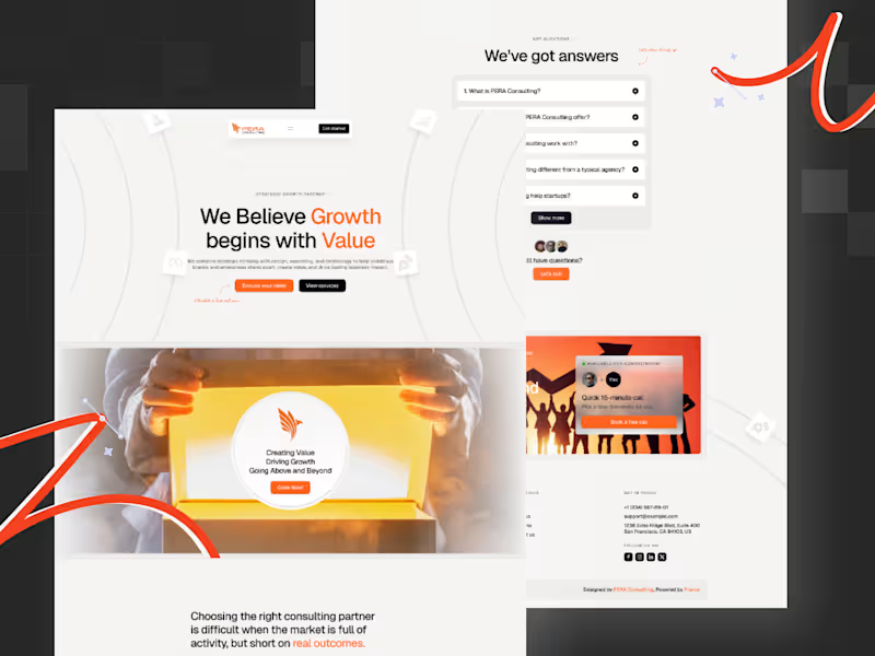
PERA Consulting – Framer Website Design & Development Client: PERA Consulting Industry: Business Consulting & Growth Strategy Role: Framer Designer & Developer Tools Used: Framer Website: https://www.peraconsulting.xyz/ Project Overview I collaborated with PERA Consulting to design and develop a modern, high-conversion website using Framer. The goal was to create a digital presence that clearly communicates their consulting value, simplifies complex service offerings, and positions them as a strategic growth partner. This was a full Framer build from scratch, focused on combining strong messaging, visual clarity, and conversion-driven structure. The Challenge PERA Consulting needed a website that could: Clearly communicate their value in a crowded consulting space Avoid generic “we help you grow” messaging Present multiple services without overwhelming users Build trust quickly with new visitors Guide users toward taking action (consultation, contact) My Role & Approach 1. Strategic Positioning & Messaging Defined a clear value proposition: “Growth begins with value” Structured content to focus on user problems before services Simplified language to improve clarity and relatability 2. UI/UX Design in Framer Designed a clean, modern layout with strong visual hierarchy Created structured sections: Hero → Problem → Solution → Proof → CTA Used whitespace and typography to improve readability Balanced visuals with content to avoid a “corporate-heavy” feel 3. Framer Development Built the entire website natively in Framer Implemented responsive design across all breakpoints Added smooth interactions and subtle animations Ensured fast performance with optimized assets 4. Conversion-Focused Execution Placed clear CTAs throughout the page Designed sections to guide users toward action Reduced friction in navigation and content flow Key Highlights Framer-First Build Fully designed and developed in Framer for speed, flexibility, and modern interactions. Clear Positioning Strong, simple messaging that differentiates PERA from generic consulting firms. Structured Storytelling Each section is intentionally designed to move users closer to conversion. Modern Visual Identity Clean layout, warm accents, and minimal clutter to maintain a premium feel. Conversion-Oriented Design Strategic CTA placement and content flow to increase engagement. Outcome The final website delivers a clear, modern, and conversion-focused experience that aligns with PERA Consulting’s positioning. It helps visitors quickly understand the value offered and encourages them to take the next step. The Framer build also ensures the site is easy to update, scalable, and ready for future iterations. What This Project Demonstrates Expertise in Framer design & development Ability to build conversion-focused consulting websites Strong understanding of positioning and messaging strategy Capability to translate business goals into clear digital experiences End-to-end execution: strategy → design → development
0
65