Good branding isn’t just about how a logo looks. It’s about what it represents.
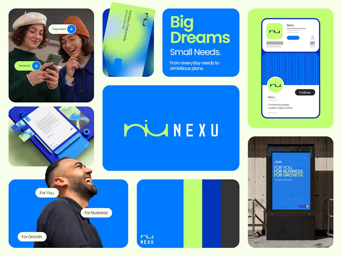
Sharing one of our recent projects: NEXU, a fintech brand identity built around connection, trust, and opportunity.
The idea was to create a visual identity that makes finance feel more human and approachable. The symbol brings together the gesture of reaching out and the strength of a bridge, representing the connection between people, capital, and opportunity.
From the logo concept to the broader visual identity, every detail was designed to communicate confidence, clarity, and progress.
It’s always rewarding to see how a simple visual idea can tell a much bigger story.
Would love to hear what you think!
Check it out (https://contra.com/p/NF3FYbO7-nexu-or-fintech-brand-identity)
#BrandIdentity #LogoDesign #Fintech #BrandDesign #ContraCommunity
6
9
1K



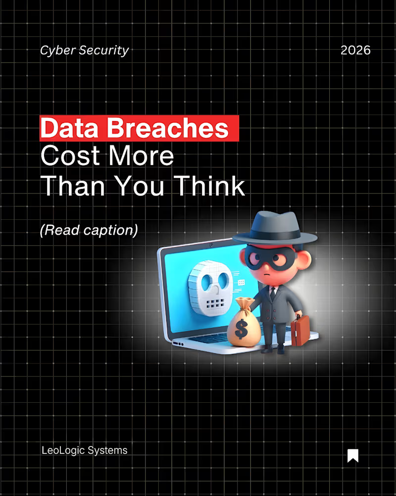
Data breaches cost more than you think.
In 2025, the global average breach cost hit $4.44M.
In the U.S., it climbs to $10.22M.
And it’s not just IT recovery.
It’s lost customers. Regulatory fines. Downtime. Legal costs. Reputation damage.
One phishing email.
One vulnerability.
One misconfiguration.
That’s all it takes.
Cyber risk isn’t an IT issue anymore.
It’s a business survival issue.
At LeoLogic Systems, we help startups and enterprises build proactive security frameworks that protect revenue, reputation, and long-term growth.
The question isn’t if you’ll be targeted.
It’s whether you’ll be ready.
#LeoLogicSystems #CyberSecurity #DataProtection #RiskManagement #EnterpriseSecurity #DigitalTrust
3
1
571
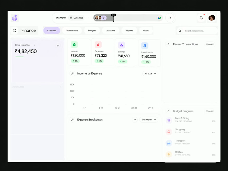
Finora — Personal Finance & Fintech Dashboard Design
A modern fintech dashboard concept crafted to simplify personal financial management through thoughtful UX and clean visual design.
The interface brings essential financial information together in one unified workspace, allowing users to monitor their total balance, income, expenses, savings, investments, transactions, and budget progress at a glance.
1
60
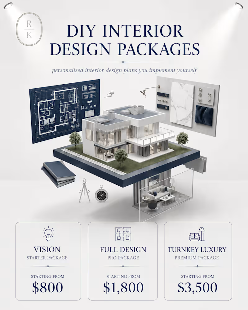
Turning RKID’s quiet-luxury positioning into content that feels as premium as the brand.
I created the creative direction, messaging and visual content to showcase RKID’s high end interior services in a way that feels elevated, intentional, and conversion-focused.
From package presentation to luxury-led storytelling, every detail was designed to make the brand stand out.
Strategy + Creative Direction + Content Design - built to attract the right luxury audience.
3
197
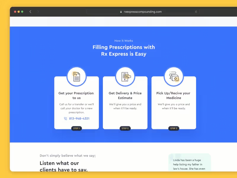


The client needed an updated, modern design for their hair transplant website. Their old website was really old-fashioned and needed to be updated to cater to new customers who use other modern websites and compare the design with the service quality.
So this landing page was designed to make the website modern and easy to scan when loaded.
Sadly, the client disappeared without paying.
1
180




Milestone timeline wall I designed. 17 years of growth. 10+ acquisitions across 4 countries. All of that information had to fit on a single wall in their head office corridor, and still be readable from 10 feet away.
The tricky part with timeline designs like this is managing density.
You have 15+ logos, country flags, acquisition labels, and year markers. If you just list them linearly it becomes a spreadsheet on a wall. Nobody reads that.
So I built it around a mountain progression. Each peak represents a growth phase. The timeline flows bottom-to-top instead of left-to-right, which naturally maps to the "climbing higher" narrative. The clouds separate the visual layers so the density doesn't overwhelm.
Designed for large-format print. This sits in their main office corridor.
2
181