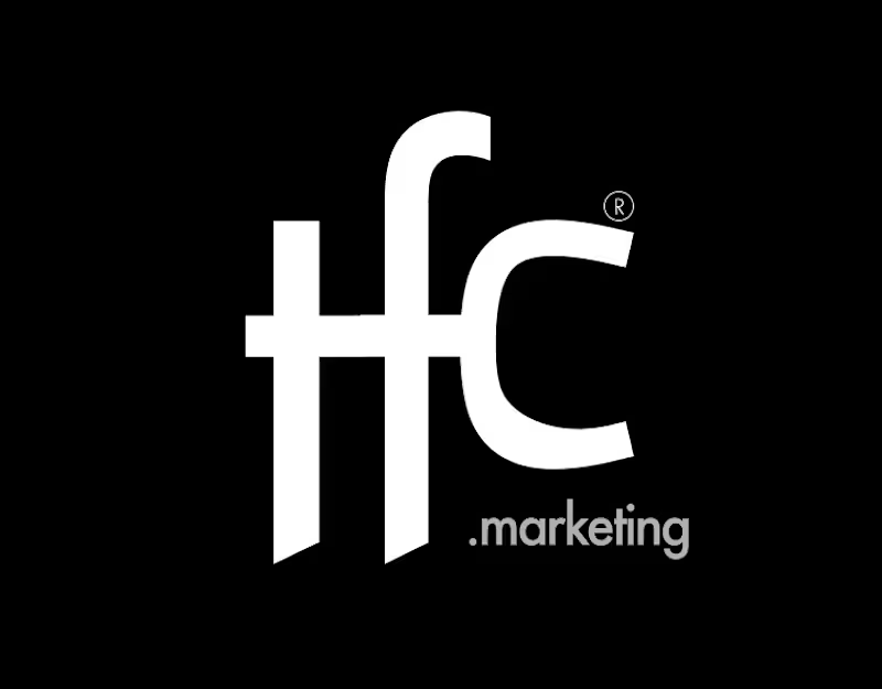
When does a hand-drawn logo make sense for a brand?
In this case, a Barcelona-based creative studio founded by a team with decades of combined experience approached me wanting a hand-drawn identity that would feel unexpected for a team like them, a way to signal creativity and distinction.
They came with a strong concept: the sediment at the bottom of a wine glass. What stays after everything else fades. A nod to what good work leaves behind after years of experience.
The entire identity is built on hand-drawn illustration, so the logo needed to do something different. With so much personality already living in the visuals, we went for a logotype with weight and presence, something that could anchor the brand and communicate their expertise.
The hand is still there. Just in a different form.
Do you think hand-drawn elements are being used more as a trend than as an intentional choice?
171
409
65.9K




Whimsical Nature Spirits — Sticker Pack
A dreamy sticker pack featuring gentle creatures born from nature — roots, trees, mushrooms, and rivers that seem to have their own tiny souls.
Each character is drawn in my signature soft style with warm colors and calm, emotional expressions. These designs can be used for stickers, prints, or tattoo inspiration — perfect for those who love cozy fantasy worlds and quiet magic.
2
1
88

This is a quick snippet from a larger explainer video focusing on West African art. My goal with this sequence was to translate the static, sophisticated feel of a high-end magazine layout into a dynamic, educational narrative.
Even after completing the project, I still love the editorial aesthetic and this warm, earthy color palette of deep ochre, muted beige, and charcoal. It builds a visual bridge between archival textures and modern motion graphics. 🙌
4
3
268