Kosmetrics – Brand Identity Design
Daniela Garza
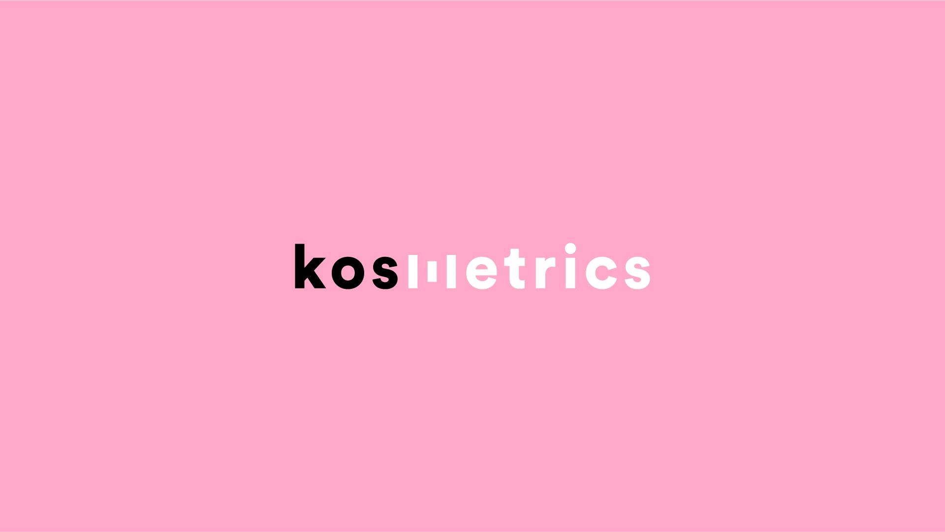
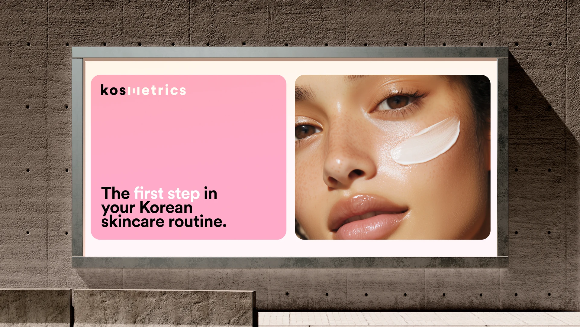
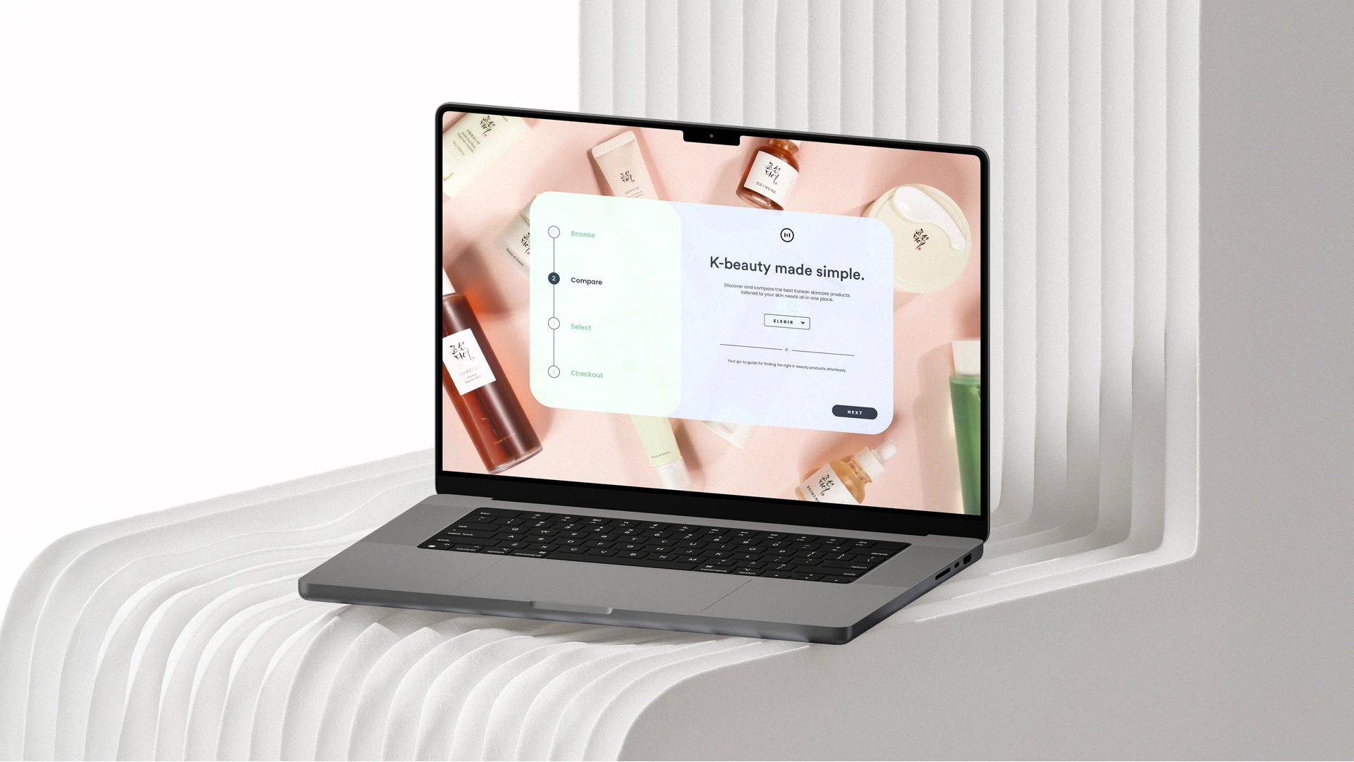
Kosmetrics - K-beauty made simple
Branding
MEXICO / KOREA
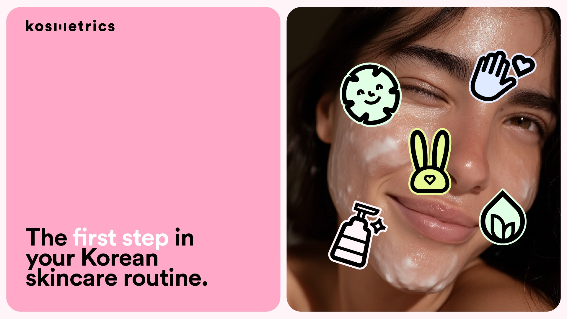
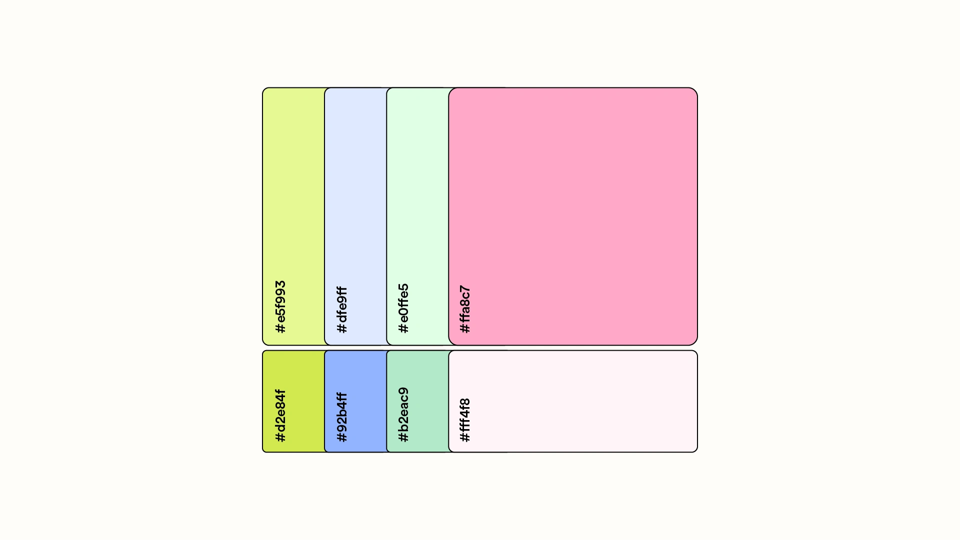
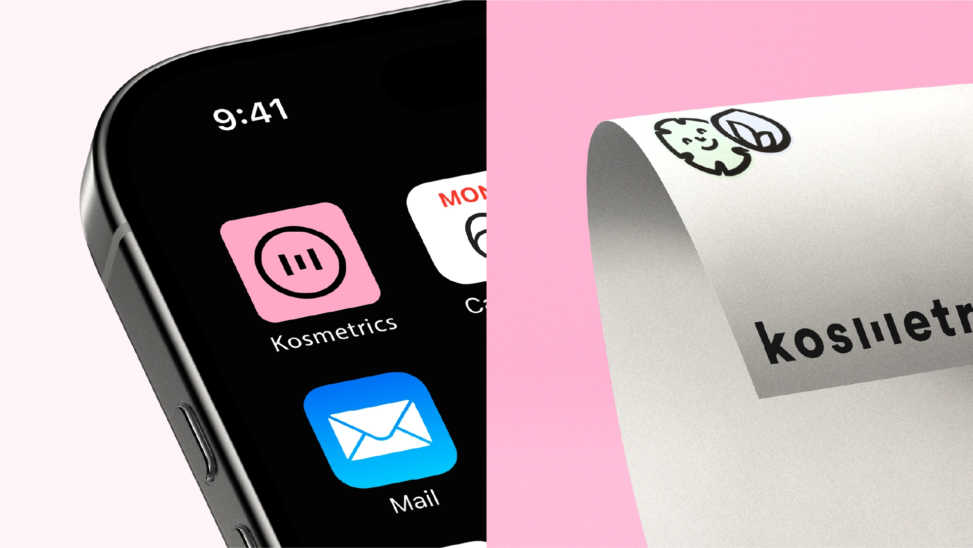
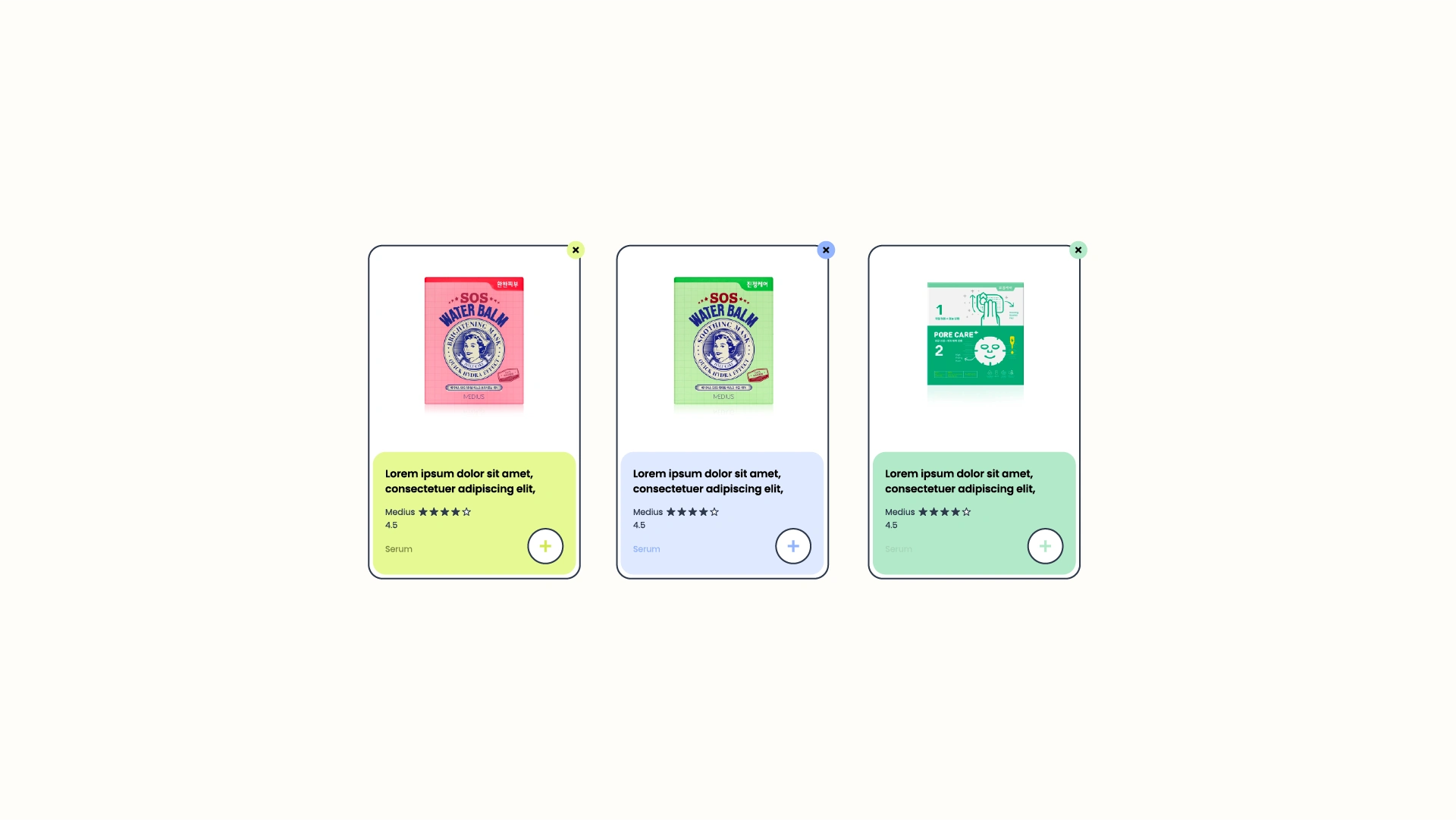
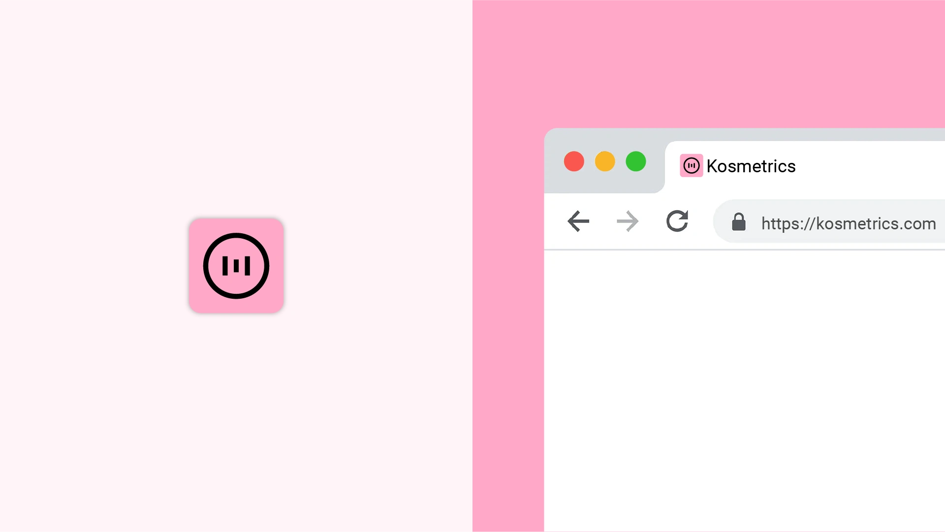
Kosmetrics is a digital platform that simplifies the search for Korean skincare products through smart comparison tools. The branding was developed to balance a tech-forward personality with the softness and appeal of the K-beauty world. The logotype uses a clean, sans-serif typeface to convey clarity and modernity, while the custom “M” icon subtly references performance charts to visually connect with the platform’s data-driven nature. The primary color is a soft pink, chosen to add warmth, friendliness, and a fresh, youthful feel to the identity. Alongside the logotype and icon, the brand system includes a cohesive color palette, a set of custom icons, and a visual guide to ensure consistent application across digital platforms. The result is a brand that feels intelligent, approachable, and visually refined, just like the experience Kosmetrics aims to offer.


Brand identity is about building connections and creating lasting impressions. Work with us to experience the difference that a cohesive and impactful brand identity can make.
Let's tell your story, connect with your audience, and unlock new opportunities together.
Work with us: www.madebylunch.com
Like this project
Posted Jul 18, 2025
The result is a brand that feels intelligent, approachable, and visually refined, just like the experience Kosmetrics aims to offer.
Likes
0
Views
9