Projects using Storybook in BrooklynProjects using Storybook in BrooklynConcept Work: Audi - Vehicle Car Website
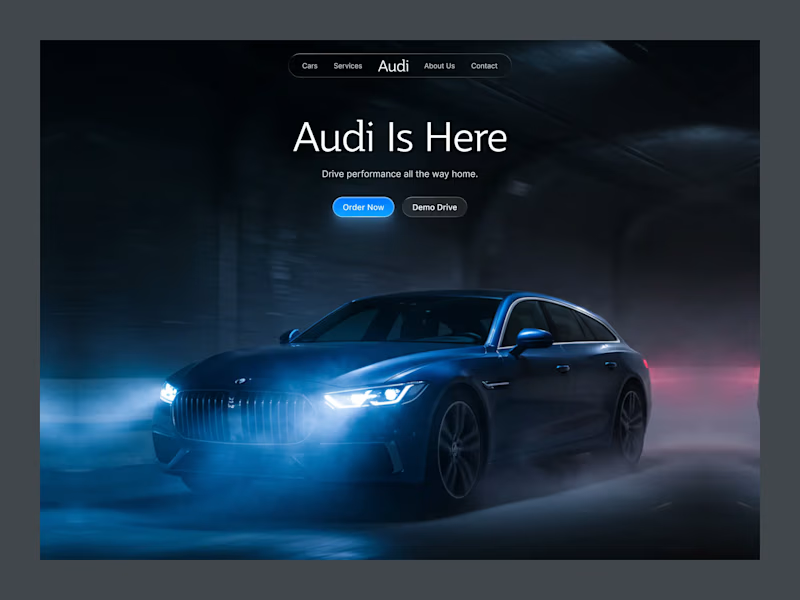
Audi Drive is a luxury automotive landing page concept designed to capture the feeling of performance, precision, and premium craftsmanship. Instead of relying on information-heavy layouts, the experience uses a cinematic hero section, minimal navigation, and focused calls to action to let the vehicle become the center of attention. The dark visual theme, atmospheric lighting, and clean typography create a premium first impression while guiding users naturally toward exploring or booking a test drive. The goal was to balance strong visual storytelling with a simple, user-friendly experience that reflects the Audi brand.
Key Design Features
Cinematic Hero Experience: A full-screen automotive visual with dramatic lighting and motion that immediately communicates performance and luxury.
Minimal Navigation: A clean, distraction-free navigation bar that keeps the focus on the vehicle while making key sections easy to access.
Clear Call-to-Action Buttons: Primary actions like Order Now and Demo Drive are visually prioritized to encourage quick user decisions.
Premium Visual Hierarchy: Large typography, generous spacing, and a balanced composition create an elegant reading flow and improve usability.
Luxury Dark Interface: A dark color palette combined with subtle glass effects and blue accent lighting enhances the premium feel while maintaining strong readability.
User-Centered Layout: Every element is intentionally placed to reduce cognitive load, making the interface both visually engaging and easy to navigate. AirFly - Flight Booking Website UI Design
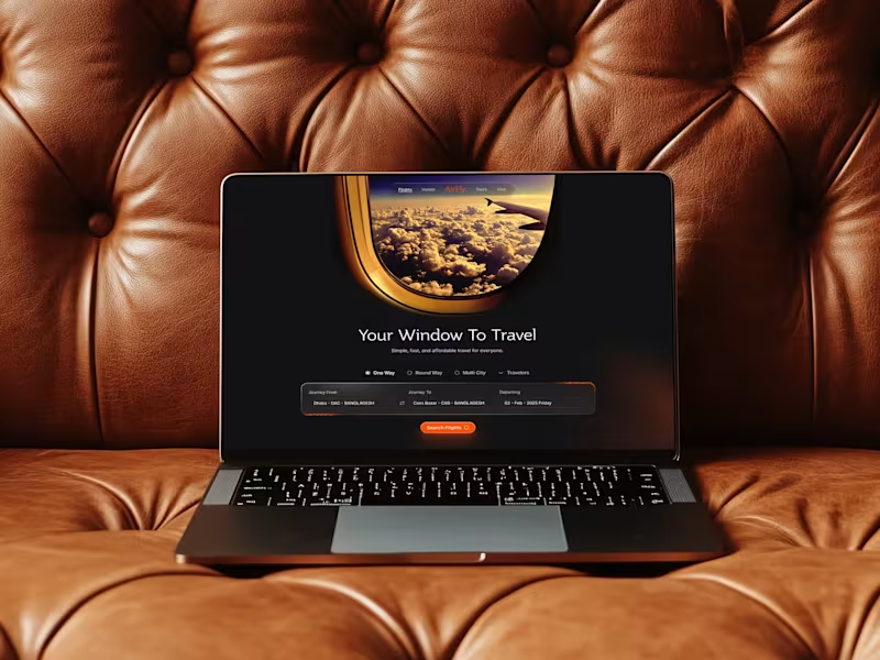
AirFly is a luxury-oriented travel UX concept that moves away from the sterile, cluttered layouts typical of booking engines. The theme focuses on "The Joy of Departure," utilizing a dark, cinematic aesthetic to evoke the mystery and excitement of travel. By combining high-impact photography with a streamlined search interface, AirFly transforms a functional task into a premium digital experience, ensuring users feel the "safely travel" promise from the first click.
Key Design Features:
Cinematic Hero Header: A breathtaking full-width landing page visual that establishes immediate emotional trust and brand authority.
Intuitive Search Widget: A glassmorphic flight selector that simplifies complex "One Way," "Multi City," and "Traveler" variables into a single, sleek bar.
Dynamic Retargeting Section: A "Still Interested in New York?" component designed to reduce cart abandonment through personalized, data-driven flight recommendations.
Trust Indicators: Seamlessly integrated social proof through a "Trusted by popular companies" marquee and clear payment gateway icons (Apple Pay, Google Pay, Visa). Zentrix Real Estate Company Brand Identity Design
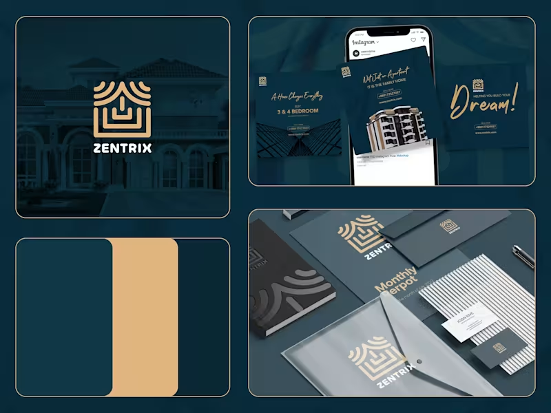
Zentrix isn't just a company; it's a commitment to excellence, innovation, and a client-centric philosophy that transforms the real estate journey. They're here to make a meaningful impact in the lives of their clients and the communities they serve. Welcome to a new era of real estate, where Zen meets the power of Trix, at Zentrix.
Zentrix isn't just a company; it's a commitment to excellence, innovation, and a client-centric philosophy that transforms the real estate journey. They're here to make a meaningful impact in the lives of their clients and the communities they serve. Welcome to a new era of real estate, where Zen meets the power of Trix, at Zentrix.
The logo of Zentrix is a combination of strip lines in the shape of a building. The consistent strip lines depicts that there is consistency between their work and there is harmony in their work process.
Challenges
The branding part was not really challenging but still a bit challenging was to incorporate the luxurious as well as trustworthy vibe to the logo. After some sketches, we were able to do it.
Solutions
To overcome the obstacles, we conducted research and meetings, as well as a lot of brainstorming and sketching. As a result, many ideas came to mind, and we were able to determine exactly what we and the client desired for the logo. StreamNext — Video Streaming Platform UI Design
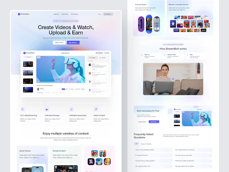
Presenting StreamNext, a sleek and modern video streaming platform UI designed to help creators effortlessly upload, share, and monetize their video content. This design focuses on a seamless user experience, combining clean aesthetics with powerful features for content creators and viewers alike.
Key Features:
Create Videos & Watch, Upload & Earn: Turn your videos into revenue. A simple, intuitive interface encourages users to upload content and start earning quickly.
Video Explorer: Browse and explore videos with rich media previews, viewer comments, and interaction options.
Monetization Dashboard: Track your earnings and schedule video releases with ease.
Content Variety: Support for multiple video categories, including quick shorts, global content, and even adult content, tailored for diverse audiences.
Unlimited Storage & Downloads: Stream your videos without buffering, with unlimited storage and download options for creators.
HLS Video Streaming: Smooth streaming technology ensures a buffer-free viewing experience. Sova AI — Dark SaaS Landing Page Design
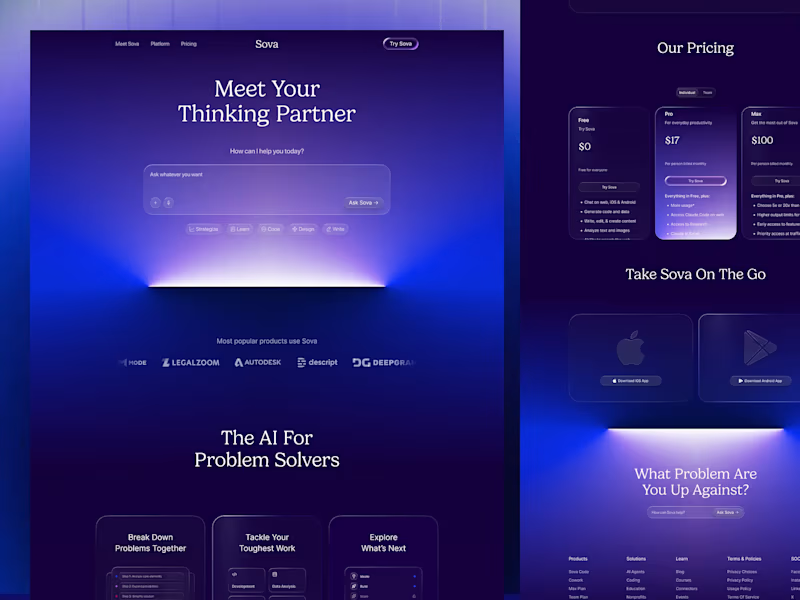
Sova AI is a next-generation AI-powered thinking and problem-solving platform built for individuals, teams, and businesses who demand more than a basic assistant; they need a true thinking partner. This shot presents the complete Dark SaaS Landing Page Design for Sova — a visually immersive, conversion-focused web experience built entirely around deep indigo and violet gradients, cinematic glow effects, and editorial typography. From the hero prompt interface down to the pricing tiers and mobile app section, every scroll tells a story that makes AI feel both powerful and deeply personal. Designed for the modern SaaS era — bold, dark, and built to convert.
Key Design Features:
Dynamic Pricing Tiers: Clean, vertical glass cards that clearly differentiate value propositions for Pro and Max users.
Seamless Cross-Platform Presence: Dedicated sections for iOS and Android integration to emphasize the "on-the-go" utility.
Problem-First Architecture: Instead of focusing on features, the layout prioritizes the user's pain points with the "The AI For Problem Solvers" section. Homevera --- Real Estate Landing Page UI Design
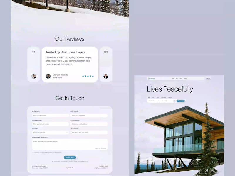
Homevera is a high-end real estate platform built around the idea of Peaceful Living. Instead of cluttered, data-heavy layouts common in property sites, it uses generous white space and immersive photography to reflect the calm and elegance of the homes it showcases. The result is an emotional, trust-driven experience from the first scroll.
The design features a clean editorial layout, strong visual hierarchy, and a search-first hero section. Clear navigation for Buy, Sell, Rent, and Agents reduces friction. Broker credibility signals, location chips, and an app download block support faster discovery, stronger trust, and higher-quality lead generation. Orbitly - CRM Analytics Dashboard
Orbitly is a purpose-built CRM and project management platform designed for agencies that need clear, actionable insights from complex data. Its Monthly Summary dashboard embraces a true data-at-a-glance philosophy, enabling agency owners to monitor financial health, claim status, and client growth without cognitive overload.
The interface uses a refined soft-UI style with subtle glassmorphism and a calming mint-and-sage palette. Layered cards, strong visual hierarchy, and generous whitespace make dense financial data easy to scan. Key features include intuitive revenue trend charts, a workflow-focused sidebar, and contextual KPI cards with growth indicators, bringing clarity, focus, and control into a single view.