Brand & Web Designer | Landing Pages, Sites & Art Direction
- 5.0
- Rating
- 45
- Followers
Brand & Web Designer | Landing Pages, Sites & Art Direction
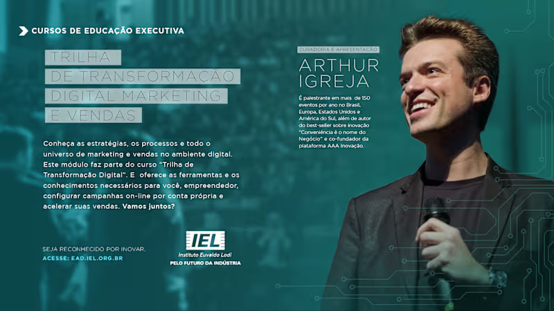
Visual design and art direction for IEL’s Executive Education campaigns. I developed a flexible visual system for multiple courses and programs, balancing strong typography, photography, brand consistency, and complex information hierarchies across digital communication assets.
1
163
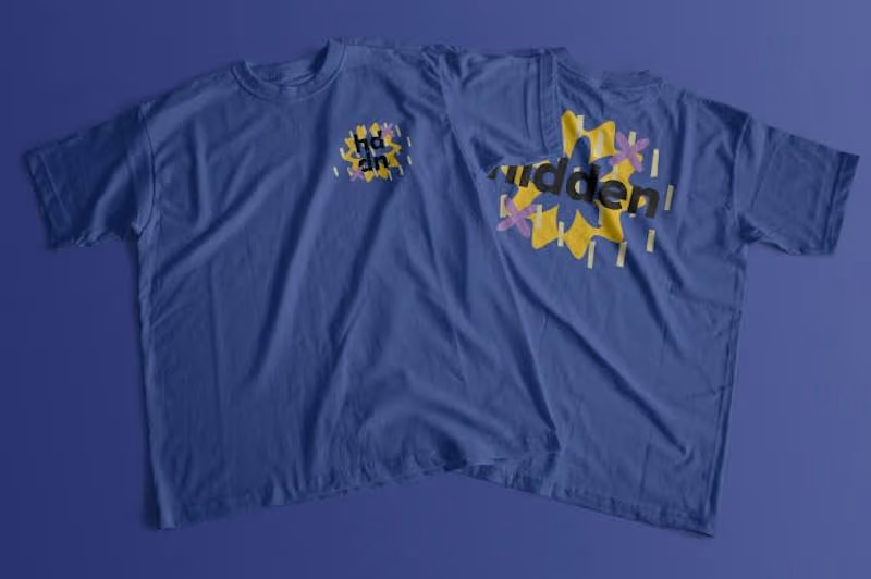
Visual identity and event design system developed for a special edition of Hidden in Salvador, Brazil. Working from the existing Hidden brand, I created the edition’s visual language and expanded it across promotional graphics, environmental signage, wayfinding, VIP credentials, apparel, and other event touchpoints. The system was designed to remain bold, flexible, and recognizable across both physical and digital applications.
1
234

Senior Brand Designer & Art Director | Branding & Editorial
New to Contra
Senior Brand Designer & Art Director | Branding & Editorial
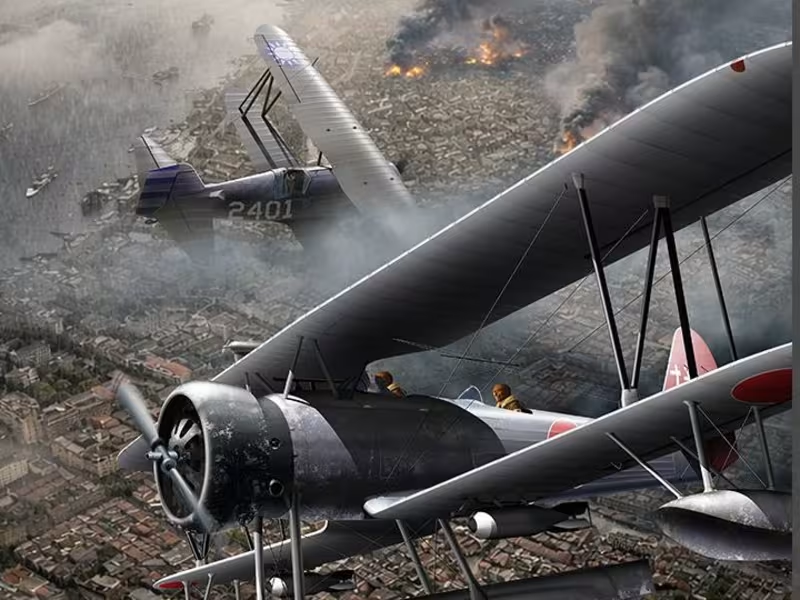
Historical aviation illustration depicting an aerial combat over Shanghai in the 1930s.
The aircraft were illustrated and composited manually using Illustrator and Photoshop, while atmospheric elements and environmental background were developed through AI-assisted generation and refined through advanced photo editing techniques.
This project combines historical research, visual storytelling, digital illustration, and modern AI workflows to recreate a cinematic interpretation of a real aviation conflict, balancing historical accuracy with narrative impact.
0
31
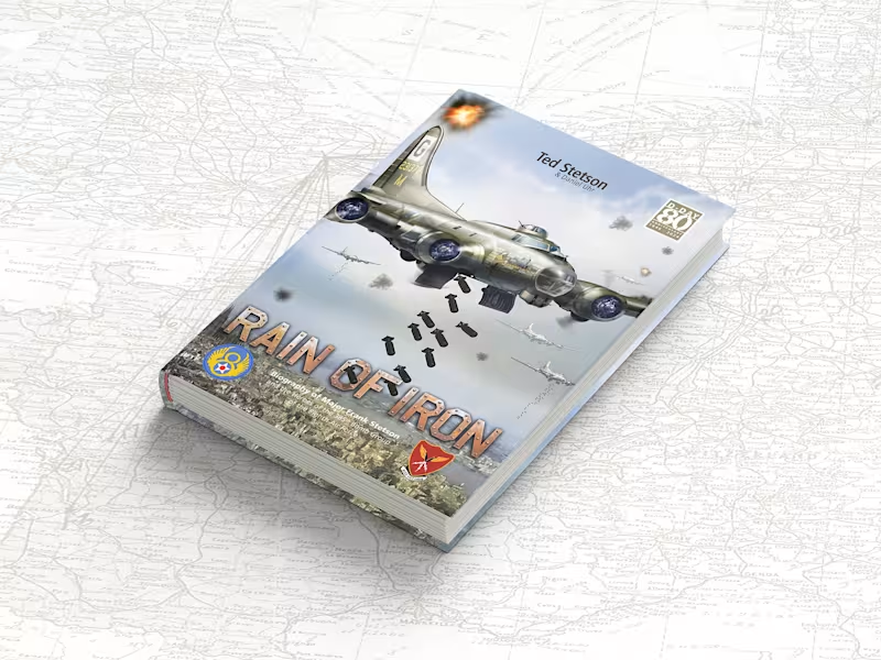
Some projects challenge your technical skills. Others challenge something much deeper. Rain of Iron was one of those experiences. This project was born from a deep personal story: the real experiences lived by the father of the author, a B-17 bombardier who fought during World War II.
But beyond the historical context, the heart of this work was never simply war itself. It was about telling the story of an ordinary person whose life was permanently changed after being called to face one of humanity’s darkest moments — and how returning home after war never truly means returning to who you once were.
From a design perspective, the challenge was immense. Hundreds of pages, large volumes of text, historical research, image restoration, technical illustrations, custom-built mission maps, typography decisions, editorial consistency, and the constant search for balance between density of information and fluid visual reading.
But what made this project truly meaningful to me was something beyond design. I had the opportunity to help someone fulfil a deeply personal mission: honouring his father and preserving the testimony of someone who witnessed history firsthand.
Not through the words of historians. But through the eyes of someone who was there. Sometimes we work for deadlines.
Sometimes we work for clients. And sometimes we work because certain stories simply deserve to exist. Because there are moments when money becomes secondary. And helping build something meaningful becomes the greatest reward itself.
1
37
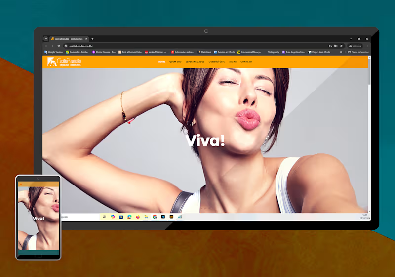
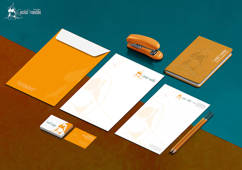
A Visual ID is one of the most important things for your own business
or for a corporate business.
Without it, there will be nothing to be presented for the audience and no matter if it is composed just by letters, letters and symbols or just symbols.
The work shown here was done for a gynaecologist and sex therapeutic
with focus on female public.
To develop the logo two main points were considered.
The idea of constructing a new structure, being this construction composed by multiple lines as happens in our lives, and woman sensuality represented by curved lines.
0
43

Designer, Creative Director & AI Specialist (visual)
Designer, Creative Director & AI Specialist (visual)