Freelancers using Contra in Bhiwandi
Freelancers using Contra in Bhiwandi
Sign Up
Post a job
Sign Up
Log In
Filters
2
Projects
People
Shezaan Ansari
pro
Mumbai, India
AI Video Producer | Brand Designer
$25k+
Earned
19x
Hired
4.3
Rating
284
Followers
expert
Expert
+4
Follow
Message
AI Video Producer | Brand Designer
8
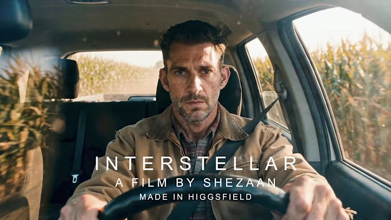
2nd Place in the CapCut AI Video Studio Challenge! 🥈 I’m incredibly stoked to announce that I’ve taken 2nd Place ($2,000) in the CapCut Video Studio Challenge right here on Contra. For this piece, I leaned into my obsession with the "Nolan" aesthetic—specifically focusing on 70mm IMAX textures and a cinematic narrative that bridges the gap between the grounded and the galactic. Hearing the judges break down my "Interstellar" tribute and call the shots "VFX-worthy" during the live announcement was a massive highlight. The Workflow: I utilized the new VideoStudio ecosystem, using the integrated Seedance engine to art-direct every frame. It was all about precision—syncing the atmosphere and scale to ensure the AI felt like a high-end camera, not just a generator. The Mindset: Most people look for a peak, but I’ve learned that when you’re built to keep climbing, there is no ceiling. This win is just the new baseline. Huge thanks to Zoë and the Contra team for the recognition and for pushing the boundaries of what’s possible in the freelance ecosystem. On to the next one.
4
8
694
2
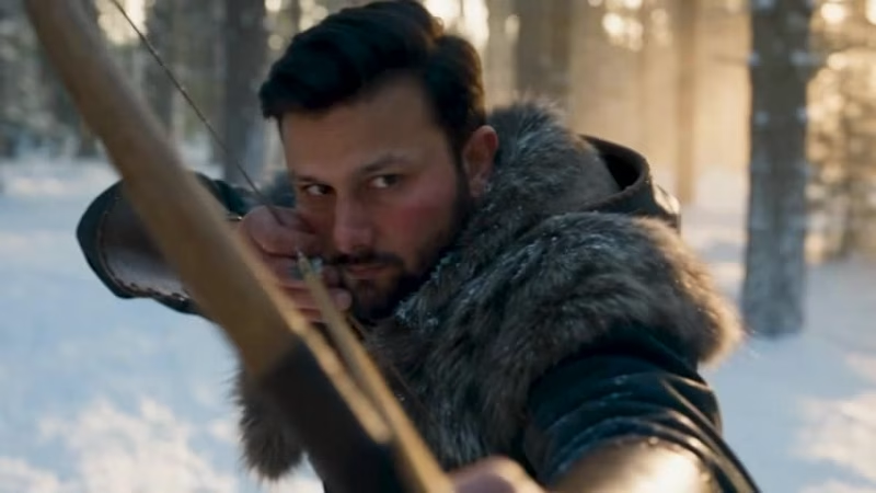
A hunter sparing the wolf that was meant to be his target 🏹🐺 Built this entire cinematic short using Higgsfield AI. Standard prompts usually give you flat camera motion and broken faces, so I pushed Higgsfield’s Cinema Studio controls, depth maps, and multi-shot consistency to land this level of realism. The Breakdown: Visuals: Higgsfield AI (photorealistic fur, atmospheric snow, dynamic lens lighting) Sound: Layered diegetic FX (iron clinking, snow crunch, breath) + dynamic cello score If you’re looking for high-end AI video production, pre-vis, or cinematic ad concepts—I'm open for contract work. Drop a DM or hit the hire button! 📩
2
2
462
4
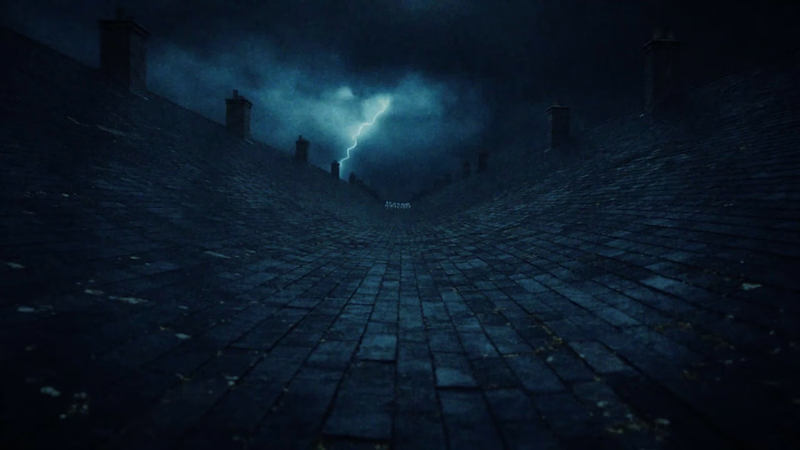
STORM HERD — 30 seconds, one continuous take, no cuts. A herd of white horses stampedes across the slate rooftops of a nineteenth-century city while a thunderstorm tears the sky open behind them. The camera never breaks: it starts at hoof height on a rooftop ridge, lifts into the air as the herd charges past, drops into a chase behind them, threads between two galloping bodies, climbs above the roof valley, then dives and flies backwards ahead of the leaders to the final leap off the roof edge into open air. The whole film is graded to a single cold palette — cyan-steel monochrome, blacks crushed to zero, highlights blown to pure white. The only light source in the entire 30 seconds is the storm. Five lightning strikes punctuate the take, and at the 16-second mark one of them blows the frame completely white for two frames, turning the horses into black cut-outs before the image recovers through a bloom haze. That flash is the hardest part of the whole piece — a full-frame whiteout is exactly where a model wants to cut, and holding the take through it was the technical problem I built the prompt around. Made in CapCut Video Studio with Seedance 2.5. Full prompt and workflow below.
3
4
796
2
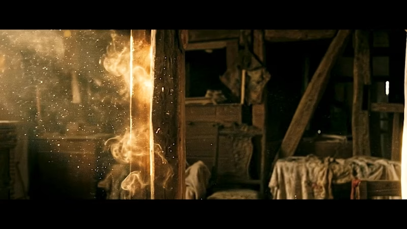
Hey Contra fam! 👋 A lot of you saw Version 1 of my Interstellar AI project when it won 2nd place in the CapCut Video Studio Challenge recently. The support from this community during that run was absolutely unreal, so I wanted to share the next evolution with you first. Here is Version 2. I wanted to see how far I could push the current AI video stack to mimic high-end cinematic language. I built this entirely from scratch—made in Higgsfield—to try and nail a very specific, gritty, and tactile aesthetic. Dialing in the prompt architecture to get consistent, heavy motion (like the massive wave and the curved space station) took a lot of trial and error, but the level of control Higgsfield offers creators right now is incredible. I’m always refining my prompt workflow for client projects, but passion pieces like this are where the real R&D happens. If anyone is currently building out their own AI video pipelines or wrestling with motion consistency, drop a comment! I’d love to chat about what tools you’re all testing right now.
2
2
805
Contra
(1)
Follow
Message
Abu Aasif Ansari
Bhiwandi, India
I build AI agents & internal tools that act on data
12
Followers
Follow
Message
I build AI agents & internal tools that act on data
4
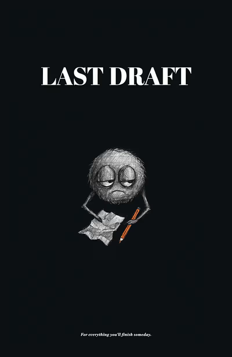
SOOT — Mascot of LAST DRAFT Every creative person has a SOOT inside them. SOOT is the official mascot of LAST DRAFT — a fictional stationery brand built for people who start things beautifully and abandon them gloriously. SOOT is a small, round creature made entirely of graphite smudge and dust. He has no legs — he just floats, unbothered. He has oversized expressive eyes that carry the weight of seventeen unfinished projects. And he always, always carries one unfinished thing. It's never the same thing twice. He's not sad about it. He's weirdly proud. THE BRAND IDEA LAST DRAFT exists for the beautifully unfinished. Not for people who quit — for people who start with full intention, get distracted by a better idea, and begin again. The brand lives on stationery, notebooks, and merch — products for people who buy notebooks but never finish them. Sound familiar? Tagline: "For everything you'll finish someday." CHARACTER BRIEF Name: SOOT Role: Brand mascot of LAST DRAFT Form: Small round graphite smudge creature — no legs, tiny stubby arms, oversized expressive eyes Personality: Unbothered, chaotic, soft, perpetually mid-thought, oddly proud of unfinished work SOOT is the patron saint of good intentions and better beginnings. Warm and chaotic, he shows up on every LAST DRAFT product as a reminder that starting is the whole point. He has been working on something for three years. He doesn't mind. Neither should you. THE SYSTEM Every element of LAST DRAFT was designed to feel like it belongs together — and like nothing else out there. Color palette: Three colors only. Deep charcoal #1C1C1E, warm paper off-white #F5F0E8, and a single burnt amber accent #D4622A — used sparingly, like a pencil tip. Typography: Bold serif for LAST, italic serif for DRAFT — because one thing is certain, and the other is still being figured out. SOOT across five applications: Sticker Pack — Six emotional states: happy, tired, shrugging, focused, done, pretending to work. Because SOOT contains multitudes. Dark Poster — Pure charcoal background, SOOT centered with breathing room, one orange pencil. Tagline at the bottom in the smallest possible font. Less is the whole point. Notebook Cover — SOOT peeking from the bottom edge of a kraft paper cover, just his eyes and the top of his head visible. Because the best notebooks are the ones you almost finish. Social Post Template — "another unfinished thought." SOOT holding a crumpled paper, looking directly at you. @lastdraft. This is the post format that would make anyone who has ever abandoned a project stop scrolling. T-Shirt Merch — SOOT on a clean white tee, small and centered. "still working on it." in tiny lowercase. The most relatable shirt ever made. WHY SOOT WORKS Most mascots are aspirational. SOOT is the opposite — he's deeply, specifically relatable. Every creative person, every student, every person who has ever bought a notebook and not finished it will see SOOT and think: that's me. That's the point. A mascot people laugh at themselves through is a mascot they remember. SOOT is distinctive enough to own a silhouette. Simple enough to stay consistent. And human enough to make you feel seen. He's been working on something for three years. You already know what it feels like. That's LAST DRAFT. 🔗 Full Recraft Project: https://www.recraft.ai/project/adad844a-479d-4b83-86ff-665bf04fca89
1
4
434
0
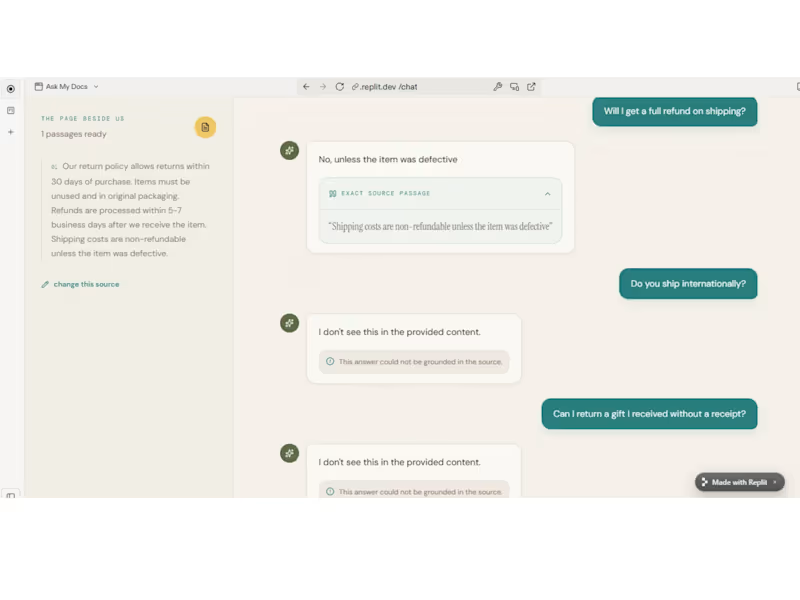
Ask My Docs — RAG-Based AI Chat Agent
0
6
0
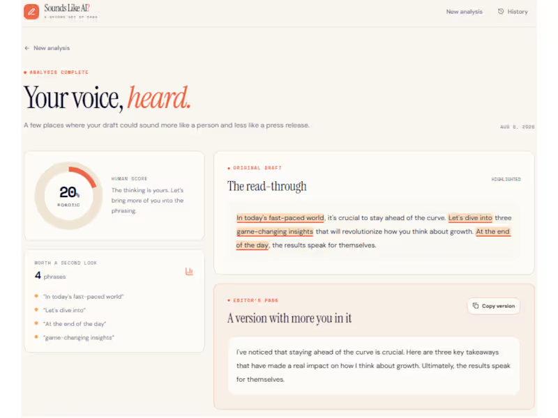
Sounds Like AI? — AI Writing Authenticity Checker
0
4
0
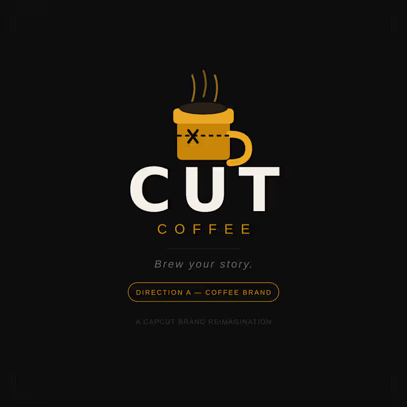
CUT Coffee — Brew Your Story I reimagined CapCut as a premium coffee brand for creators. The scissors become a cup mark. The timeline becomes a film-strip sleeve. Every great story begins with a cut. Direction A — CapCut as a Different Industry https://www.linkedin.com/posts/abuaasif_capcutdesignstudio-branddesign-capcut-activity-7467333219772952576-53vt?utm_source=share&utm_medium=member_desktop&rcm=ACoAACRm5rcB0nVG0_HUX6-IXfuWqNGquZ-jMQU
0
581
Contra
(1)
Follow
Message
Mayank Lulla
Mumbai, India
AI-Powered Web Designer | Landing Pages & Chatbots
6
Followers
Follow
Message
AI-Powered Web Designer | Landing Pages & Chatbots
1
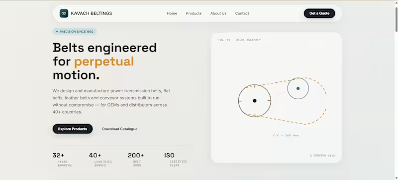
Kavach Beltings — A Product Catalogue
1
10
2
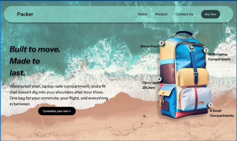
Designed this hero section. Kept it simple on purpose. The whole vibe — colors, mood, even the beach backdrop — came straight from the bag itself. Wanted the product to lead the design, not fight it for attention. A few details I added along the way: numbered callouts on the bag itself (waterproof shell, laptop compartment, capacity, storage) instead of generic floating badges — felt more like actually showing the product than just decorating around it. Still figuring out if this is the right balance of "clean" vs "does enough." If you've got an idea to make this better — layout, hierarchy, anything — I'd genuinely like to hear it. Drop it below 👇
2
73
2
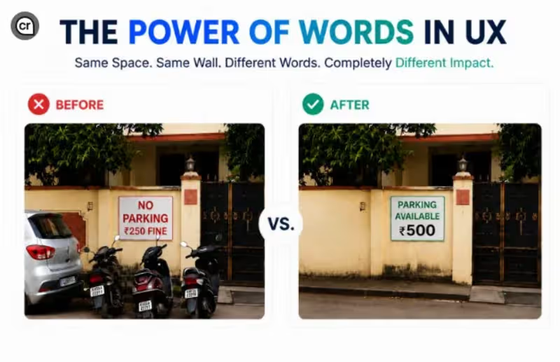
Same sign. Same rule. Same fine. Just different words. One version people ignore. The other, they stop and read. That's the power of framing in design — it's not always about what you say, it's about how you say it. Which one grabs your attention more? A or B? 👇 #UXDesign #Creativity #DesignThinking #PowerOfWords
2
111
1
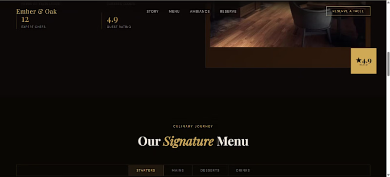
Ember & Oak — Fine Dining Website Designed and developed a premium restaurant website concept for Ember & Oak, focused on creating an immersive digital experience around fine dining, culinary storytelling, and ambience. The goal was to make the website feel like an introduction to the restaurant itself — from discovering its story and signature dishes to exploring the space and reserving a table. What I focused on:- -Premium fine-dining visual direction -Strong editorial-style typography and layout -Immersive hero section -Restaurant story and brand positioning -Curated menu presentation with pricing -Categorized food and drink sections -Ambience and interior showcase The experience is designed to take visitors through the restaurant's identity, cuisine, atmosphere, and ultimately towards making a reservation. Built as a sample website concept for a premium fine-dining restaurant. Live Website: https://mayanklulla12.github.io/Website_restaurant_sample/ #WebDesign #RestaurantWebsite #UIUX #FrontendDevelopment #WebDevelopment #HospitalityDesign #FineDining #WebsiteDesign #ProductShowcase
2
1
94
Contra
(2)
Follow
Message
Tushar Patil
Mumbai, India
A freelance software engineer for Website development.
New to Contra
Follow
Message
A freelance software engineer for Website development.
0
Can someone help me getting projects because I really need money and I can do whatever client gives me the requirement.
0
109
4
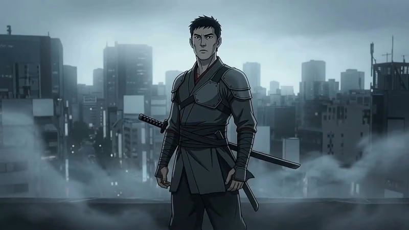
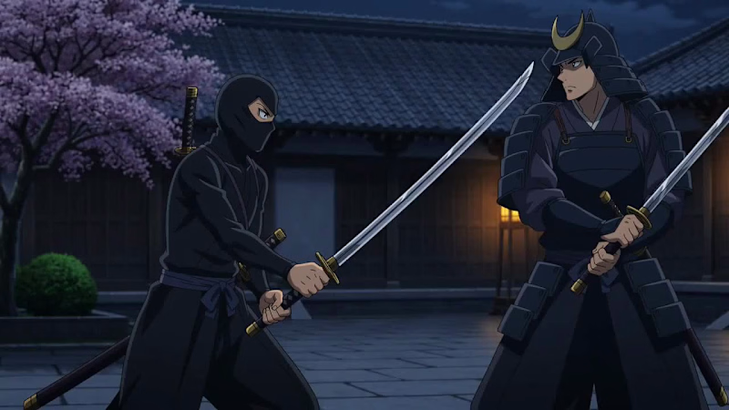
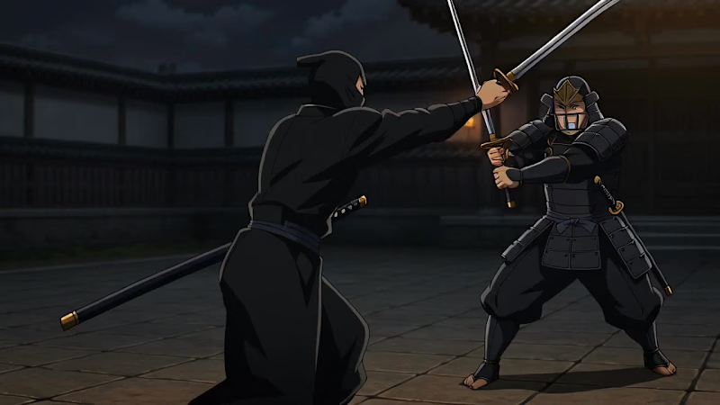
Animated Ninja vs Samurai fight
1
4
166
0
Someone please take this video and send me 500$
0
72
0
Ninja Animated fight.
0
96
Contra
(2)
Follow
Message
Explore people