Projects using UserTesting in BengaluruProjects using UserTesting in BengaluruAI-Powered Payments Platform — Operational Command Center for JP Morgan
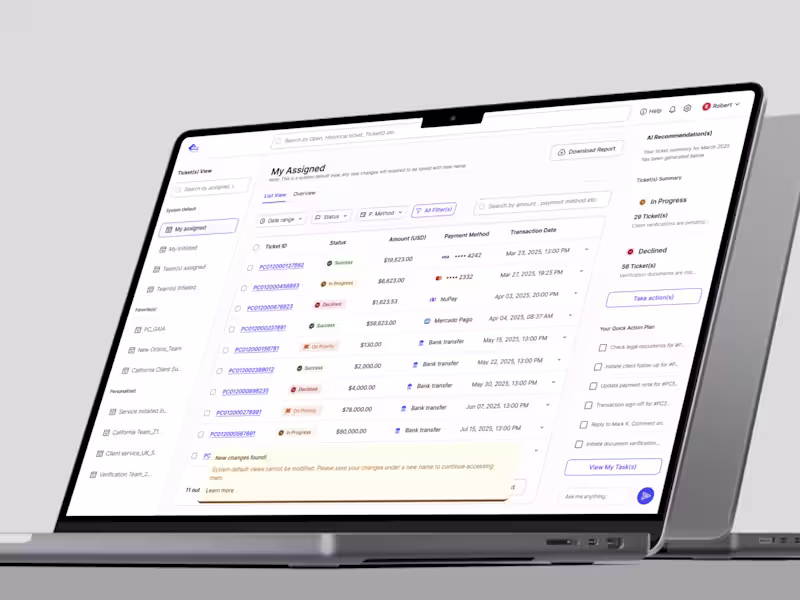
About: JP Morgan's Payment Blotter was doing its job managing high-value institutional transactions across multiple teams but nobody could actually see what was happening. Layered permissions, fragmented listing logic, and role-based visibility rules that had accumulated over years meant the system provided data but not clarity. Operations associates, client service teams, and back-office stakeholders were all looking at the same platform and interpreting it differently. In a compliance-driven, time-sensitive environment, that ambiguity isn't a UX problem it's operational risk.
What I did: I was the sole designer on a 9-person cross-functional team, responsible for auditing the entire workflow architecture, untangling role-based logic inconsistencies, and redesigning the blotter into a structured operational workspace while simultaneously laying the AI foundation for future enhancements. 12 stakeholder interviews across 4 service locations in US and UK. 3 sprints. One mandate: make a dense enterprise system behave predictably without stripping the depth that power users depend on.
The key insight that drove every decision: in enterprise financial systems, clarity and consistency drive operational performance more than feature depth. The redesign surfaced role-aware access transparently, embedded ticket handling directly into contextual views, and simplified payment state logic so users could identify state faster, understand their access, act from the listing view, and share context without exporting.
Post Launch: Launched and awarded in 2025. Ticket actions down to under 3 minutes. Processing time under 4 minutes. Task satisfaction at 75–80%. Ticket volume per team brought under 2,000. A payment blotter that finally worked like a command center. Unified Banking Dashboard — Multi-Brand Design System for Emirates NBD & Emirates Islamic
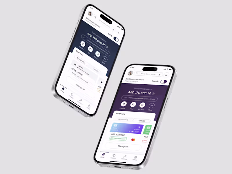
About: Two banking brands. One codebase. 2.5 million digital users in the GCC expecting instant financial clarity every time they open the app. The existing dashboard was fragmented, brand-heavy, and cognitively expensive research showed 70% of daily sessions were spent just checking balances and recent transactions, yet the interface was treating every screen like a promotional surface.
What I did: I led UX strategy, information architecture, interaction design, and design systems thinking solo delivering a token-driven, brand-adaptive dashboard that let Emirates NBD and Emirates Islamic share core structural components while expressing completely distinct identities through color, elevation, tone, and motion. No UX fragmentation. No engineering overhead duplication.
The layered hierarchy I designed answered the three questions every banking user silently asks: Where do I stand? What can I do now? What needs attention? in that exact order, every time.
Post-launch: 85–95% task completion, drop-off reduced by 20%, 70% component reuse across brands, 2–3× improved engagement, and a 2× faster brand rollout for engineering teams. A dashboard that finally worked like a financial command center not a promotional feed.