Projects using Adobe Photoshop in Bengaluru
Projects using Adobe Photoshop in Bengaluru
Sign Up
Post a job
Sign Up
Log In
Filters
2
Projects
People
Message
12
Vaibhav Yadav
pro
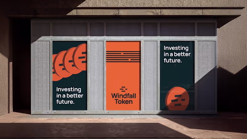
Windfall Token – Visual Identity Design
12
109
Message
3
Praveen Kumar
max
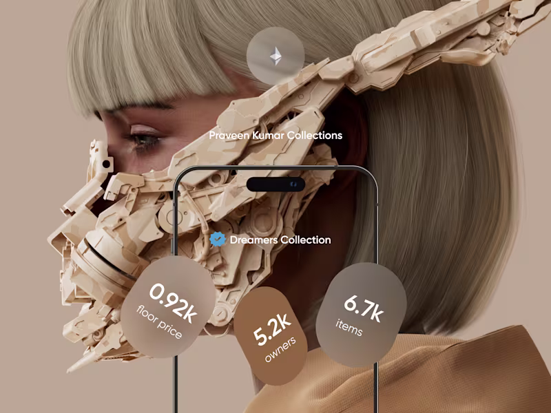
NFT UX UI App Design Web3
3
81
Message
23
Aryabhatta @SanganakHQ
pro
Divine Aura – Luxury Jewellery Brand Identity
1
23
5
Message
1
Dishant Agnihotri
Neo-Brutalism - Ecommerce Website
1
144
Message
1
Saanel Bhatnagar
pro
Visual Identity System for a Personal Brand
1
11
Message
3
Krishna Raj
pro
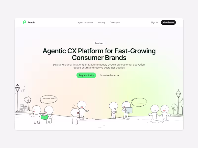
TryPeach.ai - Agentic CX Platform Website
3
16
Message
1
Smriti Jaiswal
pro
Think Tasty - Ideation Game
1
4
Message
1
Nabeel M
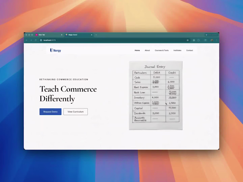
Made some changes to the website. Still WIP. Suggestions are welcome. 2 things I'm gonna change in this design - The three journal entry panels. Need to find a better solution than that to show. Secondly, the third images in the Commerce Education Infrastructure section.
1
323
Message
2
Davis Johnson
pro
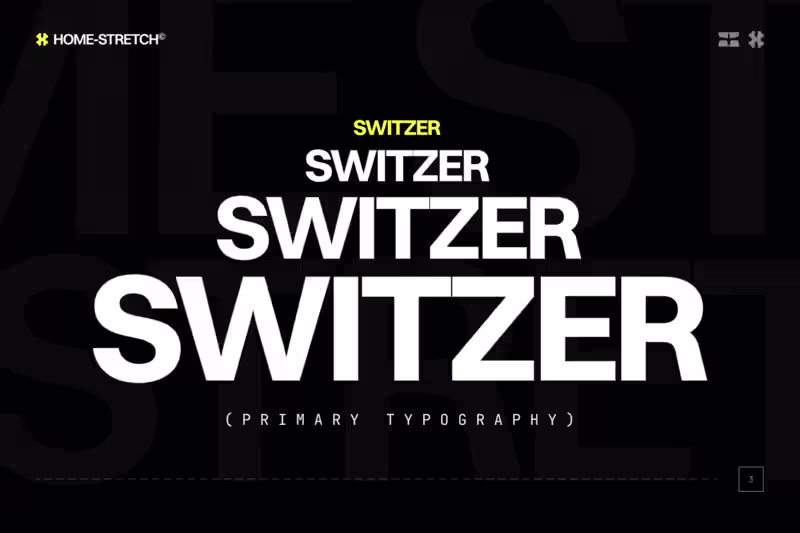
Homestretch - Branding Guideline
2
25
Message
0
Sathish G
Yeti Character
0
21
Message
2
Prajwal ✌
pro
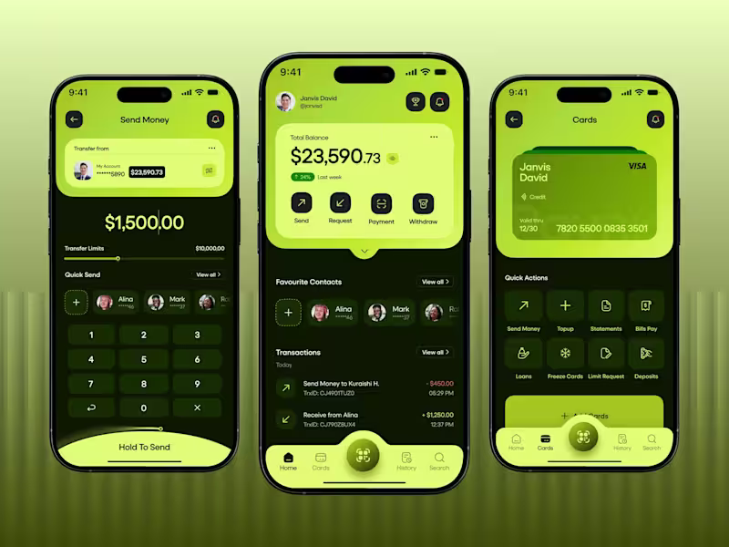
Reimagined Fintech Mobile Banking App
2
5
Message
0
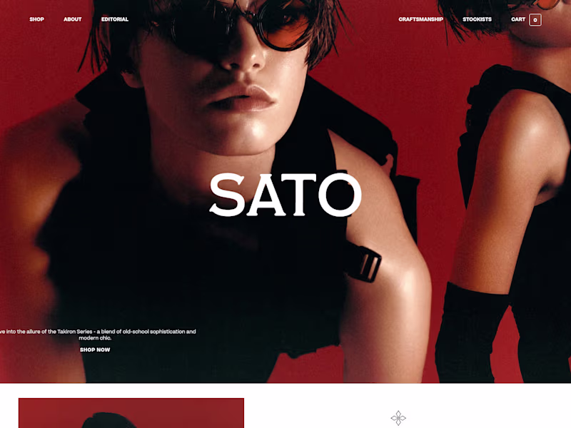
Neelanjan Munshi
pro
Sato Eyewear Luxury E-commerce Website
0
4
Message
0
Shrutillusion | Branding+Editorial Studio
Wairua - Brand Identity Design
0
4
Message
2
Aniketh A
Logo Design done for Glavida Groups along with 15+ Brand Elements Design
2
125
Message
0
Arjun Haridas
LOGO DESIGNS
0
2
Message
2
Drapz DZN
Fugitive Visual Identity Project.
2
99
Explore projects