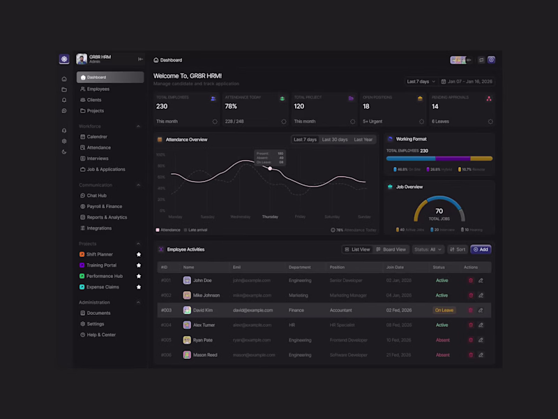
Branding | Product Design | Website design | MVP Design
Branding | Product Design | Website design | MVP Design
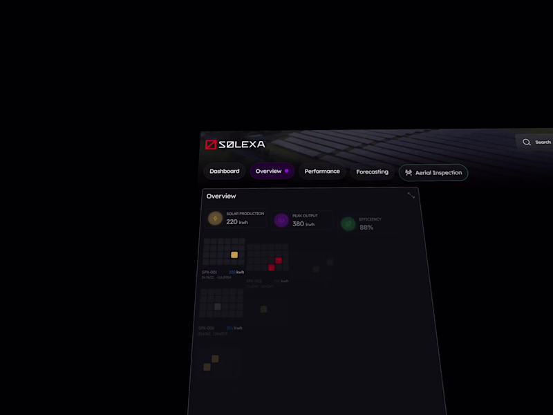
Brand & Motion Designer | AI Video, Visual Identity, UI/UX
Brand & Motion Designer | AI Video, Visual Identity, UI/UX
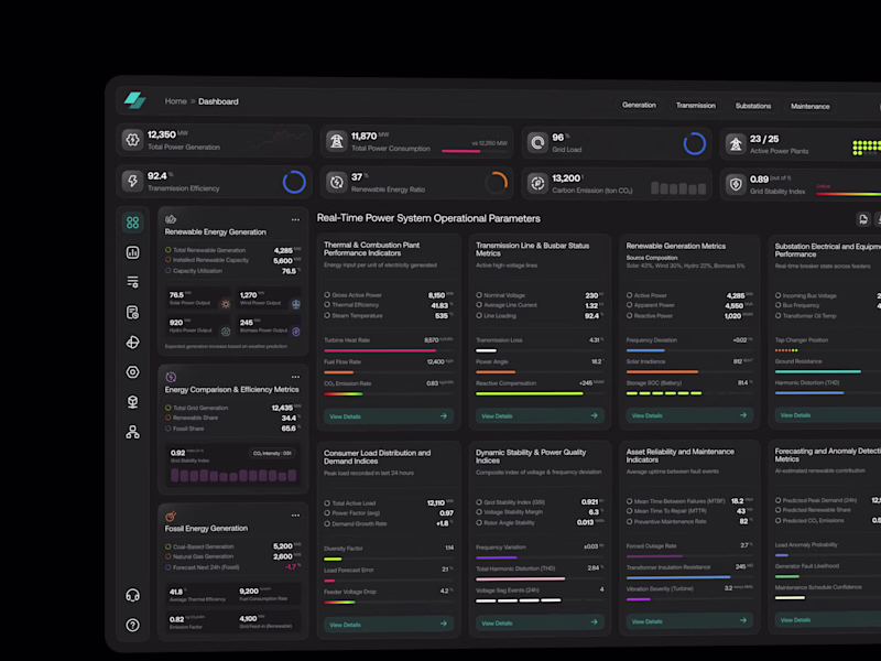
Growth-focused UI/UX Designer
Growth-focused UI/UX Designer
Delivering Memorable User Experiences for Apps and Websites.
- $5k+
- Earned
- 2x
- Hired
- 5.0
- Rating
- 123
- Followers
Delivering Memorable User Experiences for Apps and Websites.
UI/UX Designer | Figma → Framer & Elementor
UI/UX Designer | Figma → Framer & Elementor
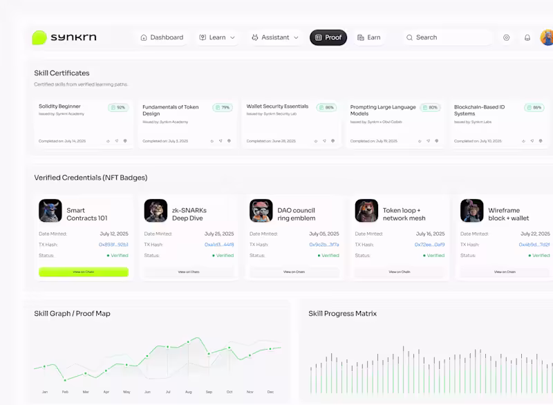
Next, React, HTML, SASS | Building Brand | Websites | Framer
Next, React, HTML, SASS | Building Brand | Websites | Framer
UX-led product design & dev agency for b2b saas and AI
UX-led product design & dev agency for b2b saas and AI
Top 10% Product Designer | Designing SaaS & Websites
Top 10% Product Designer | Designing SaaS & Websites