
Web Designer & Frontend Developer
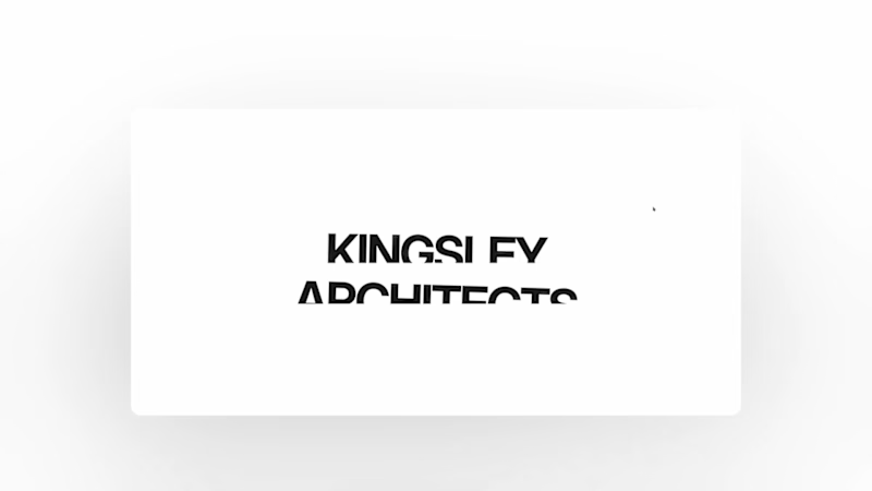
I've been paying attention to how architecture firms present their work online, and one thing I kept coming back to was how much the first few seconds matter.
Large project photography, minimal distraction, strong project information, and recognition placed close to the work itself.
I kept those ideas in mind while designing Kingsley Architects.
The homepage opens with a project slideshow where the imagery, project name, location and recognition change together, so each project gets its own moment rather than feeling like another item in a grid.
I approached motion the same way.
Using GSAP, I focused on transitions that guide attention, create hierarchy and give the architectural photography enough room to carry the experience.
But I also wanted Kingsley to work beyond the initial launch.
Architecture practices keep evolving. New projects are completed, photography gets updated, awards are received, and the portfolio grows.
So I built a content management system behind the website that allows the studio to add projects, replace imagery and update content without touching the code.
That was an important part of the concept for me.
A studio website shouldn't only look good when it launches. It should be something the practice can continue building on as its body of work grows.
Kingsley is a fictional architecture practice, but the design decisions came from patterns I found while studying real architecture firms and how they present projects, recognition and studio credibility online.
I designed and developed the full experience with Next.js, Tailwind CSS, GSAP and CMS, covering visual direction, responsive development, motion, project presentation and content management.
🔗 Live site:
https://kingsley-architecture.vercel.app/
For architects and studio teams, how important is it for your team to be able to update your portfolio without relying on a developer?
0
60
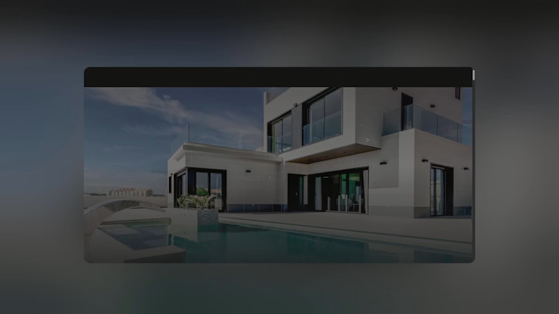
I wanted VELA to feel less like a conventional portfolio and more like a quiet introduction to a studio’s way of thinking.
The starting point was simple:
Can a website communicate the character of an architecture practice before someone reads much at all?
For VELA, I built the visual language around a restrained palette, oversized imagery, measured typography and generous spacing.
Rather than showing everything immediately, the site reveals the studio gradually through projects, interiors, process, materials and smaller editorial moments.
The photography does most of the talking.
The interface stays intentionally understated so the architecture can remain the focus.
I also spent a lot of time on rhythm.
Some sections are almost completely visual, while others slow things down with smaller images, text and details about the studio’s approach.
Motion follows the same idea.
I used GSAP to connect sections and give the page a natural flow, while keeping the interactions subtle enough that they never compete with the work.
VELA is a fictional architecture and interiors studio, but the project was shaped by a lot of research into how design-led practices communicate atmosphere, materiality and identity online.
I designed and developed the complete experience with Next.js, Tailwind CSS and GSAP, including the visual direction, responsive layouts, motion and project presentation.
🔗 Live site:
https://vela-studio-eight.vercel.app/
For architects and interior designers, when someone lands on your website for the first time, what do you want them to understand about your practice before anything else?
0
70
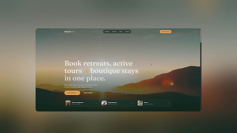
You don't usually decide to travel because a website had a good CTA.
You decide because you started imagining yourself there.
That's the feeling I wanted to capture with Wanderwell.
Instead of treating the experience like a traditional booking platform, I approached it more like an editorial travel experience.
Large imagery.
Spacious layouts.
Curated destinations.
Stories before transactions.
Then, once the visitor is inspired, the booking journey becomes the natural next step.
🔗 Live website:
https://wanderwell-five.vercel.app/
Built with Next.js, Tailwind CSS & GSAP
Would you rather book from a website that's optimized for speed or one that makes you want to pack your bags?
0
244
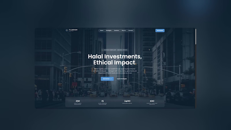
First impressions matter. Especially when money is involved.
For this Tijarah Capital concept, I wanted to explore what a financial website could feel like when the priority isn't just "looking premium", but actually communicating trust and clarity.
I kept the visual language restrained:
• Strong typography
• Structured information
• Editorial layouts
• Subtle motion
• Plenty of breathing room
Nothing too flashy.
Because sometimes the most convincing design is the one that knows when to stop.
🔗 Live website:
https://tijarahcapital.vercel.app/
Built with Next.js, Tailwind CSS & GSAP
What makes you trust a financial website within the first 10 seconds?
0
225

I build fast, beautiful landing pages and websites.

Coffee Shop Landing Page Design & Development
Project Value: $150 USD
Designed and developed a modern coffee shop landing page that blends warm aesthetics with a seamless user experience, helping the brand create a memorable online presence and attract more customers.
What was delivered
Elegant and modern UI inspired by premium coffee brands
Fully responsive design optimized for desktop, tablet, and mobile
Visually engaging hero section with immersive imagery
Well-organized menu and featured products presentation
Smooth scrolling and subtle animations for a premium browsing experience
Strategic call-to-action sections to encourage reservations and customer inquiries
Fast-loading, performance-optimized frontend
Clean, maintainable code built with modern web technologies
Project Highlights
This project was designed to capture the atmosphere of a modern café while showcasing its menu and brand identity through a clean, visually appealing interface. Careful attention was given to typography, spacing, and visual hierarchy to create an inviting experience that keeps visitors engaged.
The result is a professional, conversion-focused landing page that enhances brand credibility, improves customer engagement, and provides an enjoyable browsing experience across all devices.
Project Price: $150 USD
0
38

Restaurant Landing Page Design & Development
Project Value: $125 USD
Designed and developed a modern landing page for a local food brand, focused on showcasing the menu, strengthening brand identity, and making online ordering simple and intuitive.
What was delivered
Modern and appetizing UI tailored for a food & beverage business
Fully responsive design for desktop, tablet, and mobile devices
Engaging hero section with strong visual branding
Well-structured food menu with attractive product presentation
Smooth scrolling experience and subtle interactive animations
Clear call-to-action sections to encourage WhatsApp orders
Performance-optimized frontend for fast loading
Clean, maintainable code built with modern web technologies
Project Highlights
The website was designed to create a memorable first impression while making it effortless for customers to explore the menu and place an order. The clean layout, appealing food presentation, and intuitive navigation help increase customer confidence and enhance the overall digital experience.
This project demonstrates how a simple yet thoughtfully designed landing page can elevate a local food business, improve its online presence, and support customer conversions.
Project Price: $125 USD
0
38

Startup Landing Page Design & Development
Project Value: $200 USD
Designed and developed a modern startup landing page focused on helping early-stage businesses establish a strong online presence and communicate their vision with clarity.
What was delivered
Modern and professional startup-focused UI
Clean, responsive design for all screen sizes
Engaging hero section with a clear value proposition
Structured content flow to improve user engagement
Smooth scrolling and interactive user experience
Modern typography and balanced visual hierarchy
Strategic call-to-action sections to encourage sign-ups and inquiries
Performance-optimized frontend with clean, maintainable code
Project Highlights
This project was created to help a startup communicate its mission, attract potential team members, and present its business idea in a professional way. Every section was carefully designed to build trust, simplify information, and guide visitors toward taking action.
The final result is a fast, visually engaging, and conversion-focused landing page that strengthens brand credibility while delivering a polished user experience across all devices.
Project Price: $300 USD
0
43

Premium Shoe Brand Landing Page
Project Value: $300
Designed and developed a premium landing page for a modern footwear brand, combining luxury aesthetics with a conversion-focused user experience.
What was delivered
Modern and elegant UI inspired by premium fashion brands
Responsive design optimized for desktop, tablet, and mobile
Smooth scrolling experience with refined animations and transitions
Strong visual hierarchy to showcase products and brand identity
High-quality product presentation with premium typography and spacing
Strategic call-to-action sections to encourage customer engagement
Performance-optimized layout for fast loading and seamless browsing
Clean, scalable code built with modern web technologies
Project Highlights
The landing page was crafted to communicate a premium brand image while maintaining a minimalist and sophisticated design language. Every section was intentionally designed to guide visitors through the brand story, highlight the footwear collection, and maximize user engagement.
The result is a visually polished website that strengthens brand credibility, improves first impressions, and creates a shopping experience that feels both modern and luxurious.
Project Price: $300 USD
0
45

Efficient Backend Engineer for Scalable Solutions
Efficient Backend Engineer for Scalable Solutions


Building sites, editing frames — all-in-one
Building sites, editing frames — all-in-one


Full-Stack Developer · Web Apps, AI & Web3
- 46
- Followers
Full-Stack Developer · Web Apps, AI & Web3
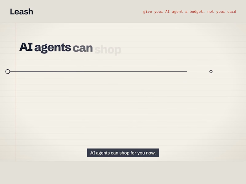
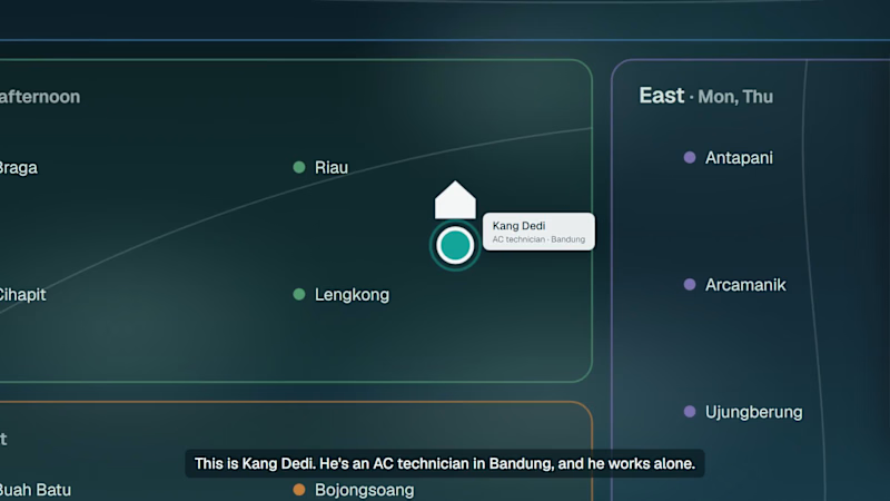
Built a booking app for Kang Dedi, a one-man AC technician in Bandung (fictional client, very real problem).
Every booking used to be a WhatsApp marathon: "how much?", "which day?", "what time?", "send your location". Around 10 messages per job, answered at night after work. Then his days zig-zag across the city, and sometimes he shows up to an empty house because the customer forgot.
So I turned the whole chat into one link:
✅ Pick your neighborhood, you only see days he's already around (mornings in your area, afternoons in the center)
✅ Price and time on site show up instantly, only slots where the whole job actually fits
✅ Booked in about a minute, with a ticket and the exact WhatsApp confirmation
✅ Reminder the evening before: still on, or reschedule? No reply gets flagged for him
✅ Someone cancels? The slot goes straight to the next person on that area's waitlist
✅ Review request goes out after the job, on its own
✅ His whole day on one map, plus the week, the waitlist and every message sent
Ngl the fun part was the scheduling rule. My first version literally put him in two places at once, took a couple of rounds to get it right (the process video shows the whole thing, bugs included).
Try it: ademservice.lovable.app
(http://ademservice.lovable.app)Owner view, no login: ademservice.lovable.app/demo
(Messages are simulat:ed in the demo, production would go through the WhatsApp Business API.)
4
427

Work Life Balance
Work Life Balance

Finansist Landing Page
Recently built a landing page for a financial assistant service, focusing on trust, clarity, and conversion.
Tech Stack
- Next.js (TypeScript) → fullstack framework (SSR + API routes)
- Supabase → PostgreSQL database + storage (asset buckets)
- Clean, scalable component-based architecture
Highlights
- Responsive and modern UI
- SEO-friendly with server-side rendering
- Consultation form integrated directly with database
- Asset management via Supabase Storage
- Modular structure, ready to scale into CMS or dashboard
Goal
To help businesses showcase their credibility (certifications, experience, services) in a clean and professional way, while increasing consultation conversions.
0
79
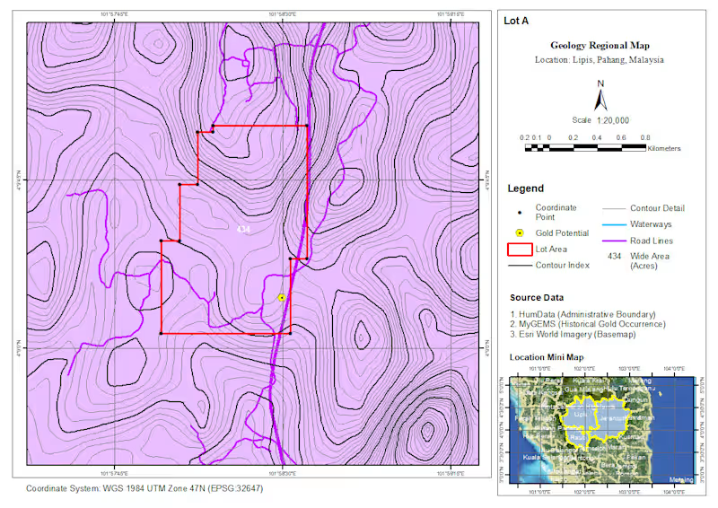
Recently completed a GIS-based desktop study for a gold exploration project in Pahang, Malaysia, covering areas around Lipis, Jerantut, and Raub.
As a GIS Analyst, I worked on compiling and integrating multiple spatial datasets to support preliminary assessment and planning of potential exploration areas.
The analysis and mapping included:
• Regional geological mapping
• Geomorphological analysis
• Satellite imagery interpretation
• Gold occurrence and resource visualization
• Accessibility and surrounding area analysis
• Quarry/resource mapping
• Project planning and infrastructure mapping
• Permit application mapping
The workflow involved combining geological and mineral occurrence data with terrain, satellite imagery, road networks, waterways, and project boundaries to create clear and structured thematic maps for desktop-level assessment.
The maps were developed using ArcGIS with a focus on consistent cartographic standards, spatial accuracy, and presenting complex geospatial information in a format that can support further exploration planning and decision-making.
This project was a great opportunity to apply GIS not only for visualization, but also as a tool for integrating geological, environmental, and spatial information into a more structured exploration workflow.
📍 Pahang, Malaysia
🗺️ GIS Analysis & Cartography
⛏️ Gold Exploration Desktop Study
1
198
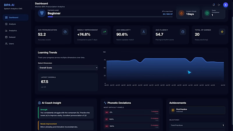
BIPA AI — AI-Powered Pronunciation Learning Platform
BIPA AI is an intelligent pronunciation learning platform that helps non-native Indonesian speakers improve their speaking skills through AI-driven speech analysis and personalized learning.
The platform evaluates pronunciation across multiple dimensions—including pronunciation accuracy, fluency, intonation, clarity, vowel articulation, phoneme accuracy, and native speaker similarity—to provide detailed, actionable feedback after every speaking exercise.
Designed as more than just a speech analyzer, BIPA AI introduces structured pronunciation tasks, learning progress tracking, historical performance analytics, and adaptive AI recommendations, creating an engaging learning experience similar to modern language learning platforms.
By combining speech processing, machine learning, and interactive analytics, the application transforms spoken audio into measurable insights that support continuous pronunciation improvement.
Highlights
- AI-based pronunciation evaluation
- Native speaker comparison
- Speech performance analytics dashboard
- Guided pronunciation learning
- Personalized AI feedback
- Long-term learning progress tracking
- Modern responsive web application
0
99
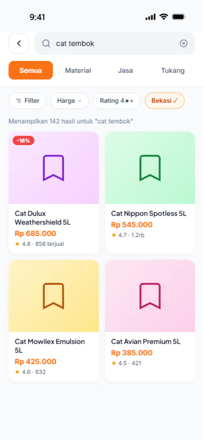
This project aims to design and develop a modern mobile-based construction and home renovation platform tailored for the Indonesian market. The platform will serve as an integrated ecosystem that connects homeowners with building material suppliers, renovation service providers, contractors, and project monitoring tools within a single digital experience.
The product is designed to address common challenges faced by Indonesian homeowners during renovation processes, including difficulty finding trusted contractors, lack of transparency in project progress, fragmented purchasing workflows for construction materials, and limited digital tools for renovation management.
The platform combines four core service pillars:
Building material marketplace
Home renovation and repair services
Contractor and worker booking system
Renovation project monitoring and documentation
The application is intended primarily for non-technical homeowners who require a simple, guided, and trustworthy renovation experience. Therefore, the product strategy emphasizes beginner-friendly navigation, transparent workflows, intuitive mobile interactions, and a modern premium user experience that remains approachable for mass-market users.
From a product and UX perspective, this project focuses on creating a startup-grade mobile application blueprint that includes:
Product architecture and information hierarchy
Mobile UX strategy and interaction design
End-to-end user journey planning
Marketplace and service booking workflows
Renovation project management experience
Scalable design system planning
Component and navigation structure
Screen-by-screen UX documentation
Trust-building and accessibility considerations
The final output of this project will function as a comprehensive product design foundation for:
UI design development in Figma
Design system implementation
Frontend and mobile application development
UX documentation and stakeholder alignment
MVP planning and startup execution strategy
The visual and interaction direction will adopt a modern startup aesthetic inspired by leading digital platforms such as Tokopedia, Gojek, Stripe, Linear, and Airbnb, combining marketplace usability with clean and elegant mobile-first design principles.
This initiative is expected to produce a scalable, production-ready mobile product framework capable of supporting future business growth, service expansion, and digital transformation within Indonesia’s home renovation and construction industry.
0
95

Innovative software engineer crafting digital solutions.
Innovative software engineer crafting digital solutions.


Wordpress, UI & UX, Digital Marketing
Wordpress, UI & UX, Digital Marketing


