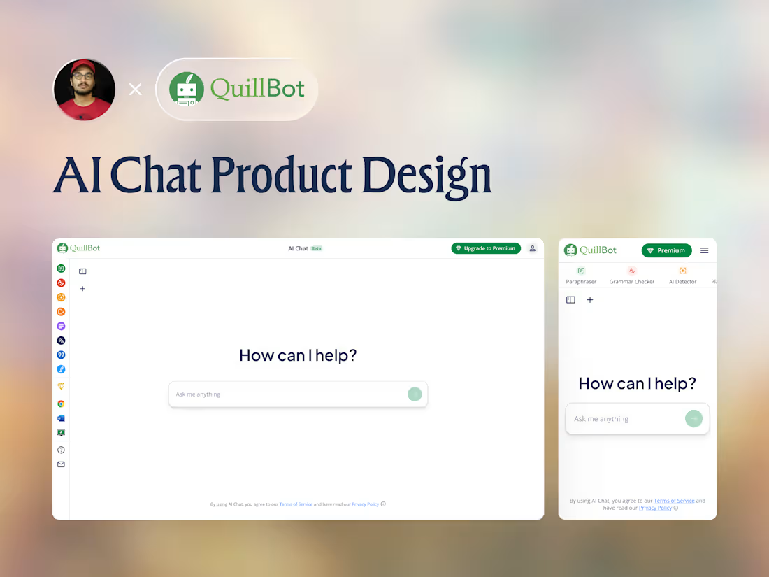
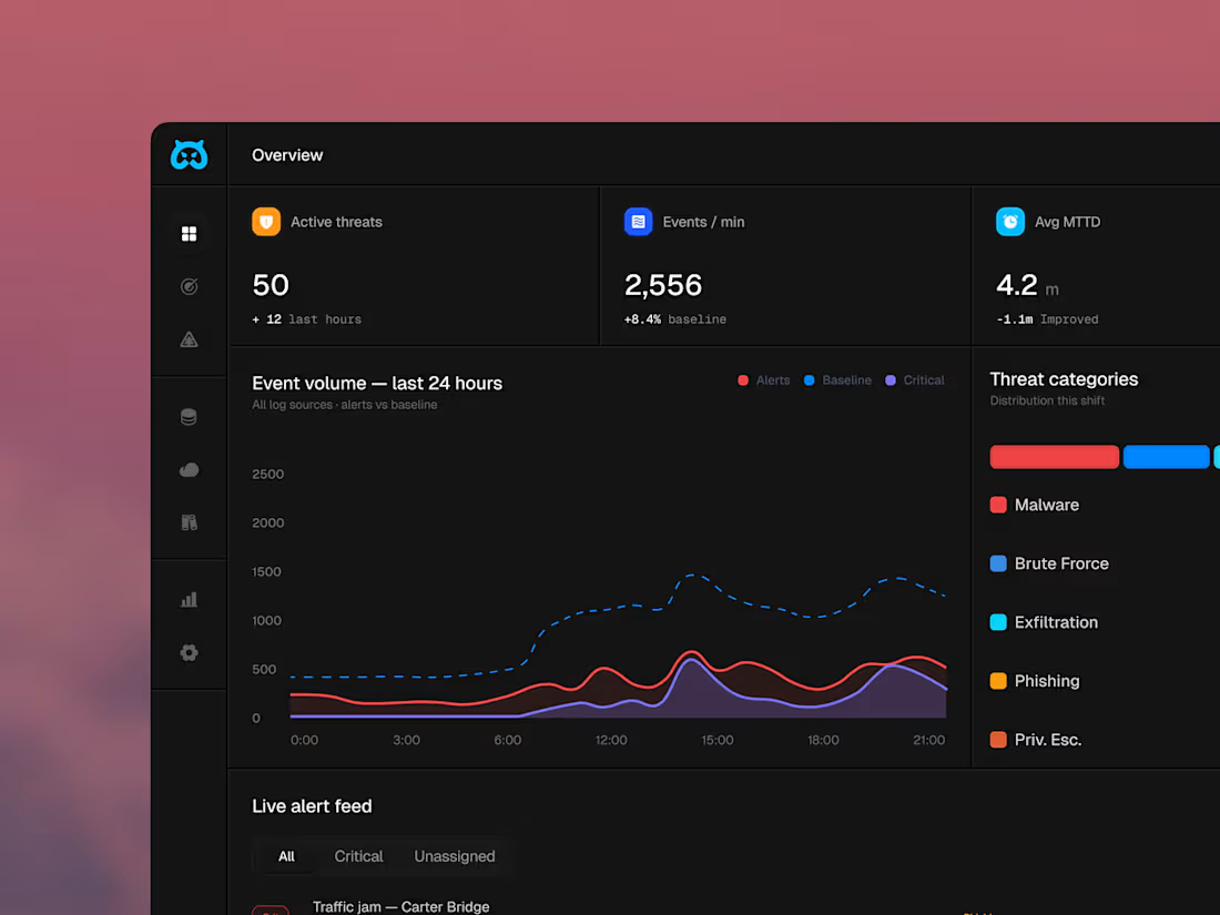


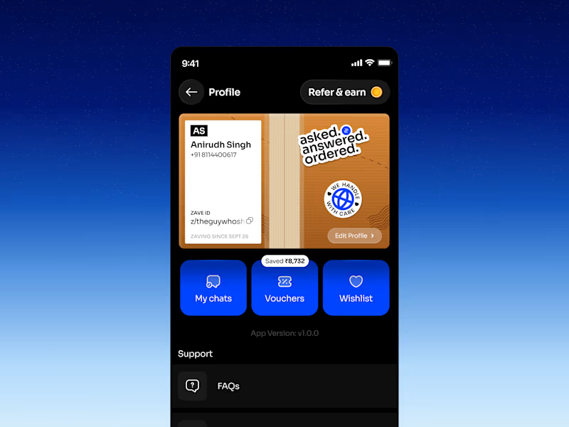
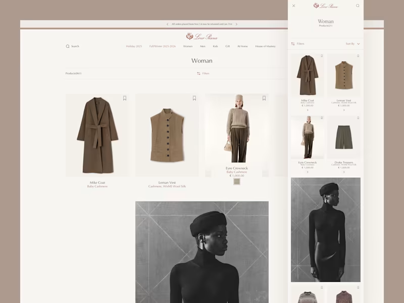
In high-end fashion and luxury retail, the Product Listing Page isn't just a catalog, it's an extension of the brand's boutique experience. The goal is to balance quiet luxury aesthetics with an intuitive, seamless browsing experience across all screen sizes.
🚀 Looking to design or upgrade a luxury e-commerce platform?
Let’s create a sleek, high-converting digital storefront tailored to your brand. Send me a direct message or hire me on Contra to collaborate! 💬
Explore full proejct here: https://rinkeshchopada.com/project/loro-piana-ecommerce/
0
131

Clean packaging. Premium feel. Bold branding. 🌿✨
A modern cosmetic mockup designed to make products stand out with elegance and simplicity. Perfect balance of minimal aesthetics, smooth shadows, and luxury packaging visuals.
Open for UI/UX, Branding & Product Mockup Projects 🚀
👉 Book a call: https://calendly.com/gopi-uiux/30min
(https://calendly.com/gopi-uiux/30min)👉 Dribble: https://dribbble.com/OptimityLogics
(https://dribbble.com/OptimityLogics)👉 Behance: https://www.behance.net/optimitylogics
(https://www.behance.net/optimitylogics)👉 Portfolio: https://gopi-prajapati-portfolio.vercel.app
8
13
1.5K


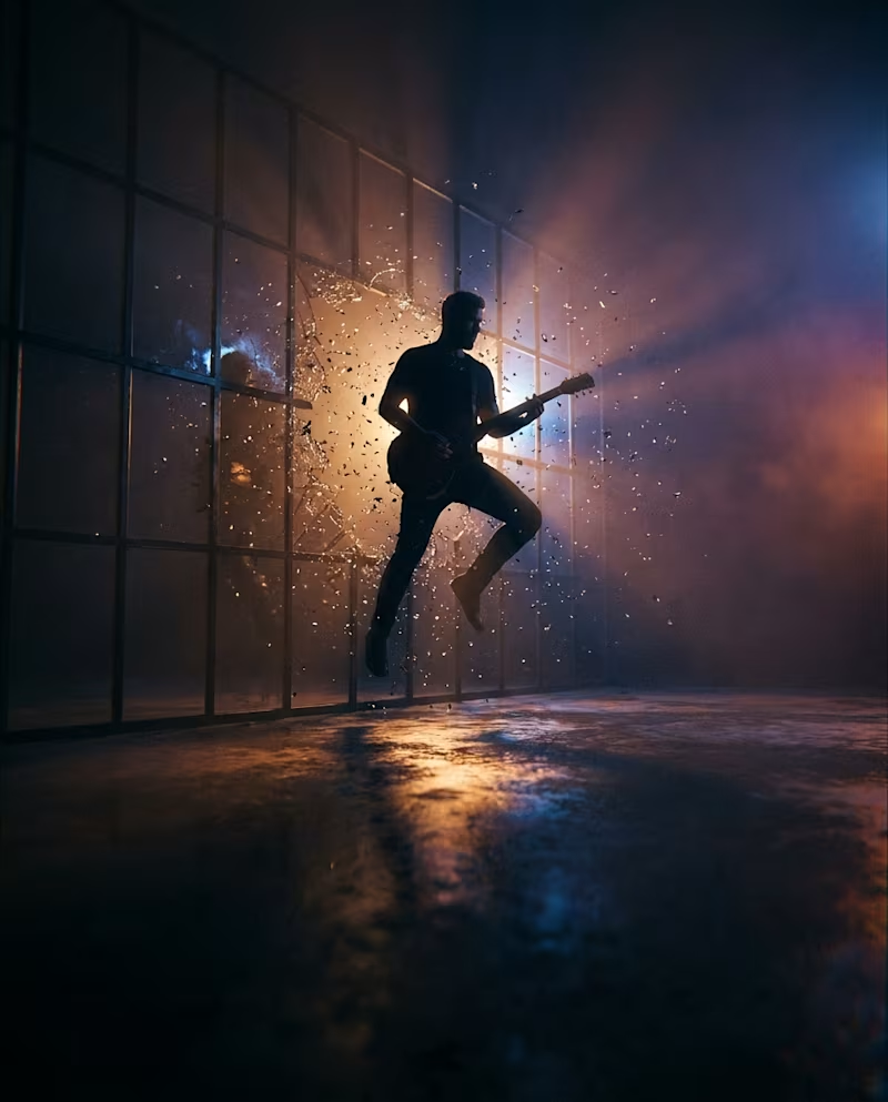
UK's Believe UK x Tileyard Music just launched Tenace Records — a new frontline label built to develop emerging artists. No visual identity out yet, so I built one. 🎧
Researched the label's story first — "Tenace" comes from tenacious, and the whole positioning is about raw talent breaking through with real infrastructure behind it. That became my creative brief.
Built 4 concept directions entirely with Higgsfield AI (Nano Banana Pro under the hood):
→ "The Breakthrough" — silhouette shattering through glass, duotone amber/cyan
→ "Grip" — a hand holding a cable of light, literalizing the name itself
→ "Studio Object" — mic + vinyl on black glass, for press kit use
→ "London Energy" — profile dissolving into sparks over a skyline
Kept every shot to one dramatic key light + a bold color clash — same formula you see in premium brand campaigns (DayDream, VINCA). Left negative space in every frame for a wordmark drop-in via Canva.
Which direction reads most "record label" to you — the Breakthrough or the Grip concept? 👇
#BuildInPublic #BrandDesign #AIDesign #HiggsfieldAI #MusicBranding #GraphicDesign #ConceptDesign #TenaceRecords #CreativeDirection #Contra
0
82


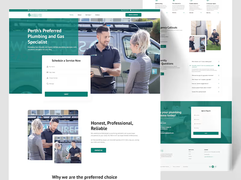
Sureflow — Plumbing & Gas Specialist Landing Page
Plumbing is an emergency-adjacent industry — half the people landing on this site have water actively going somewhere it shouldn't. So Sureflow's design had to do two things at once: feel calm and professional for someone comparing quotes, and get someone in a genuine emergency to the phone number in under five seconds.
The hero photo does a lot of the "professional" work on its own — two real people, a branded van, a tablet mid-conversation — while the "Schedule a Service Now" form sits as a clean white card cut directly into the teal hero, immediately actionable without needing a scroll. Google star ratings appear early too, right below the fold, four separate short reviews rather than one long testimonial, because for a trade business, volume of proof reads more convincing than a single polished quote.
The water-drop shape from the logo becomes a running visual motif — it wraps around team photos as a soft background shape, sits behind the "Contact us for upfront pricing" banner, reappears at the free-safety-check section — small thing, but it ties a fairly text-heavy, section-heavy page back to the brand every time the eye lands on a new block. The six-service grid (Safety Checks, Taps & Sink Installation, Hot Water & Gas Servicing, Appliance Installs) uses real on-the-job photos instead of icons, because a homeowner deciding whether to book wants to see the actual work, not an abstract pictogram.
Two small sections do real conversion work: a 3-step "Locate → Identify → Remove" breakdown that turns "we fix blocked drains" into something that sounds like an actual method, not a vague promise, and an "Emergency Callouts" block that's deliberately more urgent in tone — burst pipes, blocked toilets, gas leaks — set apart from the calmer sections around it.
Thanks for scrolling through this one 🙌
2
162