

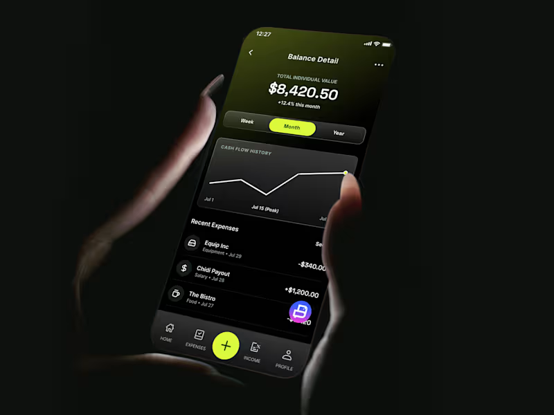
Light or dark? 👀
I’ve been exploring both themes for this bookkeeping/finance app, and I want to know which one you’d actually prefer to use.
Designed for people and businesses who want to stay in control of their finances without the complexity.
☀️ Light theme — clean, bright, and minimal
🌙 Dark theme — sleek, immersive, and easy on the eyes
Which one would you choose: Light or Dark?
2
2
182

Safeye - Eye Health Website
-
Safeye – Clarity in Every Glance
A modern, technology-driven healthcare website designed to make eye screening simple, fast, and accessible. Safeye blends warm clinical tones, immersive close-up visuals, and clean typography to create a refined and reassuring digital experience.
✅ Vision-Centered Visual Identity
Macro eye imagery, soft gradients, and minimal layouts emphasize clarity, precision, and medical trust.
✅ Smart, Insight-Led Structure
Data highlights, screening scores, and clear metrics communicate results instantly and confidently.
Safeye’s design transforms eye care into a sleek, intelligent experience, where science, simplicity, and confidence meet in seconds.
2
248

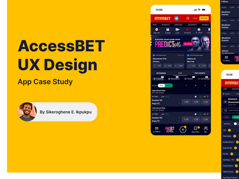


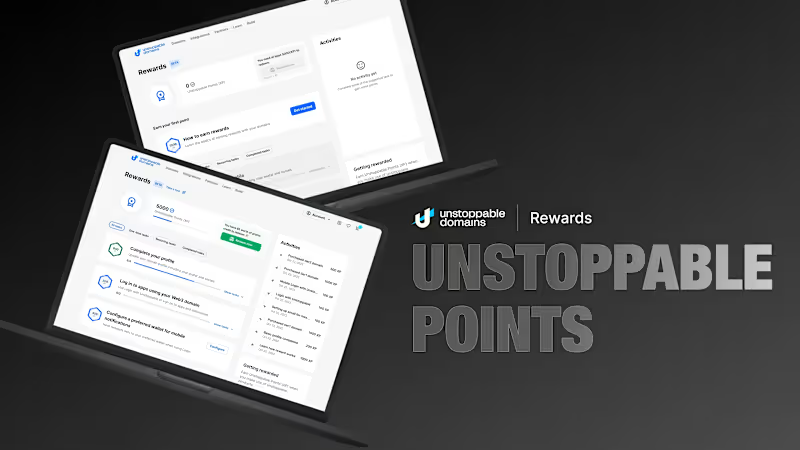

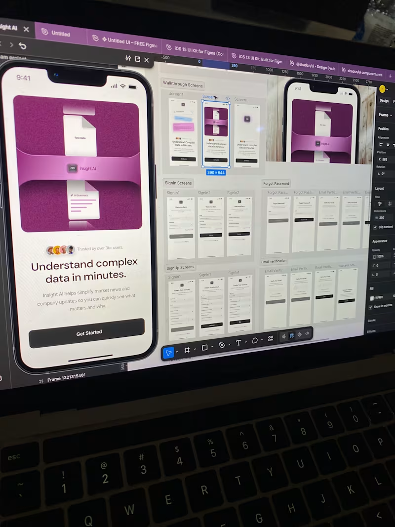
Good onboarding = a strong first impression.
I recently designed a prototype focused on creating a smoother and more natural onboarding experience for users. It’s all about helping them understand the product quickly and feel confident from their very first interaction.
Would love to hear your thoughts. how do you approach onboarding in your designs?
1
632